
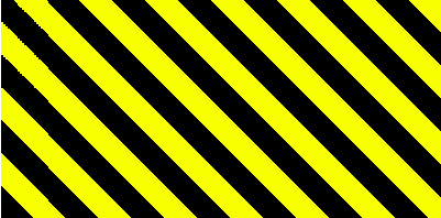
今回は「repeating-linear-gradient」関数を使用し、上下に斜めストライプを入れたCSSデザインを紹介します。
黒に黄色や赤色を入れた斜めストライプにすると目を引く注意喚起風のデザインになりますよね。
セキュリティ関連のサイトや記事、入力フォームの警告メッセージなどで活用してください。
「linear-gradient」関数とは
主にCSSの「background」プロパティに指定し、線型のグラデーションを生成します。今回ストライプをかける際もこのプロパティを応用して適用しています。
基本の構文は以下のとおりです。
background: linear-gradient(方向または角度, 開始色, 終了色);方向
to top:下から上へ
to right:左から右へ
to bottom:上から下へ
to left:右から左へ
角度
0deg:下から上へ
90deg:左から右へ
180deg:上から下へ
270deg:右から左へ
以下は具体的な指定方法です。
background:linear-gradient(to left top, black, yellow);

右下から左上に向かうグラデーション
background:linear-gradient(90deg, black, yellow);

角度90度。左から右に向かうグラデーション
background:linear-gradient(45deg, black 0 50%, yellow 50% 100%);

45度に傾け、0〜50%まで黒、50%〜100%までが黄色にしたグラデーション
background:repeating-linear-gradient(45deg, black 0 5%, yellow 5% 10%);
45度に傾け、0〜5%まで黒、5%〜10%までが黄色にし、「repeating-linear-gradient」を指定するとストライプになります。
before、after疑似要素で上下に斜めストライプを設置
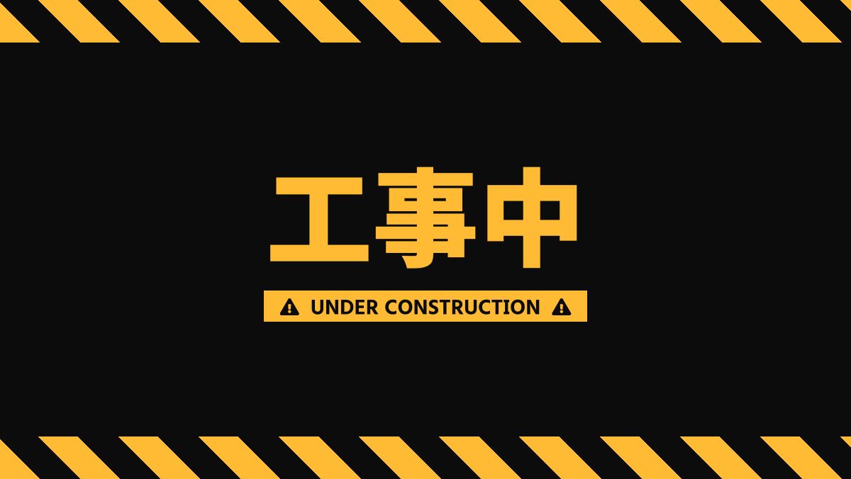
今回のテンプレでは「repeating-linear-gradient」をbefore、after疑似要素に適用しています。
.box::before,
.box::after {
    position: fixed;
    height: 30px;
    width: 100%;
    content: '';
    background: repeating-linear-gradient(45deg, var(--main-color) 0, var(--main-color) 20px, var(--base-color) 20px, var(--base-color) 40px);
}

.box::before {
    top: 0;
    left: 0;
}

.box::after {
    bottom: 0;
    left: 0;
}
「position」プロパティに「fixed」を指定し、高さ「height」を30pxにしました。「top」と「bottom」を0にすることで上下に表示できます。
全てのHTML・CSSコード
CSS表示
<div class="pic-container">
    <div class="box">
        <div class="box-title">
            <p>工事中</p>
        </div>
        <div class="box-sub-title">
            <p>UNDER CONSTRUCTION</p>
        </div>
    </div>
</div>
:root {
    /* ベースカラー */
    --base-color: #0c0c0c;
    /* メインカラー */
    --main-color: #ffbb33;
}

.pic-container {
    width: 600px;
    height: 338px;
}

.box {
    display: flex;
    justify-content: center;
    align-items: center;
    flex-direction: column;
    height: 100%;
    background-color: var(--base-color);
    font-family: GenEiNuGothicEB;
    text-align: center;
}


.box-title p {
    position: relative;
    margin: 0 0 0.5rem;
    color: var(--main-color);
    font-size: 75px;
}


.box-sub-title p {
    position: relative;
    padding: 0.3rem 0.2rem;
    background-color: var(--main-color);
    color: var(--base-color);
    font-size: 12px;
}

.box-sub-title p::before,
.box-sub-title p::after {
    padding: 0 0.5rem;
    font-family: "Font Awesome 5 Free";
    content: "\f071";
    color: var(--base-color);
    font-weight: 900;
}


.box::before,
.box::after {
    position: fixed;
    height: 30px;
    width: 100%;
    content: '';
    background: repeating-linear-gradient(45deg, var(--main-color) 0, var(--main-color) 20px, var(--base-color) 20px, var(--base-color) 40px);
}

.box::before {
    top: 0;
    left: 0;
}

.box::after {
    bottom: 0;
    left: 0;
}HTML・CSSのカスタマイズや動作確認ができます
サブタイトルの文字の前後にfontawesome5のアイコンを表示しています。
こちらもboxクラスの「before」「after」疑似要素で指定しています。


