
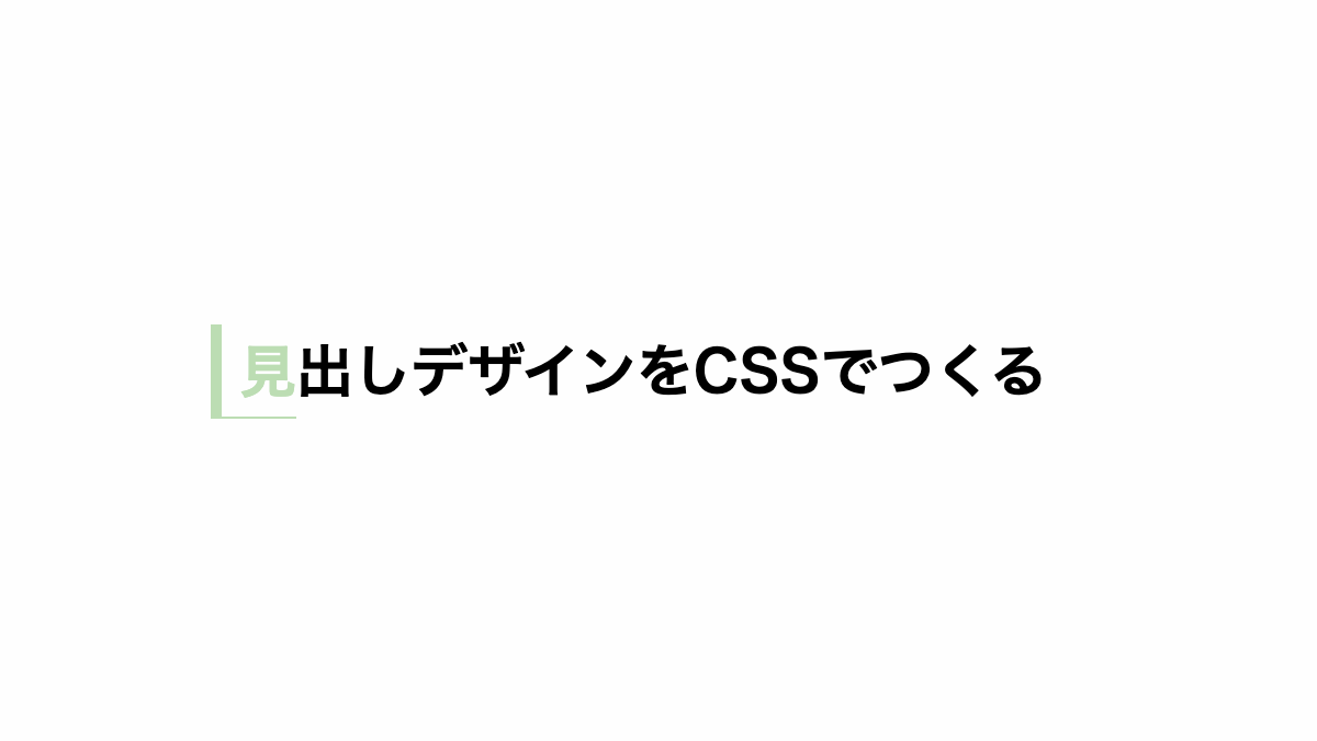
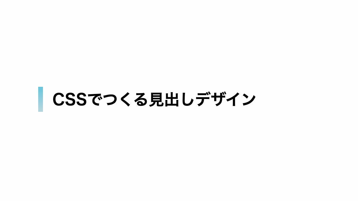
今回のテンプレでは文字の左側を装飾してみました。
見出しデザインとしては最もよく使われている装飾の一つですよね。
単純に実践を引くだけではなく、二重線やドット、パターンなどを使うことで目を引くお洒落なデザインにすることができます。
気に入った装飾があればブログなどに活用してください。
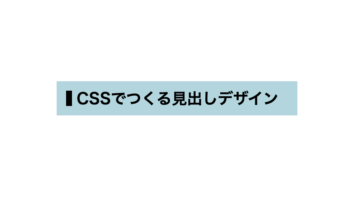
文字の左に太線を引いたシンプルな見出し
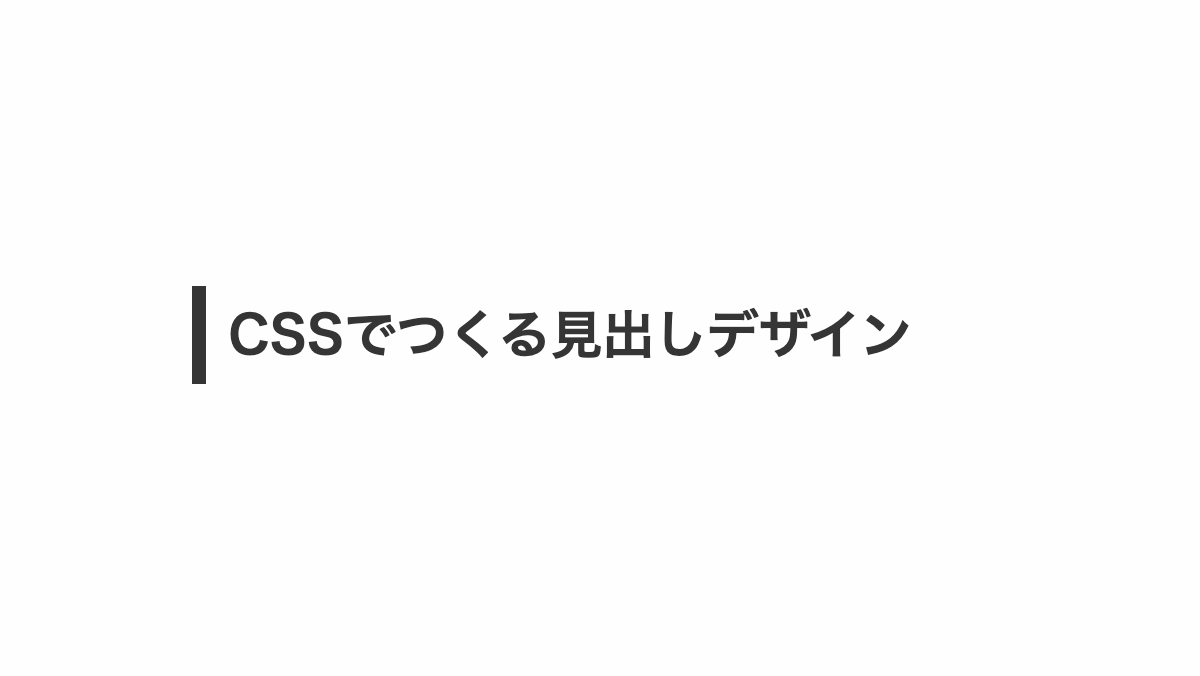
「padding」で線の長さを調整し、「border-left」で太めの実践を引いてます
CSS表示
h2 {
    margin-bottom: 0.2rem;
    padding: 0.3rem;
    border-left: 10px solid;
    color: #333;
    font-weight: bold;
    font-size: 26px;
}
HTML・CSSのカスタマイズや動作確認ができます
文字の左に二重線を引いたシンプルな見出し
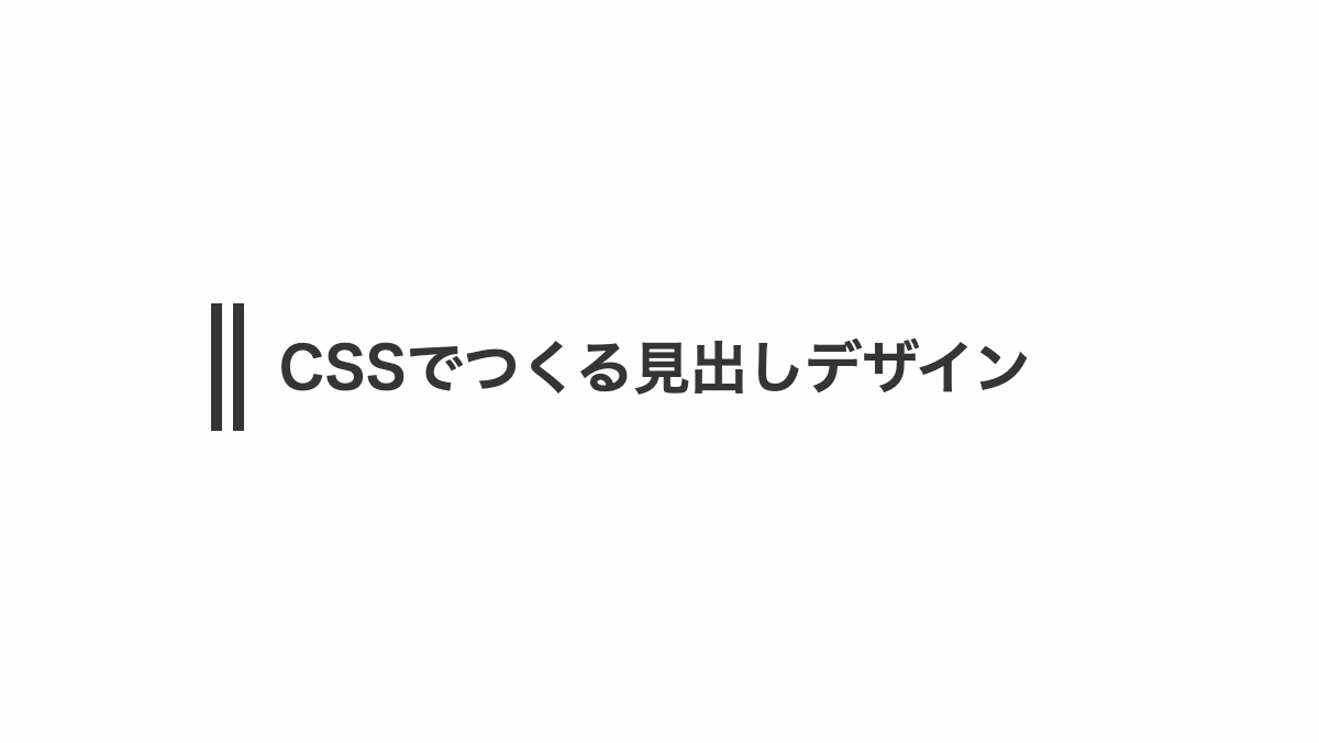
「border-left」に「double」を指定し、二重線を引いてます
CSS表示
h2 {
    position: relative;
    margin-bottom: 0.2rem;
    padding: 0.2rem 0.2rem;
    color: #69e4fa;
    border-left: 20px double;
    font-weight: bold;
    font-size: 26px;
}
HTML・CSSのカスタマイズや動作確認ができます
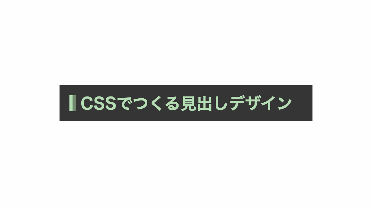
文字の左に線を引き背景を入れたシンプルな見出し
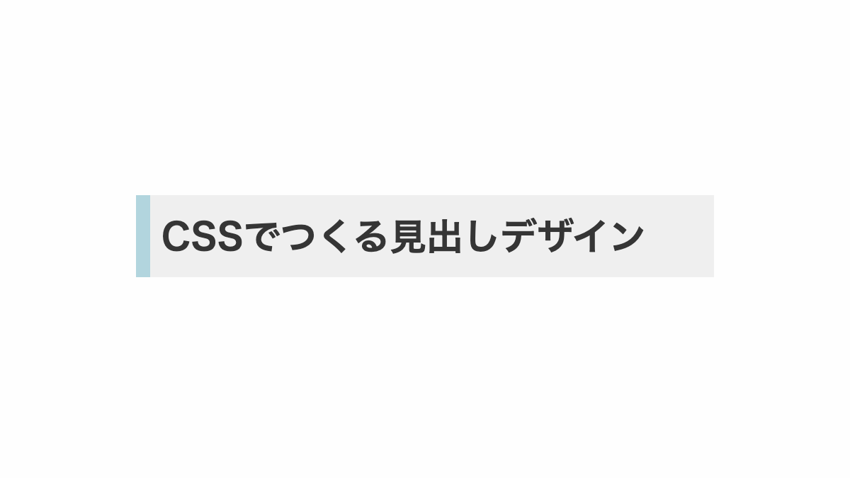
背景を白にし、「border-left」で緑線を引いたデザイン
CSS表示
h2 {
    margin-bottom: 0.2rem;
    padding: 1rem 0.2rem;
    border-left: 10px solid #51AC9A;
    background-color: #efefef;
    font-weight: bold;
    font-size: 26px;
}
HTML・CSSのカスタマイズや動作確認ができます
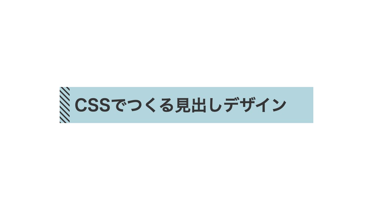
左に文字の高さに合わせた斜めストライプを入れた見出し
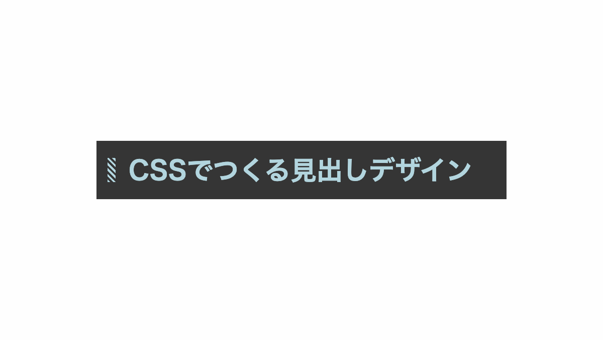
色はカスタムプロパティの「--main-color」で指定。「repeating-linear-gradient」でストライプにして「background-size」で幅と高さ、「background-position」で文字の左側に配置しています。
CSS表示
h2 {
    --main-color: #e481a0;
    padding: 1rem 1.5rem;
    margin-bottom: 0.5rem;
    background-color: white;
    background-image: repeating-linear-gradient(45deg, var(--main-color) 0, var(--main-color) 2px, transparent 2px, transparent 4px);
    background-repeat: no-repeat;
    background-size: 0.5rem 1.5rem;
    background-position: 0.7rem 50%;
    color: var(--main-color);
    font-weight: bold;
    font-size: 26px;
}
HTML・CSSのカスタマイズや動作確認ができます
左に斜めストライプを入れた見出し
「repeatiing-linear-gradient」で左側に黒いストライプをいれ、背景を入れてます。
CSS表示
h2 {
    padding: 1rem 1rem 1rem 1.5rem;
    background-color: #C6D8DA;
    background-image: repeating-linear-gradient(45deg, #353535 0 2px, transparent 2px 6px);
    background-repeat: no-repeat;
    background-size: 1rem 100%;
    background-position: left;
    color:#353535;
    font-weight: bold;
    font-size: 26px;
}
HTML・CSSのカスタマイズや動作確認ができます
左に斜めストライプを入れた見出し
「repeatiing-linear-gradient」で左側を緑色のストライプいれ、背景なしのシンプルなデザイン
CSS表示
h2 {
    --main-color: #4faeba;
    padding: 5px 5px 5px 15px;
    background-image: repeating-linear-gradient(45deg, var(--main-color) 0, var(--main-color) 2px, transparent 2px, transparent 4px);
    background-repeat: no-repeat;
    background-size: 10px 100%;
    background-position: left;
    color: var(--main-color);
    font-weight: bold;
    font-size: 26px;
}
HTML・CSSのカスタマイズや動作確認ができます
文字の左に小さな斜めストライプを入れた見出し
左側に正方形のストライプを配置。「repeating-linear-gradient」でストライプを作り「background-size」で正方形に。「background-position」で左寄せ中央揃えにしています。
CSS表示
h2 {
    padding-left:20px;
    font-weight: bold;
    font-size: 26px;
    color: white;
    background-image: repeating-linear-gradient(45deg, #48f23c 0, #48f23c 2px, transparent 2px, transparent 4px);
    background-repeat: no-repeat;
    background-size: 15px 15px;
    background-position:left center;
}
HTML・CSSのカスタマイズや動作確認ができます
2つのラインを文字の左に入れたシンプルな見出し
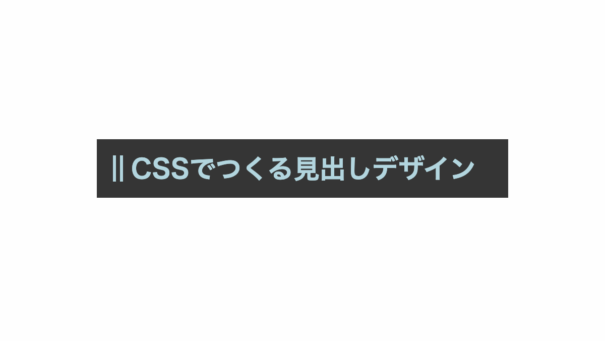
before疑似要素で「border-left」に「double」を指定し、二重線にしています。
CSS表示
h2 {
    margin-bottom: 0.2rem;
    padding: 1rem;
    background-color: #fafafa;
    color: #50b2c5;
    font-weight: bold;
    font-size: 26px;
}

h2:before {
    content: '';
    border-left: 10px double #50b2c5;
    margin-right: 0.5rem;
}
HTML・CSSのカスタマイズや動作確認ができます
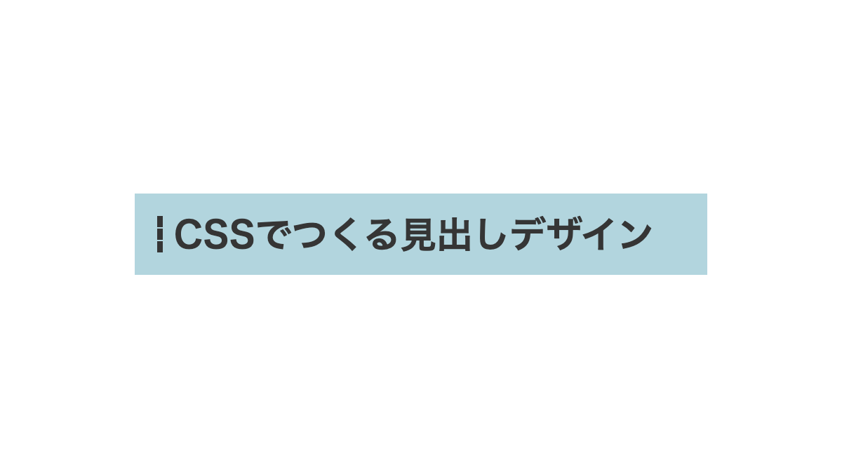
ラインを文字の左に入れたシンプルな見出し
before疑似要素で「border-left」に「solid」を指定し、実線にしています。
CSS表示
h2 {
    margin-bottom: 0.2rem;
    padding: 1rem;
    background-color: #e2dee2;
    font-weight: bold;
    font-size: 26px;
}

h2:before {
    margin-right: 0.5rem;
    border-left: 10px solid;
    content: '';
}
HTML・CSSのカスタマイズや動作確認ができます
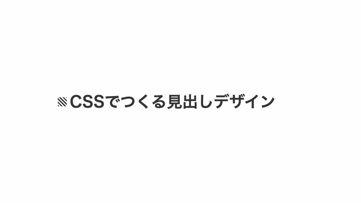
ドット線を文字の左に入れたシンプルな見出し
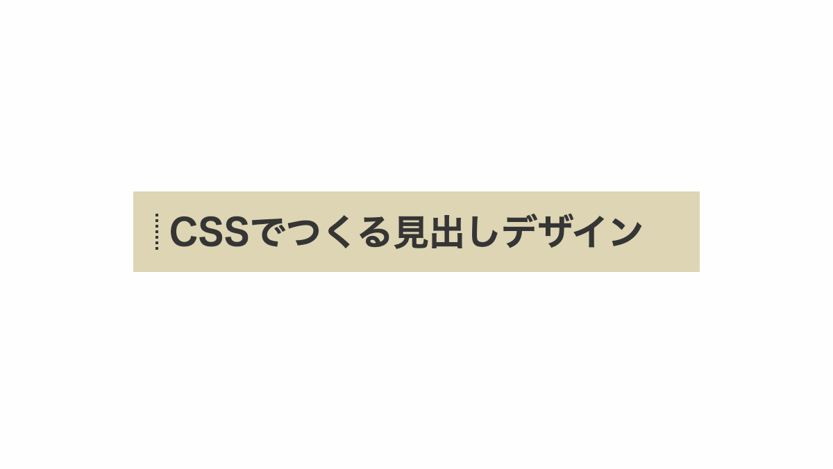
before疑似要素で「border-left」に「dotted」を指定し、点線にしています。
CSS表示
h2 {
    margin-bottom: 0.2rem;
    padding: 1rem;
    background-color: #93867f;
    color: white;
    font-weight: bold;
    font-size: 26px;
}

h2:before {
    content: '';
    border-left: 2px dotted;
    margin-right: 0.5rem;
}
HTML・CSSのカスタマイズや動作確認ができます
文字の左に2色のラインを入れたシンプルな見出し
before疑似要素で「border-left」に「ridge」を指定し、色分けした二重線にしています。
CSS表示
h2 {
    margin-bottom: 0.2rem;
    padding: 1rem;
    background-color: white;
    color: #94c93d;
    font-weight: bold;
    font-size: 26px;
}

h2:before {
    content: '';
    border-left: 10px ridge #94c93d;
    margin-right: 0.5rem;
}
HTML・CSSのカスタマイズや動作確認ができます
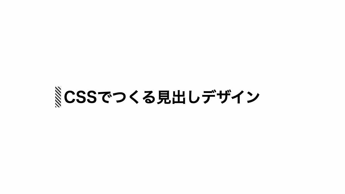
文字の左に三本の破線を入れたシンプルな見出し
before疑似要素で「border-left」に「dashed」を指定し、破線にしています。
CSS表示
h2 {
    margin-bottom: 0.2rem;
    padding: 1rem;
    background-color: white;
    color: #e579e1;
    font-weight: bold;
    font-size: 26px;
}

h2:before {
    content: '';
    border-left: 4px dashed;
    margin-right: 0.5rem;
}
HTML・CSSのカスタマイズや動作確認ができます
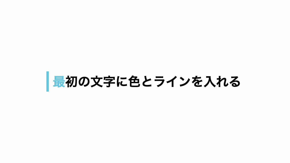
最初の文字カラーを変え左と下にラインを入れた見出し
first-letter疑似要素で最初の文字色を緑にして、「borde-left」「borde-bottom」で線を引いています
CSS表示
h2 {
    font-size: 26px;
    font-weight: bold;
}

h2::first-letter {
    padding: 0.5rem 0 0.5rem 0.5rem;
    color: #58e861;
    border-left: 5px solid;
    border-bottom: 1px solid;
}
HTML・CSSのカスタマイズや動作確認ができます
最初の文字カラーを変え左にラインを入れた見出し
first-letter疑似要素で最初の文字色を赤にして、「borde-left」で線を引いています
CSS表示
h2 {
    font-size: 26px;
    font-weight: bold;
}

h2::first-letter {
    padding: 0.5rem 0 0.5rem 0.5rem;
    color: #e94361;
    border-left: 5px solid;
}
HTML・CSSのカスタマイズや動作確認ができます
左のラインを2色に分ける見出し
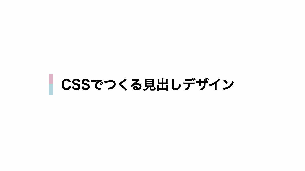
linear-gradientで2色に色分けしています
CSS表示
h2 {
    padding: 0.5rem 1rem 0.5rem 1.5rem;
    margin-bottom: 0.2rem;
    background-image:
        linear-gradient(#24809A 50%, #f7bc33 50%);
    background-repeat: no-repeat;
    background-size: 0.5rem 100%;
    font-weight: bold;
    font-size: 26px;
}
HTML・CSSのカスタマイズや動作確認ができます
左側にドット柄をいれた見出し
「linear-gradient」で透過→灰色のグラデーションで背景にして、「radial-gradient」で左側にドット柄を表示しています
CSS表示
h2 {
    padding: 1rem 1rem 1rem 2rem;
    margin-bottom: 0.2rem;
    background-image:
        linear-gradient(90deg, transparent 1rem, #333 1rem),
        radial-gradient(#89dd7c 40%, #333 40%);
    background-repeat: no-repeat, repeat;
    background-size: 100%, 5px 5px;
    color: white;
    font-weight: bold;
    font-size: 26px;
}
HTML・CSSのカスタマイズや動作確認ができます
左のラインをグラデーションにした見出し
linear-gradientで左のラインをグラデーションにしています
CSS表示
h2 {
    padding: 0.5rem 1rem 0.5rem 1.5rem;
    margin-bottom: 0.2rem;
    background-image: linear-gradient(to top, #a9f959 10%, #58CFFB 100%);
    background-repeat: no-repeat;
    background-size: 0.5rem 100%;
    font-weight: bold;
    font-size: 26px;
}
HTML・CSSのカスタマイズや動作確認ができます
文字の左に英字を配置し線を引いた見出し
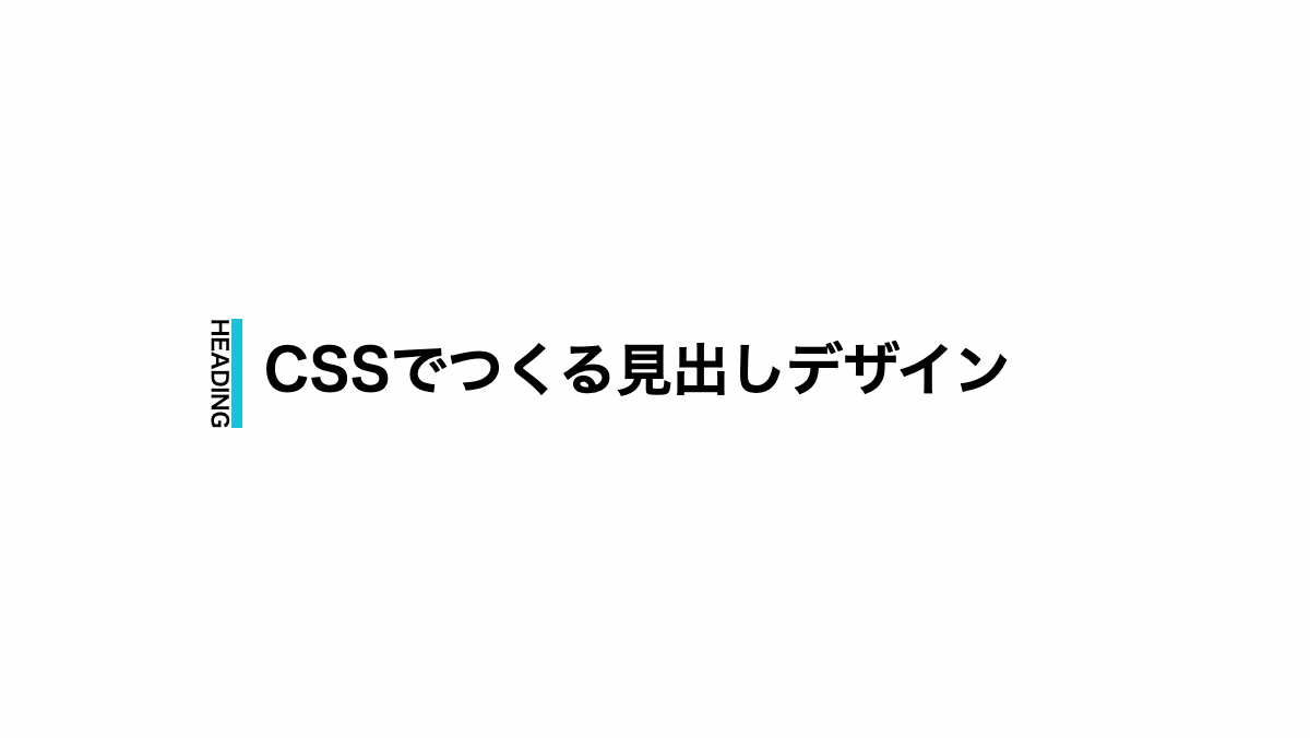
contentに 'heading'を設定。位置を調整し文字の左に配置。「border-right」で線を引いています。
CSS表示
h2 {
    position: relative;
    padding-left: 25px;
    font-weight: bold;
    font-size: 30px;
}

h2::before {
    position: absolute;
    top: -10px;
    left: 0;
    border-right: 5px solid #1ac2d8;
    color: black;
    font-size: 10px;
    writing-mode: vertical-rl;
    -ms-writing-mode: tb-rl;
    text-transform: uppercase;
    content: 'heading';
}
HTML・CSSのカスタマイズや動作確認ができます
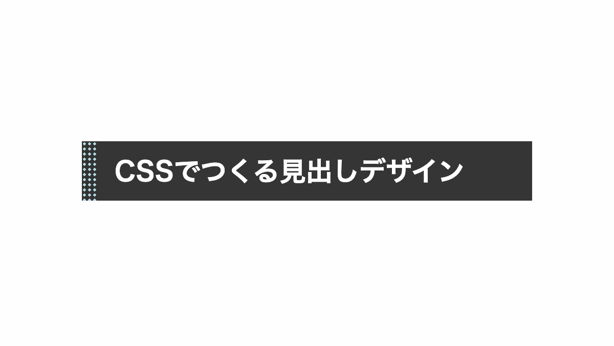
立体的にし左に太いラインを入れた見出し
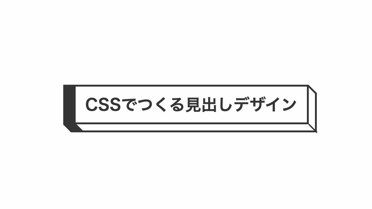
「border-width」プロパティで左の境界線を太くしています。
コードを表示
<h2>CSSでつくる見出しデザイン</h2>
h2 {
    position: relative;
    padding: 1rem;
    border: solid #353535;
    border-width: 3px 3px 3px 20px;
    color: #353535;
    font-size: 26px;
    font-weight: bold;
}

h2::before,
h2::after {
    position: absolute;
    border: solid #353535;
    content: '';
}

h2::before {
    top: -10px;
    right: -16px;
    width: 10px;
    height: 100%;
    border-width: 2px 3px 4px 0px;
    transform: skewY(-45deg);
}

h2::after {
    top: -16px;
    left: -14px;
    right: -10px;
    height: 10px;
    border-width: 3px 2px 0px 22px;
    transform: skewX(-45deg);
}HTML・CSSのカスタマイズや動作確認ができます
以上がCSSで文字の左を装飾した見出しデザインとなります。
また新たな装飾を作成したら追加していきます。


