
CSSで下線を引いた見出しを34個、実装しました。
実線を引いただけのデザインから、ストライプや線の一部だけ色を変えたもの、グラデーションをかけたものなど様々なパターンで装飾しています。
気に入った見出しがあればコピペしてブログやホームページなどでご活用ください。
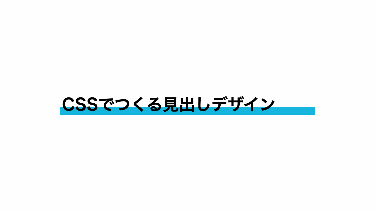
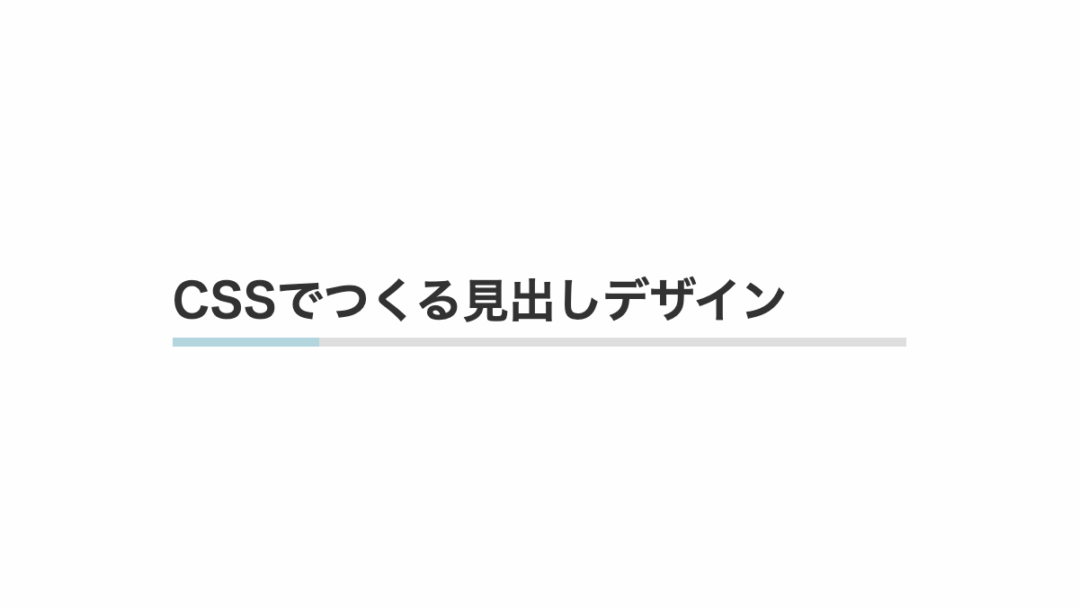
実線を引いた見出し
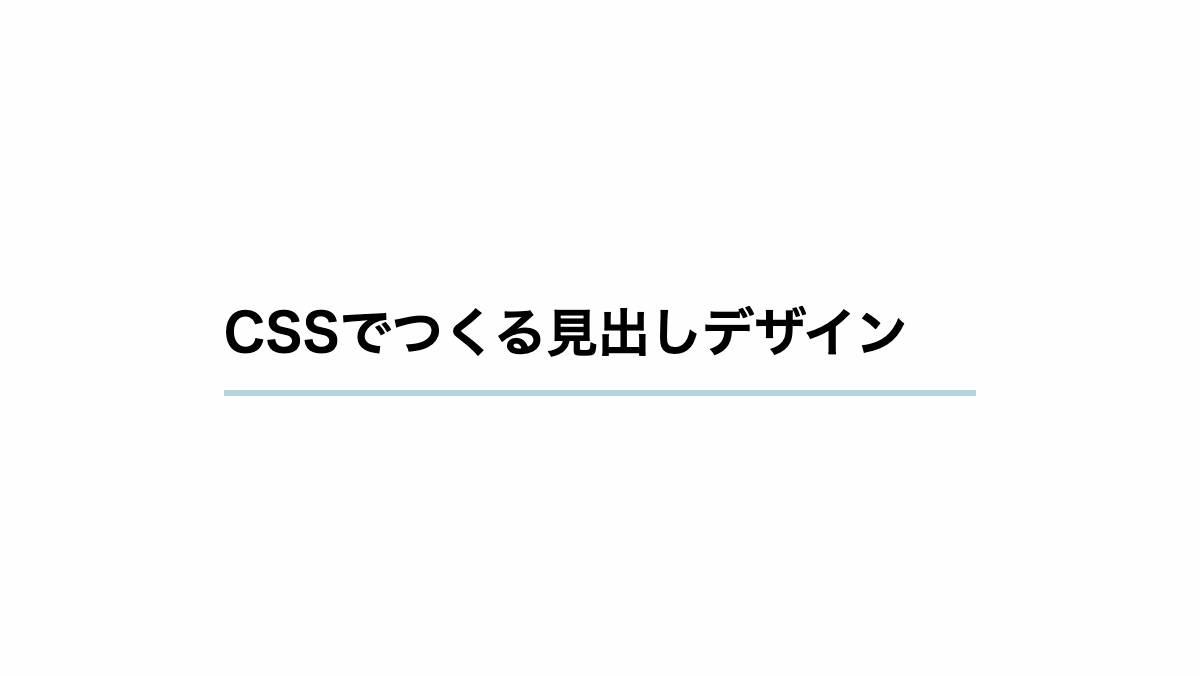
「border-bottom」に「solid」を指定し、線を少し太くしたシンプルな下線です
CSS表示
h2 {
    padding: 1rem 0rem;
    margin-bottom: 0.2rem;
    border-bottom: 3px solid #b2d5de;
    font-weight: bold;
    font-size: 26px;
}HTML・CSSのカスタマイズや動作確認ができます
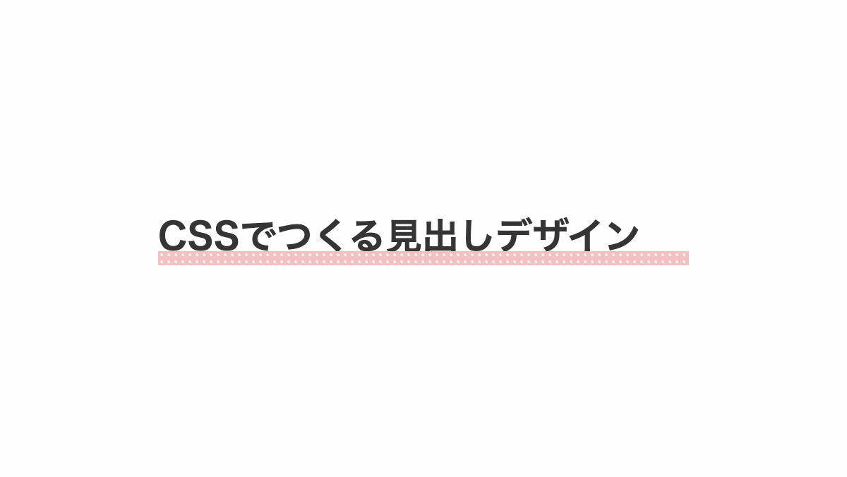
ドット線を引いた見出し

「border-bottom」に「dotted」を指定した、可愛らしい下線。色もピンクにして女性向けの記事に最適です
CSS表示
h2 {
    padding: 0.5rem 0;
    margin-bottom: 0.2rem;
    border-bottom: 3px dotted #b2d5de;
    font-weight: bold;
    font-size: 26px;
}HTML・CSSのカスタマイズや動作確認ができます
破線にした見出し
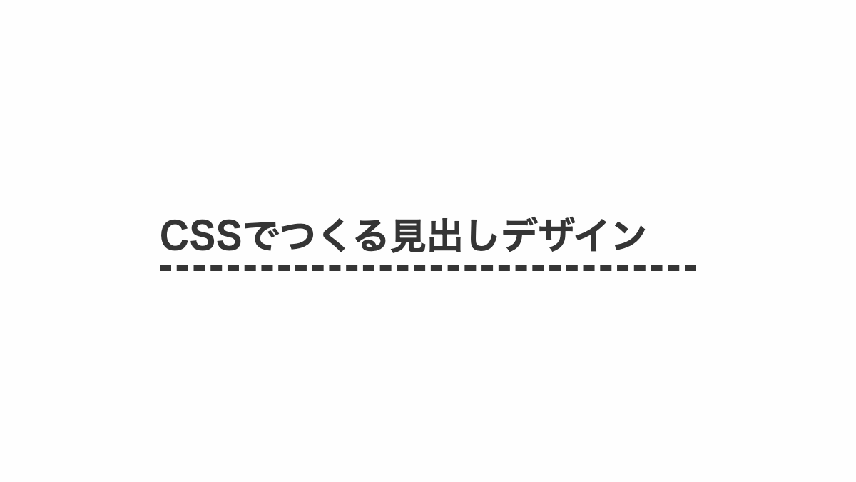
「border-bottom: 4px dashed;」で破線にしてます
コードを表示
h2 {
    position: relative;
    margin-bottom: 0.2rem;
    padding: 0.5rem 0rem;
    color: #353535;
    border-bottom: 4px dashed;
    font-weight: bold;
    font-size: 26px;
}HTML・CSSのカスタマイズや動作確認ができます
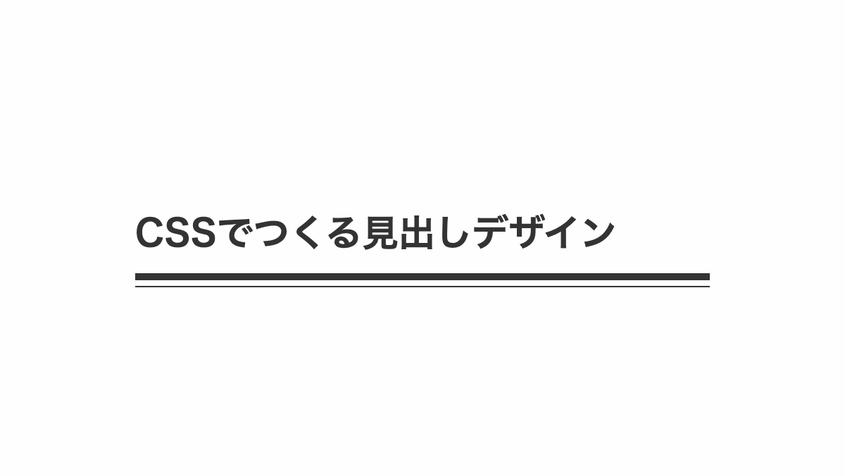
二重の下線を引いた見出し
border-bottomにdoubleを指定し二重線にしています。
CSS表示
h2 {
    padding: 0.5rem 0;
    margin-bottom: 0.2rem;
    border-bottom: 6px double #b2d5de;
    color: #35353;
    font-weight: bold;
    font-size: 26px;
}
HTML・CSSのカスタマイズや動作確認ができます
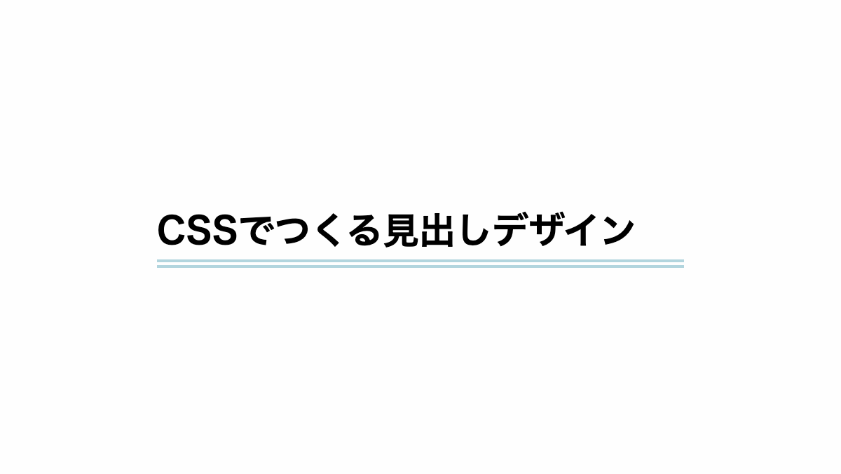
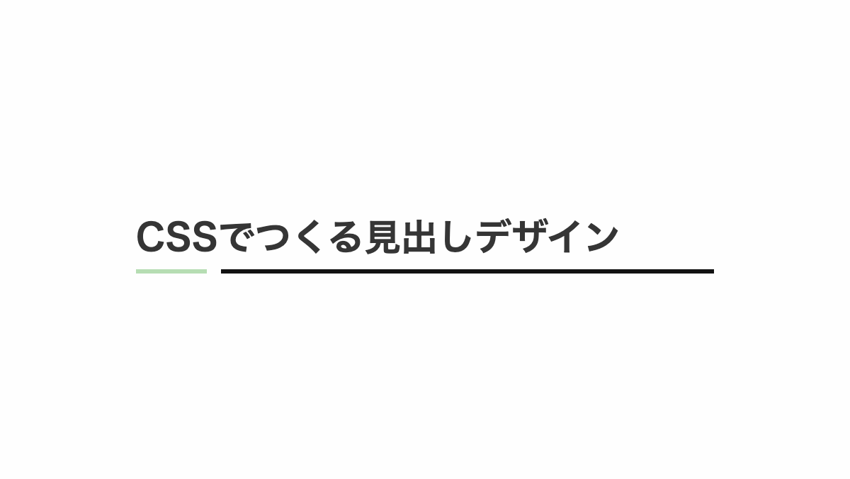
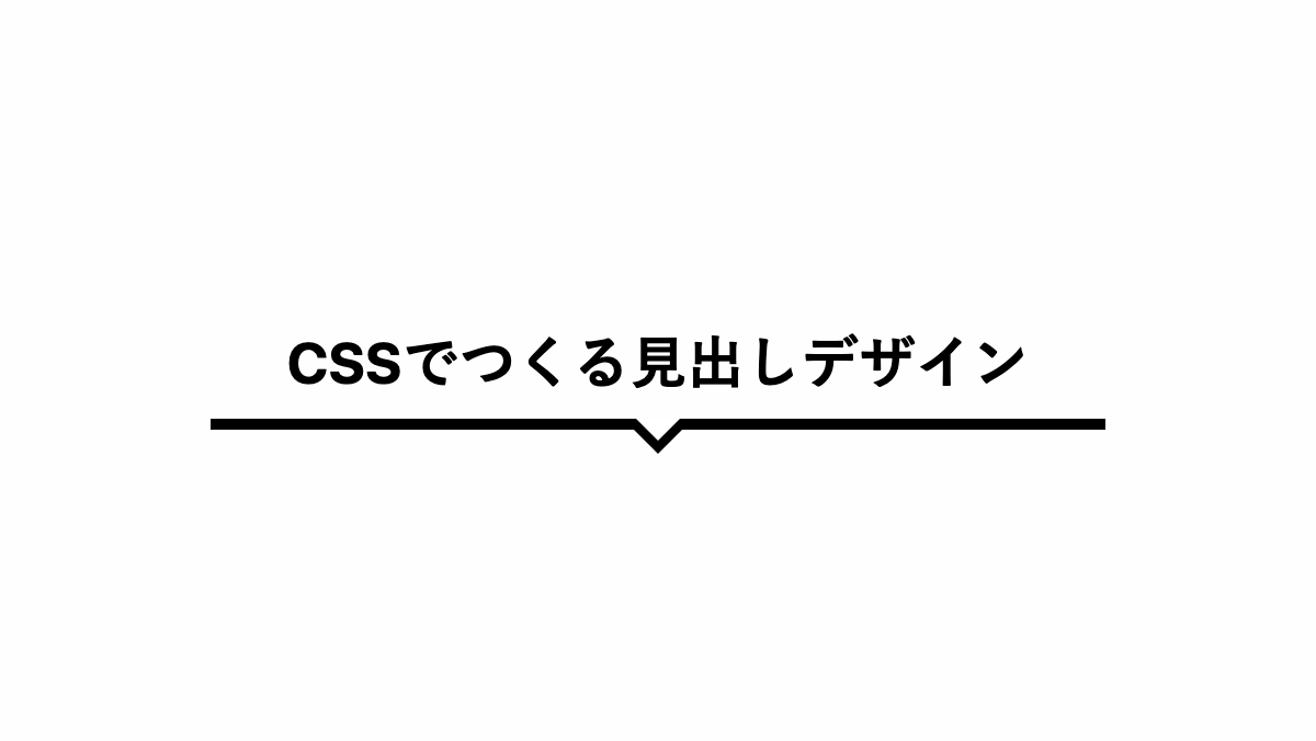
太さの違う下線を2本引いたシンプルな見出し
太線は「h2セレクタ」、細い線は「before」疑似要素のborder-bottomで引いてます。 色は「color」プロパティで調整可能。
CSS表示
h2 {
    position: relative;
    margin-bottom: 0.2rem;
    padding: 1rem 0;
    border-bottom: 5px solid;
    color: #333;
    font-size: 26px;
    font-weight: bold;
}

h2:before {
    position: absolute;
    bottom: -0.6rem;
    left: 0rem;
    right: 0rem;
    border-bottom: 1px solid;
    content: '';
}HTML・CSSのカスタマイズや動作確認ができます
蛍光ペンのような下線を引いた見出し
強調表示などで使える蛍光ペンを加えたような下線。linear-gradientを使用し、上から60%まで透過させ、60%以降に色を加えることで文字の下側にかかる線となります。
CSS表示
h2 {
    padding: 0.2rem;
    margin-bottom: 0.2rem;
    background: linear-gradient(transparent 60%, #16b5dd 60%);
    font-weight: bold;
    font-size: 26px;
}
HTML・CSSのカスタマイズや動作確認ができます
蛍光ペンのような下線を文字だけに引いた見出し
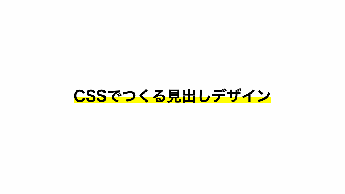
「h2」セレクタで中央寄せにして「span」セレクタでグラデーションをかけてます
コードを表示
<h2><span>CSSでつくる見出しデザイン</span></h2>
h2 {
    padding: 0.2rem;
    margin-bottom: 0.2rem;
    font-weight: bold;
    font-size: 26px;
    text-align: center;
}

h2 span {
    background: linear-gradient(transparent 60%, #FFFE03 60%);
}HTML・CSSのカスタマイズや動作確認ができます
蛍光ペンような下線を少しゆがませて引いた見出し
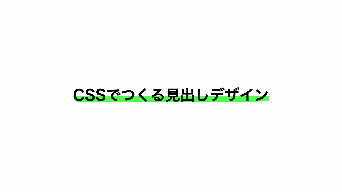
「span」セレクタで「border-radius」を指定し歪んだ線にしています
コードを表示
<h2><span>CSSでつくる見出しデザイン</span></h2>
h2 {
    padding: 0.2rem;
    margin-bottom: 0.2rem;
    font-weight: bold;
    font-size: 26px;
    text-align: center;
}

h2 span {
    background: linear-gradient(transparent 60%, #52FD4D 60%);
    border-radius: 80% 50% 60% 5%/80% 75% 15% 75%;
}HTML・CSSのカスタマイズや動作確認ができます
蛍光ペンで波線を入れたような見出し
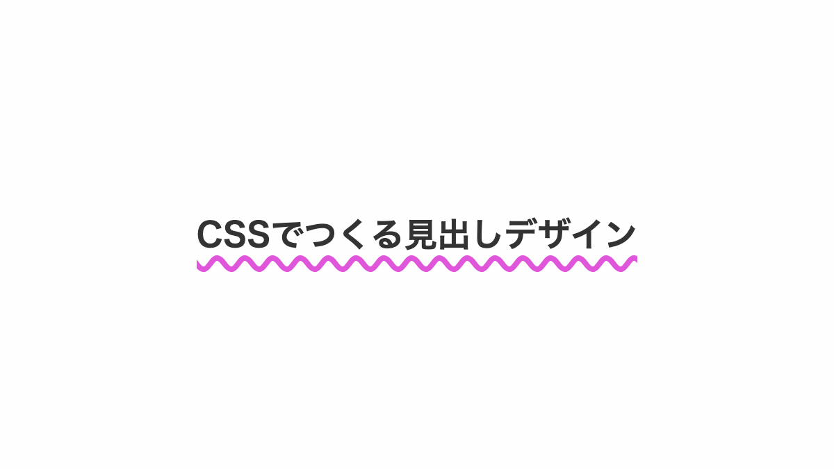
「text-decoration」で下部に波線を入れ、「text-underline-offset」で下線の位置を調整しています。
コードを表示
<h2>CSSでつくる見出しデザイン</h2>
h2 {
    color: #333;
    text-decoration: 4px underline wavy #E056DB;
    text-underline-offset: 5px;
    text-align: center;
    font-weight: bold;
    font-size: 24px;
}HTML・CSSのカスタマイズや動作確認ができます
下線を2色に色分けした見出し
「linear-gradient」で2色に色分けし、「background-size」で幅を100%、高さを10%に指定。「background-position」で下部に表示しています。
コードを表示
<h2>CSSでつくる見出しデザイン</h2>
h2 {
    padding: 0.8rem 0;
    margin-bottom: 0.2rem;
    background-image: linear-gradient(90deg, #b2d5de 0 20%, #dedede 20%);
    background-repeat: no-repeat;
    background-size: 100% 10%;
    background-position: bottom;
    color: #323232;
    font-weight: bold;
    font-size: 26px;
}HTML・CSSのカスタマイズや動作確認ができます
下線を2色に色分けして隙間をあけた見出し
「linear-gradient」で途中から「transparent」を指定し隙間をあけてます
コードを表示
h2 {
    padding: 0.8rem 0;
    margin-bottom: 0.2rem;
    background-image: linear-gradient(90deg, #b6ddb3 0 50px, transparent 50px 60px, #121212 0 60px);
    background-repeat: no-repeat;
    background-size: 100% 3px;
    background-position: bottom;
    color: #353535;
    font-weight: bold;
    font-size: 26px;
}HTML・CSSのカスタマイズや動作確認ができます
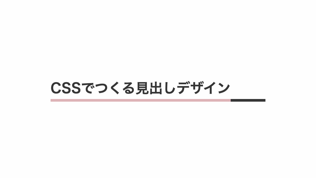
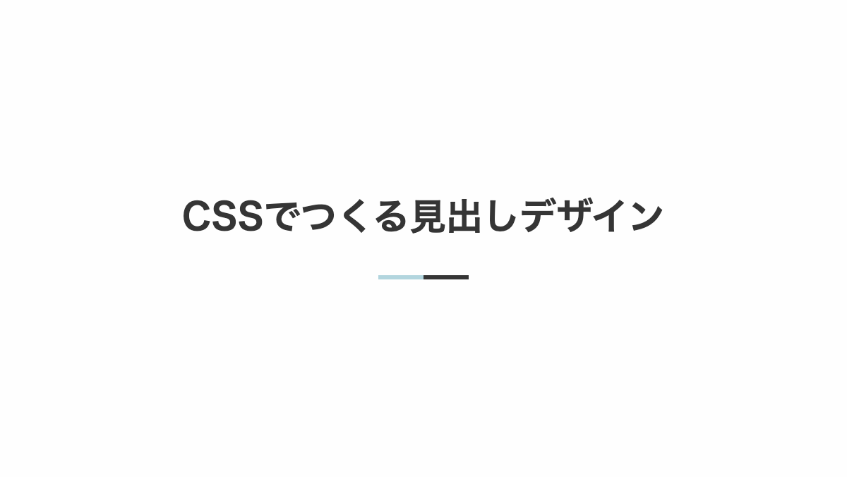
下線を2色に色分けし線の太さを変えた見出し
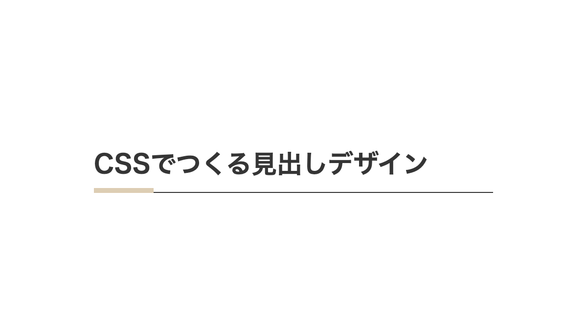
「border-bottom」で細い線を引き、before疑似要素で幅を15%にしたオレンジの線を引いてます。
コードを表示
<h2>CSSでつくる見出しデザイン</h2>
h2 {
    position: relative;
    margin-bottom: 0.2rem;
    padding: 1rem 0;
    border-bottom: 1px solid #353535;
    color: #353535;
    font-size: 26px;
    font-weight: bold;
}

h2:before {
    position: absolute;
    content: '';
    width: 15%;
    left: 0;
    bottom: -1px;
    border-bottom: 5px solid #ddcdb3;
}
HTML・CSSのカスタマイズや動作確認ができます
文字幅に合わせ下線を2色に色分けした見出し
「overflow:hidden;」を指定し、「before」「after」疑似要素で幅を100%にした「border-bottom」を指定し色分けしています。
コードを表示
<h2>CSSでつくる見出しデザイン</h2>
h2 {
    position: relative;
    padding: 0.8rem 0;
    margin-bottom: 0.2rem;
    overflow: hidden;
    color: #353535;
    font-weight: bold;
    font-size: 26px;
}

h2:before,
h2:after {
    position: absolute;
    width: 100%;
    bottom: 0;
    content: '';
}

h2:before {
    border-bottom: 5px solid #ddb3b8;
}

h2:after {
    border-bottom: 5px solid #353535;
}
HTML・CSSのカスタマイズや動作確認ができます
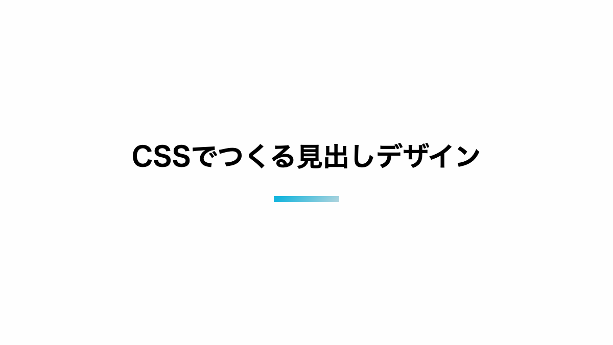
グラデーションの下線を引いた見出し
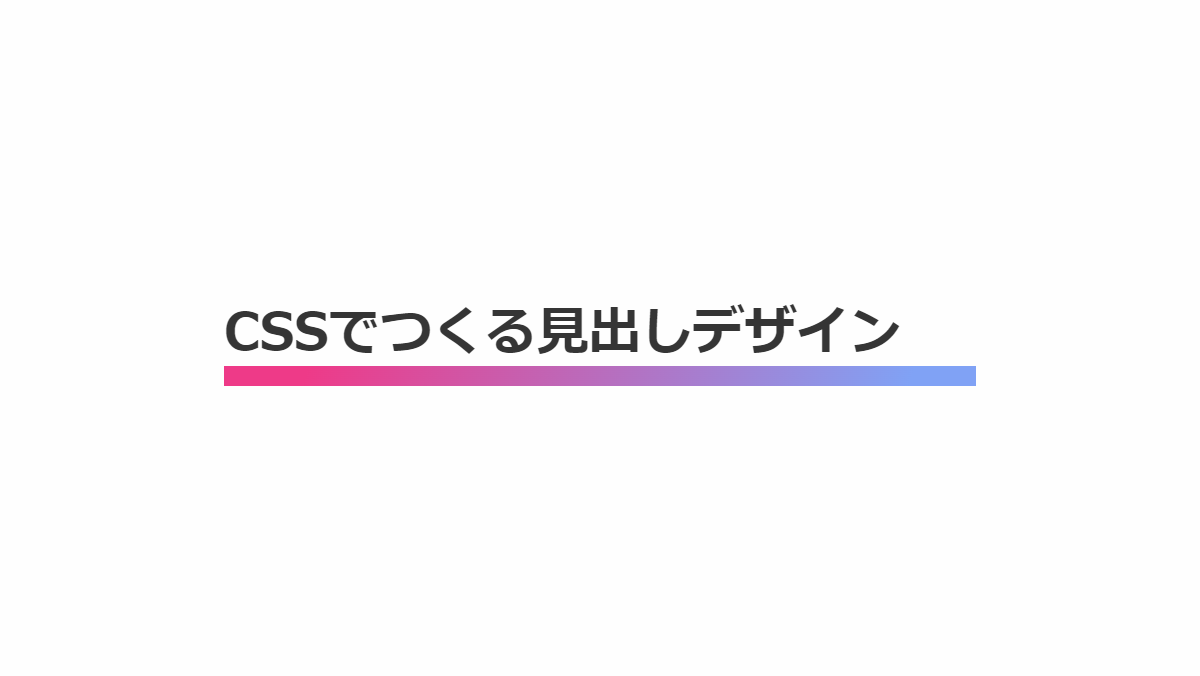
下線を鮮やかなグラデーションにした見出しです。「linear-gradient」グラデーションを作り、「background-size」で高さを10pxに。「background-position」で下部に配置し下線にしています。
CSS表示
h2 {
    position: relative;
    padding: 0.8rem 0;
    margin-bottom: 0.2rem;
    color: #333;
    background: linear-gradient(90deg, #16b5dd 0%, #d815d8 100%);
    background-repeat: no-repeat;
    background-size: 100% 10px;
    background-position: bottom;
    font-weight: bold;
    font-size: 26px;
}HTML・CSSのカスタマイズや動作確認ができます
下線を文字に重ねてグラデーションにした見出し
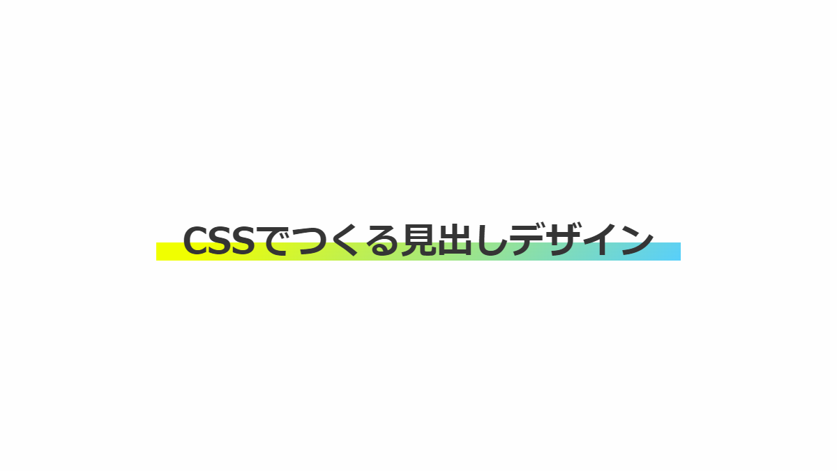
下線は「background-image」で調整可能です。
コードを表示
<h2>CSSでつくる見出しデザイン</h2>
h2 {
    padding: 0.8rem 0 0;
    margin-bottom: 0.2rem;
    background-image: linear-gradient(135deg, #F0FF00 10%, #58CFFB 100%);
    background-repeat: no-repeat;
    background-size: 100% 13px;
    background-position: bottom;
    color: #353535;
    text-align: center;
    font-weight: bold;
    font-size: 26px;
}HTML・CSSのカスタマイズや動作確認ができます
文字を二色にして下線を引いた見出し
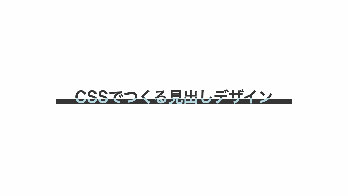
線の高さにあわせて色分けした見出しです。テキストはlinear-gradientで180degで上から下方向にグラデーションをかけ、上部を黒、下部をピンクに色分け。下線はbefore疑似要素で引いてます
CSS表示
h2 {
    position: relative;
    margin-bottom: 0.2rem;
    background: linear-gradient(180deg, #353535 0 60%, #b2d5de 60%);
    -webkit-background-clip: text;
    color: transparent;
    font-weight: bold;
    font-size: 26px;
    text-align: center;
}

h2::before {
    position: absolute;
    left: 0;
    bottom: 0px;
    width: 100%;
    height: 40%;
    background-color: #353535;
    z-index: -1;
    content: '';
}
HTML・CSSのカスタマイズや動作確認ができます
下線をグリッドパターンにした見出し
before疑似要素で「repeating-linear-gradient」を2つ指定しグリッドパターンにしてます。
コードを表示
<h2>CSSでつくる見出しデザイン</h2>
h2 {
    position: relative;
    padding: 0.5rem 0;
    margin-bottom: 0.2rem;
    font-size: 26px;
    font-weight: bold;
    color: #353535;
}


h2:before {
    position: absolute;
    bottom: 0px;
    left: 0;
    width: 100%;
    height: 10px;
    background: repeating-linear-gradient(#c9efcb 0 2px, transparent 2px 4px),
        repeating-linear-gradient(90deg, #c9efcb 0 2px, transparent 2px 4px);
    content: '';
}
HTML・CSSのカスタマイズや動作確認ができます
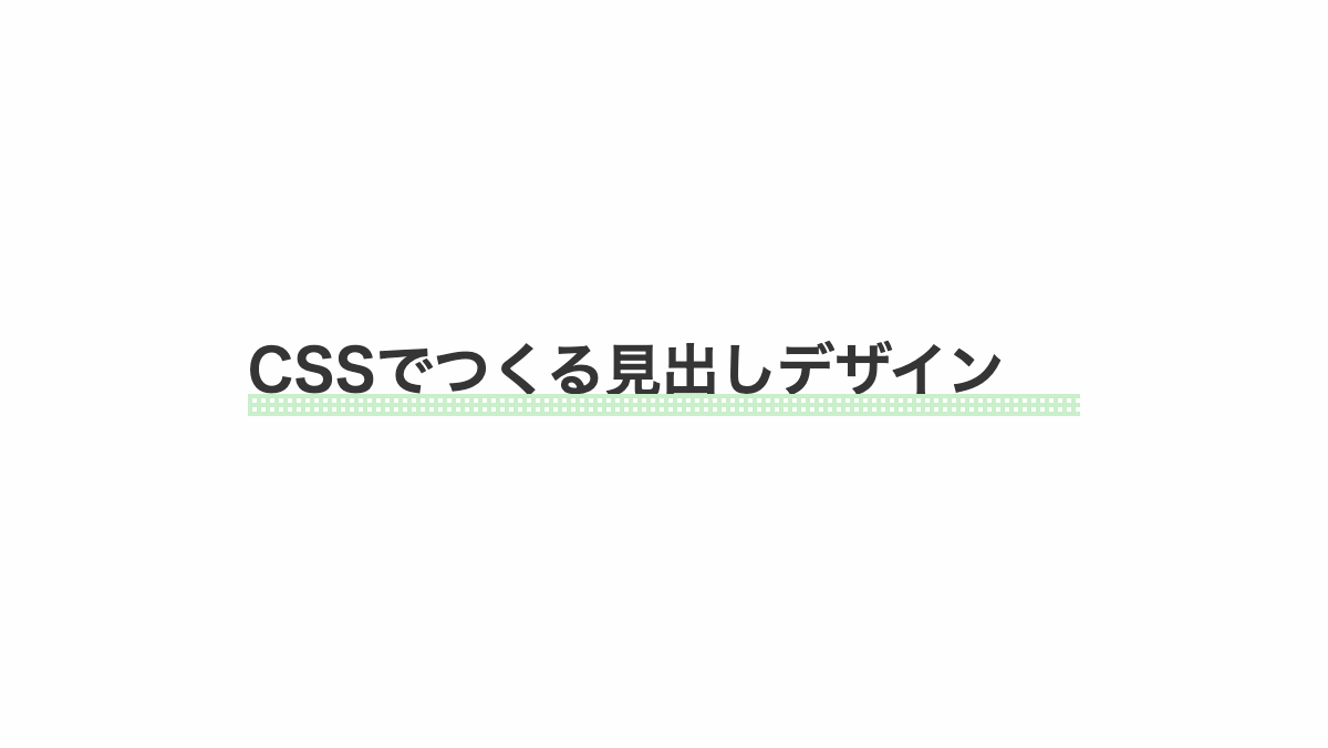
下線をドットパターンにした見出し
before疑似要素で「radial-gradient」「linear-gradien」を指定しドットパターンにしてます。
コードを表示
<h2>CSSでつくる見出しデザイン</h2>
h2 {
    position: relative;
    padding: 0.5rem 0;
    margin-bottom: 0.2rem;
    font-size: 26px;
    font-weight: bold;
    color: #353535;
}


h2:before {
    position: absolute;
    bottom: 0px;
    left: 0;
    width: 100%;
    height: 10px;
    background:
        radial-gradient(#f2eded 30%, transparent 30%),
        linear-gradient(#F3C1C2 0 100%);
    background-repeat: repeat, no-repeat;
    background-size: 5px 5px, 100% 100%;
    content: '';
}HTML・CSSのカスタマイズや動作確認ができます
下線をジグザグパターンにした見出し
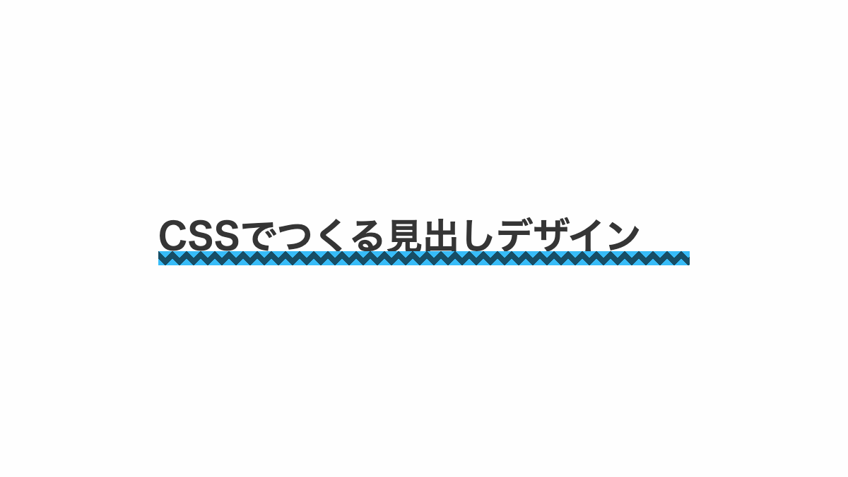
before疑似要素で「linear-gradien」を4つ指定しジグザクパターンにしてます。
コードを表示
<h2>CSSでつくる見出しデザイン</h2>
h2 {
    position: relative;
    padding: 0.5rem 0;
    margin-bottom: 0.2rem;
    font-size: 26px;
    font-weight: bold;
    color: #353535;
}


h2:before {
    position: absolute;
    bottom: 0px;
    left: 0;
    width: 100%;
    height: 10px;
    background-image:
        linear-gradient(135deg, #37bcf8 25%, transparent 25%),
        linear-gradient(225deg, #37bcf8 25%, transparent 25%),
        linear-gradient(45deg, #37bcf8 25%, transparent 25%),
        linear-gradient(315deg, #37bcf8 25%, #174e66 25%);
    background-position: 5px 0, 5px 0, 0 0, 0 0;
    background-size: 10px 10px;
    background-repeat: repeat;
    content: '';
}
HTML・CSSのカスタマイズや動作確認ができます
下線を市松模様にした見出し
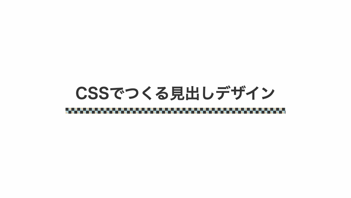
linear-gradientを使用して下線を市松模様にしました。注目を集めたい見出しに最適です。
CSS表示
h2 {
    position: relative;
    padding: 0.5rem 0 1.5rem;
    margin-bottom: 0.2rem;
    font-size: 26px;
    font-weight: bold;
    color: #353535;
    text-align: center;
}


h2:before {
    position: absolute;
    content: '';
    bottom: 2px;
    left: 0;
    width: 100%;
    height: 10px;
    background: linear-gradient(45deg, #ddd0b3 25%, transparent 25%, transparent 75%, #ddd0b3 75%),
        linear-gradient(45deg, #b2d5de 25%, transparent 25%, transparent 75%, #b2d5de 75%);
    background-position: 0 0, 5px 5px;
    /* 四角のサイズ */
    background-size: 10px 10px;
    /* 白の四角 */
    background-color: #353535;
}
HTML・CSSのカスタマイズや動作確認ができます
カラフルに色分けした下線を入れたポップな見出し
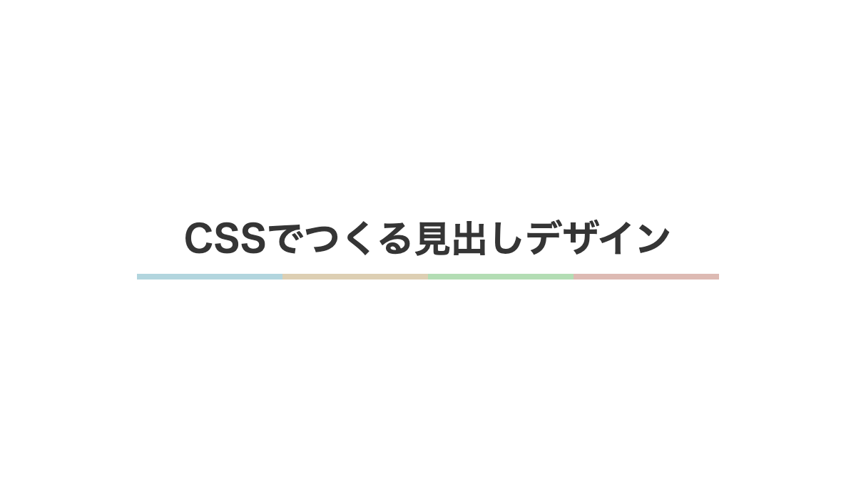
下線をカラフルにしポップなデザイン。linear-gradientで色分けしています。
CSS表示
h2 {
    padding: 1rem 0;
    margin-bottom: 0.2rem;
    background-image: linear-gradient(90deg, #b2d5de 0 25%, #ddcfb3 25% 50%, #b3ddb4 50% 75%, #ddbab3 75%);
    background-repeat: no-repeat;
    background-size: 100% 0.3rem;
    background-position: bottom;
    color: #353535;
    font-weight: bold;
    font-size: 26px;
    text-align: center;
}
HTML・CSSのカスタマイズや動作確認ができます
下線を斜めストライプにした見出し
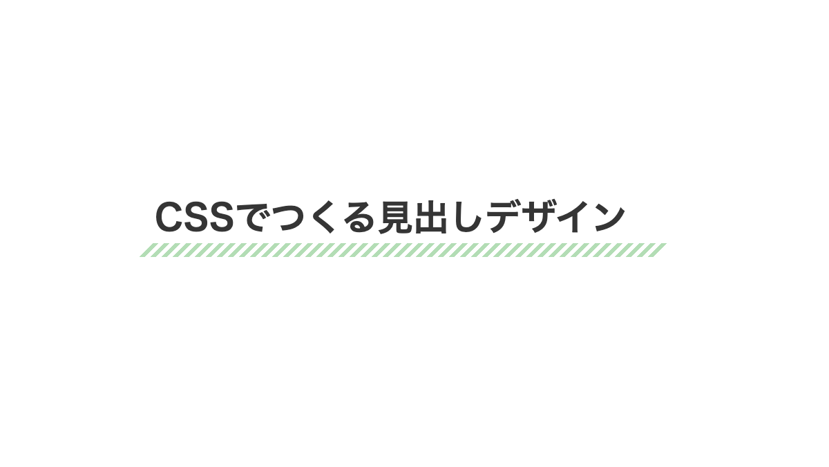
repeating-linear-gradientを使用し、斜めのストライプを作成しました。角度を45度に指定し、白色と透過を2px毎に繰り返しています。
CSS表示
h2 {
    position: relative;
    margin-bottom: 0.5rem;
    padding-bottom: 1rem;
    font-weight: bold;
    font-size: 26px;
    color: #353535;
}

h2::before {
    position: absolute;
    left: -10px;
    bottom: 0px;
    width: 100%;
    height: 10px;
    transform: skew(-45deg);
    background-image: repeating-linear-gradient(90deg, transparent 0 4px, #b3ddb5 4px 8px);
    content: '';
    z-index: -1;
}HTML・CSSのカスタマイズや動作確認ができます
ストライプと下線を入れたCSS見出しデザイン
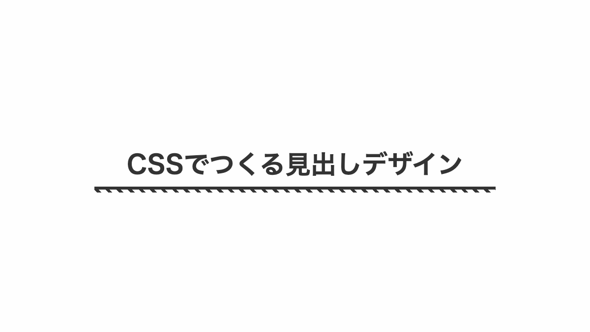
before疑似要素の「repeating-linear-gradient」で短いストライプにしています
コードを表示
<h2>CSSでつくる見出しデザイン</h2>
h2 {
    position: relative;
    padding: 1rem 0;
    margin-bottom: 0.2rem;
    color: #333;
    font-weight: bold;
    font-size: 26px;
    text-align: center;
}

h2::before {
    position: absolute;
    height: 0.2rem;
    width: 100%;
    bottom: 0px;
    right: 0;
    border-top: 3px solid #333;
    background: repeating-linear-gradient(45deg, transparent 5px 10px, #333 10px 13px);
    content: '';
}
HTML・CSSのカスタマイズや動作確認ができます
ストライプに少し文字を重ねたCSS見出しデザイン
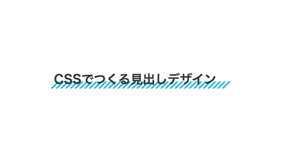
「repeating-linear-gradient」でストライプにし、「background-position」で位置を調整。
コードを表示
<h2>CSSでつくる見出しデザイン</h2>
h2 {
    position: relative;
    padding: 0.7rem 0;
    margin-bottom: 0.2rem;
    color: #353535;
    font-weight: bold;
    font-size: 26px;
}

h2::before {
    position: absolute;
    left: -5px;
    bottom: 5px;
    width: 100%;
    height: 15px;
    transform: skew(-45deg);
    background-image: repeating-linear-gradient(90deg, transparent 0 5px, #2ebadd 5px 10px);
    content: '';
    z-index: -1;
}
HTML・CSSのカスタマイズや動作確認ができます
下線に小さい斜めストライプを入れた見出し
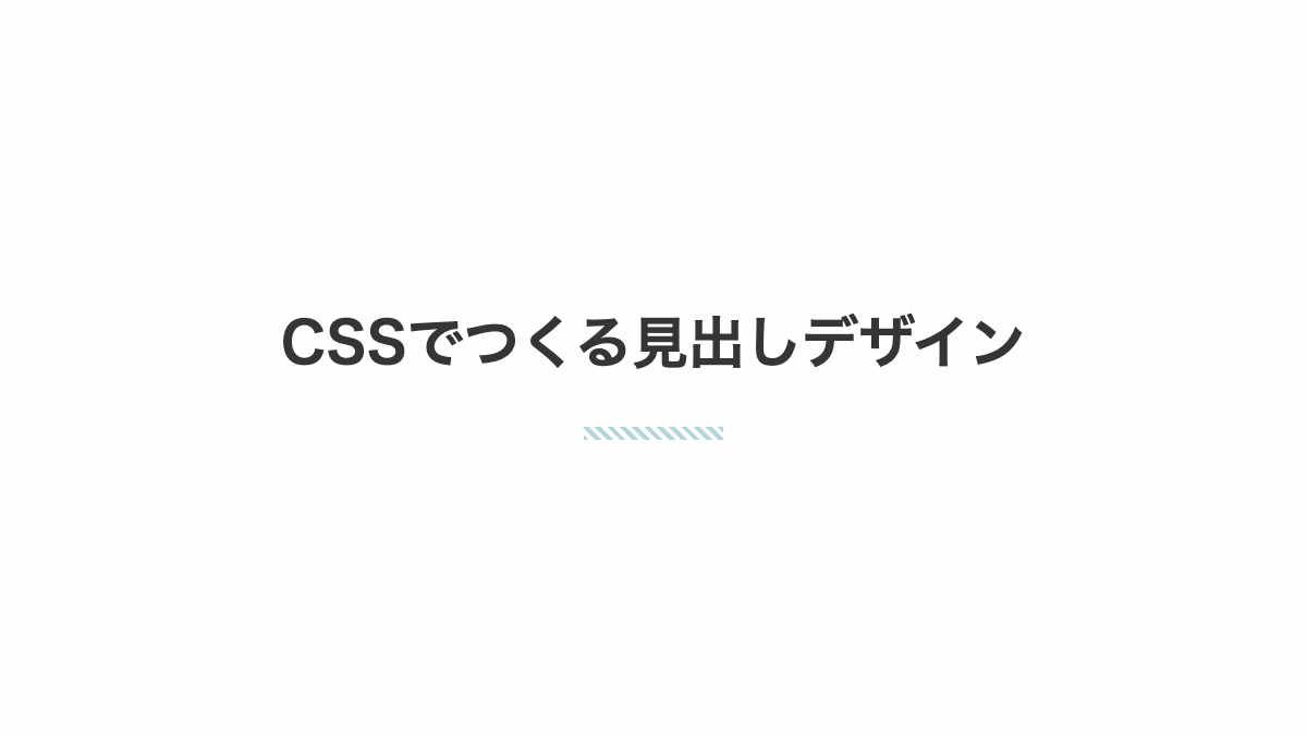
ストライプを小さくしお洒落にしています。background-sizeで幅を指定。
CSS表示
h2 {
    padding: 1rem 0 2rem;
    margin-bottom: 0.5rem;
    background-image: repeating-linear-gradient(45deg, #b2d5de 0 2px, transparent 2px 4px);
    background-repeat: no-repeat;
    background-size: 4rem 0.4rem;
    background-position: center bottom;
    color: #353535;
    font-weight: bold;
    font-size: 26px;
    text-align: center;
}HTML・CSSのカスタマイズや動作確認ができます
吹出口の右側だけ線を入れた見出し
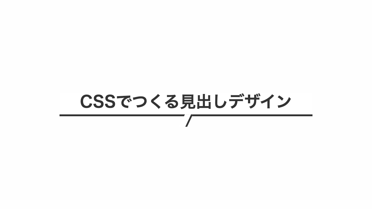
before疑似要素で「skew」を指定し線を斜めに、「border-right」で右側だけ実線を入れてます
コードを表示
h2 {
    position: relative;
    padding-bottom: 0.5rem;
    border-bottom: 3px solid #333;
    background-color: white;
    color: #333;
    font-weight: bold;
    font-size: 26px;
}

h2:before {
    position: absolute;
    top: 100%;
    left: 50%;
    transform: translateX(-50%) skew(-25deg);
    height: 20px;
    width: 10px;
    border-right: 3px solid #333;
    background-color: white;
    content: "";
}
HTML・CSSのカスタマイズや動作確認ができます
下線を引き吹出口を線にした見出し
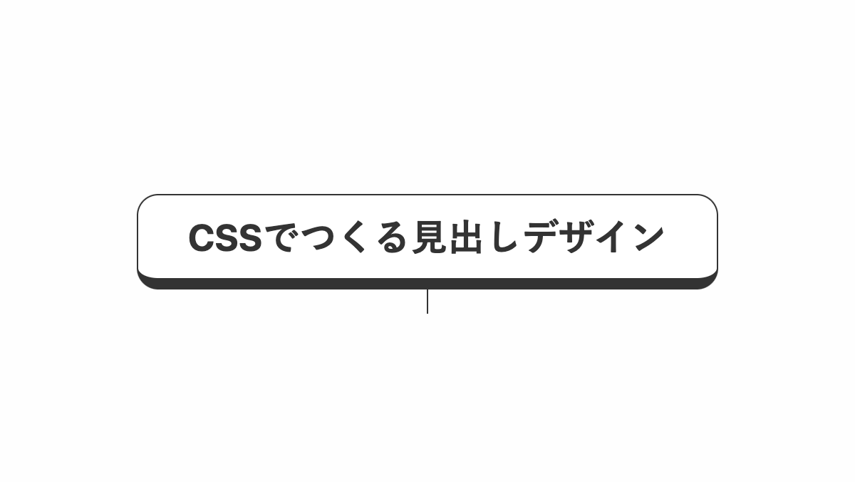
before疑似要素で高さ、幅を調整し吹出口を線にしてます
CSSを表示
h2 {
    position: relative;
    padding: 1rem;
    border-radius: 15px;
    border: 1px solid;
    border-bottom: 8px solid #333;
    background-color: #fff;
    color: #333;
    font-weight: bold;
    font-size: 26px;
    text-align: center;
}


h2:before {
    position: absolute;
    top: 100%;
    left: 50%;
    transform: translateX(-50%);
    height: 25px;
    width: 1px;
    background-color: #333;
    content: "";
}
HTML・CSSのカスタマイズや動作確認ができます
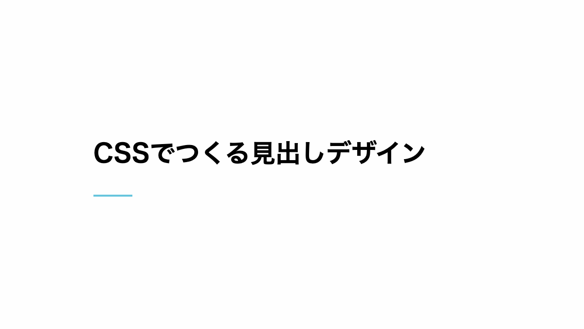
下線を短くした見出し
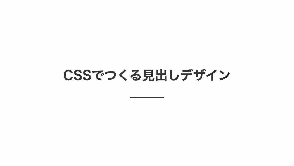
before疑似要素で「border-bottom」を指定。「width: 70px;」で下線を短くしています。
CSS表示
h2 {
    position: relative;
    padding: 0.5rem 0 2rem;
    margin-bottom: 0.5rem;
    font-weight: bold;
    font-size: 26px;
    text-align: center;
    color: #353535;
}

h2::before {
    position: absolute;
    border-bottom: 2px solid #353535;
    top: 100%;
    left: 50%;
    transform: translateX(-50%);
    width: 70px;
    content: '';
}
HTML・CSSのカスタマイズや動作確認ができます
二色に色分けした小さい線を入れた見出し
linear-gradientで50%ずつ赤と黒を指定し、2色に色分けしています
CSS表示
h2 {
    position: relative;
    padding: 0.5rem 0 2rem;
    margin-bottom: 0.5rem;
    font-weight: bold;
    font-size: 26px;
    background: linear-gradient(90deg, #b2d5de 0% 50%, #353535 50%);
    background-repeat: no-repeat;
    background-size: 4rem 0.2rem;
    background-position: bottom;
    color: #353535;
    text-align: center;
}
HTML・CSSのカスタマイズや動作確認ができます
グラデーションの小さい線を入れた見出し
linear-gradientで下線をグラデーションにし、background-sizeで小さくしてお洒落に。
CSS表示
h2 {
    position: relative;
    padding: 0.5rem 0 2rem;
    margin-bottom: 0.5rem;
    font-weight: bold;
    font-size: 26px;
    background-image: linear-gradient(135deg, #16b5dd 10%, #b2d5de 100%);
    background-repeat: no-repeat;
    background-size: 4rem 0.4rem;
    background-position: bottom;
    text-align: center;
}
HTML・CSSのカスタマイズや動作確認ができます
小さい線を左側に入れた見出し
「linear-gradient」関数で色を指定し、「background-size」プロパティでサイズを調整。「background-position: left bottom;」で左下に表示しています。
コードを表示
<h2>CSSでつくる見出しデザイン</h2>
h2 {
    padding: 1rem 0 2rem;
    margin-bottom: 0.5rem;
    background: linear-gradient(90deg, #66c5dd 0% 100%);
    background-repeat: no-repeat;
    background-size: 40px 2px;
    background-position: left bottom;
    font-weight: bold;
    font-size: 26px;
}HTML・CSSのカスタマイズや動作確認ができます
下線の代わりに小さな英字を配置した見出し
contentに 'heading'を設定し、位置を調整し文字の下に配置。after疑似要素で横線をひいてます
コードを表示
h2 {
    position: relative;
    margin-bottom: 0.2rem;
    font-weight: bold;
    font-size: 26px;
    text-align: center;
}

h2::before,
h2::after {
    position: absolute;
    left: 50%;
    transform: translateX(-50%);
}

h2::before {
    bottom: -40px;
    color: #66c5dd;
    font-size: 12px;
    text-transform: uppercase;
    content: 'heading';
}

h2::after {
    bottom: -35px;
    width: 100px;
    height: 2px;
    background-image: linear-gradient(90deg, #66c5dd 10px, transparent 10px calc(100% - 10px), #66c5dd calc(100% - 10px));
    content: '';
}
HTML・CSSのカスタマイズや動作確認ができます
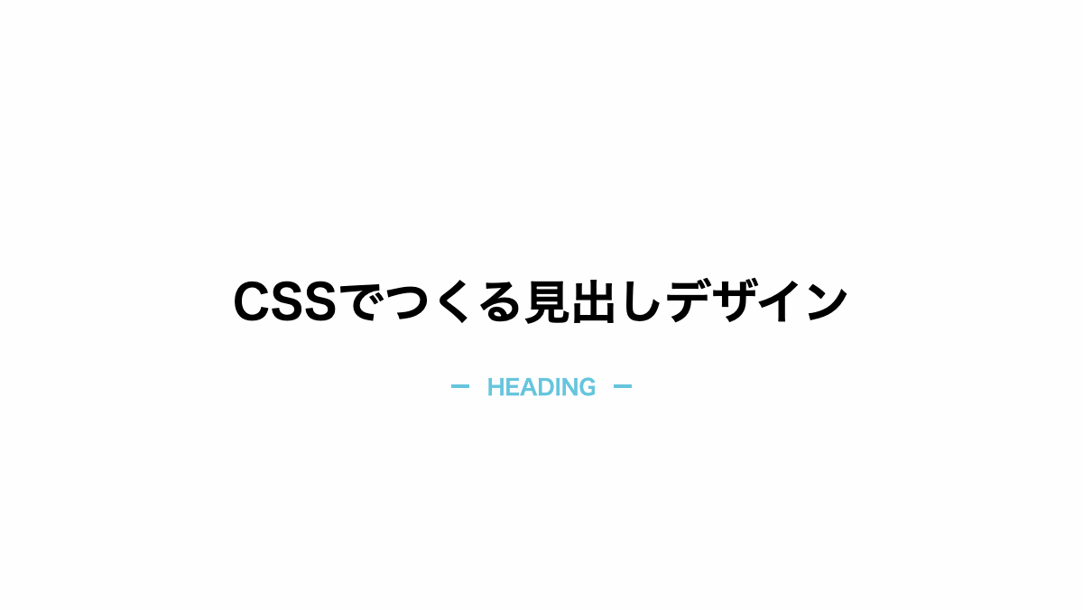
下線の代わりに小さな英字を配置した見出し
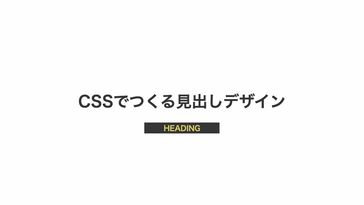
contentに 'heading'を設定。位置を調整し文字の下に配置しています
コードを表示
h2 {
    position: relative;
    margin-bottom: 0.2rem;
    color: #353535;
    font-weight: bold;
    font-size: 26px;
    text-align: center;
}

h2::before {
    position: absolute;
    bottom: -2.5rem;
    left: 50%;
    transform: translateX(-50%);
    padding: 0.2rem 2rem;
    background-color: #353535;
    color: #ddd166;
    font-size: 12px;
    text-transform: uppercase;
    content: 'heading';
}
HTML・CSSのカスタマイズや動作確認ができます
以上がCSSで下線を引いた見出しデザインとなります。
「linear-gradient」を使用し下線を引くとグラデーションや色分け、線幅を小さくするなど様々な表現が可能になります。ぜひ試してみてくださいね。


