
CSSで作る吹き出しの見出しデザインを作りました。
before、after疑似要素で「border」プロパティ等を使用し吹出口を作っています。
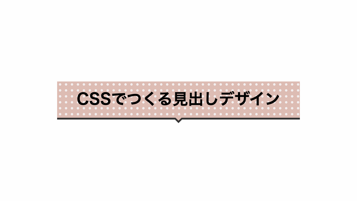
三角の吹出口だけではなく、線を入れただけのシンプルな吹き出しや背景をストライプにしたものなど様々なパターンで作成しています。
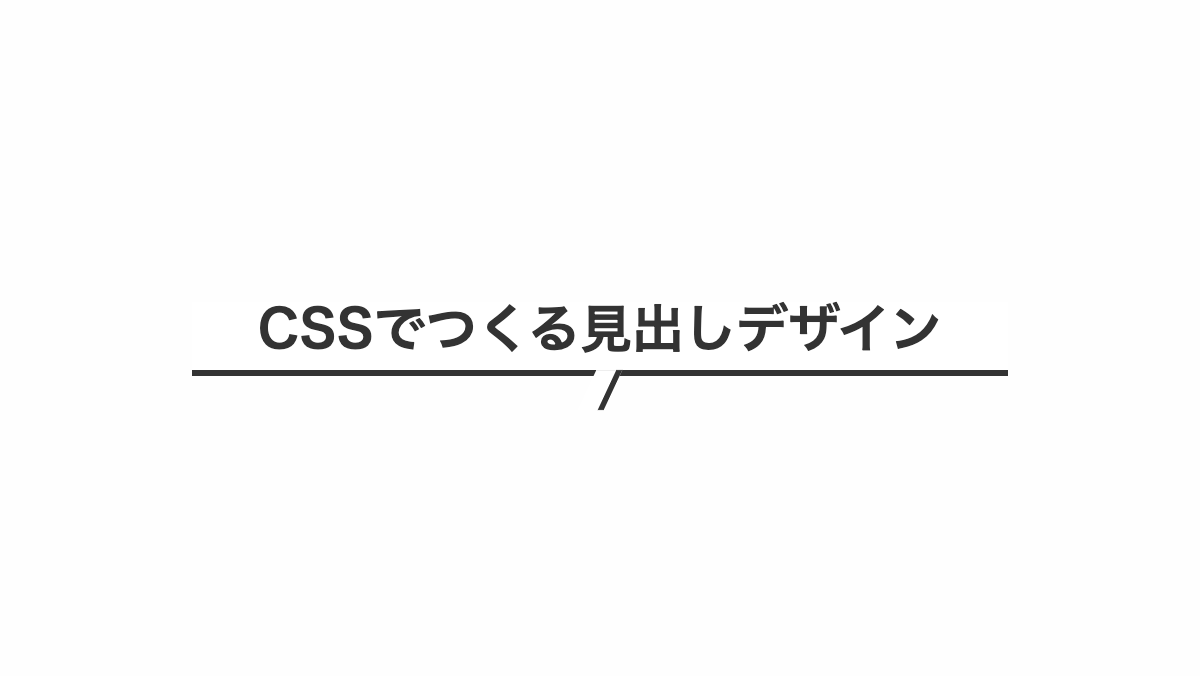
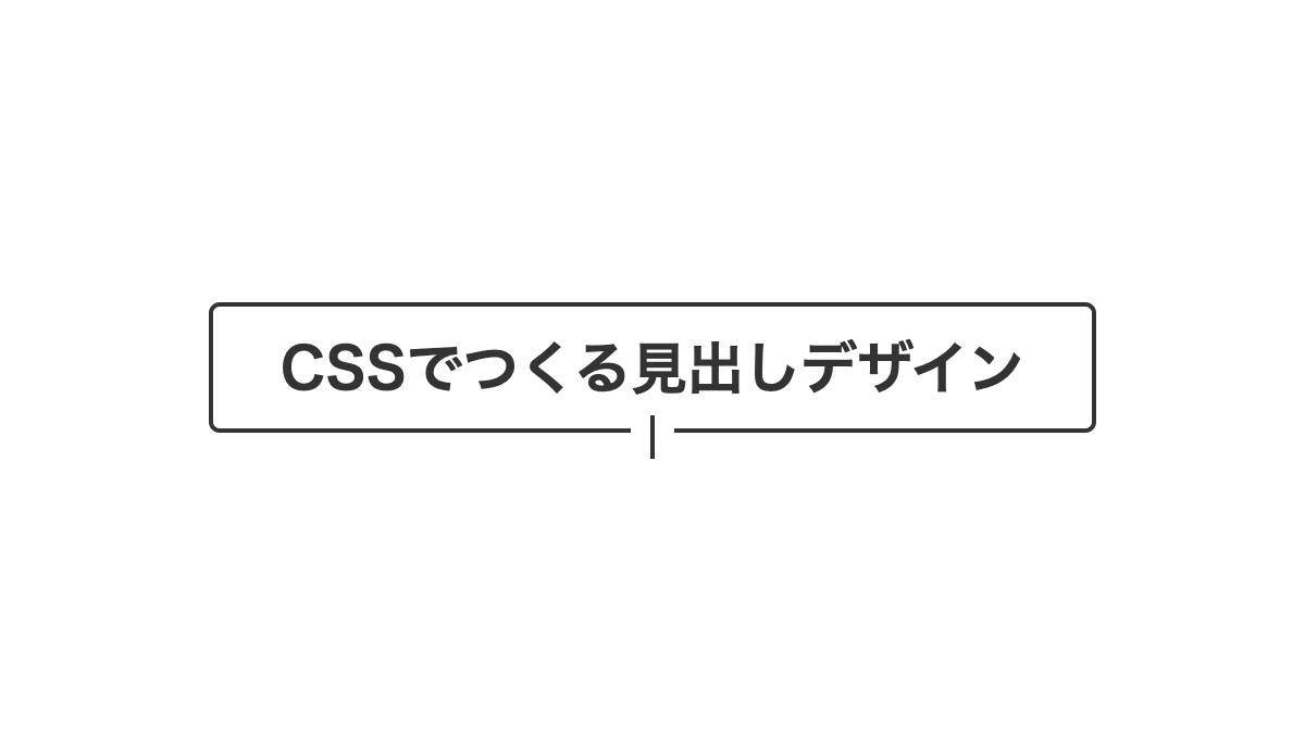
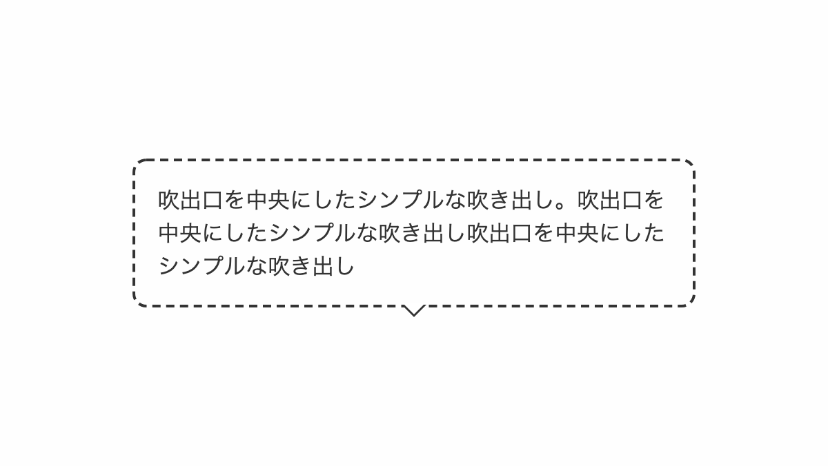
下線を吹き出しにしたデザイン
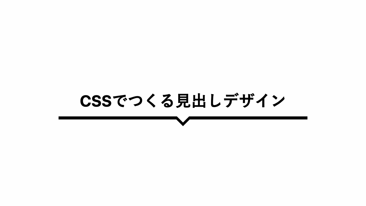
「before」「after」疑似要素で下線を吹き出しにしています。
コードを表示
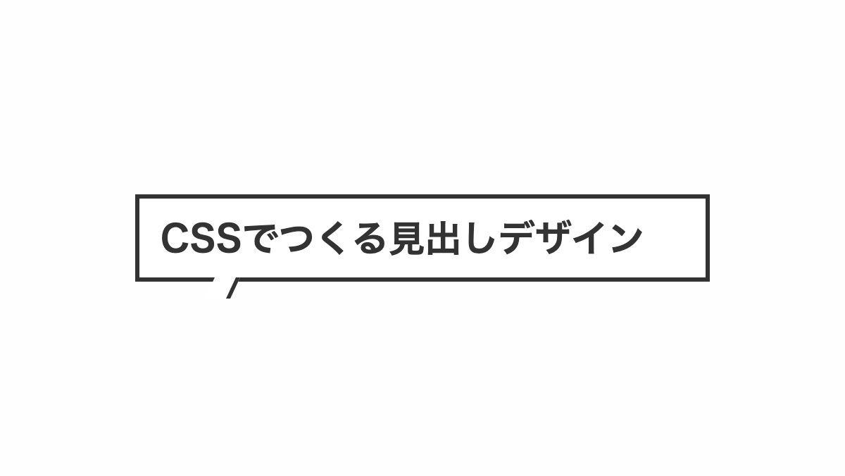
<h2>CSSでつくる見出しデザイン</h2>
h2 {
    position: relative;
    padding: 0.8rem 0;
    margin-bottom: 0.2rem;
    border-bottom: 5px solid;
    color: black;
    font-weight: bold;
    font-size: 26px;
    text-align: center;
}

h2:before,
h2:after {
    position: absolute;
    top: 100%;
    left: 50%;
    content: "";
    height: 0;
    width: 0;
}

h2:before {
    border: 16px solid;
    border-color: transparent;
    border-top-color: black;
    margin-left: -16px;
}

h2:after {
    border: 10px solid;
    border-color: transparent;
    border-top-color: white;
    margin-left: -10px;
}HTML・CSSのカスタマイズや動作確認ができます
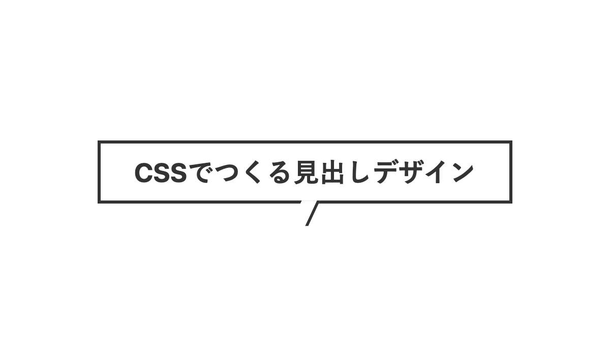
下向きの吹き出しを入れたデザイン
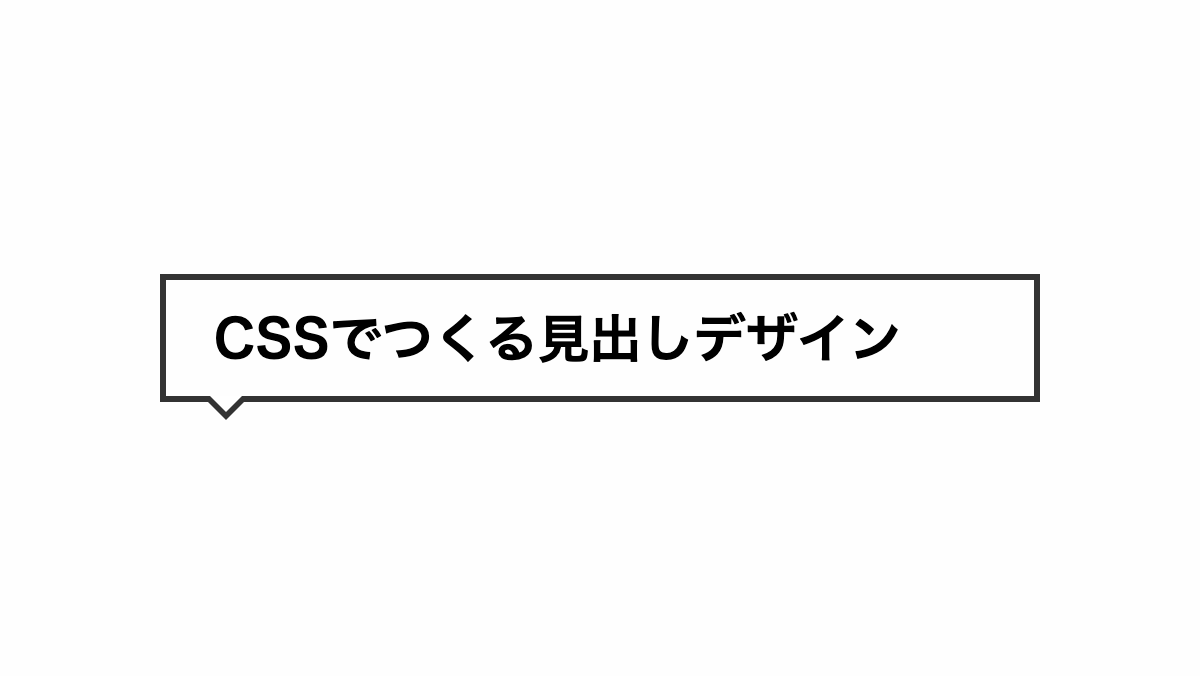
before,after疑似要素で「border」プロパティを指定し吹き出しを作っています
コードを表示
<h2>CSSでつくる見出しデザイン</h2>
h2 {
    position: relative;
    padding: 1rem 1rem 1rem 1.5rem;
    border: 3px solid #333;
    font-weight: bold;
    font-size: 26px;
}

h2:before,
h2:after {
    position: absolute;
    top: 100%;
    left: 30px;
    height: 0;
    width: 0;
    border: solid transparent;
    content: "";
}

h2:before {
    margin-left: -12px;
    border-color: transparent;
    border-top-color: #333;
    border-width: 12px;
}

h2:after {
    margin-left: -8px;
    border-color: transparent;
    border-top-color: white;
    border-width: 8px;
}HTML・CSSのカスタマイズや動作確認ができます
丸枠の吹き出しにしたデザイン
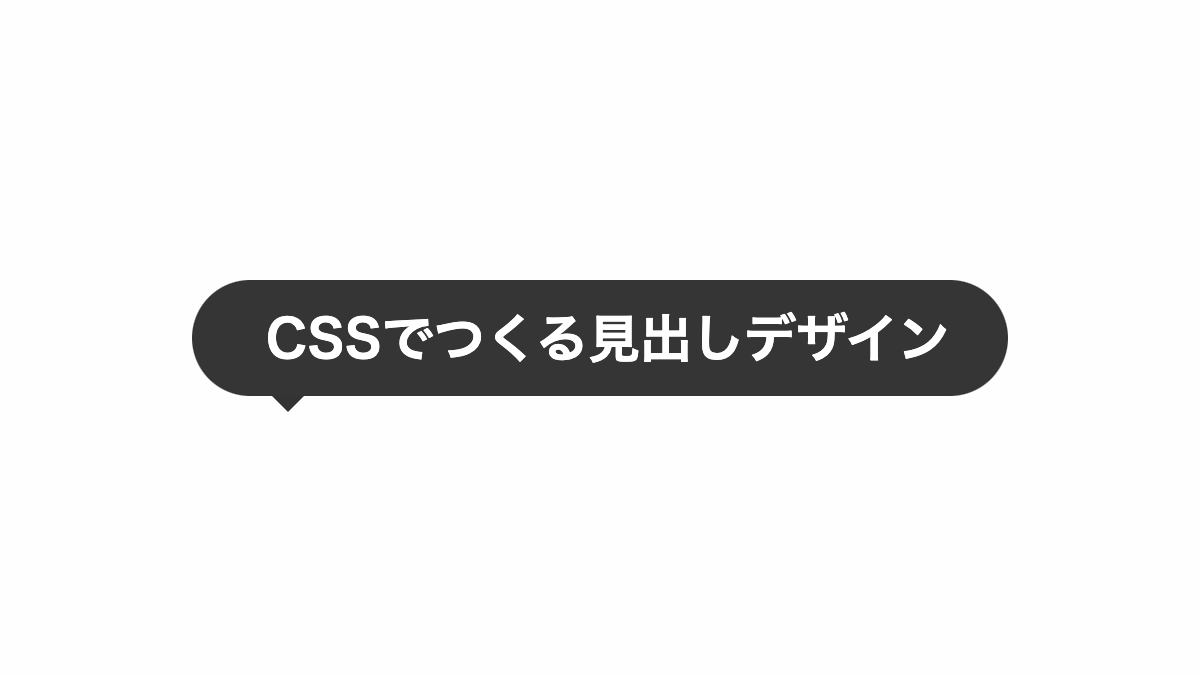
before疑似要素でborder-topのみ黒塗りし吹き出しを作ってます。
コードを表示
<h2>CSSでつくる見出しデザイン</h2>
h2 {
    position: relative;
    padding: 1rem 1rem 1rem 1.5rem;
    border-radius: 30px;
    background-color: #333;
    color: white;
    font-weight: bold;
    font-size: 26px;
}

h2:before {
    position: absolute;
    top: 100%;
    left: 40px;
    height: 0;
    width: 0;
    border-style: solid;
    border-color: transparent;
    border-top-color: #333;
    border-width: 8px;
    content: "";
}HTML・CSSのカスタマイズや動作確認ができます
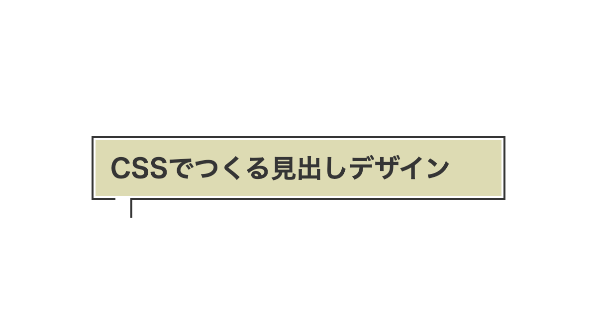
内側に破線を入れたデザイン
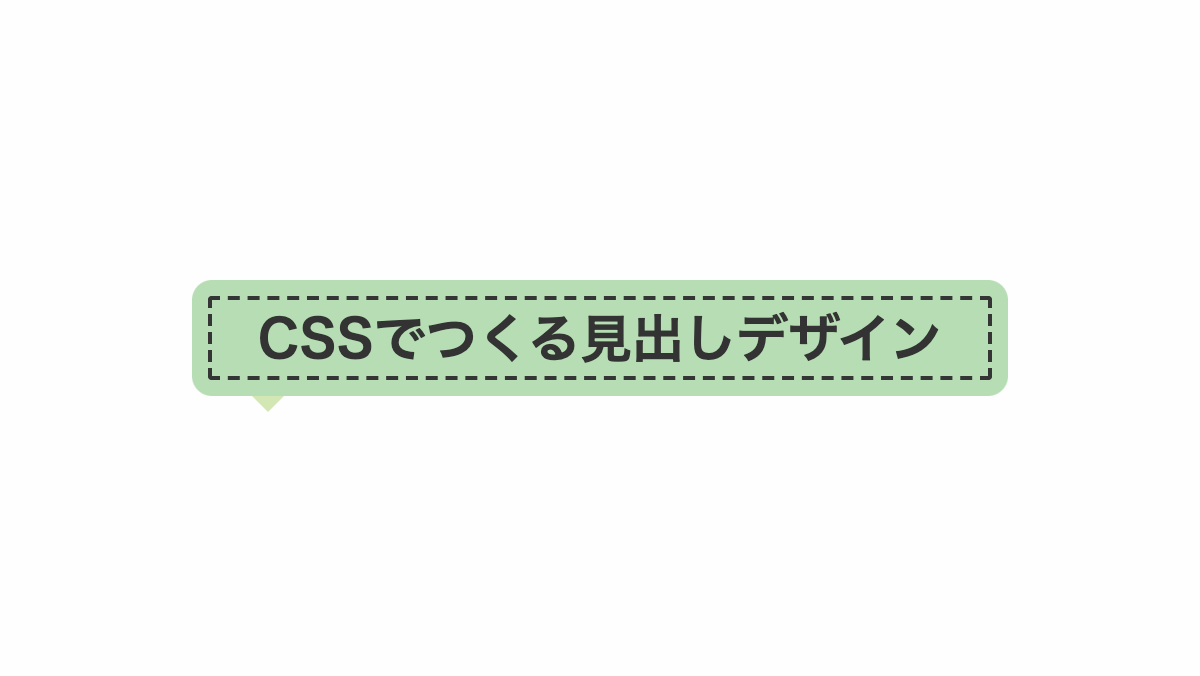
before疑似要素でborder-topのみ塗りを入れて吹き出しを作ってます。
コードを表示
<h2>CSSでつくる見出しデザイン</h2>
h2 {
    position: relative;
    padding: 1rem;
    outline: 2px dashed #353535;
    outline-offset: -8px;
    border-radius: 10px;
    background-color: #D3E7B4;
    color: #333;
    font-weight: bold;
    font-size: 26px;
    text-align: center;
}

h2:before {
    position: absolute;
    top: 100%;
    left: 30px;
    height: 0;
    width: 0;
    border-style: solid;
    border-color: transparent;
    border-top-color: #D3E7B4;
    border-width: 8px;
    content: "";
}HTML・CSSのカスタマイズや動作確認ができます
吹出口の右側だけ線を入れたデザイン
before疑似要素で「skew」を指定し線を斜めに、「border-right」で右側だけ実線を入れてます
コードを表示
<h2>CSSでつくる見出しデザイン</h2>
h2 {
    position: relative;
    padding: 15px;
    border: 3px solid #333;
    background-color: white;
    color: #333;
    font-weight: bold;
    font-size: 26px;
}

h2:before {
    position: absolute;
    top: 100%;
    left: 50px;
    transform: skew(-25deg);
    height: 15px;
    width: 15px;
    border-right: 3px solid #333;
    background-color: white;
    content: "";
}HTML・CSSのカスタマイズや動作確認ができます
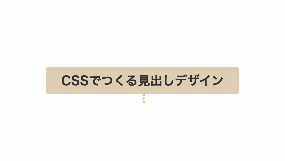
2つの円を下側に入れたデザイン
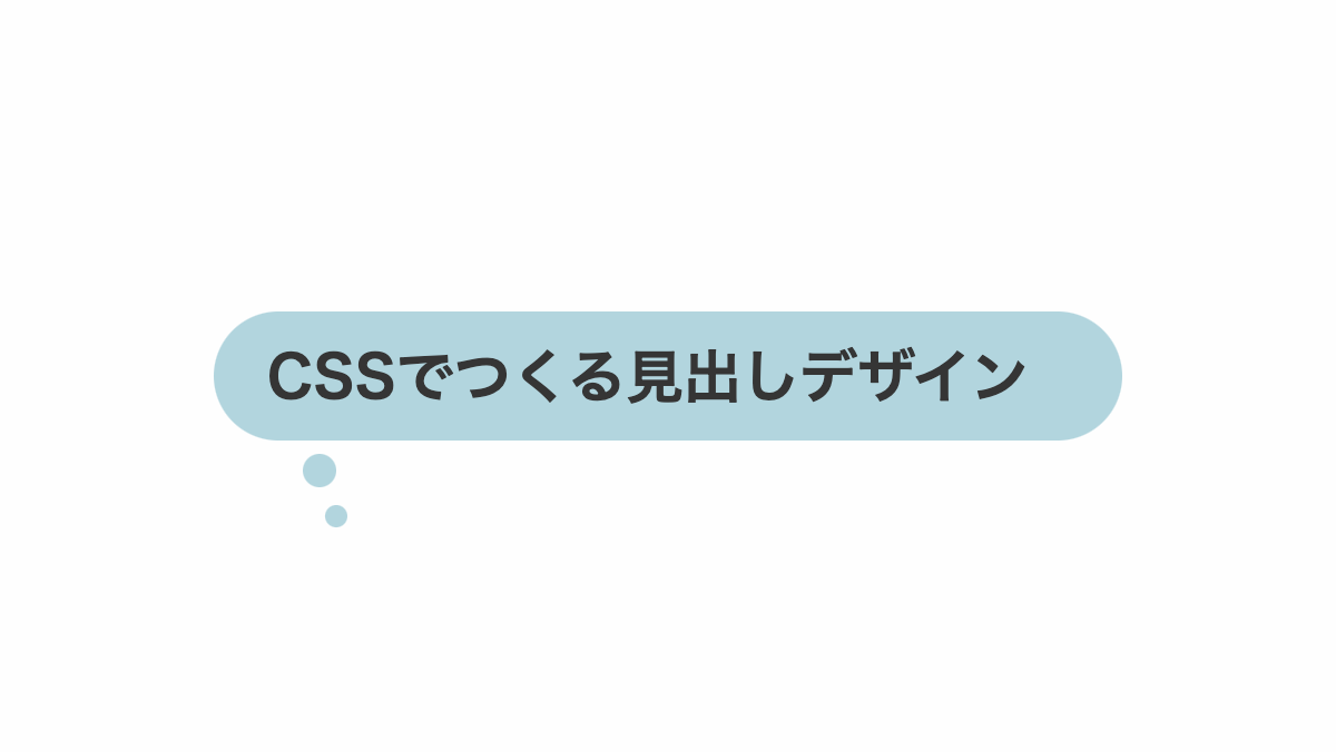
before、after疑似要素で円形要素を作り考え事をしているような吹き出しにしています。
コードを表示
<h2>CSSでつくる見出しデザイン</h2>
h2 {
    position: relative;
    padding: 1rem 1rem 1rem 1.5rem;
    border-radius: 30px;
    background-color: #9CC7CE;
    color: white;
    font-weight: bold;
    font-size: 26px;
}

h2:before,
h2:after {
    position: absolute;
    border-radius: 50%;
    background-color: #9CC7CE;
    content: "";
}

h2:before {
    top: 110%;
    left: 40px;
    height: 15px;
    width: 15px;
}

h2:after {
    top: 150%;
    left: 50px;
    height: 10px;
    width: 10px;
}HTML・CSSのカスタマイズや動作確認ができます
吹出口の右側だけ線を入れたデザイン
before疑似要素で「skew」を指定し線を斜めに、「border-right」で右側だけ実線を入れてます
コードを表示
<h2>CSSでつくる見出しデザイン</h2>
h2 {
    position: relative;
    padding: 15px;
    border: 3px solid #333;
    background-color: white;
    color: #333;
    font-weight: bold;
    font-size: 26px;
    text-align: center;
}

h2:before {
    position: absolute;
    top: 100%;
    left: 50%;
    transform: translateX(-50%) skew(-25deg);
    height: 25px;
    width: 15px;
    border-right: 3px solid #333;
    background-color: white;
    content: "";
}HTML・CSSのカスタマイズや動作確認ができます
吹出口を線だけにしたデザイン
before疑似要素で実線を入れてます
コードを表示
<h2>CSSでつくる見出しデザイン</h2>
h2 {
    position: relative;
    padding: 15px;
    border-radius: 5px;
    border: 2px solid #333;
    background-color: #EB8694;
    color: #333;
    font-weight: bold;
    font-size: 26px;
    text-align: center;
}

h2:before {
    position: absolute;
    top: 100%;
    left: 50%;
    transform: translateX(-50%);
    height: 20px;
    width: 2px;
    background-color: #333;
    content: "";
}HTML・CSSのカスタマイズや動作確認ができます
吹出口を破線にしたデザイン
before疑似要素の「border-left」で破線を入れてます
コードを表示
<h2>CSSでつくる見出しデザイン</h2>
h2 {
    position: relative;
    padding: 15px;
    border-radius: 5px;
    background-color: #eac988;
    color: #333;
    font-weight: bold;
    font-size: 26px;
    text-align: center;
}

h2:before {
    position: absolute;
    top: 100%;
    left: 50%;
    transform: traslateX(-50%) rotate(-20deg);
    border-left: 5px dotted #eac988;
    height: 20px;
    content: "";
}HTML・CSSのカスタマイズや動作確認ができます
吹出口を線だけにしたデザイン
before疑似要素で高さ、幅を調整し吹出口を線にしてます
コードを表示
<h2>CSSでつくる見出しデザイン</h2>
h2 {
    position: relative;
    padding: 1rem;
    border-radius: 15px;
    border-bottom: 5px solid #333;
    background-color: #e0c9be;
    color: #333;
    font-weight: bold;
    font-size: 26px;
    text-align: center;
}

h2:before {
    position: absolute;
    top: 100%;
    left: 50%;
    transform: translateX(-50%);
    height: 25px;
    width: 3px;
    background-color: #e0c9be;
    content: "";
}HTML・CSSのカスタマイズや動作確認ができます
吹出口の右側だけ線を入れたデザイン
before疑似要素で「skew」を指定し線を斜めに、「border-right」で右側だけ実線を入れてます
コードを表示
<h2>CSSでつくる見出しデザイン</h2>
h2 {
    position: relative;
    padding-bottom: 0.5rem;
    border-bottom: 3px solid #333;
    background-color: white;
    color: #333;
    font-weight: bold;
    font-size: 26px;
    text-align: center;
}

h2:before {
    position: absolute;
    top: 100%;
    left: 50%;
    transform: translateX(-50%) skew(-25deg);
    height: 20px;
    width: 10px;
    border-right: 3px solid #333;
    background-color: white;
    content: "";
}HTML・CSSのカスタマイズや動作確認ができます
吹出口の右側だけ線を入れたデザイン
before疑似要素で「skew」を指定し線を斜めに、「border-right」で右側だけ実線を入れてます
コードを表示
<h2>CSSでつくる見出しデザイン</h2>
h2 {
    position: relative;
    padding: 15px;
    outline: 2px solid #333;
    outline-offset: 2px;
    background: #f4d58d;
    color: #333;
    font-size: 26px;
    font-weight: bold;
}

h2:before {
    position: absolute;
    top: calc(100% + 2px);
    left: 50px;
    height: 20px;
    width: 15px;
    background-color: white;
    border-right: 3px solid #333;
    content: "";
}

h2 p {
    color: white;
    line-height: 1.5;
}HTML・CSSのカスタマイズや動作確認ができます
水平軸を基点に20度回転させたデザイン
「rotateX」関数で水平軸をを基点に回転させてます
コードを表示
<h2>CSSでつくる見出しデザイン</h2>
h2 {
    position: relative;
    padding: 1rem;
    border-radius: 10px;
    border: 3px solid #333;
    transform: perspective(1000px) rotateX(20deg);
    box-shadow: 0px 10px 0px #333;
    background-color: #fff;
    color: #333;
    font-weight: bold;
    font-size: 26px;
}

h2:before {
    position: absolute;
    top: 100%;
    left: 50px;
    transform: skew(-25deg);
    height: 25px;
    width: 15px;
    border-right: 13px solid #333;
    background-color: #fff;
    content: "";
}HTML・CSSのカスタマイズや動作確認ができます
吹出口を中央にしパターンを入れたCSS吹き出しデザイン
before,after疑似要素の「border」で吹出口を作っています
コードを表示
<h2>CSSでつくる見出しデザイン</h2>
h2 {
    position: relative;
    padding: 1rem 1rem 1.2rem;
    border-bottom: 3px solid #333;
    background:
        radial-gradient(#f2eded 30%, transparent 30%),
        linear-gradient(#F3C1C2 0 100%);
    background-repeat: repeat, no-repeat;
    background-size: 10px 10px, 100% 100%;
    font-size: 26px;
    font-weight: bold;
    text-align: center;
}

h2:before,
h2:after {
    position: absolute;
    left: 50%;
    content: "";
    height: 0;
    width: 0;
}

h2:before {
    top: 100%;
    border: 9px solid;
    border-color: transparent;
    border-top-color: #333;
    margin-left: -9px;
}

h2:after {
    top: 99%;
    border: 6px solid;
    border-color: transparent;
    border-top-color: #F3C1C2;
    margin-left: -6px;
}

h2 p {
    color: #333;
    line-height: 1.5;
}HTML・CSSのカスタマイズや動作確認ができます
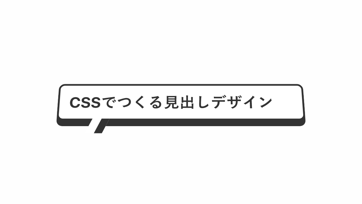
下向きの吹き出しを入れたデザイン
before,after疑似要素で「border」プロパティを指定し吹き出しを作っています
コードを表示
<h2>CSSでつくる見出しデザイン</h2>
h2 {
    position: relative;
    padding: 1rem 1rem 1rem 1.5rem;
    border: 3px solid #333;
    font-weight: bold;
    font-size: 26px;
}

h2:before,
h2:after {
    position: absolute;
    left: 30px;
    height: 0;
    width: 0;
    border: solid transparent;
    content: "";
}

h2:before {
    top: 100%;
    margin-left: -10px;
    border-color: transparent;
    border-top-color: #333;
    border-right-color: #333;
    border-width: 10px;
}

h2:after {
    top: 99%;
    margin-left: -7px;
    border-color: transparent;
    border-top-color: white;
    border-right-color: white;
    border-width: 7px;
}HTML・CSSのカスタマイズや動作確認ができます
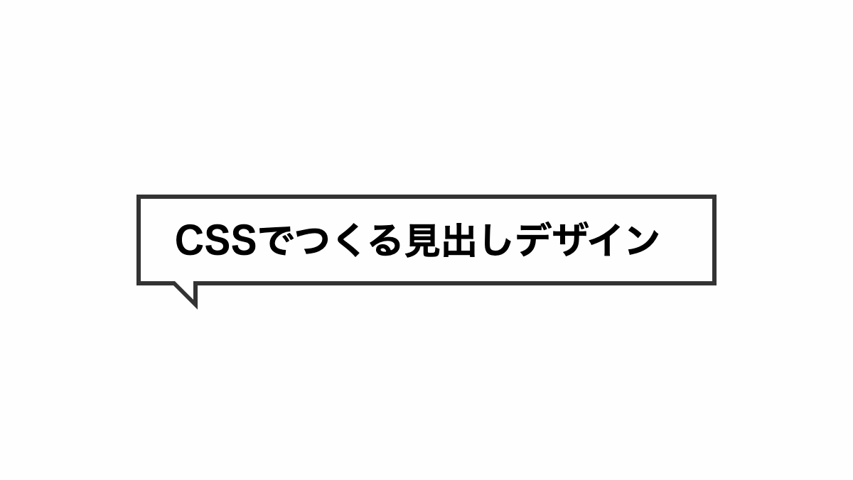
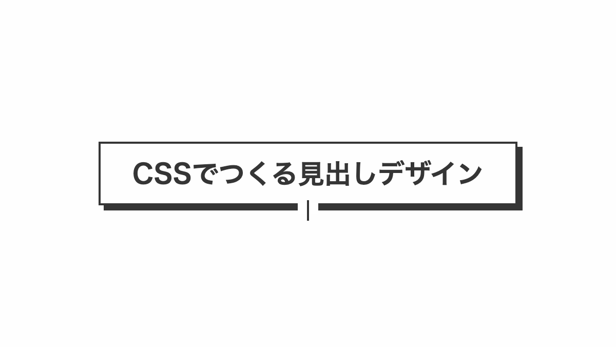
下向きの吹き出しを入れたデザイン
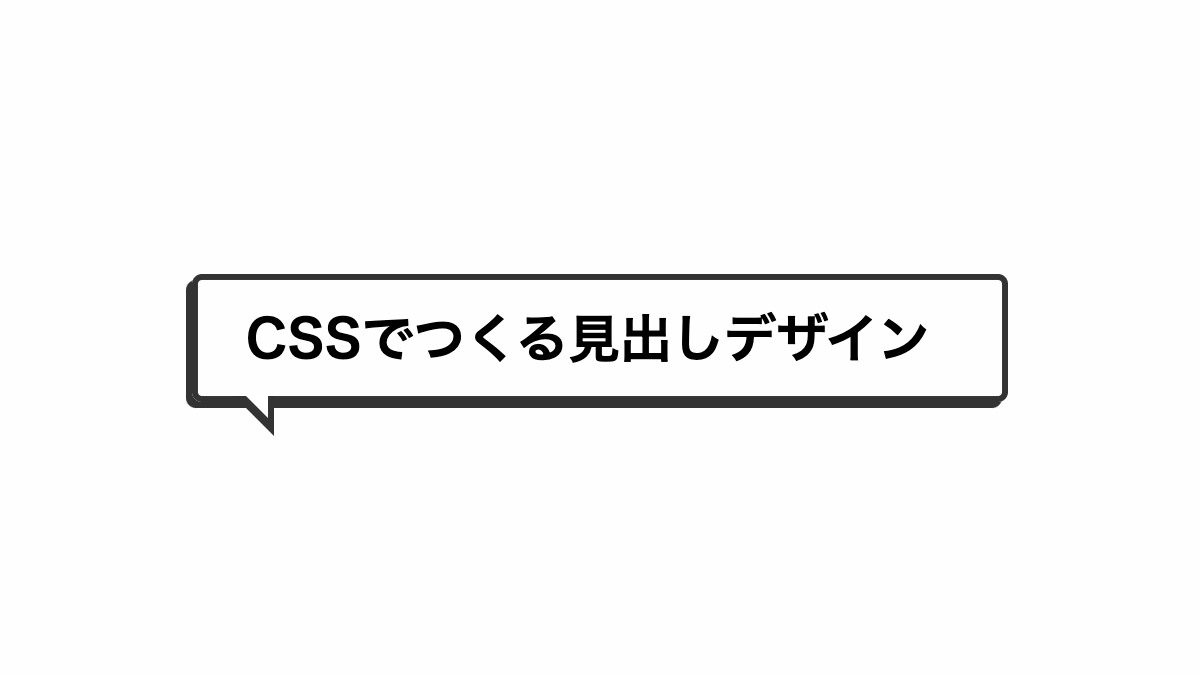
before,after疑似要素で「border」プロパティを指定し吹き出しを作っています
コードを表示
<h2>CSSでつくる見出しデザイン</h2>
h2 {
    position: relative;
    padding: 1rem 1rem 1rem 1.5rem;
    border-radius: 5px;
    border: 3px solid #333;
    box-shadow: -3px 3px 0 0 #333;
    font-weight: bold;
    font-size: 26px;
}

h2:before,
h2:after {
    position: absolute;
    left: 30px;
    height: 0;
    width: 0;
    border: solid transparent;
    content: "";
}

h2:before {
    top: 100%;
    margin-left: -12px;
    border-color: transparent;
    border-top-color: #333;
    border-right-color: #333;
    border-width: 10px;
}

h2:after {
    top: 99%;
    margin-left: -7px;
    border-color: transparent;
    border-top-color: white;
    border-right-color: white;
    border-width: 6.5px;
}HTML・CSSのカスタマイズや動作確認ができます
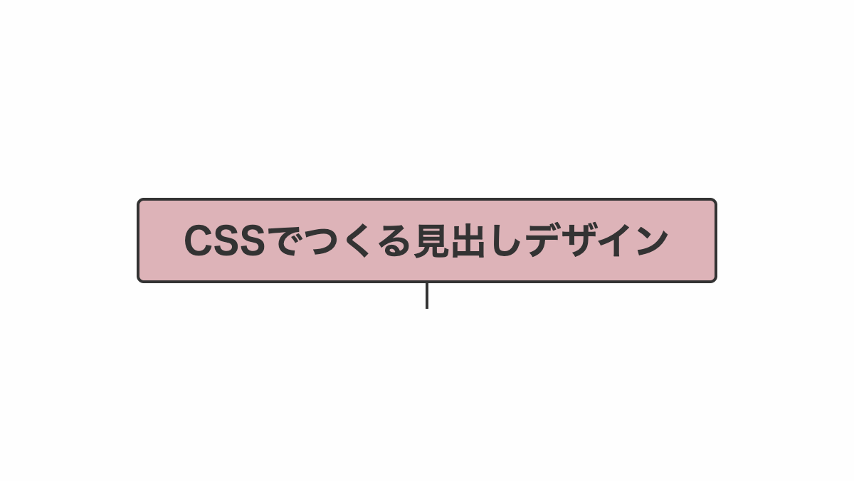
吹出口を線だけにしたデザイン
before疑似要素で実線を入れてます
コードを表示
<h2>CSSでつくる見出しデザイン</h2>
h2 {
    position: relative;
    padding: 15px;
    border-radius: 5px;
    border: 2px solid #333;
    color: #333;
    font-weight: bold;
    font-size: 26px;
    text-align: center;
}

h2:before {
    position: absolute;
    top: 100%;
    left: 50%;
    transform: translateX(-50%);
    height: 3px;
    width: 20px;
    background-color: #fff;
    content: "";
}

h2:after {
    position: absolute;
    top: 90%;
    left: 50%;
    transform: translateX(-50%);
    height: 20px;
    width: 2px;
    background-color: #333;
    content: "";
}HTML・CSSのカスタマイズや動作確認ができます
斜めストライプを入れたデザイン
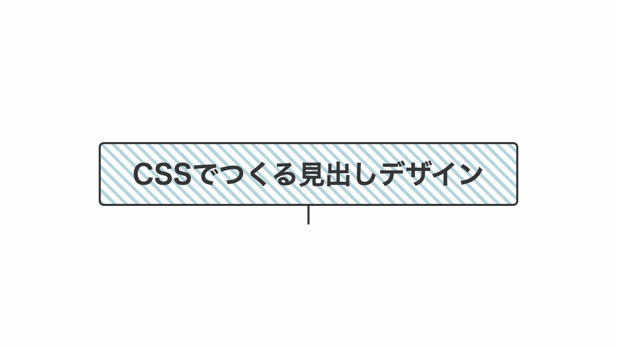
「repeating-linear-gradient」で斜めストライプを入れてます
コードを表示
<h2>CSSでつくる見出しデザイン</h2>
h2 {
    position: relative;
    padding: 1rem;
    border-radius: 5px;
    border: 2px solid #333;
    background: repeating-linear-gradient(45deg, #aAE8F2 0 3px, #fff 3px 8px);
    color: #333;
    font-weight: bold;
    font-size: 26px;
    text-align: center;
}

h2::before {
    position: absolute;
    top: 100%;
    left: 50%;
    transform: translateX(-50%);
    height: 20px;
    width: 2px;
    background-color: #333;
    content: "";
}

h2 p {
    line-height: 1.5;
}HTML・CSSのカスタマイズや動作確認ができます
斜めストライプをずらしたデザイン
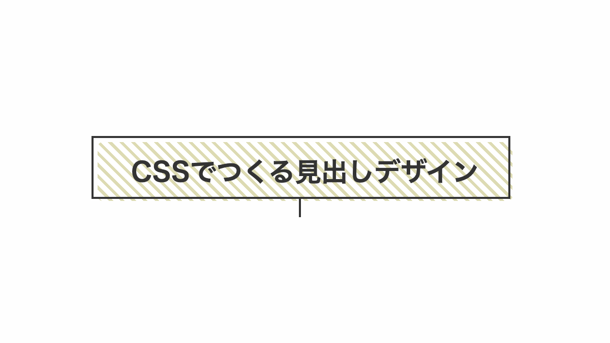
「repeating-linear-gradient」で斜めストライプを入れ、after疑似要素で境界線をずらしてます
コードを表示
<h2>CSSでつくる見出しデザイン</h2>
h2 {
    position: relative;
    padding: 1rem;
    border-radius: 5px;
    background: repeating-linear-gradient(45deg, #E7DA2C 0 3px, #fff 3px 8px);
    color: #333;
    font-weight: bold;
    font-size: 26px;
    text-align: center;
}

h2::before {
    position: absolute;
    bottom: -16px;
    left: calc(50% - 6px);
    transform: translateX(-50% + 6px);
    height: 20px;
    width: 2px;
    background-color: #333;
    content: "";
}

h2::after {
    position: absolute;
    top: -6px;
    left: -6px;
    width: 100%;
    height: 100%;
    border: 2px solid #353535;
    content: '';
}HTML・CSSのカスタマイズや動作確認ができます
吹出口を線にした影を入れたデザイン
before疑似要素で実線を入れてます
コードを表示
<h2>CSSでつくる見出しデザイン</h2>
h2 {
    position: relative;
    padding: 1rem;
    box-shadow: 5px 5px #3da5f1;
    border: 2px solid #3da5f1;
    color: #3da5f1;
    font-weight: bold;
    font-size: 26px;
    text-align: center;
}

h2:before {
    position: absolute;
    top: 100%;
    left: 50%;
    transform: translateX(-50%);
    height: 10px;
    width: 20px;
    background-color: #fff;
    content: "";
}

h2:after {
    position: absolute;
    top: 95%;
    left: 50%;
    transform: translateX(-50%);
    height: 20px;
    width: 2px;
    background-color: #3da5f1;
    content: "";
}HTML・CSSのカスタマイズや動作確認ができます
ボックス型の吹き出しデザイン
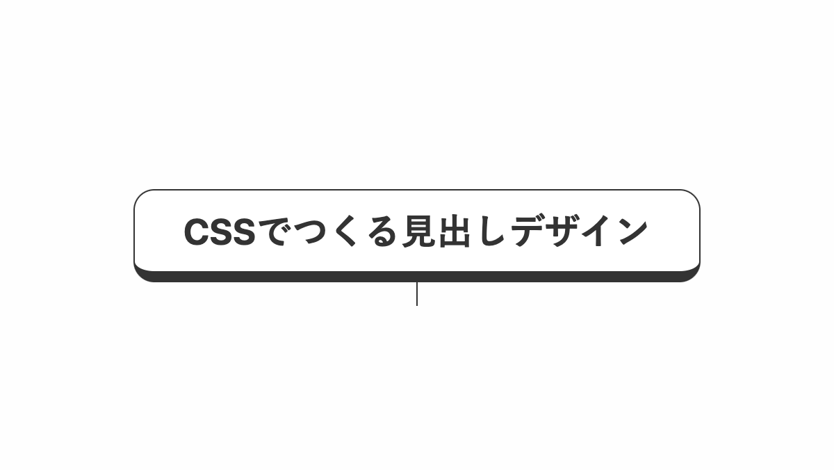
ここからは補足説明などに使えるボックス型の吹き出しデザインを紹介します。
線だけを入れたシンプルなデザイン
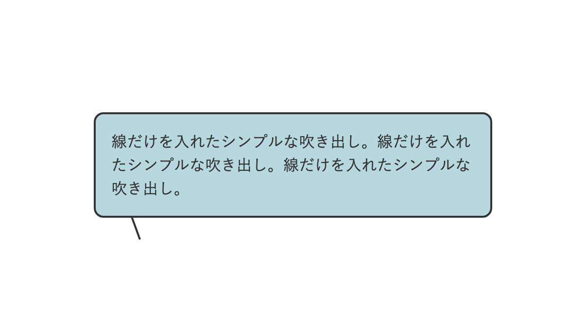
before疑似要素の「border」で吹出口を作っています
コードを表示
<div class="box">
    <p>線だけを入れたシンプルな吹き出し。線だけを入れたシンプルな吹き出し。線だけを入れたシンプルな吹き出し。</p>
</div>
.box {
    position: relative;
    padding: 1rem;
    border-radius: 10px;
    background-color: #b8d8e0;
    border: 2px solid #333;
}

.box::before {
    position: absolute;
    top: 100%;
    left: 10%;
    height: 25px;
    width: 2px;
    transform: rotate(-20deg);
    background-color: #333;
    content: '';
}

.box p {
    color: #333;
    line-height: 1.5;
}HTML・CSSのカスタマイズや動作確認ができます
吹出口を中央にしたデザイン
before,after疑似要素の「border」で吹出口を作っています
コードを表示
<div class="box">
    <p>吹出口を中央にしたシンプルな吹き出し。吹出口を中央にしたシンプルな吹き出し吹出口を中央にしたシンプルな吹き出し</p>
</div>
.box {
    position: relative;
    padding: 1rem 1rem 1.2rem;
    border-bottom: 2px solid #333;
    background: linear-gradient(#DFF3CA 0 calc(100% - 0.2rem), white calc(100% - 0.2rem));
}

.box:before,
.box:after {
    position: absolute;
    left: 50%;
    content: "";
    height: 0;
    width: 0;
}

.box:before {
    top: 100%;
    border: 9px solid;
    border-color: transparent;
    border-top-color: #333;
    margin-left: -9px;
}

.box:after {
    top: 99%;
    border: 8px solid;
    border-color: transparent;
    border-top-color: white;
    margin-left: -8px;
}

.box p {
    color: #333;
    line-height: 1.5;
}HTML・CSSのカスタマイズや動作確認ができます
吹出口の右側だけ線を入れたデザイン
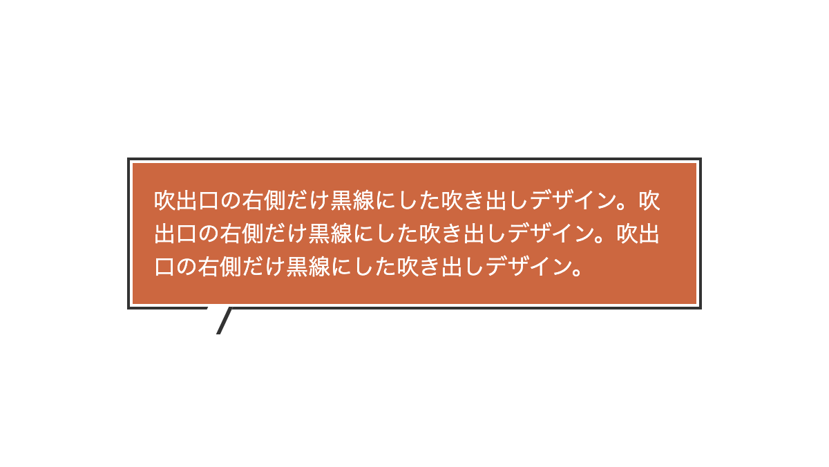
before疑似要素で「skew」を指定し線を斜めに、「border-right」で右側だけ実線を入れてます
コードを表示
<div class="box">
    <p>吹出口の右側だけ黒線にした吹き出しデザイン。吹出口の右側だけ黒線にした吹き出しデザイン。吹出口の右側だけ黒線にした吹き出しデザイン。</p>
</div>
.box {
    position: relative;
    padding: 15px;
    outline: 2px solid #333;
    outline-offset: 2px;
    background: #CC6740;
    color: #333;
}

.box:before {
    position: absolute;
    top: calc(100% + 2px);
    left: 50px;
    transform: skew(-25deg);
    height: 20px;
    width: 15px;
    background-color: white;
    border-right: 3px solid #333;
    content: "";
}

.box p {
    color: white;
    line-height: 1.5;
}HTML・CSSのカスタマイズや動作確認ができます
線だけを入れたシンプルなデザイン

before疑似要素の「border」で吹出口を作っています
コードを表示
<div class="box">
    <p>線だけを入れたシンプルな吹き出し。線だけを入れたシンプルな吹き出し。線だけを入れたシンプルな吹き出し。</p>
</div>
.box {
    position: relative;
    padding: 1rem;
    border-radius: 10px;
    background-color: #b8d8e0;
    border: 2px solid #333;
}

.box::before {
    position: absolute;
    top: 100%;
    left: 10%;
    height: 25px;
    width: 2px;
    transform: rotate(-20deg);
    background-color: #333;
    content: '';
}

.box p {
    color: #333;
    line-height: 1.5;
}HTML・CSSのカスタマイズや動作確認ができます
吹出口を中央にしパターンを入れたデザイン
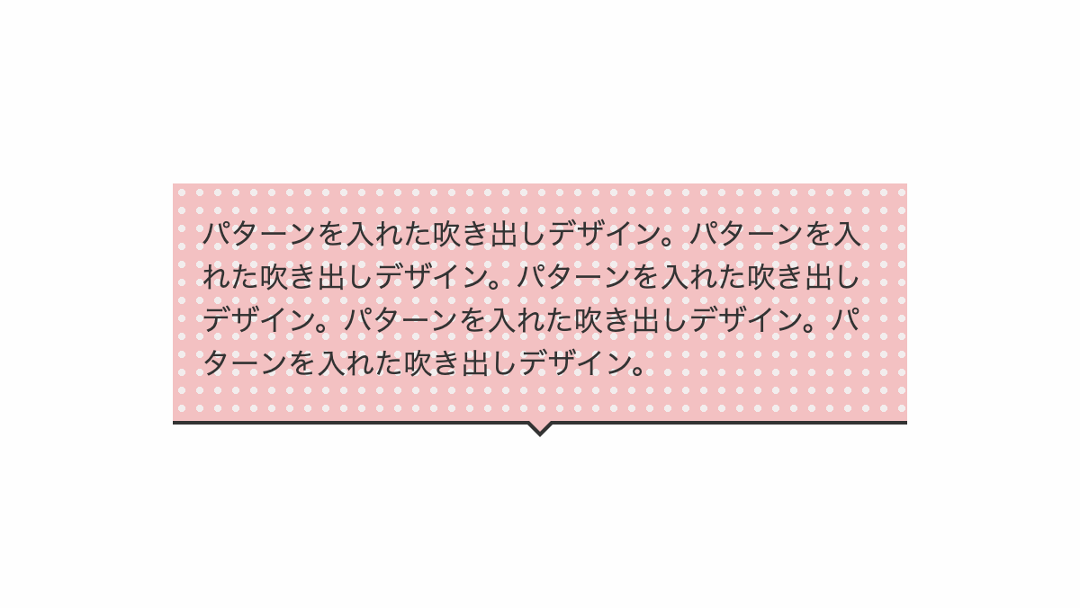
before,after疑似要素の「border」で吹出口を作っています
コードを表示
<div class="box">
    <p>パターンを入れた吹き出しデザイン。パターンを入れた吹き出しデザイン。パターンを入れた吹き出しデザイン。パターンを入れた吹き出しデザイン。パターンを入れた吹き出しデザイン。</p>
</div>
.box {
    position: relative;
    padding: 1rem 1rem 1.2rem;
    border-bottom: 2px solid #333;
    background:
        radial-gradient(#f2eded 30%, transparent 30%),
        linear-gradient(#F3C1C2 0 100%);
    background-repeat: repeat, no-repeat;
    background-size: 10px 10px, 100% 100%;
}

.box:before,
.box:after {
    position: absolute;
    left: 50%;
    content: "";
    height: 0;
    width: 0;
}

.box:before {
    top: 100%;
    border: 9px solid;
    border-color: transparent;
    border-top-color: #333;
    margin-left: -9px;
}

.box:after {
    top: 99%;
    border: 8px solid;
    border-color: transparent;
    border-top-color: #F3C1C2;
    margin-left: -8px;
}

.box p {
    color: #333;
    line-height: 1.5;
}HTML・CSSのカスタマイズや動作確認ができます
斜めストライプを入れたデザイン
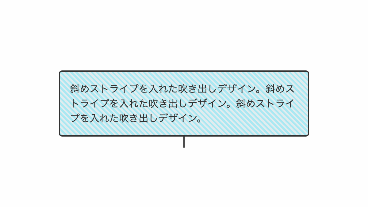
「repeating-linear-gradient」で斜めストライプを入れてます
コードを表示
<div class="box">
    <p>斜めストライプを入れた吹き出しデザイン。斜めストライプを入れた吹き出しデザイン。斜めストライプを入れた吹き出しデザイン。</p>
</div>
.box {
    position: relative;
    padding: 1rem;
    border-radius: 5px;
    border: 2px solid #333;
    background: repeating-linear-gradient(45deg, #aAE8F2 0 3px, #e1ecef 3px 6px);
    color: #333;
}

.box::before {
    position: absolute;
    top: 100%;
    left: 50%;
    transform: translateX(-50%);
    height: 20px;
    width: 2px;
    background-color: #333;
    content: "";
}

.box p {
    line-height: 1.5;
}HTML・CSSのカスタマイズや動作確認ができます
グリッドパターンを入れたデザイン
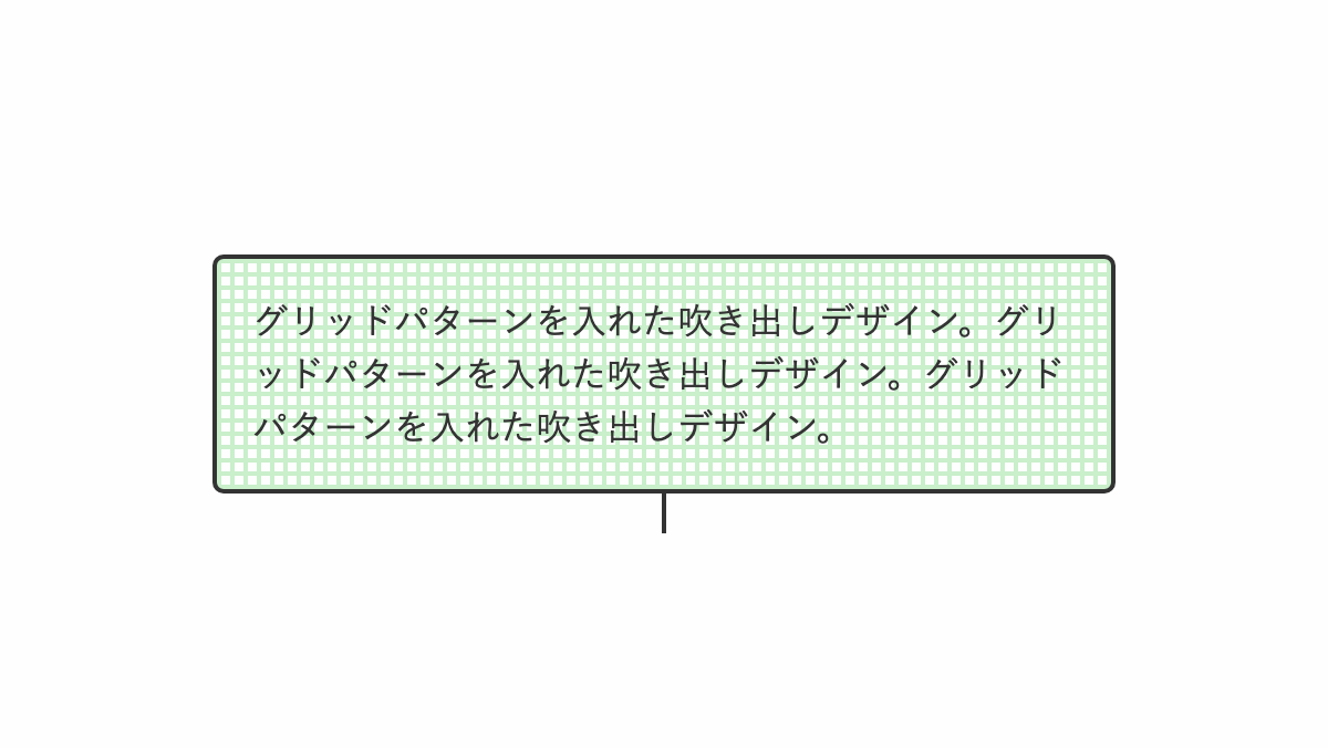
「repeating-linear-gradient」でグリッドパターンを入れてます
コードを表示
<div class="box">
    <p>グリッドパターンを入れた吹き出しデザイン。グリッドパターンを入れた吹き出しデザイン。グリッドパターンを入れた吹き出しデザイン。</p>
</div>
.box {
    position: relative;
    padding: 1rem;
    border-radius: 5px;
    border: 2px solid #333;
    background: repeating-linear-gradient(#c9efcb 0 2px, transparent 2px 6px),
        repeating-linear-gradient(90deg, #c9efcb 0 2px, transparent 2px 6px);
    color: #333;
}

.box::before {
    position: absolute;
    top: 100%;
    left: 50%;
    transform: translateX(-50%);
    height: 20px;
    width: 2px;
    background-color: #333;
    content: "";
}

.box p {
    line-height: 1.5;
}HTML・CSSのカスタマイズや動作確認ができます
市松模様を入れたデザイン
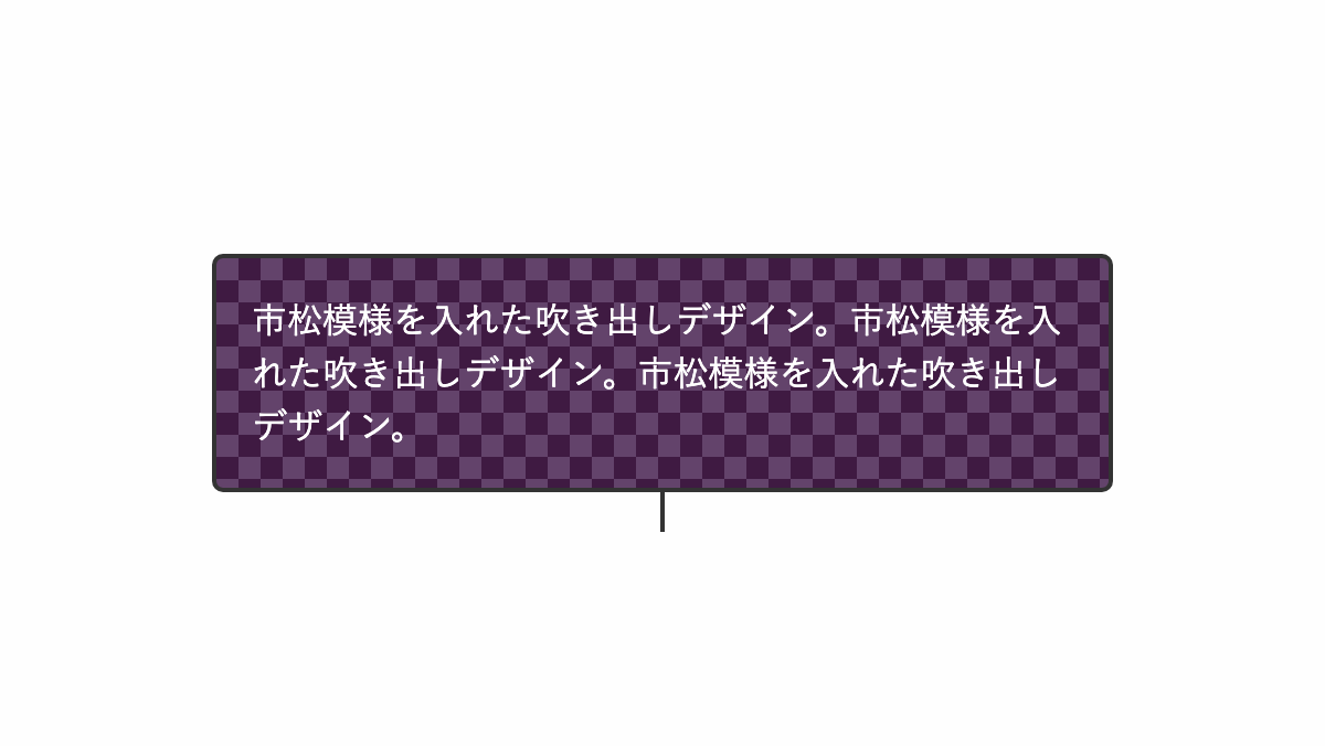
「linear-gradient」で市松模様を入れてます
コードを表示
<div class="box">
    <p>市松模様を入れた吹き出しデザイン。市松模様を入れた吹き出しデザイン。市松模様を入れた吹き出しデザイン。</p>
</div>
.box {
    position: relative;
    padding: 1rem;
    border-radius: 5px;
    border: 2px solid #333;
    background: linear-gradient(45deg, #3f1a42 25%, transparent 25%, transparent 75%, #3f1a42 75%),
        linear-gradient(45deg, #3f1a42 25%, #63436b 25%, #63436b 75%, #3f1a42 75%);
    background-position: 0 0, 10px 10px;
    background-size: 20px 20px;
    color: #333;
}

.box::before {
    position: absolute;
    top: 100%;
    left: 50%;
    transform: translateX(-50%);
    height: 20px;
    width: 2px;
    background-color: #333;
    content: "";
}

.box p {
    color: white;
    line-height: 1.5;
}HTML・CSSのカスタマイズや動作確認ができます
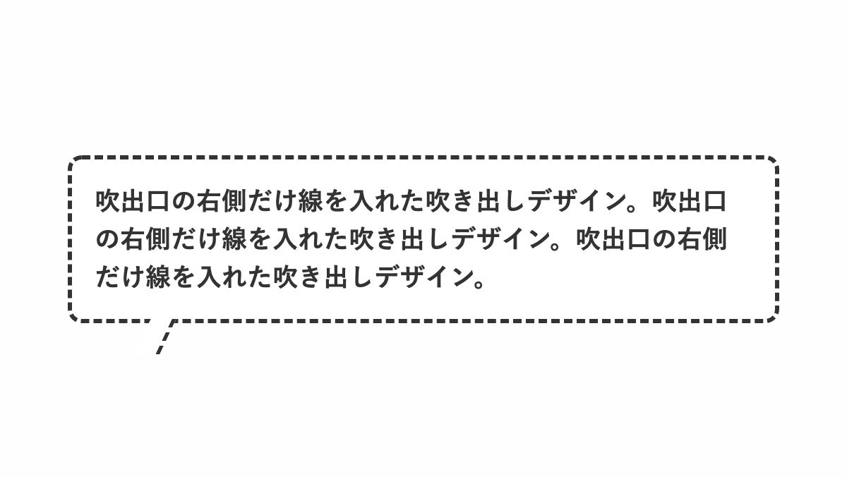
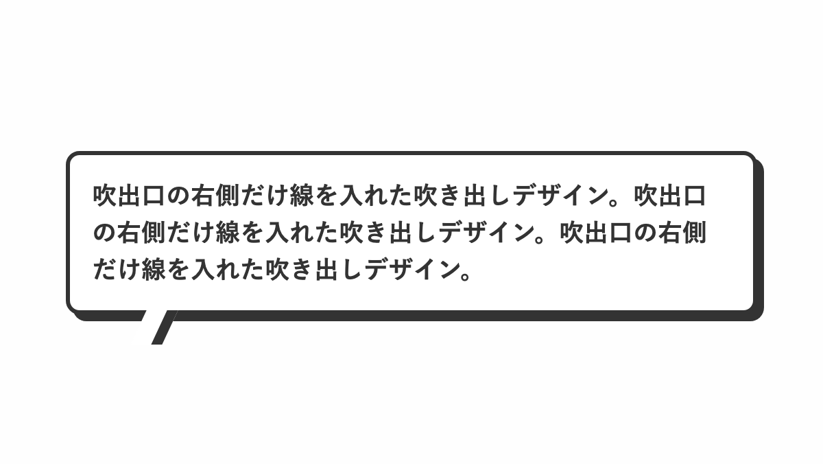
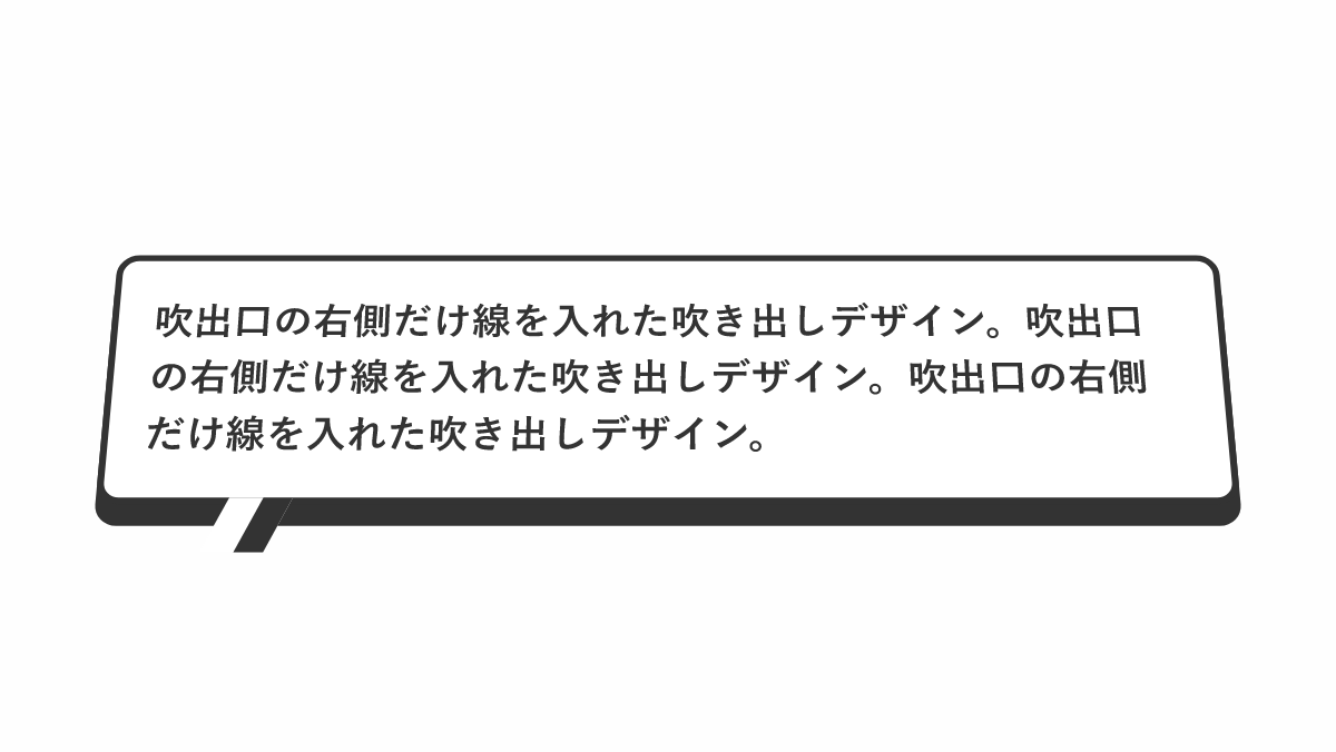
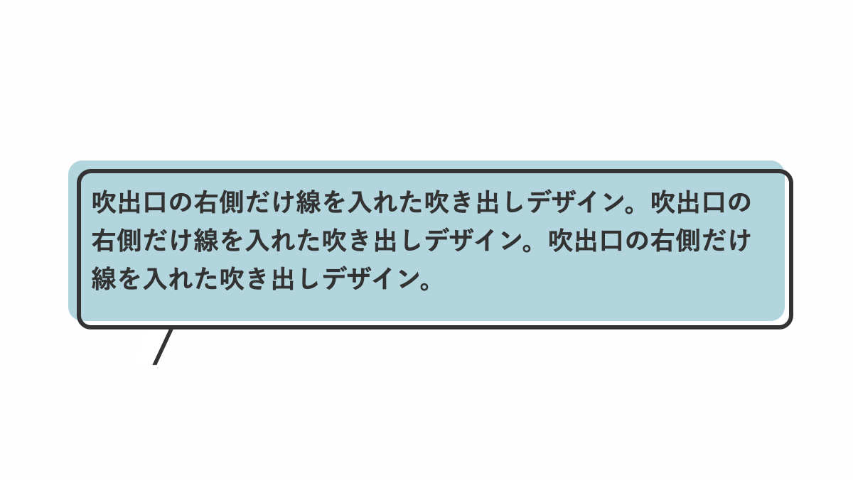
吹出口の右側だけ線を入れたデザイン
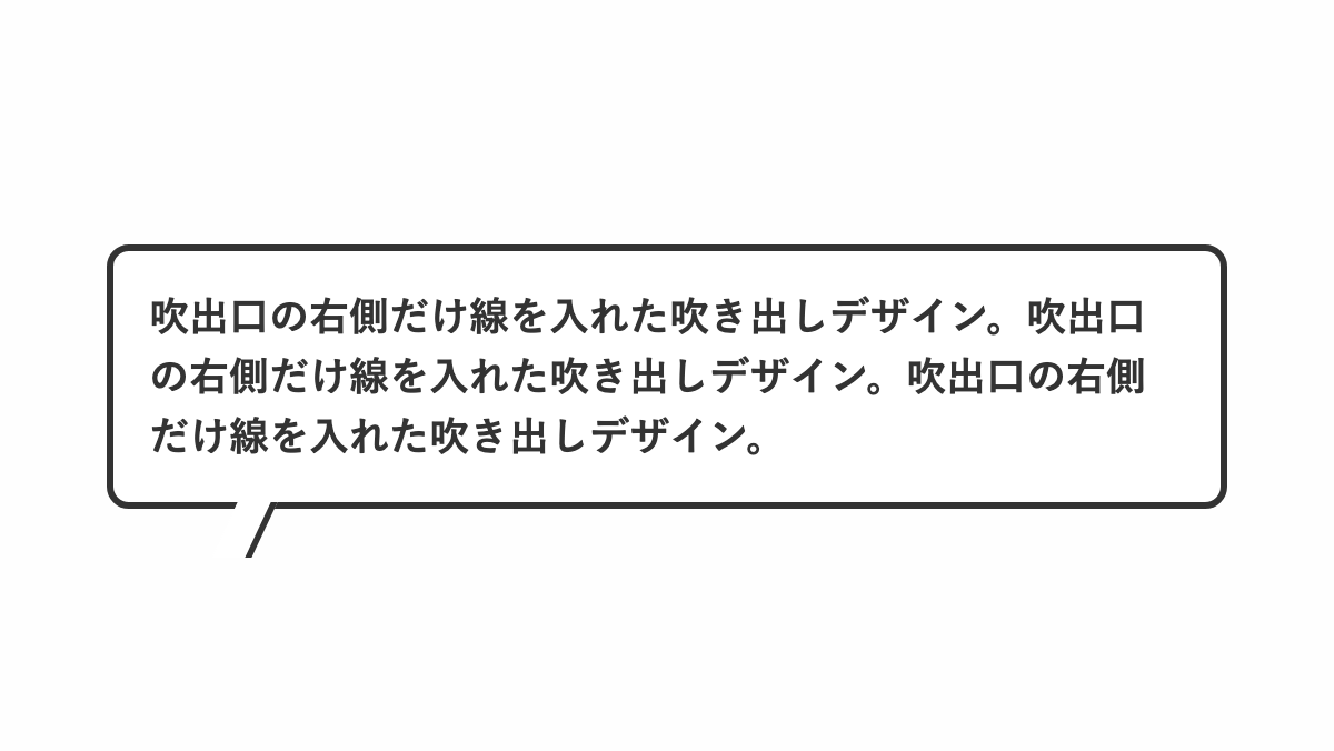
before疑似要素で「skew」を指定し線を斜めに、「border-right」で右側だけ実線を入れてます
コードを表示
<div class="box">
    <p>吹出口の右側だけ線を入れた吹き出しデザイン。吹出口の右側だけ線を入れた吹き出しデザイン。吹出口の右側だけ線を入れた吹き出しデザイン。</p>
</div>
.box {
    position: relative;
    padding: 1rem;
    border-radius: 10px;
    border: 3px solid #333;
    background-color: #fff;
    color: #333;
    font-weight: bold;
    font-size: 18px;
}

.box:before {
    position: absolute;
    top: 100%;
    left: 50px;
    transform: skew(-25deg);
    height: 25px;
    width: 15px;
    border-right: 3px solid #333;
    background-color: #fff;
    content: "";
}

.box p {
    line-height: 1.5;
}HTML・CSSのカスタマイズや動作確認ができます
破線にしたデザイン
「border」プロパティで「dashed」を指定してます
コードを表示
<div class="box">
    <p>吹出口の右側だけ線を入れた吹き出しデザイン。吹出口の右側だけ線を入れた吹き出しデザイン。吹出口の右側だけ線を入れた吹き出しデザイン。</p>
</div>
.box {
    position: relative;
    padding: 1rem;
    border-radius: 10px;
    border: 3px dashed #333;
    background-color: #fff;
    color: #333;
    font-weight: bold;
    font-size: 18px;
}

.box:before {
    position: absolute;
    top: 100%;
    left: 50px;
    transform: skew(-25deg);
    height: 25px;
    width: 15px;
    border-right: 3px dashed #333;
    background-color: #fff;
    content: "";
}

.box p {
    line-height: 1.5;
}HTML・CSSのカスタマイズや動作確認ができます
影を入れたデザイン
「box-shadow」で影を入れてます
コードを表示
<div class="box">
    <p>吹出口の右側だけ線を入れた吹き出しデザイン。吹出口の右側だけ線を入れた吹き出しデザイン。吹出口の右側だけ線を入れた吹き出しデザイン。</p>
</div>
.box {
    position: relative;
    padding: 1rem;
    border-radius: 10px;
    border: 3px solid #333;
    box-shadow: 5px 5px 0px #333;
    background-color: #fff;
    color: #333;
    font-weight: bold;
    font-size: 18px;
}

.box:before {
    position: absolute;
    top: 100%;
    left: 50px;
    transform: skew(-25deg);
    height: 25px;
    width: 15px;
    border-right: 8px solid #333;
    background-color: #fff;
    content: "";
}

.box p {
    line-height: 1.5;
}HTML・CSSのカスタマイズや動作確認ができます
水平軸を基点に20度回転させたデザイン
「rotateX」関数で水平軸をを基点に回転させてます
コードを表示
<div class="box">
    <p>吹出口の右側だけ線を入れた吹き出しデザイン。吹出口の右側だけ線を入れた吹き出しデザイン。吹出口の右側だけ線を入れた吹き出しデザイン。</p>
</div>
.box {
    position: relative;
    padding: 1rem;
    border-radius: 10px;
    border: 3px solid #333;
    transform: perspective(1000px) rotateX(20deg);
    box-shadow: 0px 10px 0px #333;
    background-color: #fff;
    color: #333;
    font-weight: bold;
    font-size: 18px;
}

.box:before {
    position: absolute;
    top: 100%;
    left: 50px;
    transform: skew(-25deg);
    height: 25px;
    width: 15px;
    border-right: 13px solid #333;
    background-color: #fff;
    content: "";
}

.box p {
    line-height: 1.5;
}HTML・CSSのカスタマイズや動作確認ができます
要素をずらしたデザイン
before疑似要素で「top」「left」を指定し境界線をずらしてます
コードを表示
<div class="box">
    <p>吹出口の右側だけ線を入れた吹き出しデザイン。吹出口の右側だけ線を入れた吹き出しデザイン。吹出口の右側だけ線を入れた吹き出しデザイン。</p>
</div>
.box {
    position: relative;
    padding: 1rem;
    border-radius: 10px;
    border: 1px solid #359bf0;
    background-color: #73b7ef;
    color: #333;
    font-weight: bold;
    font-size: 18px;
}

.box:before {
    position: absolute;
    top: 3px;
    left: 3px;
    width: 100%;
    height: 100%;
    border-radius: 10px;
    border: 3px solid #333;
    content: "";
}

.box:after {
    position: absolute;
    bottom: -31px;
    left: 50px;
    transform: skew(-25deg);
    height: 25px;
    width: 15px;
    border-right: 3px solid #333;
    background-color: #fff;
    content: "";
}

.box p {
    line-height: 1.5;
}HTML・CSSのカスタマイズや動作確認ができます
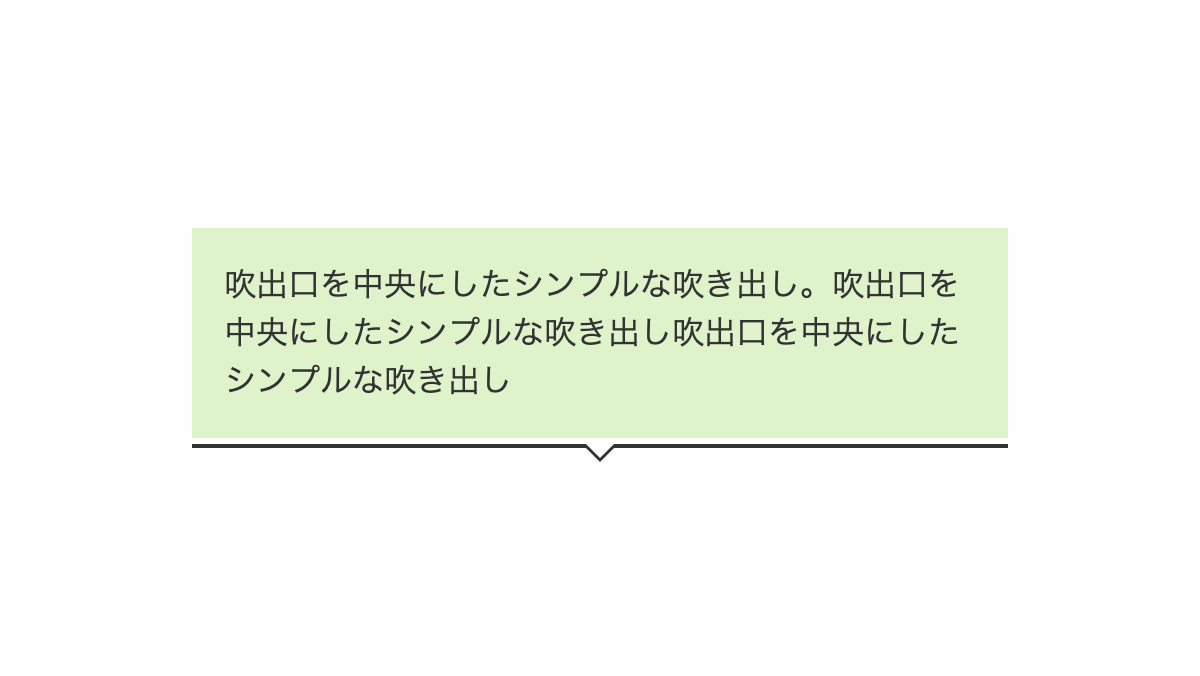
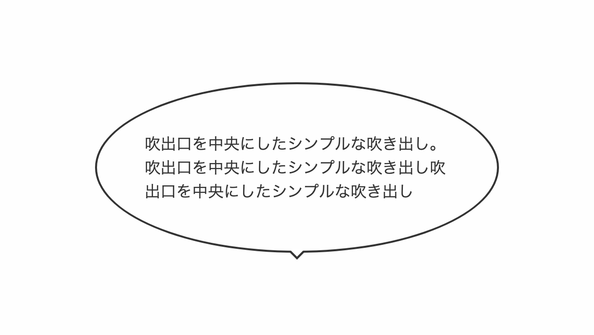
吹出口を中央にしたデザイン
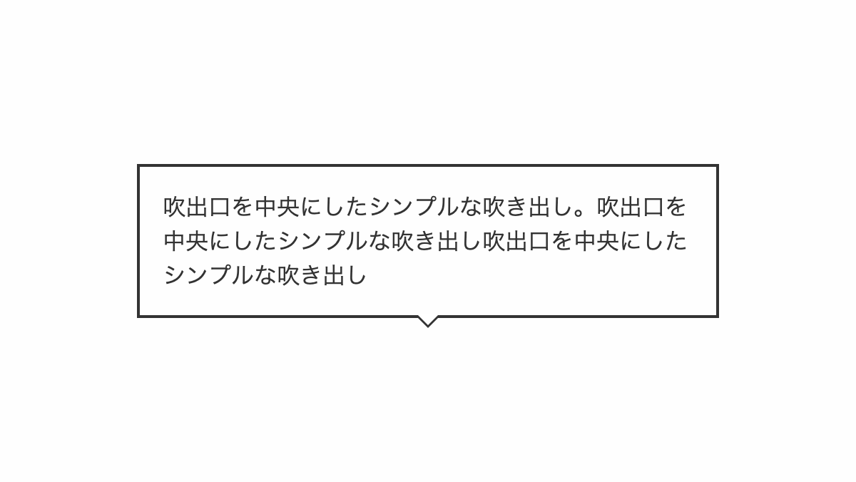
before,after疑似要素の「border」で吹出口を作っています
コードを表示
<div class="box">
    <p>吹出口を中央にしたシンプルな吹き出し。吹出口を中央にしたシンプルな吹き出し吹出口を中央にしたシンプルな吹き出し</p>
</div>
.box {
    position: relative;
    padding: 1rem;
    border: 2px solid #333;
}

.box:before,
.box:after {
    position: absolute;
    left: 50%;
    content: "";
    height: 0;
    width: 0;
}

.box:before {
    top: 100%;
    border: 9px solid;
    border-color: transparent;
    border-top-color: #333;
    margin-left: -9px;
}

.box:after {
    top: 99%;
    border: 8px solid;
    border-color: transparent;
    border-top-color: white;
    margin-left: -8px;
}

.box p {
    color: #333;
    line-height: 1.5;
}HTML・CSSのカスタマイズや動作確認ができます
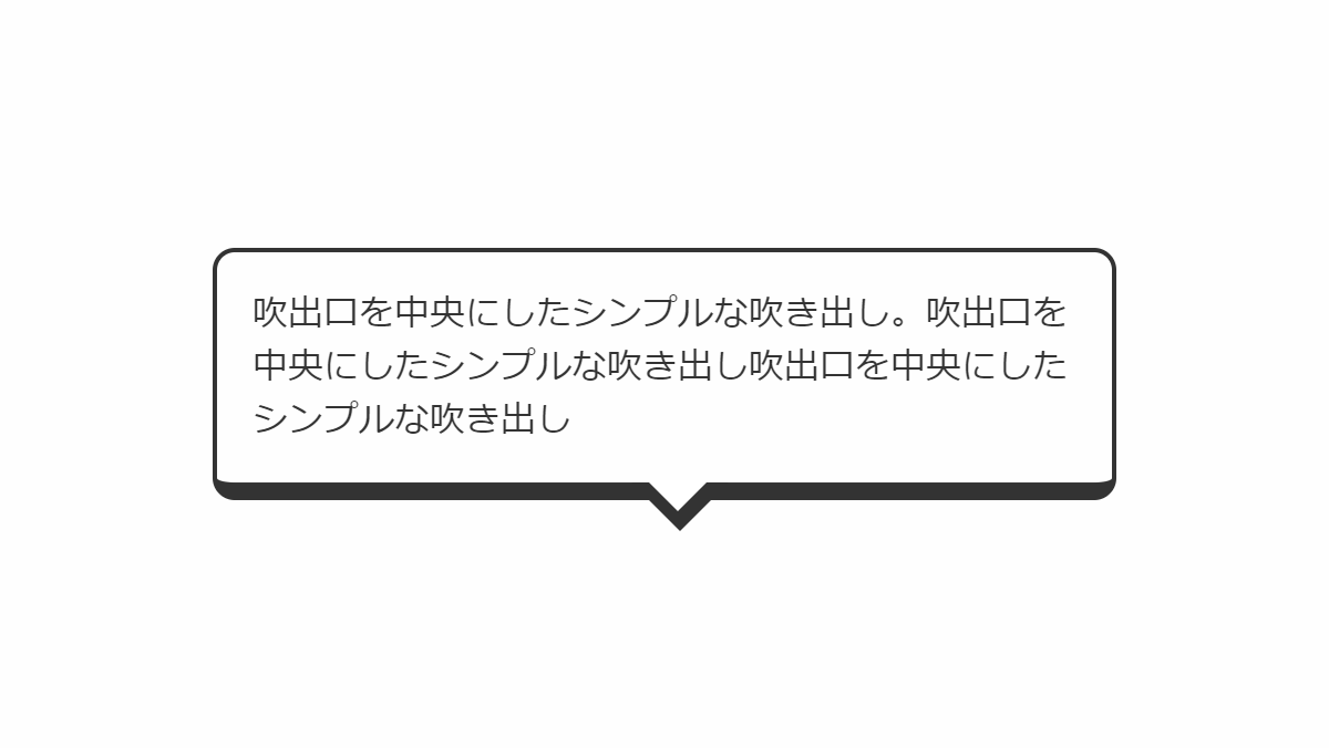
角丸にしたシンプルなデザイン
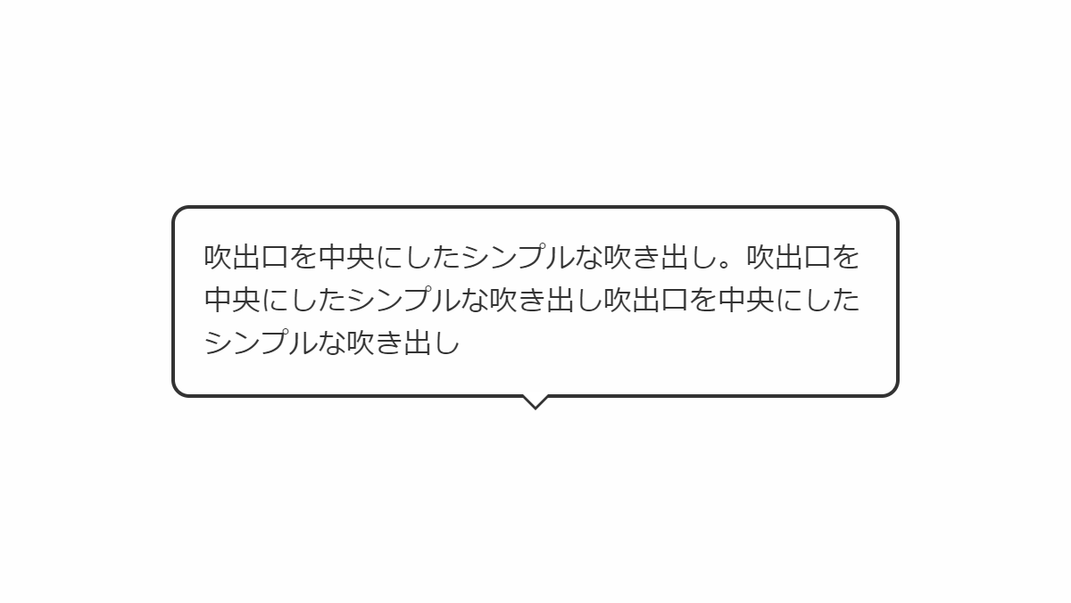
before,after疑似要素の「border」で吹出口を作っています
コードを表示
<div class="box">
    <p>吹出口を中央にしたシンプルな吹き出し。吹出口を中央にしたシンプルな吹き出し吹出口を中央にしたシンプルな吹き出し</p>
</div>
.box {
    position: relative;
    padding: 1rem;
    border-radius: 10px;
    border: 2px solid #333;
}

.box:before,
.box:after {
    position: absolute;
    left: 50%;
    content: "";
    height: 0;
    width: 0;
}

.box:before {
    top: 100%;
    border: 9px solid;
    border-color: transparent;
    border-top-color: #333;
    margin-left: -9px;
}

.box:after {
    top: 99%;
    border: 8px solid;
    border-color: transparent;
    border-top-color: white;
    margin-left: -8px;
}

.box p {
    color: #333;
    line-height: 1.5;
}HTML・CSSのカスタマイズや動作確認ができます
上下に線を引いたシンプルなデザイン
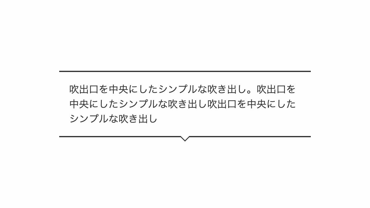
before,after疑似要素の「border」で吹出口を作っています
コードを表示
<div class="box">
    <p>吹出口を中央にしたシンプルな吹き出し。吹出口を中央にしたシンプルな吹き出し吹出口を中央にしたシンプルな吹き出し</p>
</div>
.box {
    position: relative;
    padding: 1rem;
    border-top: 2px solid #333;
    border-bottom: 2px solid #333;
}

.box:before,
.box:after {
    position: absolute;
    left: 50%;
    content: "";
    height: 0;
    width: 0;
}

.box:before {
    top: 100%;
    border: 9px solid;
    border-color: transparent;
    border-top-color: #333;
    margin-left: -9px;
}

.box:after {
    top: 99%;
    border: 8px solid;
    border-color: transparent;
    border-top-color: white;
    margin-left: -8px;
}

.box p {
    color: #333;
    line-height: 1.5;
}HTML・CSSのカスタマイズや動作確認ができます
下線を引いたシンプルなデザイン
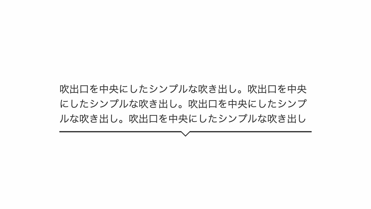
before,after疑似要素の「border」で吹出口を作っています
コードを表示
<div class="box">
    <p>吹出口を中央にしたシンプルな吹き出し。吹出口を中央にしたシンプルな吹き出し。吹出口を中央にしたシンプルな吹き出し。吹出口を中央にしたシンプルな吹き出し</p>
</div>
.box {
    position: relative;
    padding: 0.5rem 0;
    border-bottom: 2px solid #333;
}

.box:before,
.box:after {
    position: absolute;
    left: 50%;
    content: "";
    height: 0;
    width: 0;
}

.box:before {
    top: 100%;
    border: 9px solid;
    border-color: transparent;
    border-top-color: #333;
    margin-left: -9px;
}

.box:after {
    top: 99%;
    border: 8px solid;
    border-color: transparent;
    border-top-color: white;
    margin-left: -8px;
}

.box p {
    color: #333;
    line-height: 1.5;
}HTML・CSSのカスタマイズや動作確認ができます
円形にしたシンプルなデザイン
before,after疑似要素の「border」で吹出口を作っています
コードを表示
<div class="box">
    <p>吹出口を中央にしたシンプルな吹き出し。吹出口を中央にしたシンプルな吹き出し吹出口を中央にしたシンプルな吹き出し</p>
</div>
.box {
    position: relative;
    padding: 3rem;
    border-radius: 50%;
    border: 2px solid #333;
}

.box:before,
.box:after {
    position: absolute;
    left: 50%;
    content: "";
    height: 0;
    width: 0;
}

.box:before {
    top: 100%;
    border: 9px solid;
    border-color: transparent;
    border-top-color: #333;
    margin-left: -9px;
}

.box:after {
    top: 99%;
    border: 8px solid;
    border-color: transparent;
    border-top-color: white;
    margin-left: -8px;
}

.box p {
    color: #333;
    line-height: 1.5;
}HTML・CSSのカスタマイズや動作確認ができます
破線にしたシンプルなデザイン
before,after疑似要素の「border」で吹出口を作っています
コードを表示
<div class="box">
    <p>吹出口を中央にしたシンプルな吹き出し。吹出口を中央にしたシンプルな吹き出し吹出口を中央にしたシンプルな吹き出し</p>
</div>
.box {
    position: relative;
    padding: 1rem;
    border-radius: 10px;
    border: 2px dashed #333;
}

.box:before,
.box:after {
    position: absolute;
    left: 50%;
    content: "";
    height: 0;
    width: 0;
}

.box:before {
    top: 100%;
    border: 9px solid;
    border-color: transparent;
    border-top-color: #333;
    margin-left: -9px;
}

.box:after {
    top: 99%;
    border: 8px solid;
    border-color: transparent;
    border-top-color: white;
    margin-left: -8px;
}

.box p {
    color: #333;
    line-height: 1.5;
}HTML・CSSのカスタマイズや動作確認ができます
下側に影を入れたデザイン
before,after疑似要素の「border」で吹出口を作っています
コードを表示
<div class="box">
    <p>吹出口を中央にしたシンプルな吹き出し。吹出口を中央にしたシンプルな吹き出し吹出口を中央にしたシンプルな吹き出し</p>
</div>
.box {
    position: relative;
    padding: 1rem;
    border-radius: 10px;
    border: 2px solid #333;
    border-bottom: 8px solid #333;
}

.box:before,
.box:after {
    position: absolute;
    left: 50%;
    content: "";
    height: 0;
    width: 0;
}

.box:before {
    top: 100%;
    border: 22px solid;
    border-color: transparent;
    border-top-color: #333;
    margin-left: -15px;
}

.box:after {
    top: 99%;
    border: 14px solid;
    border-color: transparent;
    border-top-color: white;
    margin-left: -8px;
}

.box p {
    color: #333;
    line-height: 1.5;
}HTML・CSSのカスタマイズや動作確認ができます


