
before、after疑似要素で「skew」関数を使用し立体感のあるボタンを作りました。高さ、幅を調整して奥行きを作り、クリック時に値を小さくすることで、押し込めるよう実装しています。
3Dボタンの作り方
フラットボタンを作る
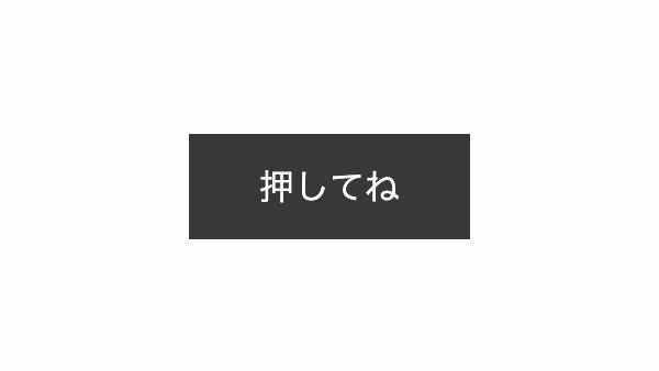
「background-color」で背景を黒くしたフラットボタンを配置します。
<a href="#!" class="btn-solid">押してね</a>
.btn-solid {
    position: relative;
    margin: 0.5rem;
    padding: 1rem 2rem;
    background-color: #383838;
    color: #fff;
    text-decoration: none;
    transition: all 0.5s;
}
立体感を出す
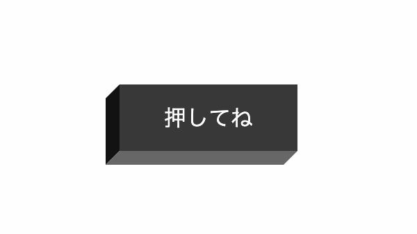
before,after疑似要素の「transform: skew」で要素を平行四辺形に変形し、立体的にしています。before疑似要素で左側、after疑似要素で下側の幅高さを調整し奥行きを「10px」に設定。
.btn-solid::before,.btn-solid::after {
    position: absolute;
    transition: all 0.5s;
    content: '';
}

.btn-solid::before {
    top: 5px;
    left: -10px;
    width: 10px;
    height: 100%;
    background-color: #121212;
    transform: skewY(-45deg);
}
.btn-solid::after {
    left: -5px;
    bottom: -10px;
    width: 100%;
    height: 10px;
    background-color: #676767;
    transform: skewX(-45deg);
}
ボタンを押し込めるようにする
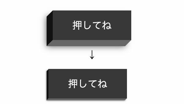
ボタンアクティブ時(クリック時)に「translate」でボタンの位置を左下に7px移動し、before,after疑似要素で奥行きを3pxに変更。ホバー時に薄い影を入れてます。
.btn-solid:active {
  transform: translate(-7px,7px);
  box-shadow: -3px 3px 3px rgba(0, 0, 0, .7);
}
.btn-solid:active::before {
  top: 2px;
  left: -3px;
  width: 3px;
}
.btn-solid:active::after {
  left: -2px;
  bottom: -3px;
  height: 3px;
}
.btn-solid:hover {
  box-shadow: -10px 10px 10px rgba(0, 0, 0, .7);
}
全てのソースとデモ
コードを表示
<a href="#!" class="btn-solid">
    CSSボタン
</a>
.btn-solid {
    position: relative;
    margin: 0.5rem;
    padding: 1rem 2rem;
    background-color: #383838;
    color: #fff;
    text-decoration: none;
    transition: all 0.5s;
}

.btn-solid::before,
.btn-solid::after {
    position: absolute;
    transition: all 0.5s;
    content: '';
}

.btn-solid::before {
    top: 5px;
    left: -10px;
    width: 10px;
    height: 100%;
    background-color: #121212;
    transform: skewY(-45deg);
}

.btn-solid::after {
    left: -5px;
    bottom: -10px;
    width: 100%;
    height: 10px;
    background-color: #676767;
    transform: skewX(-45deg);
}

.btn-solid:hover {
    box-shadow: -10px 10px 10px rgba(0, 0, 0, .7);
}

.btn-solid:active {
    transform: translate(-7px, 7px);
    box-shadow: -3px 3px 3px rgba(0, 0, 0, .7);
}

.btn-solid:active::before {
    top: 2px;
    left: -3px;
    width: 3px;
}

.btn-solid:active::after {
    left: -2px;
    bottom: -3px;
    height: 3px;
}3Dソーシャルボタン
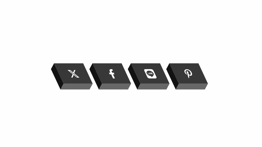
「skew」関数でボタンを傾斜。before、after疑似要素で左、下側に影を入れてます。ホバー時「translate」で上に移動、クリック時で配置を変え押し込んだようにしています。
コードを表示
<a href="#!" class="btn-sns btn-twitter">
    <i class="fab fa-twitter"></i>
</a>
<a href="#!" class="btn-sns btn-facebook">
    <i class="fab fa-facebook-f"></i>
</a>
<a href="#!" class="btn-sns btn-pinterest">
    <i class="fab fa-pinterest-p"></i>
</a>
.btn-sns {
    display: grid;
    place-items: center;
    position: relative;
    margin: 0.5rem;
    width: 50px;
    height: 35px;
    background-color: #383838;
    color: #fff;
    transform: skew(25deg);
    text-decoration: none;
    transition: all 0.5s;
}

.btn-sns::before,
.btn-sns::after {
    position: absolute;
    transition: all 0.5s;
    content: '';
}

.btn-sns::before {
    top: 5px;
    left: -10px;
    width: 10px;
    height: 100%;
    background-color: #121212;
    transform: skewY(-45deg);
}

.btn-sns::after {
    left: -5px;
    bottom: -10px;
    width: 100%;
    height: 10px;
    background-color: #676767;
    transform: skewX(-45deg);
}

.btn-sns:hover {
    transform: skew(25deg) translateY(-5px);
}

.btn-twitter:hover {
    background-color: #359BF0;
}

.btn-facebook:hover {
    background-color: #4064AC;
}

.btn-pinterest:hover {
    background-color: #B83026;
}

.btn-sns:active {
    transform: skew(25deg) translate(-7px, 7px);
    box-shadow: -3px 3px 3px rgba(0, 0, 0, .7);
}

.btn-sns:active::before {
    top: 2px;
    left: -3px;
    width: 3px;
}

.btn-sns:active::after {
    left: -2px;
    bottom: -3px;
    height: 3px;
}HTML・CSSのカスタマイズや動作確認ができます


