
今回は要素を透過し上下、左右に線入れる方法を紹介します。
以下「outline」「border」「linear-gradient」を使用して要素から少し離した枠線を引いてます。
ファーストビューなど画像の上に文字を入れる場合などにオススメです。
「outline」で隙間を作る

「outline」で実線を引き「outline-offset」で0.3rem隙間を空ける。「height: 100%;」で上下の線を消してます。
  <div class="box">
      <h1>左右に線を引いた枠を配置</h1>
      <p>CSSで作るタイトル</p>
  </div>
.box {
    display: flex;
    justify-content: center;
    align-items: center;
    flex-direction: column;
    padding: 0 2rem;
    outline: 0.5rem solid rgba(30, 19, 15, .6);
    outline-offset: 0.3rem;
    background-color: rgba(30, 19, 15, .6);
    text-align: center;
    height: 100%;
    line-height: 1.5;
    color: white;
}
全てのコード
コードを表示
<div class="pic-container pic-background">
    <div class="box">
        <h1>左右に線を引いた枠を配置</h1>
        <p>CSSで作るタイトル</p>
    </div>
</div>
.pic-background {
background-image: var(--pic-image-data, none);
background-size: cover;
background-position: center;
}
.pic-container {
position: relative;
display: flex;
justify-content: center;
align-items: center;
width: 100vw;
height: 100vh;
background-color: #fefefe;
box-sizing: border-box;
z-index: 0;
}
.box {
display: flex;
justify-content: center;
align-items: center;
flex-direction: column;
padding: 0 2rem;
outline: 0.5rem solid rgba(30, 19, 15, .6);
outline-offset: 0.3rem;
background-color: rgba(30, 19, 15, .6);
text-align: center;
height: 100%;
line-height: 1.5;
color: white;
}
.box h1 {
margin-bottom: 0.5rem;
font-size: 26px;
font-weight: bold;
}
このWEBパーツを確認する
HTML・CSSのカスタマイズや動作確認ができます
「before」疑似要素で隙間を作る
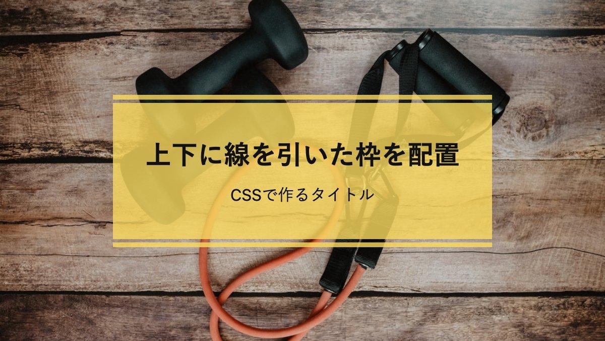
before疑似要素で「top: -0.5rem;」「bottom:-0.5rem;」を指定し上下に隙間を空け、「border-top,bottom」で線を引いてます
 .box {
    position: relative;
    padding: 2rem;
    background-color: rgba(252, 219, 95, .8);
    text-align: center;
    line-height: 1.5;
    color: #111;
}
.box::before {
    position: absolute;
    top: -0.5rem;
    bottom: -0.5rem;
    left: 0;
    width: 100%;
    border-top: 0.3rem solid rgba(252, 219, 95, .8);
    border-bottom: 0.3rem solid rgba(252, 219, 95, .8);
    content: '';
}
全てのコード
コードを表示
<div class="pic-container pic-background">
    <div class="box">
        <h1>上下に線を引いた枠を配置</h1>
        <p>CSSで作るタイトル</p>
    </div>
</div>
.pic-background {
background-image: var(--pic-image-data, none);
background-size: cover;
background-position: center;
}
.pic-container {
position: relative;
display: flex;
justify-content: center;
align-items: center;
width: 100vw;
height: 100vh;
background-color: #fefefe;
box-sizing: border-box;
z-index: 0;
}
.box {
position: relative;
padding: 2rem;
background-color: rgba(252, 219, 95, .8);
text-align: center;
line-height: 1.5;
color: #111;
}
.box::before {
position: absolute;
top: -0.5rem;
bottom: -0.5rem;
left: 0;
width: 100%;
border-top: 0.3rem solid rgba(252, 219, 95, .8);
border-bottom: 0.3rem solid rgba(252, 219, 95, .8);
content: '';
}
.box h1 {
margin-bottom: 0.5rem;
font-size: 26px;
font-weight: bold;
}
このWEBパーツを確認する
HTML・CSSのカスタマイズや動作確認ができます
「linear-gradient」で隙間を作る
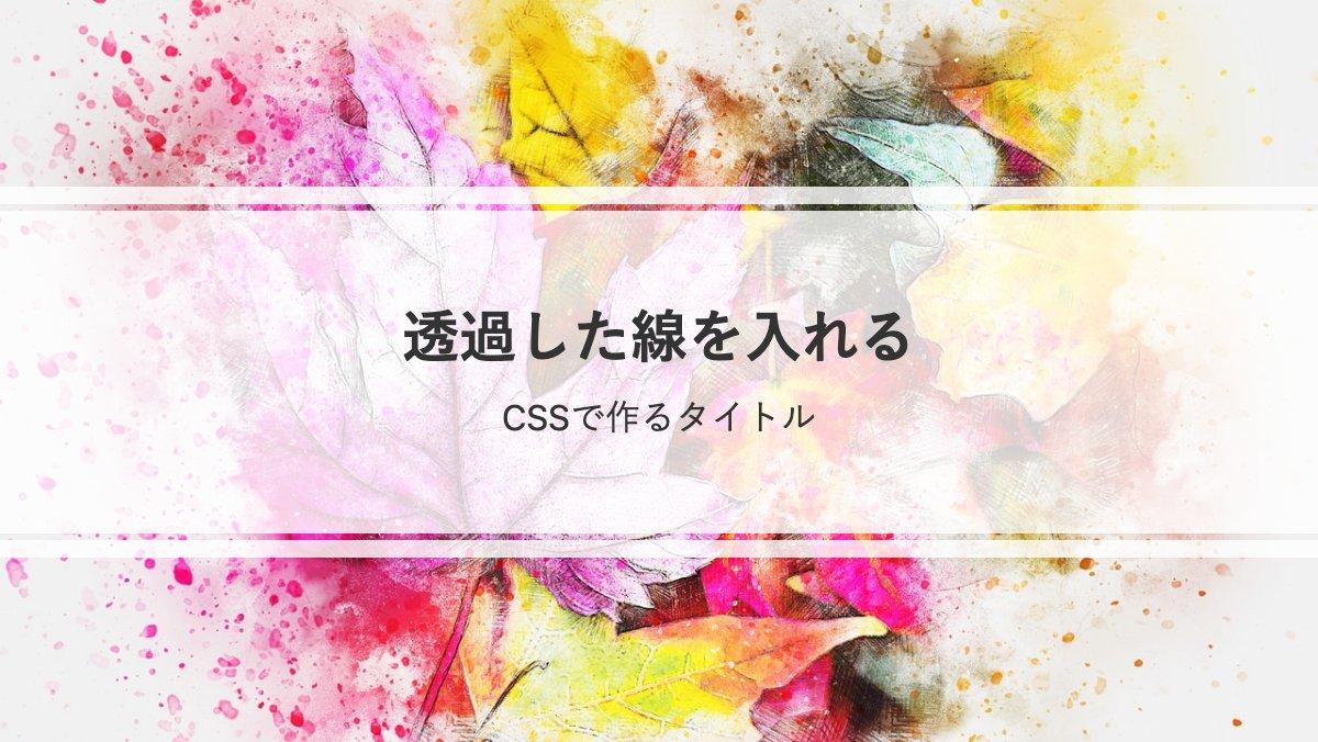
「linear-gradient」で上から下方向に白、透過、白(中央)、透過、白で色分けし境界線の間に隙間を作ってます。
.box {
  --bg-color: rgb(255, 255, 255, .8);
  display: flex;
  justify-content: center;
  align-items: center;
  flex-direction: column;
  background-image: linear-gradient(
          var(--bg-color) 0 0.5rem,
          transparent 0.5rem 0.7rem,
          var(--bg-color) 0.7rem calc(100% - 0.7rem),
          transparent calc(100% - 0.7rem) calc(100% - 0.5rem),
          var(--bg-color) calc(100% - 0.5rem));
  width: 100%;
  height: 50%;
}
全てのコード
コードを表示
<div class="pic-container pic-background">
    <div class="box">
        <h1>透過した線を入れる</h1>
        <p>CSSで作るタイトル</p>
    </div>
</div>
.pic-background {
background-image: var(--pic-image-data, none);
background-size: cover;
background-position: center;
}
.pic-container {
position: relative;
display: flex;
justify-content: center;
align-items: center;
width: 600px;
height: 338px;
background-color: #fefefe;
box-sizing: border-box;
z-index: 0;
}
.box {
--bg-color: rgb(255, 255, 255, .8);
display: flex;
justify-content: center;
align-items: center;
flex-direction: column;
background-image: linear-gradient(var(--bg-color) 0 0.5rem,
transparent 0.5rem 0.7rem,
var(--bg-color) 0.7rem calc(100% - 0.7rem),
transparent calc(100% - 0.7rem) calc(100% - 0.5rem),
var(--bg-color) calc(100% - 0.5rem));
width: 100%;
height: 50%;
}
h1 {
margin-bottom: 1rem;
color: #333;
font-size: 26px;
font-weight: bold;
}
p {
color: #333;
}
このWEBパーツを確認する
HTML・CSSのカスタマイズや動作確認ができます


