
iOSの設定画面などでよく見るスイッチ風トグルボタン。今回はチェックボックスを使用してスイッチ風にする方法を解説します。
標準のチェックボックスを消す
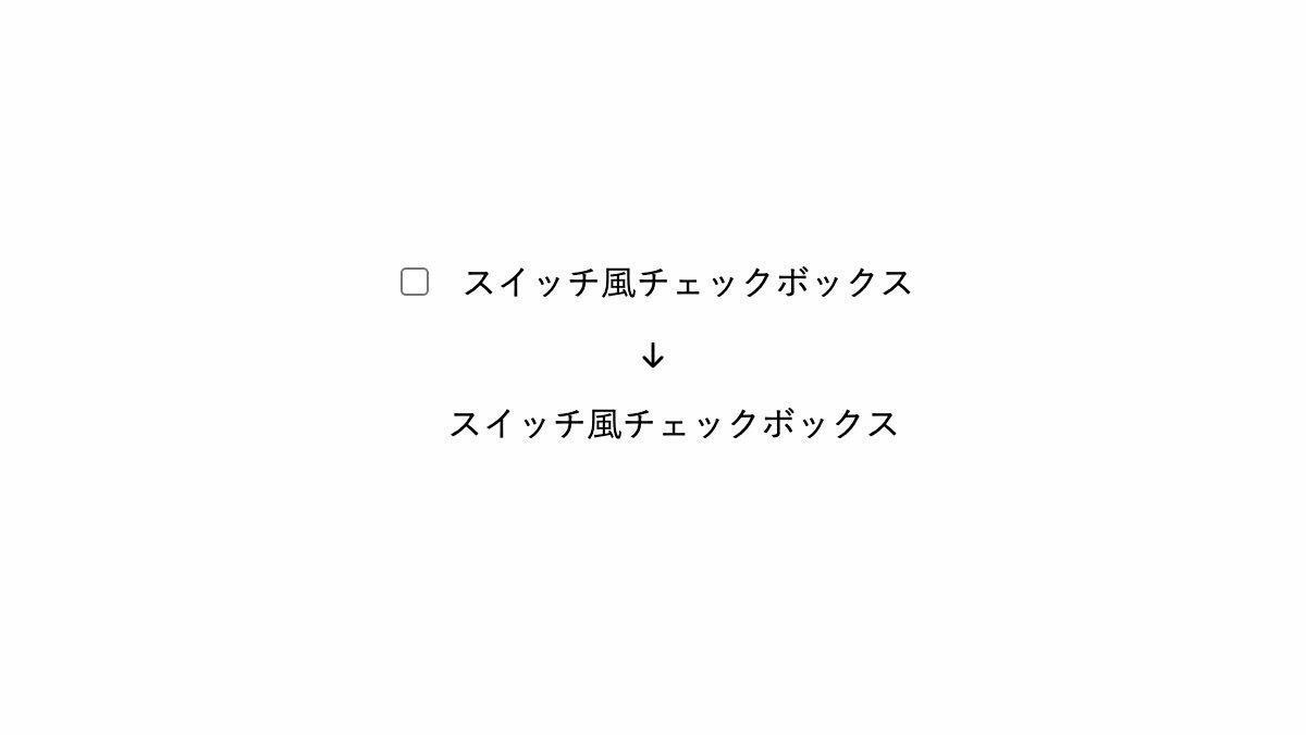
「appearance: none;」でデフォルトのスタイルを無効にし、標準のチェックボックスを消します
<div class="switch-checkbox">
  <input type="checkbox" id="switch-check-1">
  <label for="switch-check-1">スイッチ..</label>
</div>
.switch-checkbox input[type=checkbox] {
    -webkit-appearance: none;
    -moz-appearance: none;
    appearance: none;
}
スイッチ風にする
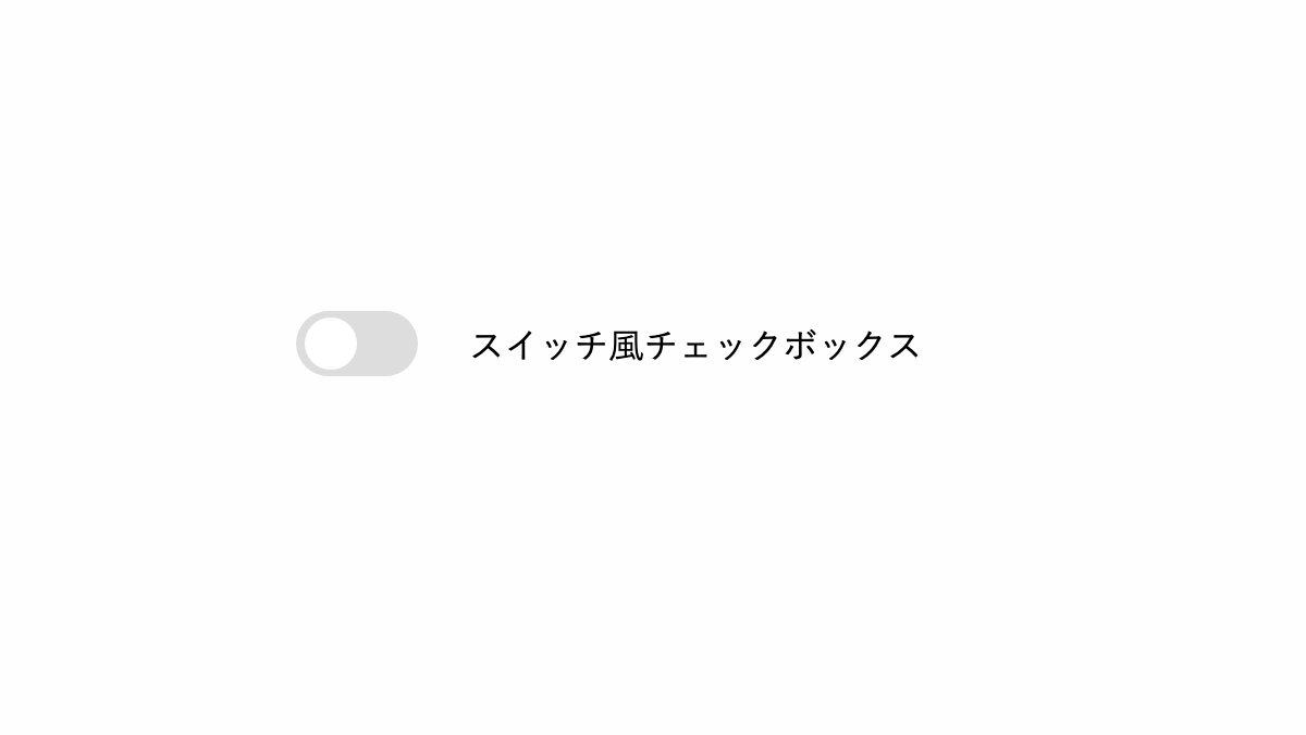
「input[type=checkbox]」でスイッチが移動する背面の枠を作り、before疑似要素で「border-radius: 50%;」を指定し円形のスイッチを作っています。
.switch-checkbox input[type=checkbox] {
    position: relative;
    width: 3.5rem; height: 1.9rem;
    margin-top: -0.2rem;
    border-radius: 60px;
    background-color: #ddd;
    appearance: none;
    ...
}
.switch-checkbox input[type=checkbox]::before {
    position: absolute;
    top: .2rem; left: .2rem;
    width: 1.5rem; height: 1.5rem;
    box-sizing: border-box;
    border-radius: 50%;
    background: white;
    content: '';
    transition: .3s ease;
}
スイッチONのスタイルを設定
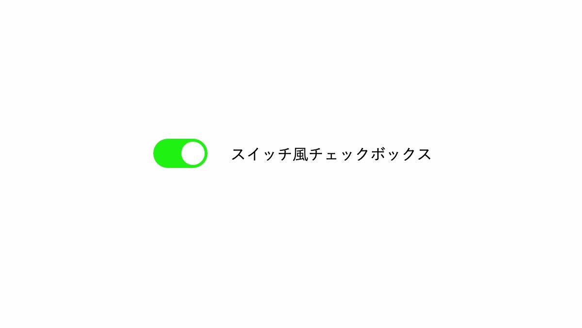
擬似クラス「:checked」でチェックボックスONの場合に背景を緑にし、before疑似要素の「left: 1.8rem;」で丸枠を右にスライドさせてます。
.switch-checkbox input[type=checkbox]:checked {
    background: #1ff210;
}

.switch-checkbox input[type=checkbox]:checked::before {
    left: 1.8rem;
}
全てのソース
コードを表示
<div class="switch-checkbox">
    <input type="checkbox" checked="" id="switch-check-1">
    <label for="switch-check-1">スイッチ風チェックボックス</label>
</div>
.switch-checkbox {
    margin-bottom: 1rem;
}

.switch-checkbox input[type=checkbox] {
    position: relative;
    cursor: pointer;
    width: 3.5rem;
    height: 1.9rem;
    margin-top: -0.2rem;
    border-radius: 60px;
    background-color: #ddd;
    -webkit-appearance: none;
    -moz-appearance: none;
    appearance: none;
    vertical-align: middle;
    transition: .5s;
}

.switch-checkbox input[type=checkbox]::before {
    position: absolute;
    top: .2rem;
    left: .2rem;
    width: 1.5rem;
    height: 1.5rem;
    box-sizing: border-box;
    border-radius: 50%;
    background: white;
    color: black;
    content: '';
    transition: .3s ease;
}

.switch-checkbox input[type=checkbox]:checked {
    background: #1ff210;
}

.switch-checkbox input[type=checkbox]:checked::before {
    left: 1.8rem;
}

.switch-checkbox label {
    margin-left: 1rem;
}HTML・CSSのカスタマイズや動作確認ができます


