
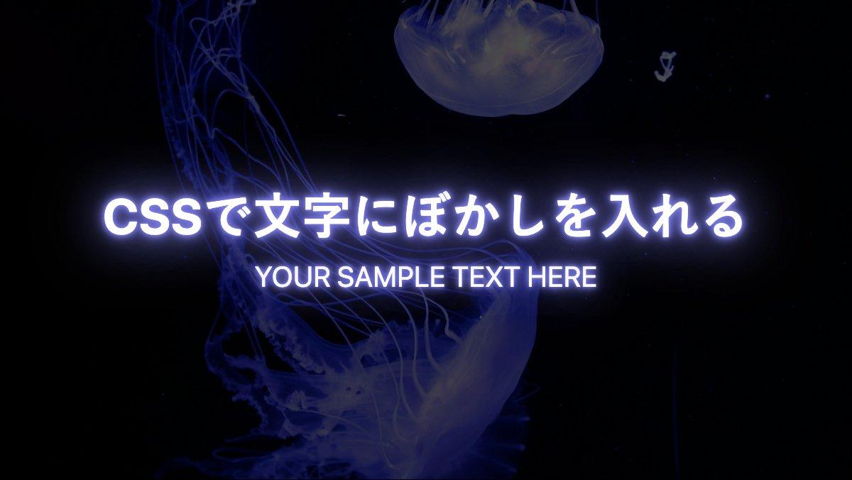
「text-shadow」プロパティを使い色々な影を付けてみました付けてみました。
文字にぼかしを入れネオン風に
h1, p {
    text-shadow:
      0 0 1px #8080ed, 0 0 3px #8080ed,
      0 0 6px #8080ed, 0 0 10px #8080ed,
      0 0 30px #8080ed, 0 0 50px #8080ed;
    color: #fff;
}

h1 {
    margin-bottom: 1rem;
    font-size: 35px;
    font-weight: bold;
}

p {
    font-size: 20px;
    text-transform: uppercase;
}
「text-shadow」でぼかしを徐々に増やしてます
全てのソース
CSS表示
このWEBパーツを確認する
HTML・CSSのカスタマイズや動作確認ができます
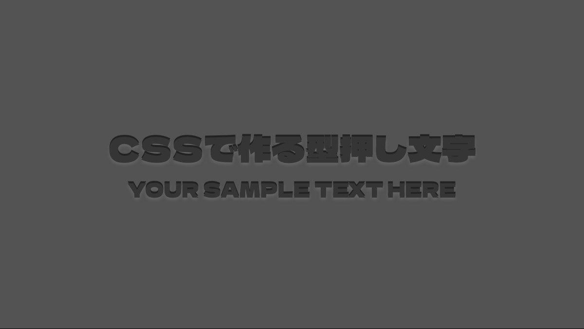
文字を型押し風にする
.container{background-color: #535353;}

h1,p {
    font-family: 'Dela Gothic One';
    color: #353535;
    text-shadow: 0px -2px 0px #333,
                  0px 2px 3px #666;
    font-weight: bold;
}

h1 {
    margin-bottom: 1rem;
    font-size: 35px;
}

p {
    font-size: 20px;
    text-transform: uppercase;
}
「text-shadow」で文字の上側に黒影、下側をぼかして白っぽい影を表示。「background-color: #535353;」で背景をグレーにしています。
全てのソース
CSS表示
.container {
    position: relative;
    display: flex;
    justify-content: center;
    align-items: center;
    flex-direction: column;
    width: 100vw;
    height: 100vh;
    background-image: url(...);
    background-size: cover;
    background-position: center;
    box-sizing: border-box;
    z-index: 0;
}

.container::before {
    position: absolute;
    top: 0;
    left: 0;
    width: 100%;
    height: 100%;
    background: inherit;
    filter: brightness(60%);
    content: '';
    z-index: -1;
}

.container h1 {
    margin-bottom: 1.5rem;
    text-shadow:
        0 1px #EEE,
        0 2px #DDD,
        0 3px #CCC,
        0 4px #BBB,
        0 5px #AAA,
        0 6px #999,
        0 7px #888,
        0 8px #777,
        0 9px #666,
        0 10px #555,
        0 11px #444,
        0 12px #222,
        0 13px #111,
        0 14px 8px #000;
    font-size: 35px;
    font-weight: bold;
    color: #fff;
}

.container p {
    color: #fff;
    font-size: 20px;
    text-transform: uppercase;
}

}
このWEBパーツを確認する
HTML・CSSのカスタマイズや動作確認ができます
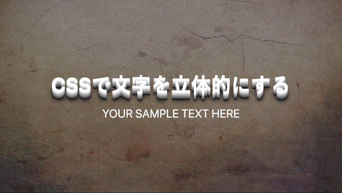
文字を立体的にする
h1 {
    margin-bottom: 1.5rem;
    text-shadow:
        0 1px #EEE, 0 2px #DDD, 0 3px #CCC,
        0 4px #BBB, 0 5px #AAA, 0 6px #999,
        0 7px #888, 0 8px #777, 0 9px #666,
        0 10px #555, 0 11px #444, 0 12px #222,
        0 13px #111, 0 14px 8px #000;
    font-size: 35px;
    font-weight: bold;
    color: #fff;
}

p {
    color: #fff;
    font-size: 20px;
    text-transform: uppercase;
}
「text-shadow」で垂直方向の値を増やし、影のカラーをグレー→黒に色を変え、最後の指定でぼかしを入れてます。
全てのソース
CSS表示
@import url('https://fonts.googleapis.com/css2?family=Dela+Gothic+One&display=swap');


.container {
    display: flex;
    justify-content: center;
    align-items: center;
    flex-direction: column;
    width: 100vw;
    height: 100vh;
    background-image: url(...);
    background-size: cover;
    background-position: center;
    box-sizing: border-box;
    background-color: #535353;
}

.container h1,
.container p {
    font-family: 'Dela Gothic One';
    color: #353535;
    text-shadow: 0px -2px 0px #222,
        0px 2px 3px #666;
    font-weight: bold;
}

.container h1 {
    margin-bottom: 1rem;
    font-size: 35px;
}

.container p {
    font-size: 20px;
    text-transform: uppercase;
}

}
このWEBパーツを確認する
HTML・CSSのカスタマイズや動作確認ができます


