
CSSで背景の枠をずらした見出しデザインを作成しました。
あえて要素をずらすことで新鮮で抜け感のあるデザインになります。
可愛いらしい雰囲気だったり雑記ブログなどあまり堅苦しくないテンプレートの見出しや記事のアイキャッチ画像にご活用ください。
枠をずらした見出し
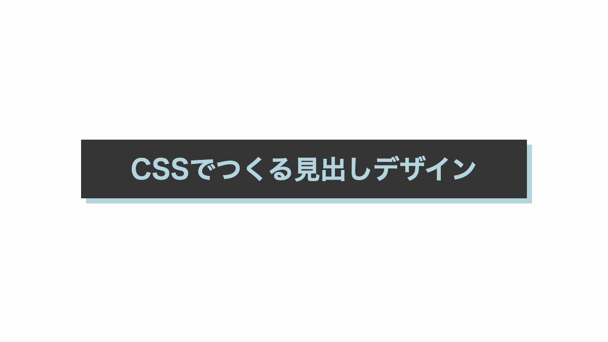
「box-shadow」プロパティを使用し、右下に文字と同色の赤色の枠をずらして表示しています
CSS表示
h2 {
    margin-bottom: 0.2rem;
    padding: 1rem;
    box-shadow: 5px 5px 0 #b2d5de;
    background-color: #353535;
    color: #b2d5de;
    font-weight: bold;
    font-size: 26px;
    text-align: center;
}HTML・CSSのカスタマイズや動作確認ができます
境界線を入れて枠をずらした見出し
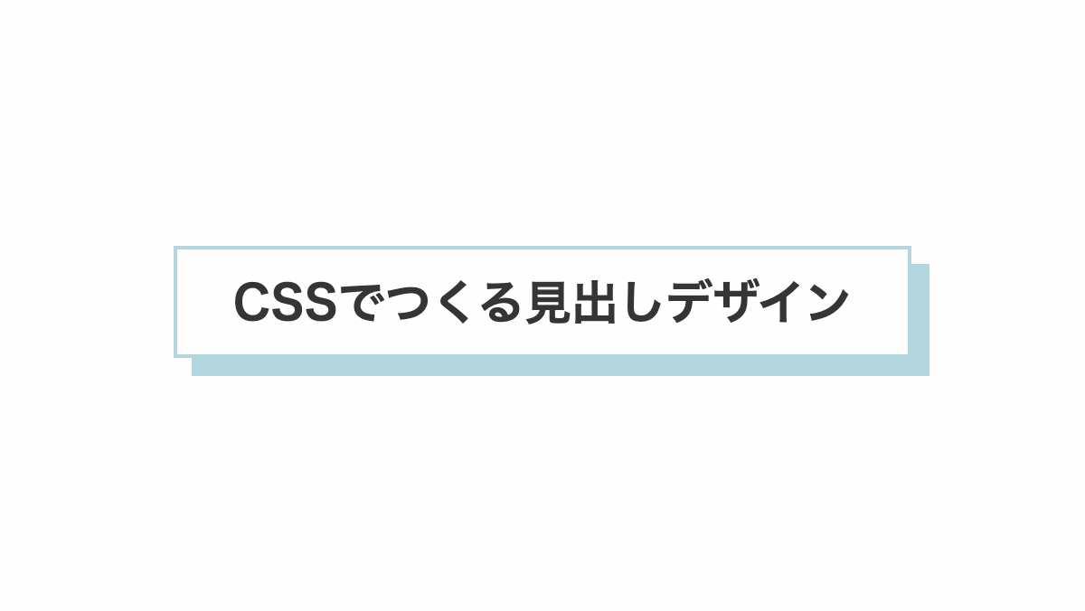
「border」プロパティで境界線を入れ影の色を同色にしたデザインです
CSS表示
:root {
    --accent-color: #b2d5de;
}

h2 {
    margin-bottom: 0.2rem;
    padding: 1rem;
    box-shadow: 10px 10px 0 var(--accent-color);
    border: 2px solid var(--accent-color);
    color: #353535;
    font-weight: bold;
    font-size: 26px;
    text-align: center;
}HTML・CSSのカスタマイズや動作確認ができます
左上にずらした見出し
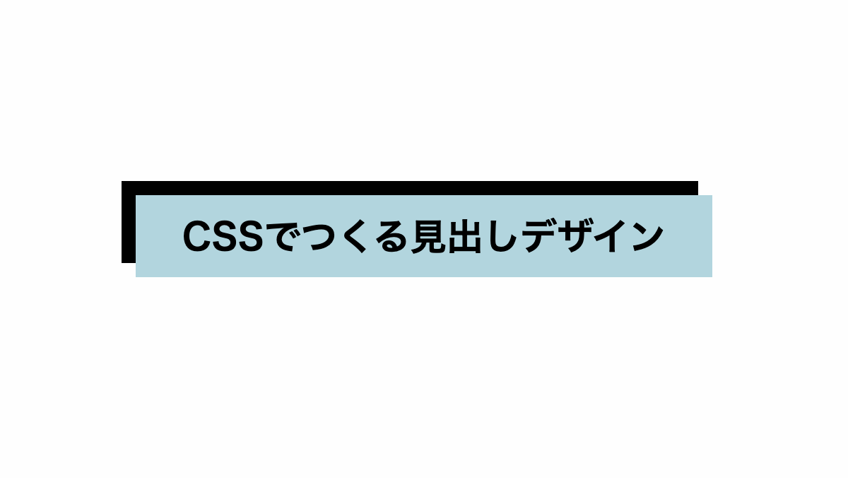
背景を指定せず左上に影をつけました。
CSS表示
h2 {
    margin-bottom: 0.2rem;
    padding: 1rem;
    box-shadow: -10px -10px 0;
    background-color: #b2d5de;
    font-weight: bold;
    font-size: 26px;
    text-align: center;
}HTML・CSSのカスタマイズや動作確認ができます
破線をずらしたCSS見出しデザイン
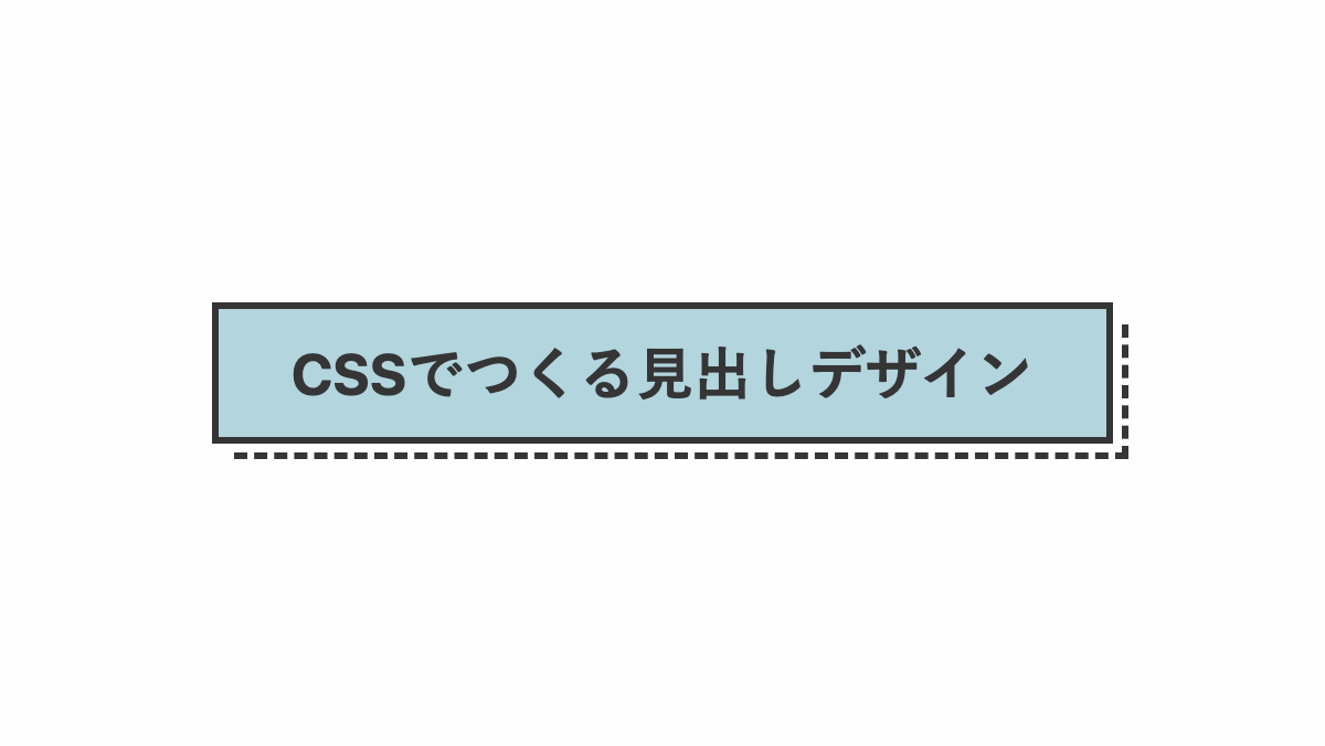
before疑似要素で破線にしてずらしてます。
コードを表示
<h2>CSSでつくる見出しデザイン</h2>
h2 {
    position: relative;
    padding: 1rem 2rem;
    border: 3px solid;
    background-color: #b2d5de;
    color: #353535;
    font-size: 26px;
    font-weight: bold;
    text-align: center;
}

h2::before {
    position: absolute;
    bottom: -10px;
    right: -10px;
    width: 100%;
    height: 100%;
    border-right: 3px dashed;
    border-bottom: 3px dashed;
    transition: .3s;
    content: '';
}HTML・CSSのカスタマイズや動作確認ができます
下側に影を入れたCSS見出しデザイン
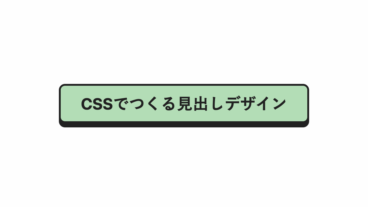
「box-shadow」で影を入れてます
コードを表示
<h2>CSSでつくる見出しデザイン</h2>
h2 {
    padding: 1rem 2rem;
    box-shadow: 0 7px #212121;
    border: 3px solid #212121;
    border-radius: 10px;
    background-color: #b3ddb6;
    color: #212121;
    font-size: 26px;
    font-weight: bold;
    text-align: center;
}HTML・CSSのカスタマイズや動作確認ができます
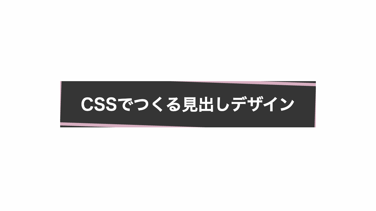
右下に影を入れた見出し
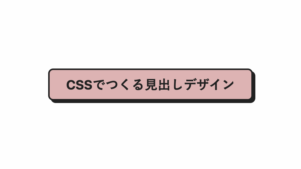
「border-radius」で角丸にし「box-shadow」で影を入れたシンプルな見出し
CSS表示
h2 {
    position: relative;
    padding: 1rem 2rem;
    box-shadow: 5px 5px #212121;
    border: 3px solid #212121;
    border-radius: 10px;
    background-color: #ddb3b3;
    color: #212121;
    font-size: 26px;
    font-weight: bold;
    text-align: center;
}影を境界線にした見出し
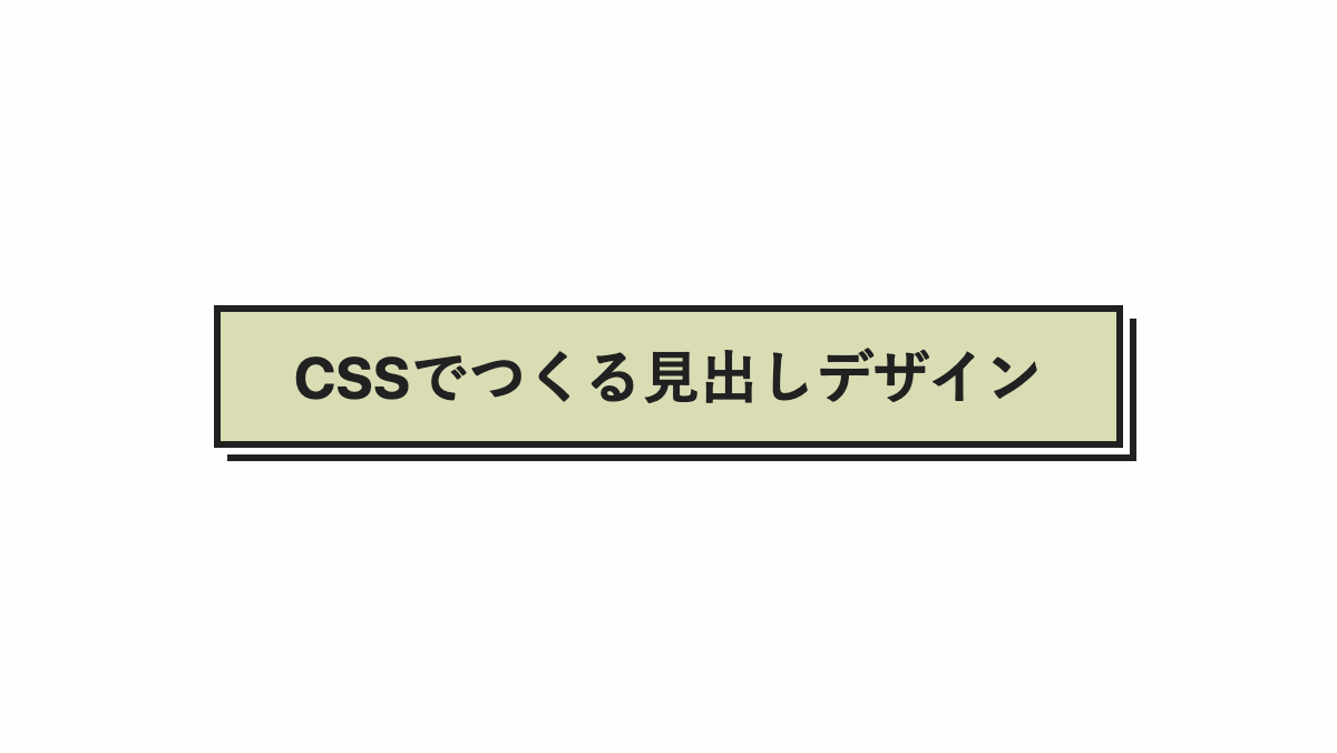
「box-shadow」で影を入れ、「outline」で白くした線を影の上に重ねて境界線を作ってます
CSS表示
h2 {
    position: relative;
    padding: 1rem 2rem;
    box-shadow: 6px 6px #212121;
    outline: 3px solid #fff;
    border: 3px solid #212121;
    background-color: #daddb3;
    color: #212121;
    font-size: 26px;
    font-weight: bold;
    text-align: center;
}
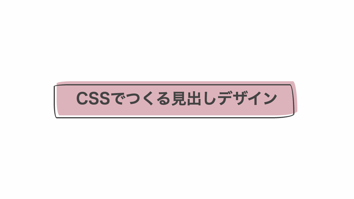
背景をずらしたCSS見出しデザイン
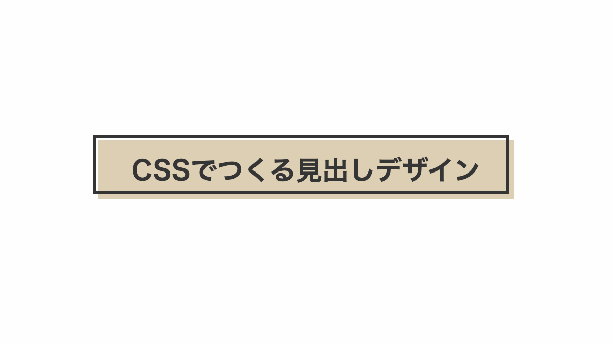
「before」疑似要素で背景をずらしました。 背景カラーは「background-color」プロパティで調整可能です。
コードを表示
<h2>CSSでつくる見出しデザイン</h2>
h2 {
    position: relative;
    margin-bottom: 0.2rem;
    padding: 1rem;
    color: #353535;
    background-color: #ddcfb3;
    font-weight: bold;
    font-size: 26px;
    text-align: center;
}

h2:before {
    position: absolute;
    inset: -5px 5px 5px -5px;
    border: 3px solid #353535;
    content: '';
}HTML・CSSのカスタマイズや動作確認ができます
枠を変形させてずらした見出し
「border-radius」で枠と背景を変形。「before」疑似要素で背景を透過させて「top」「left」でずらしています。
CSS表示
h2 {
    position: relative;
    margin-bottom: 0.2rem;
    padding: 1rem;
    background-color: #f1f1f1;
    color: #434343;
    border-radius: 2em .6em 3em .4em/.3em 4em .6em 2em;
    background-color: #ddb3bb;
    font-size: 26px;
    font-weight: bold;
    text-align: center;
}

h2:before {
    position: absolute;
    inset: 5px 5px -5px -5px;
    border: 2px solid;
    border-radius: 2em .6em 3em .4em/.3em 4em .6em 2em;
    content: '';
}
HTML・CSSのカスタマイズや動作確認ができます
枠線を傾斜させてずらした見出し
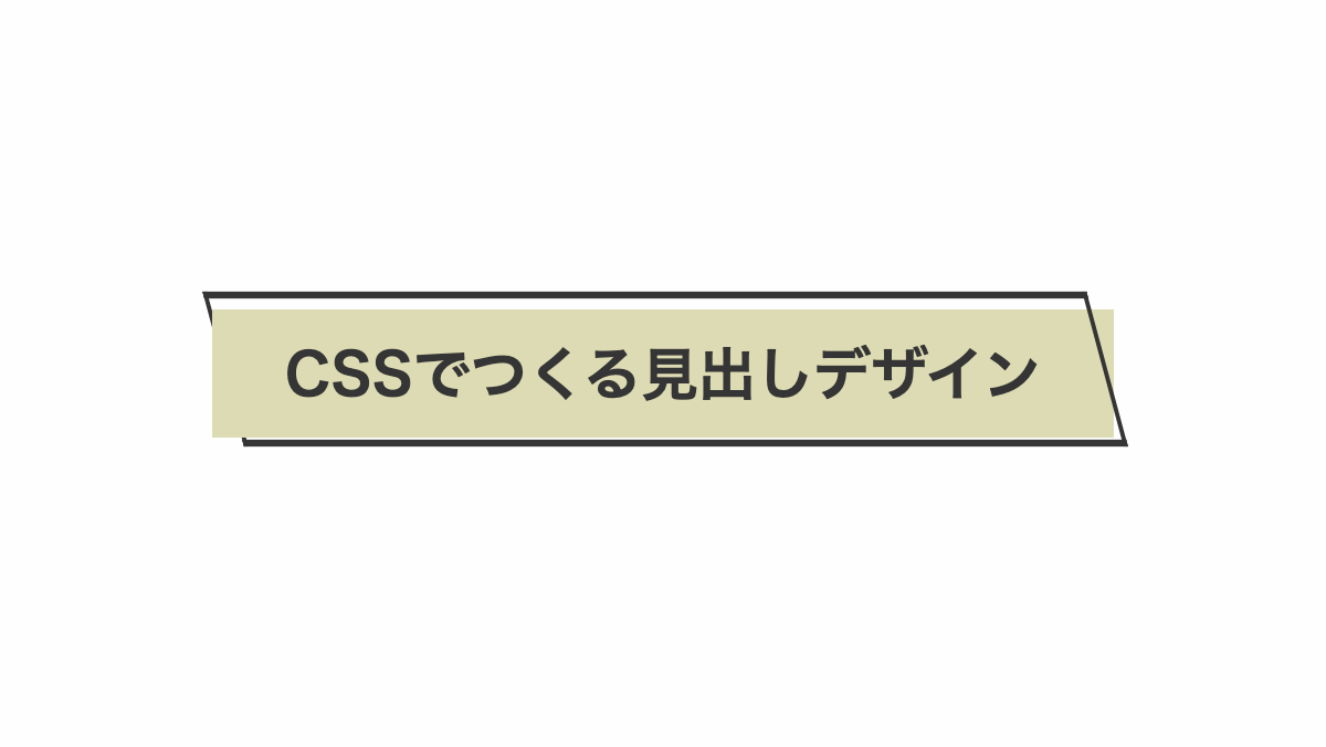
before、after疑似要素に「transform: skew」を指定し背景を枠線にくぐらせたようにしています
CSS表示
:root {
    --accent-color: #dddbb3;
}


h2 {
    position: relative;
    padding: 1rem;
    border-left: 5px solid var(--accent-color);
    border-right: 5px solid var(--accent-color);
    background-color: var(--accent-color);
    color: #353535;
    font-size: 26px;
    font-weight: bold;
    text-align: center;
}


h2::before,
h2::after {
    position: absolute;
    top: -8px;
    left: 0;
    width: 100%;
    height: 110%;
    border-top: 3px solid;
    border-bottom: 3px solid;
    transform: skew(15deg);
    content: '';
}

h2::before {
    border-left: 2px solid;
    z-index: -1;
}

h2::after {
    border-right: 2px solid;
}
枠を回転させてはみ出た部分を隠す
「before」疑似要素で境界線付きの枠をつくる。「transform:rotate」で少し回転。h2セレクタにoverflow:hiddenを指定しはみ出て部分を隠してます。
CSS表示
h2 {
    position: relative;
    padding: 1.5rem 1rem;
    margin-bottom: 0.2rem;
    overflow: hidden;
    background-color: #353535;
    color: white;
    font-weight: bold;
    font-size: 26px;
    text-align: center;
}

h2:before {
    position: absolute;
    top: -4px;
    right: -4px;
    bottom: -4px;
    left: -4px;
    border: 5px solid #d8afc1;
    transform: rotate(2deg);
    content: '';
}
HTML・CSSのカスタマイズや動作確認ができます
ストライプをずらした見出し
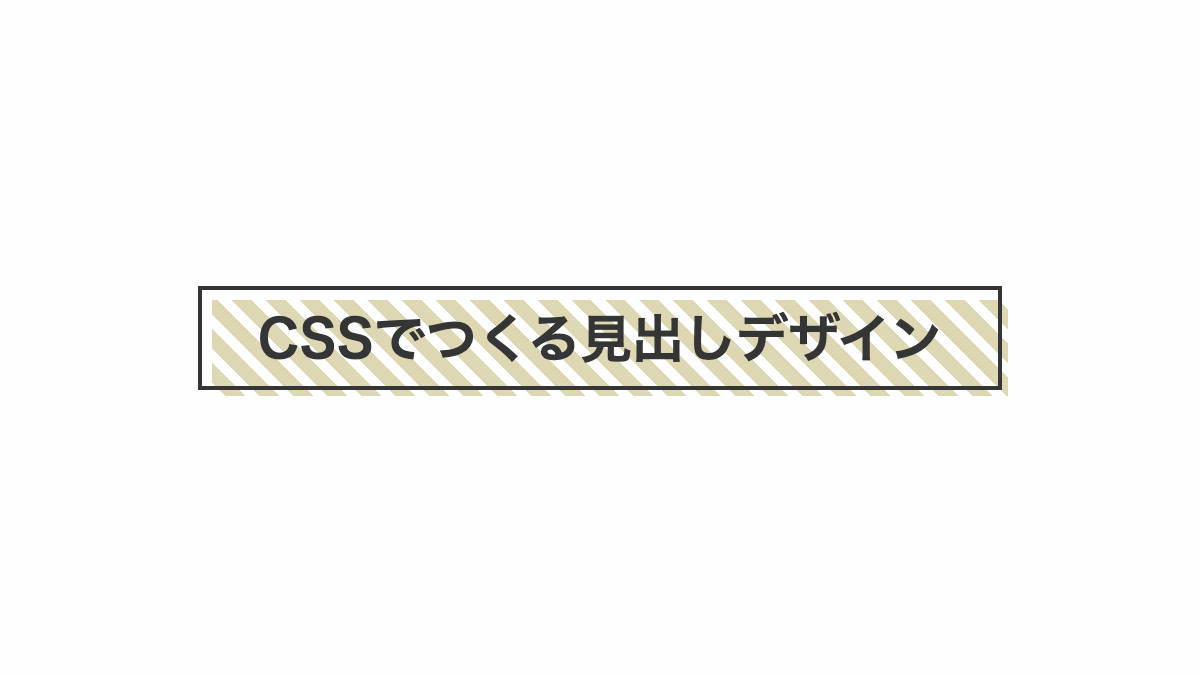
「outline」で実践を引き、「background-position」でストライプをずらしてます
コードを表示
<h2>CSSでつくる見出しデザイン</h2>
h2 {
    position: relative;
    padding: 1rem;
    outline: 2px solid;
    outline-offset: -5px;
    background-image:
        repeating-linear-gradient(45deg, #ddd8b3 0 7px, transparent 7px 12px);
    background-repeat: no-repeat;
    background-position: 10px 10px;
    color: #353535;
    font-size: 26px;
    font-weight: bold;
    text-align: center;
}
HTML・CSSのカスタマイズや動作確認ができます
以上が枠をずらした見出しとなります。「box-shadow」や「before疑似要素」で「border」等を指定するとズレを作ることができるので、ぜひ試してみてください。
以下からCSSを編集してずらした見出しをカスタマイズできます ずらした見出し一覧


