
今回はCSSの「text-shadow」「box-shadow」「疑似要素」を使用し色々なパターンの影を入れた見出しを作成しました。
テキストにロングシャドウ入れた見出しや、要素を浮かしたような影を入れた見出し、3Dやグラデーションをかけたものなど様々なパターンで装飾しました。
お気に入りの見出しがあればブログなどで活用してください。
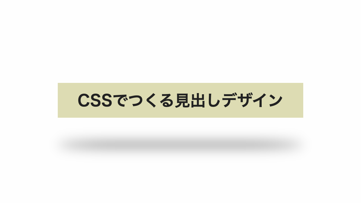
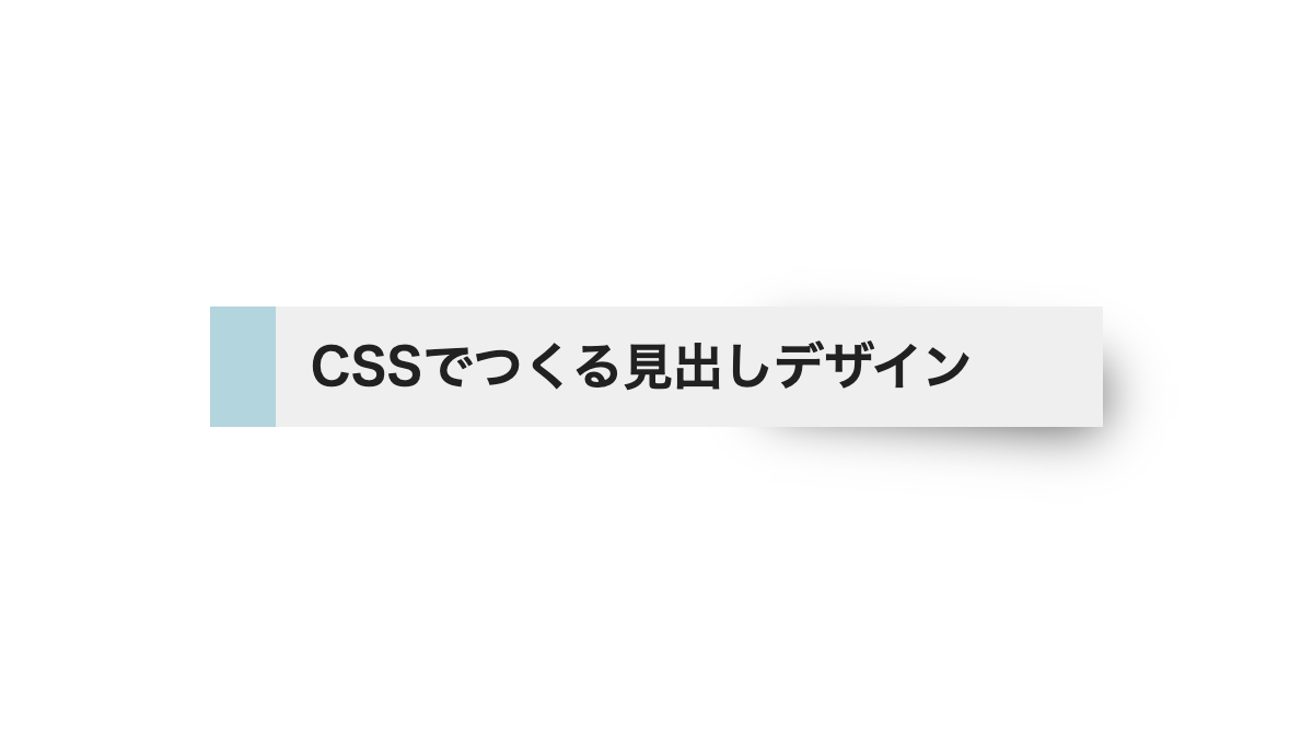
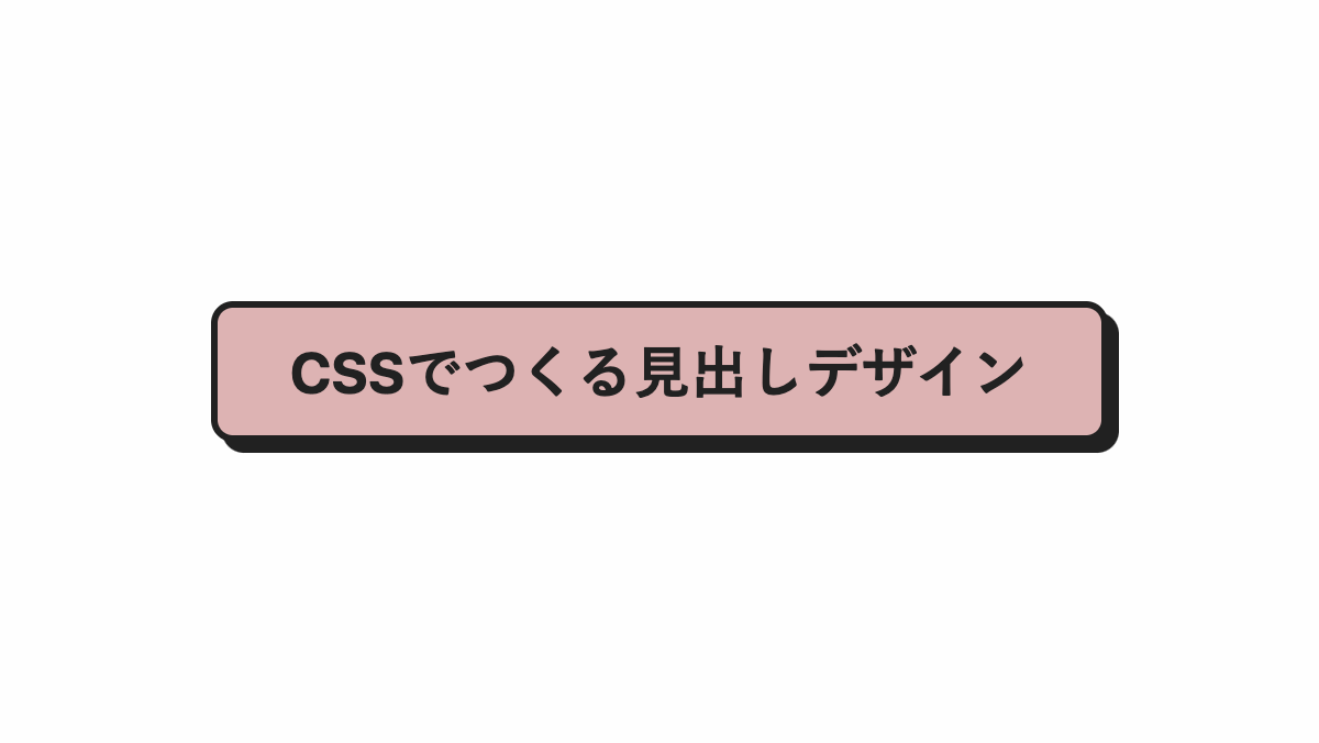
背景を立体的にしたCSS見出し
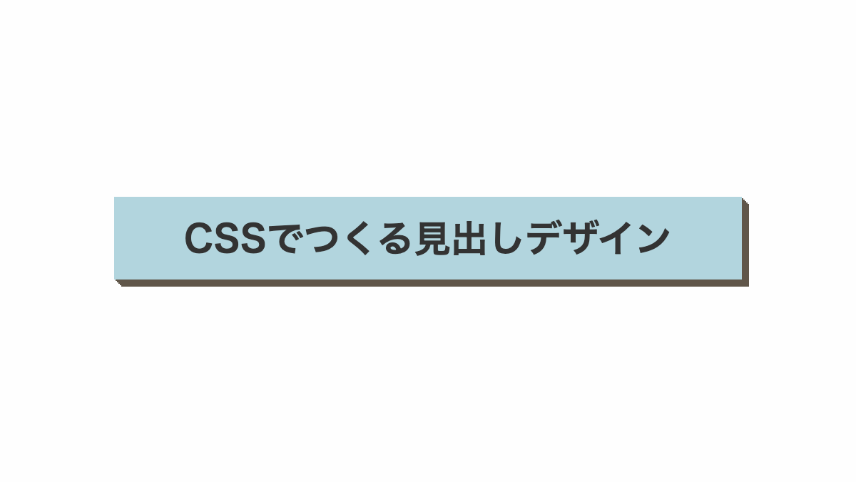
背景色は「background-color」、影の色は「box-shadow:」で調整可能です
コードを表示
<h2>CSSでつくる見出しデザイン</h2>
h2 {
    position: relative;
    margin-bottom: 0.2rem;
    padding: 0.8rem;
    /* 影 */
    box-shadow: -1px 1px #605649, -2px 2px #605649, -3px 3px #605649, -4px 4px #605649, -5px 5px #605649;
    font-size: 26px;
    font-weight: bold;
    /* 背景色 */
    background-color: #E0C7A9;
    color: #333;
    text-align: center;
}HTML・CSSのカスタマイズや動作確認ができます
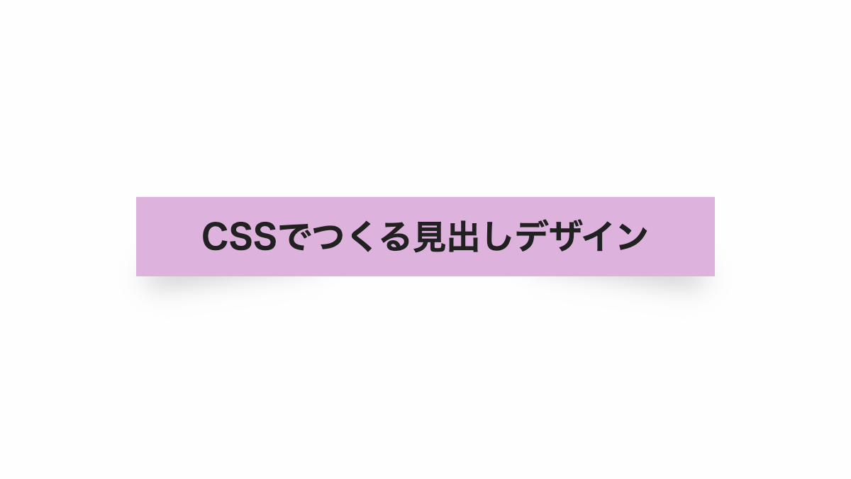
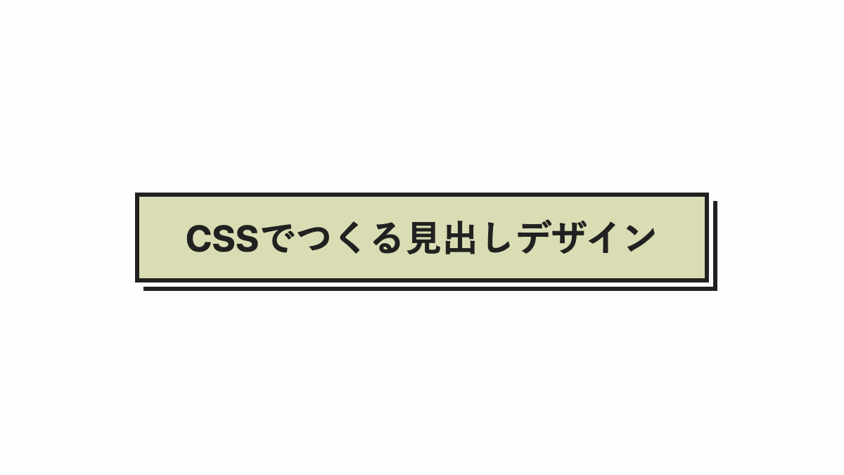
左上方向にずらしたCSS見出し
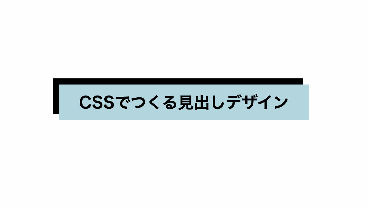
「box-shadow」を左上に影をつけてます。
コードを表示
<h2>CSSでつくる見出しデザイン</h2>
h2 {
    margin-bottom: 0.2rem;
    padding: 1rem;
    box-shadow: -10px -10px 0;
    background-color: #C5E7F3;
    font-weight: bold;
    font-size: 26px;
    text-align: center;
}HTML・CSSのカスタマイズや動作確認ができます
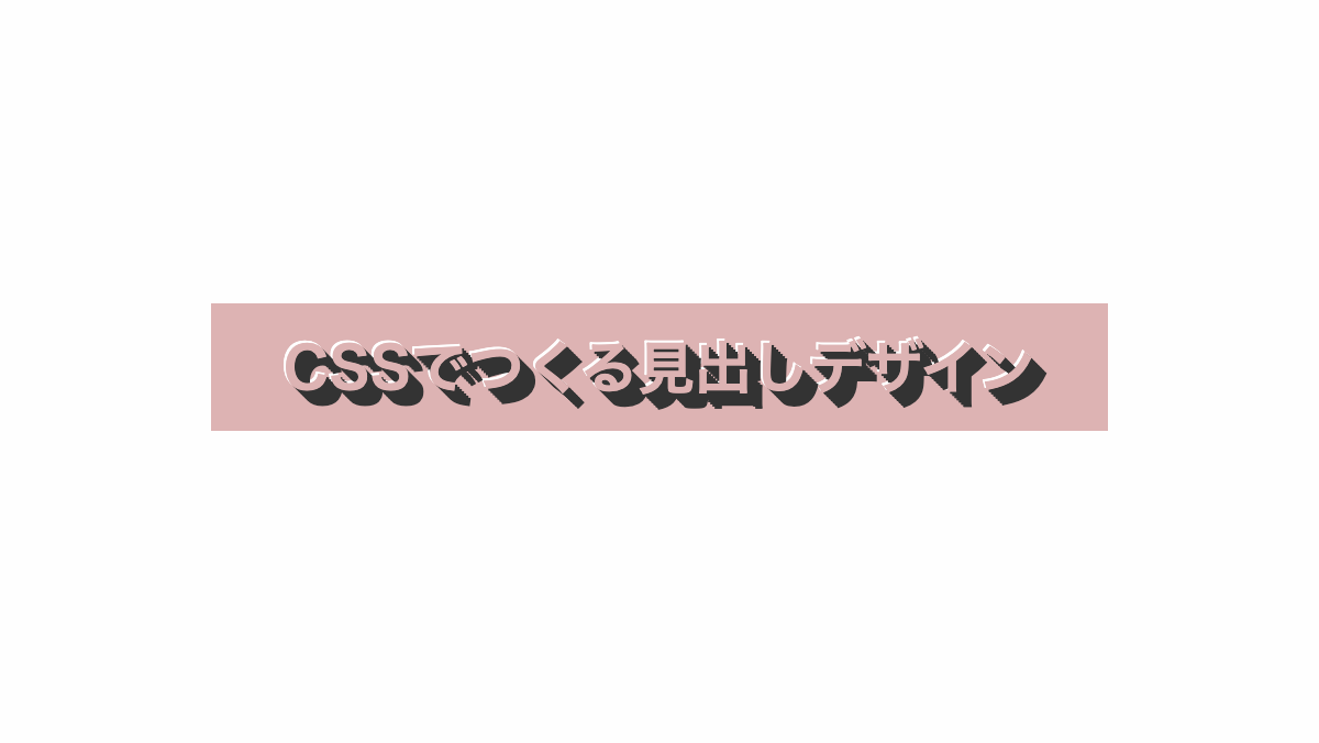
ロングシャドウを付けたCSS見出し
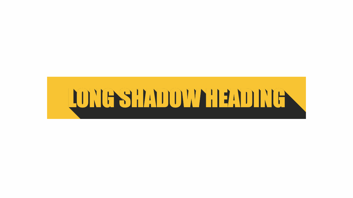
「text-shadow」プロパティでロングシャドウを付けました
コードを表示
<h2>LONG SHADOW HEADING</h2>
h2 {
    margin-bottom: 0.2rem;
    padding: 1rem;
    overflow: hidden;
    background-color: #F8C433;
    color: #F8C433;
    font-family: impact;
    font-size: 40px;
    text-shadow: 0px 0px #272826, 1px 1px #272826, 2px 2px #272826, 3px 3px #272826, 4px 4px #272826, 5px 5px #272826, 6px 6px #272826, 7px 7px #272826, 8px 8px #272826, 9px 9px #272826, 10px 10px #272826, 11px 11px #272826, 12px 12px #272826, 13px 13px #272826, 14px 14px #272826, 15px 15px #272826, 16px 16px #272826, 17px 17px #272826, 18px 18px #272826, 19px 19px #272826, 20px 20px #272826, 21px 21px #272826, 22px 22px #272826, 23px 23px #272826, 24px 24px #272826, 25px 25px #272826, 26px 26px #272826, 27px 27px #272826, 28px 28px #272826, 29px 29px #272826, 30px 30px #272826, 31px 31px #272826, 32px 32px #272826, 33px 33px #272826, 34px 34px #272826, 35px 35px #272826, 36px 36px #272826, 37px 37px #272826, 38px 38px #272826, 39px 39px #272826, 40px 40px #272826, 41px 41px #272826, 42px 42px #272826, 43px 43px #272826, 44px 44px #272826, 45px 45px #272826;
    text-align: center;
}HTML・CSSのカスタマイズや動作確認ができます
文字を浮き出したようにしたCSS見出し
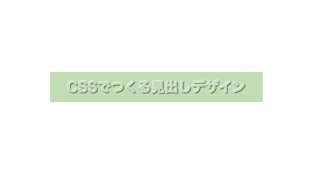
「text-shadow」プロパティで文字の上側に白、下側に黒い影を入れ浮き出したようにしています
コードを表示
<h2>CSSでつくる見出しデザイン</h2>
h2 {
    margin-bottom: 0.2rem;
    padding: 1rem;
    background: #A5A993;
    color: #A5A993;
    text-shadow: -1px -1px white, 1px 1px #333;
    font-weight: bold;
    font-size: 30px;
    text-align: center;
}HTML・CSSのカスタマイズや動作確認ができます
文字に影をつけたCSS見出し
「text-shadow」プロパティで文字に影をつけてます
コードを表示
<h2>CSSでつくる見出しデザイン</h2>
h2 {
    margin-bottom: 0.2rem;
    padding: 1rem;
    background: #f4c8c8;
    color: #f4c8c8;
    text-shadow: 1px 1px #333, 2px 2px #333, 3px 3px #333, 4px 4px #333, 5px 5px #333, 6px 6px #333, 7px 7px #333, -1px -1px #fff;
    font-weight: bold;
    font-size: 30px;
    text-align: center;
}HTML・CSSのカスタマイズや動作確認ができます
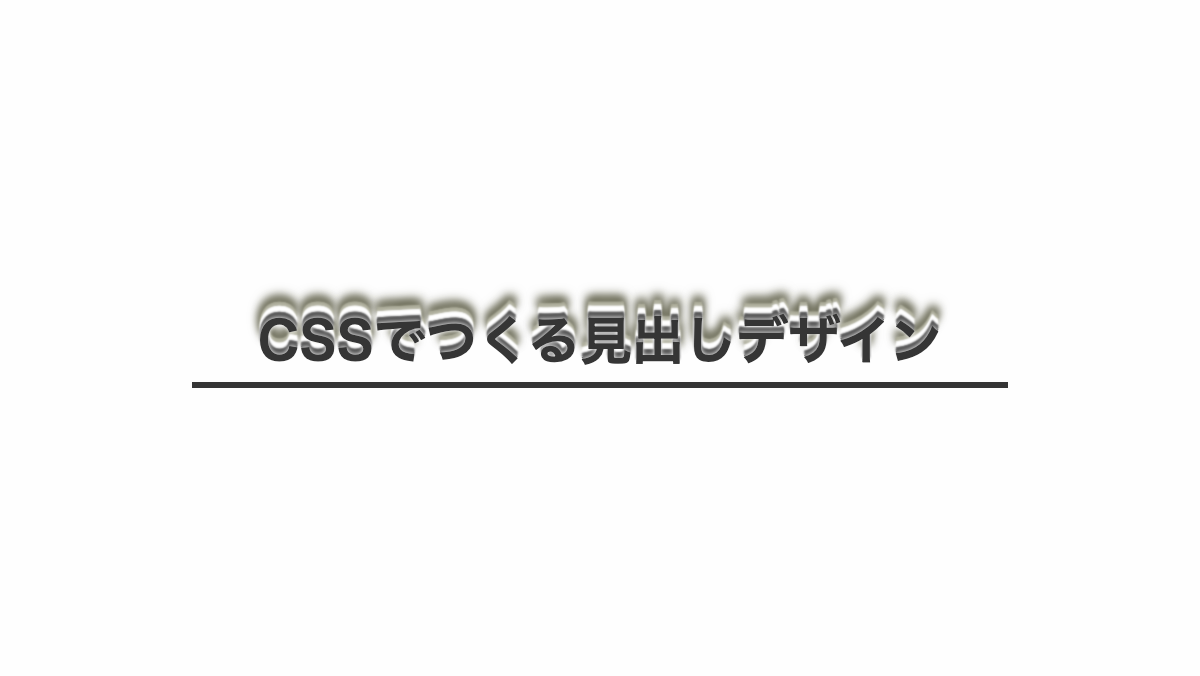
枠の下側の影にぼかしをいれたCSS見出し
「box-shadow」プロパティで枠の下側にぼかしをいれました
コードを表示
HTML・CSSのカスタマイズや動作確認ができます
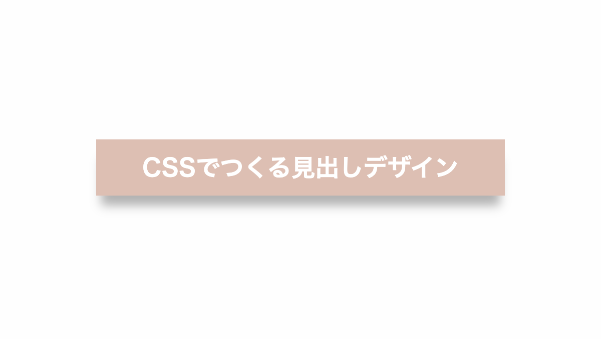
枠の下に影をいれて要素を浮いてるようにしたCSS見出し
before疑似要素の「box-shadow」プロパティで枠の下側に影をいれました
コードを表示
<h2>CSSでつくる見出しデザイン</h2>
h2 {
    position: relative;
    margin-bottom: 0.2rem;
    padding: 1rem;
    background-color: #fff2cc;
    color: #212121;
    font-weight: bold;
    font-size: 26px;
    text-align: center;
}

h2::before {
    position: absolute;
    bottom: 0;
    left: 0;
    width: 100%;
    height: 10px;
    border-radius: 200px / 10px;
    box-shadow: 0 50px 20px rgba(0, 0, 0, .5);
    content: '';
}HTML・CSSのカスタマイズや動作確認ができます
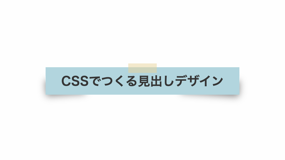
付箋風。枠の両端がめくれているようにしたCSS見出し
before疑似要素の「box-shadow」プロパティで枠の両側に影をいれ、めくれているようにしました。
コードを表示
<h2>CSSでつくる見出しデザイン</h2>
h2 {
    position: relative;
    margin-bottom: 0.2rem;
    padding: 1rem;
    background-color: #f8d8dd;
    color: #212121;
    font-weight: bold;
    font-size: 24px;
    text-align: center;
}

h2::before,
h2::after {
    position: absolute;
    bottom: 30px;
    width: 30%;
    height: 5px;
    background: transparent;
    box-shadow: 0 25px 20px #555;
    content: "";
    z-index: -1;
}

h2::before {
    transform: rotate(-8deg);
    left: 5px;
}

h2::after {
    transform: rotate(8deg);
    right: 5px;
}HTML・CSSのカスタマイズや動作確認ができます
枠の上下に影をいれてぼかしたCSS見出し
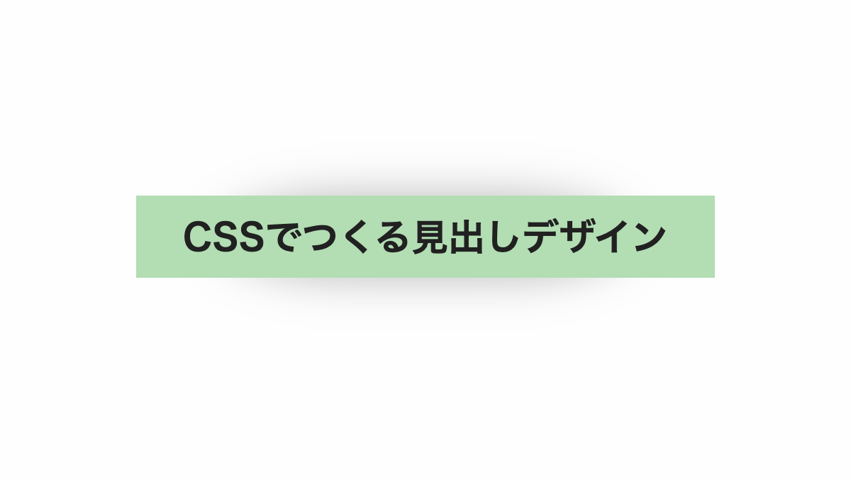
before疑似要素の「box-shadow」プロパティで枠の上下に影をいれました
コードを表示
<h2>CSSでつくる見出しデザイン</h2>
h2 {
    position: relative;
    margin-bottom: 0.2rem;
    padding: 1rem;
    background-color: #d9ead3;
    color: #212121;
    font-weight: bold;
    font-size: 26px;
    text-align: center;
}

h2::before {
    position: absolute;
    top: 0px;
    bottom: 0px;
    left: 5px;
    right: 5px;
    border-radius: 100px / 30px;
    box-shadow: 0 0 20px #888;
    content: '';
    z-index: -1;
}HTML・CSSのカスタマイズや動作確認ができます
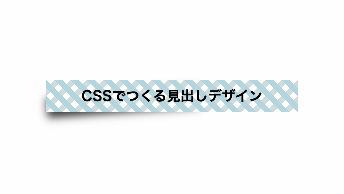
テープで紙を貼ったようなCSS見出し
before、after疑似要素で「box-shadow」を指定。影の幅と位置を調整してめくれたようなデザインにしています
コードを表示
<h2>CSSでつくる見出しデザイン</h2>
h2 {
    position: relative;
    margin-bottom: 0.2rem;
    padding: 1.5rem 1rem 1rem;
    background-image: linear-gradient(rgb(232, 211, 154, .5) 0 100%), linear-gradient(#efefef 0 100%);
    background-repeat: no-repeat;
    background-size: 60px 20px, 100% calc(100% - 0.5rem);
    background-position: center top, bottom;
    color: #353535;
    font-weight: bold;
    font-size: 26px;
    text-align: center;
}

h2::before,
h2::after {
    content: '';
    position: absolute;
    bottom: 10px;
    z-index: -1;
    height: 50%;
    box-shadow: 0 10px 15px rgba(0, 0, 0, .5);
}

h2::before {
    left: 0px;
    width: 20%;
    transform: rotate(-4deg);
}

h2::after {
    right: 0px;
    width: 30%;
    transform: rotate(4deg);
}HTML・CSSのカスタマイズや動作確認ができます
付箋がめくれたような影をつけたCSS見出し
before疑似要素の「box-shadow」と幅、位置を調整しめくれたようにしています
コードを表示
<h2>CSSでつくる見出しデザイン</h2>
h2 {
    position: relative;
    margin-bottom: 0.2rem;
    padding: 1rem;
    border-left: 30px solid #EF9293;
    background-color: white;
    color: #212121;
    font-weight: bold;
    font-size: 23px;
}

h2::before {
    position: absolute;
    right: 1px;
    bottom: 10px;
    width: 50%;
    height: 50%;
    box-shadow: 0 10px 15px #333;
    transform: rotate(4deg);
    z-index: -1;
    content: '';
}HTML・CSSのカスタマイズや動作確認ができます
付箋がめくれたような影をつけたCSS見出し
before疑似要素の「box-shadow」と幅、位置を調整しめくれたようにしています
コードを表示
<h2>CSSでつくる見出しデザイン</h2>
h2 {
    position: relative;
    margin-bottom: 0.2rem;
    padding: 1rem;
    background-color: white;
    background-image:
        repeating-linear-gradient(45deg, transparent 0 10px, #b3edfa 10px 20px),
        repeating-linear-gradient(-45deg, transparent 0 10px, rgba(24, 178, 249, .2) 10px 20px);
    color: black;
    font-weight: bold;
    font-size: 24px;
    text-align: center;
}

h2::before {
    position: absolute;
    left: 1px;
    bottom: 10px;
    width: 60%;
    height: 60%;
    box-shadow: 0 10px 15px #333;
    transform: rotate(-4deg);
    z-index: -1;
    content: '';
}HTML・CSSのカスタマイズや動作確認ができます
下側に影をつけて付箋風にしたCSS見出し
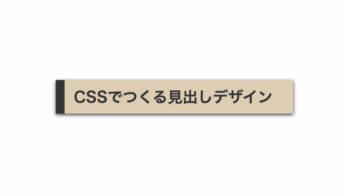
「box-shadow」で影をつけてます
コードを表示
<h2>CSSでつくる見出しデザイン</h2>
h2 {
    position: relative;
    margin-bottom: 0.2rem;
    padding: 1rem;
    border-left: 15px solid #715C47;
    box-shadow: 0 2px 6px #333;
    background-color: #BCA996;
    color: #212121;
    font-weight: bold;
    font-size: 26px;
}HTML・CSSのカスタマイズや動作確認ができます
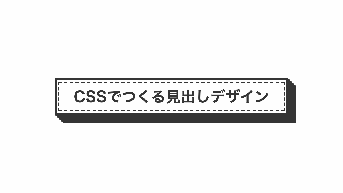
破線をずらしたCSS見出し
before疑似要素で破線にしてずらしてます。
コードを表示
<h2>CSSでつくる見出しデザイン</h2>
h2 {
    position: relative;
    padding: 1rem 2rem;
    border: 3px solid #212121;
    background-color: #95B4C1;
    color: #333;
    font-size: 26px;
    font-weight: bold;
    text-align: center;
}

h2::before {
    position: absolute;
    bottom: -10px;
    right: -10px;
    width: 100%;
    height: 100%;
    border-right: 3px dashed #212121;
    border-bottom: 3px dashed #212121;
    transition: .3s;
    content: '';
}HTML・CSSのカスタマイズや動作確認ができます
下側に影を入れたCSS見出し
「box-shadow」で影を入れてます
コードを表示
<h2>CSSでつくる見出しデザイン</h2>
h2 {
    padding: 1rem 2rem;
    box-shadow: 0 7px #212121;
    border: 3px solid #212121;
    border-radius: 10px;
    background-color: #ABD6C5;
    color: #212121;
    font-size: 26px;
    font-weight: bold;
    text-align: center;
}HTML・CSSのカスタマイズや動作確認ができます
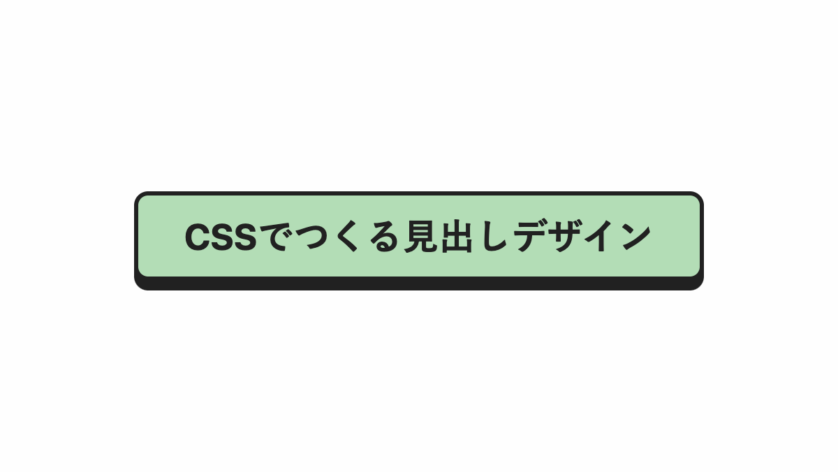
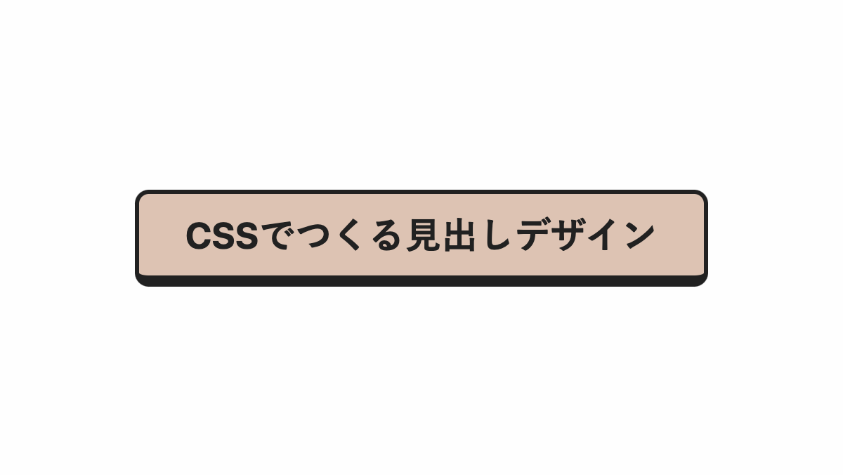
右下に影を入れたCSS見出し
「border-radius」で角丸にし「box-shadow」で影を入れたシンプルな見出し
コードを表示
<h2>CSSでつくる見出しデザイン</h2>
h2 {
    position: relative;
    padding: 1rem 2rem;
    box-shadow: 5px 5px #212121;
    border: 3px solid #212121;
    border-radius: 10px;
    background-color: #F2B1AF;
    color: #212121;
    font-size: 26px;
    font-weight: bold;
    text-align: center;
}HTML・CSSのカスタマイズや動作確認ができます
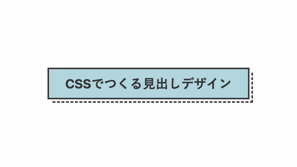
影を境界線にしたCSS見出し
「box-shadow」で影を入れ、「outline」で白くした線を影の上に重ねて境界線を作ってます
コードを表示
<h2>CSSでつくる見出しデザイン</h2>
h2 {
    position: relative;
    padding: 1rem 2rem;
    box-shadow: 6px 6px #212121;
    outline: 3px solid #fff;
    border: 3px solid #212121;
    background-color: #efe9ae;
    color: #212121;
    font-size: 26px;
    font-weight: bold;
    text-align: center;
}HTML・CSSのカスタマイズや動作確認ができます
下側に境界線を太くしたCSS見出し
下側の境界線だけ太くしてます
コードを表示
<h2>CSSでつくる見出しデザイン</h2>
h2 {
    padding: 1rem 2rem;
    border: 3px solid #212121;
    border-bottom-width: 8px;
    border-radius: 10px;
    background-color: #d3d0a9;
    color: #212121;
    font-size: 26px;
    font-weight: bold;
    text-align: center;
}HTML・CSSのカスタマイズや動作確認ができます
影を付けて内側に破線を入れた見出しデザイン
before,after疑似要素で影を入れてます
コードを表示
<h2>CSSでつくる見出しデザイン</h2>
h2 {
    position: relative;
    padding: 1rem;
    outline: 2px dashed;
    outline-offset: -8px;
    border: solid #353535;
    border-width: 3px;
    color: #353535;
    font-size: 26px;
    font-weight: bold;
    text-align: center;
}

h2::before,
h2::after {
    position: absolute;
    background-color: #353535;
    border: 3px solid;
    content: '';
}

h2::before {
    top: 4px;
    right: -17px;
    width: 8px;
    height: 100%;
    transform: skewY(45deg);
}

h2::after {
    bottom: -17px;
    left: 4px;
    width: 100%;
    height: 8px;
    transform: skewX(45deg);
}HTML・CSSのカスタマイズや動作確認ができます
影を付けてグラデーションにしたCSS見出し
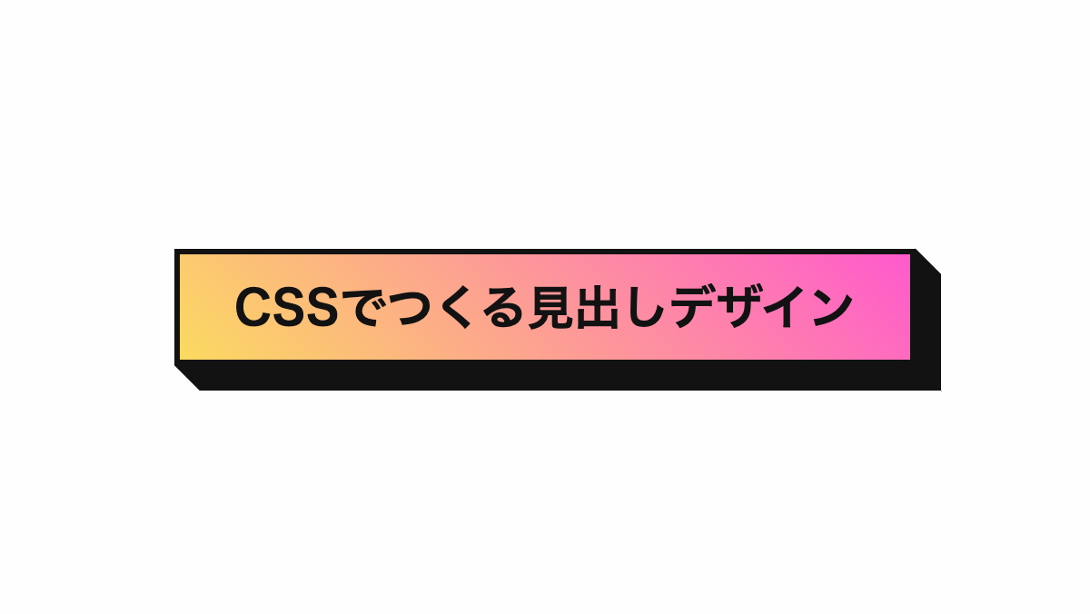
before,after疑似要素で影を入れてます
コードを表示
<h2>CSSでつくる見出しデザイン</h2>
h2 {
    position: relative;
    padding: 1rem;
    border: 3px solid #121212;
    background-image: linear-gradient(45deg, #FBDA61 0%, #FF5ACD 100%);
    color: #121212;
    font-size: 26px;
    font-weight: bold;
    text-align: center;
}

h2::before,
h2::after {
    position: absolute;
    background-color: #121212;
    border: 3px solid #121212;
    content: '';
}

h2::before {
    top: 4px;
    right: -17px;
    width: 8px;
    height: 100%;
    transform: skewY(45deg);
}

h2::after {
    bottom: -17px;
    left: 4px;
    width: 100%;
    height: 8px;
    transform: skewX(45deg);
}HTML・CSSのカスタマイズや動作確認ができます
影を付けてグラデーションにしたCSS見出し
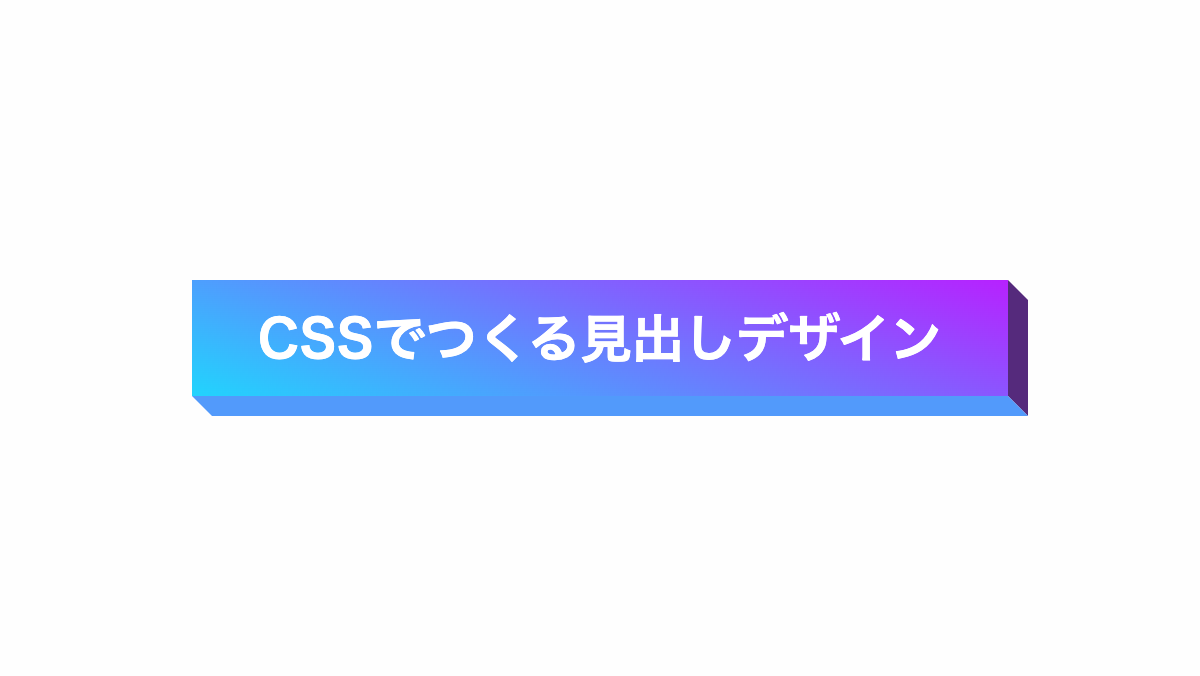
before,after疑似要素で影を入れてます
コードを表示
<h2>CSSでつくる見出しデザイン</h2>
h2 {
    position: relative;
    padding: 1rem;
    background-image: linear-gradient(19deg, #21D4FD 0%, #B721FF 100%);
    color: #fff;
    font-size: 26px;
    font-weight: bold;
    text-align: center;
}

h2::before,
h2::after {
    position: absolute;
    content: '';
}

h2::before {
    top: 5px;
    right: -10px;
    width: 10px;
    height: 100%;
    background-color: #552a7c;
    transform: skewY(45deg);
}

h2::after {
    bottom: -10px;
    left: 5px;
    width: 100%;
    height: 10px;
    background-color: #529afb;
    transform: skewX(45deg);
}HTML・CSSのカスタマイズや動作確認ができます
以上がCSSで影を入れた見出しデザインとなります。
影を入れると目を惹く見出しが作れるので、ポップ系のサイトや最も注目を集めたいセクションなどでぜひ試してみてくださいね。


