
今回は要素に折り込んだようなお洒落なラベルの作り方を解説します。
ブログ一覧のカードなどに活用してみてください。
要素を配置
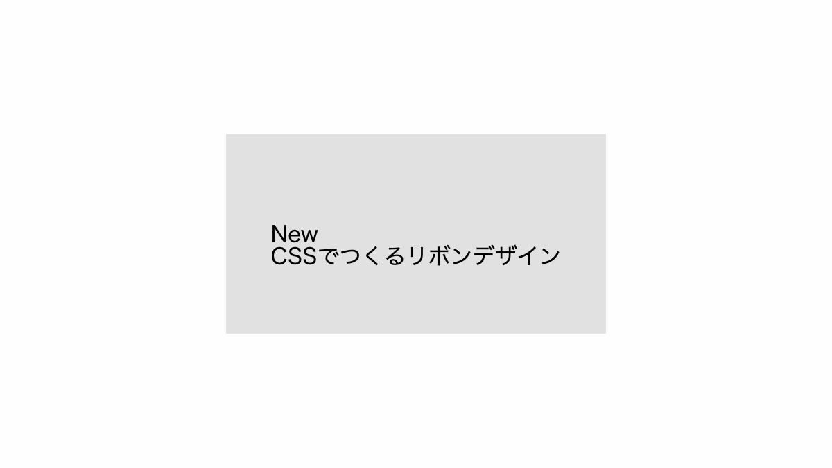
「span」タグと「p」タグを「div」タグで囲みます
<div class="box">
    <span>New</span>
    <p>CSSでつくるリボンデザイン</p>
</div>
.box {
    position: relative;
    padding: 4rem 2rem 3rem;
    background-color: #e1e1e1;
}
「span」タグを左上に配置
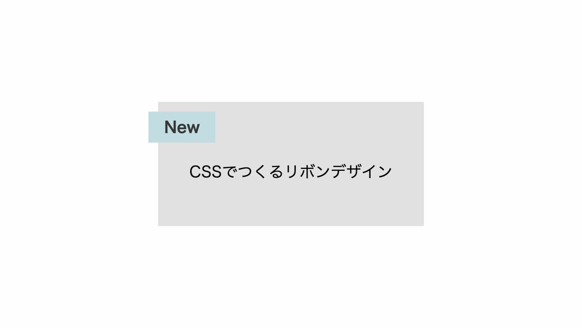
「span」タグに「position: absolute;」を指定し、「top」「left」を調整して左上に配置します。
.box {
    position: relative;
    ...
}

.box span {
    position: absolute;
    top: 10px;
    left: -10px;
    padding: 0.5rem 1rem;
    background-color: #C1DDE1;
    color: #353535;
    font-weight: bold;
}
折り目の影を作る
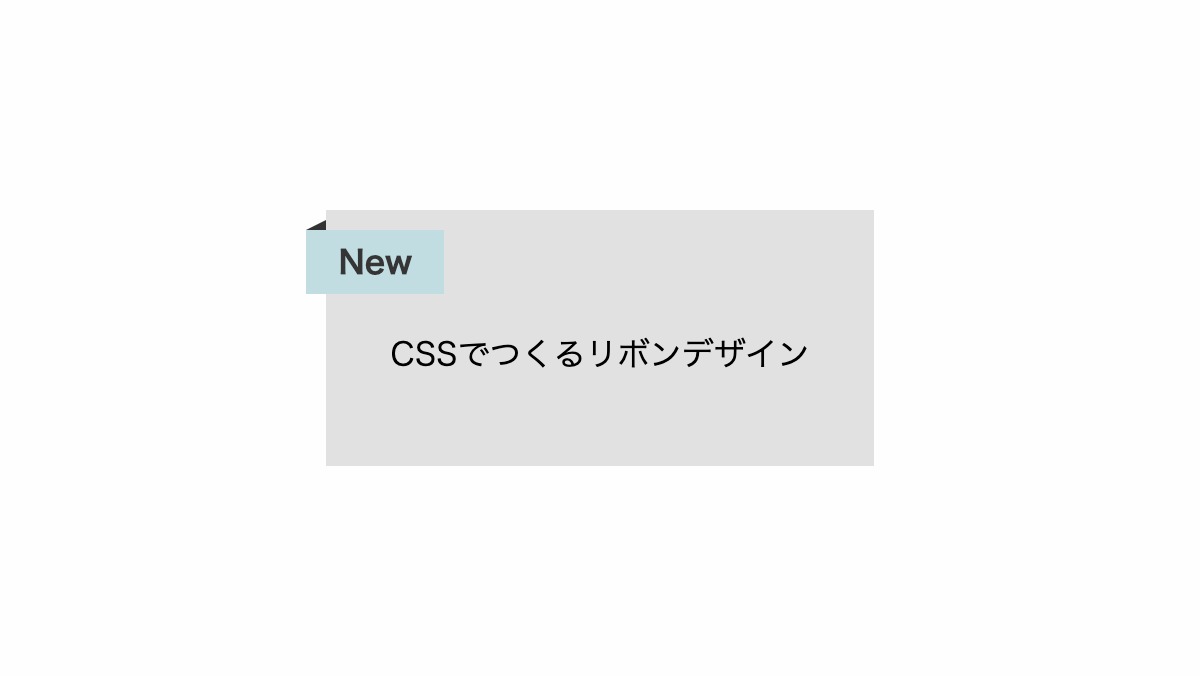
「before」疑似要素の「border-top」を透過に。「border-right」でボックスに折り込んだような影を作っています。
.box {
    position: relative;
    ...
}
.box span{...}
.box span::before {
    position: absolute;
    bottom: 100%;
    left: 0;
    width: 0px;
    height: 0px;
    border: none;
    border-top: 5px solid transparent;
    border-right: 10px solid #333;
    content: '';
}
全てのソース
コードを表示
<div class="box">
    <span>New</span>
    <p>CSSでつくるリボンデザイン</p>
</div>
.box {
    position: relative;
    padding: 4rem 2rem 3rem;
    background-color: #e1e1e1;
}

.box span {
    position: absolute;
    top: 10px;
    left: -10px;
    padding: 0.5rem 1rem;
    background-color: #C1DDE1;
    color: #353535;
    font-weight: bold;
}

.box span::before {
    position: absolute;
    bottom: 100%;
    left: 0;
    width: 0px;
    height: 0px;
    border: none;
    border-top: 5px solid transparent;
    border-right: 10px solid #333;
    content: '';
}HTML・CSSのカスタマイズや動作確認ができます


