
CSSでリボンをデザインしてみました。
before、after疑似要素で両端をカットしたり、影を入れています。
見出しや目を惹きたいTipsなどにご活用ください
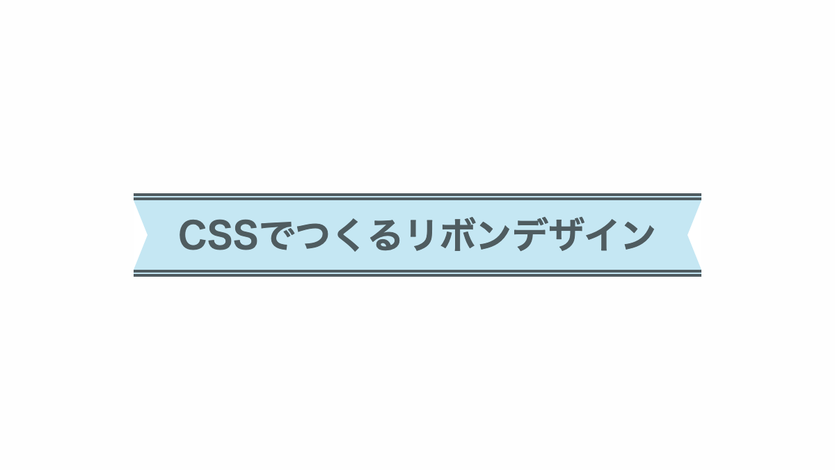
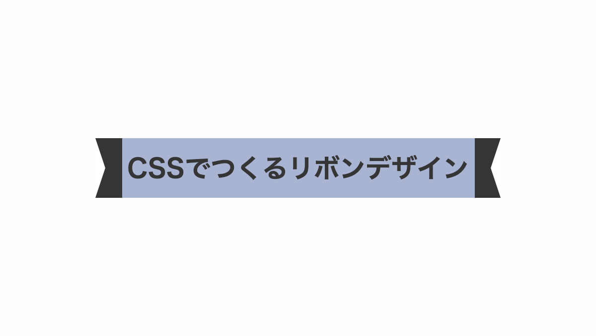
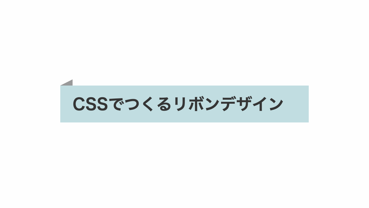
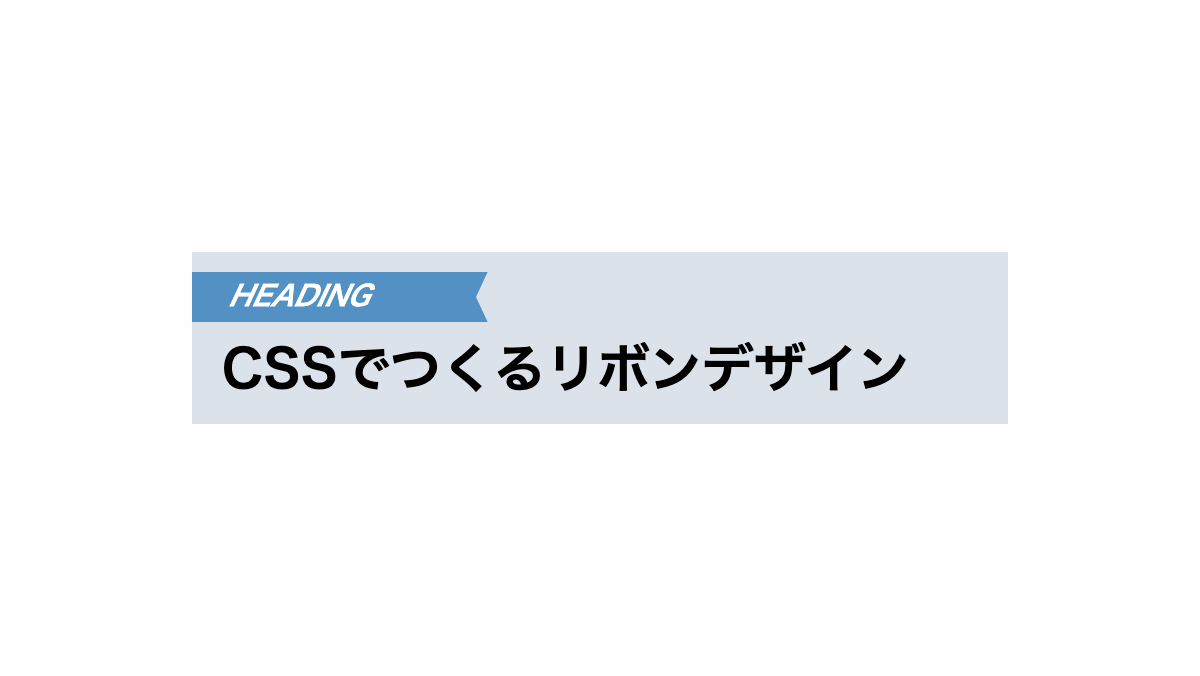
両端を斜めにカットしたシンプルなCSSデザイン
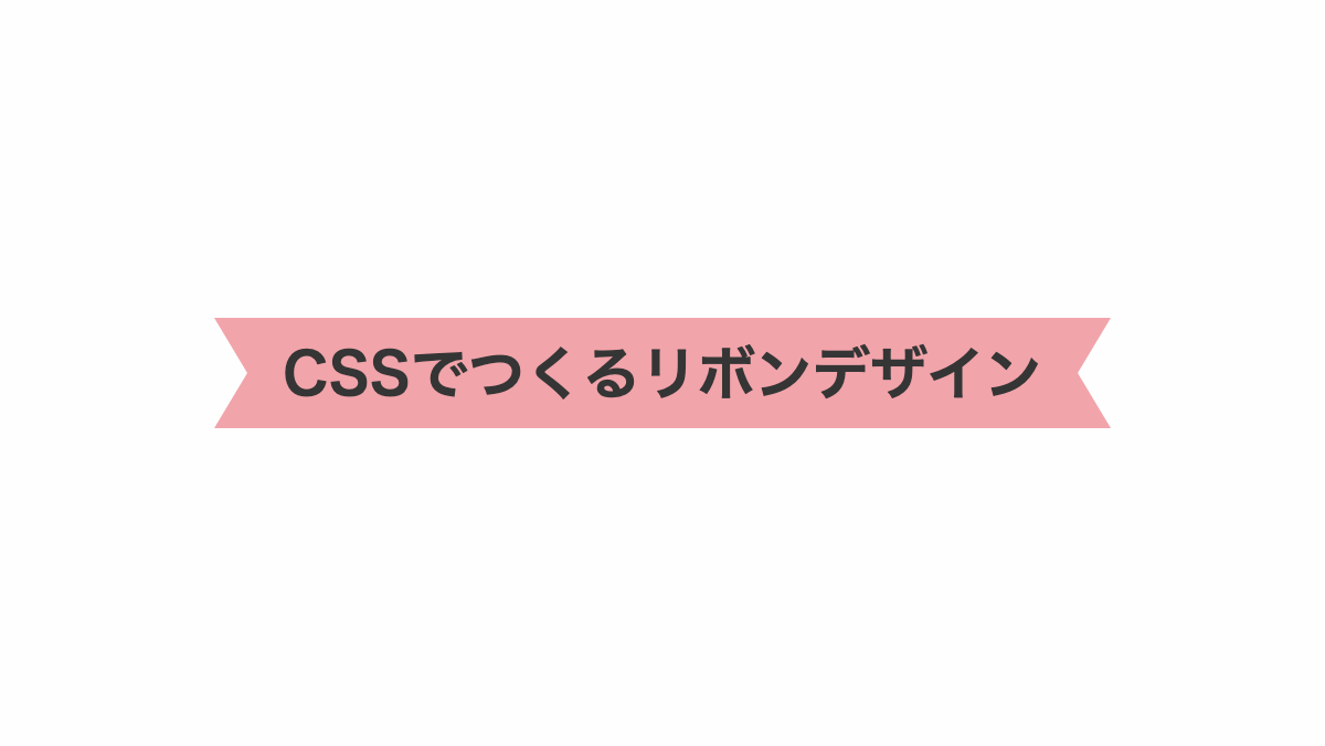
before,after疑似要素で「border」の一部を透過させ両端を斜めにカットしてます
コードを表示
<h2>CSSでつくるリボンデザイン</h2>
h2 {
    position: relative;
    display: inline-block;
    height: 50px;
    line-height: 50px;
    padding: 0 1rem;
    background-color: #f1a4aa;
    color: #353535;
    font-size: 26px;
    font-weight: bold;
    text-align: center;
}

h2::before,
h2::after {
    position: absolute;
    top: 0;
    width: 0px;
    height: 0px;
    border-color: #f1a4aa transparent;
    border-style: solid;
    content: '';
}

h2::before {
    left: -15px;
    border-width: 25px 0px 25px 15px;
}

h2::after {
    right: -15px;
    border-width: 25px 15px 25px 0px;
}HTML・CSSのカスタマイズや動作確認ができます
上下に実践を引いたCSSデザイン
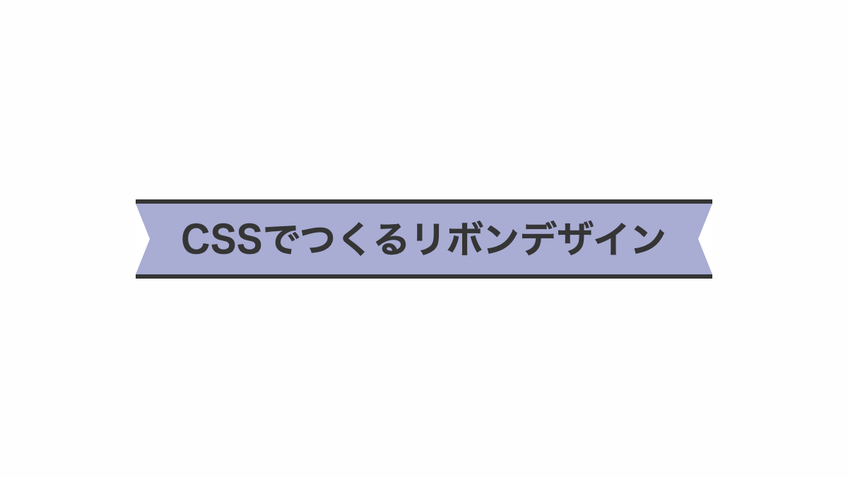
「border」プロパティを上下に指定し実践を引いてます
コードを表示
<h2>CSSでつくるリボンデザイン</h2>
h2 {
    position: relative;
    display: inline-block;
    height: 50px;
    line-height: 50px;
    padding: 0 2rem;
    border-top: 3px solid;
    border-bottom: 3px solid;
    background-color: #a9acd3;
    color: #353535;
    font-size: 26px;
    font-weight: bold;
    text-align: center;
}

h2::before,
h2::after {
    position: absolute;
    content: '';
    top: 0;
    width: 0px;
    height: 0px;
    border-color: transparent #fff;
    border-style: solid;
}

h2::before {
    left: 0;
    border-width: 25px 0px 25px 10px;
}

h2::after {
    right: 0;
    border-width: 25px 10px 25px 0px;
}HTML・CSSのカスタマイズや動作確認ができます
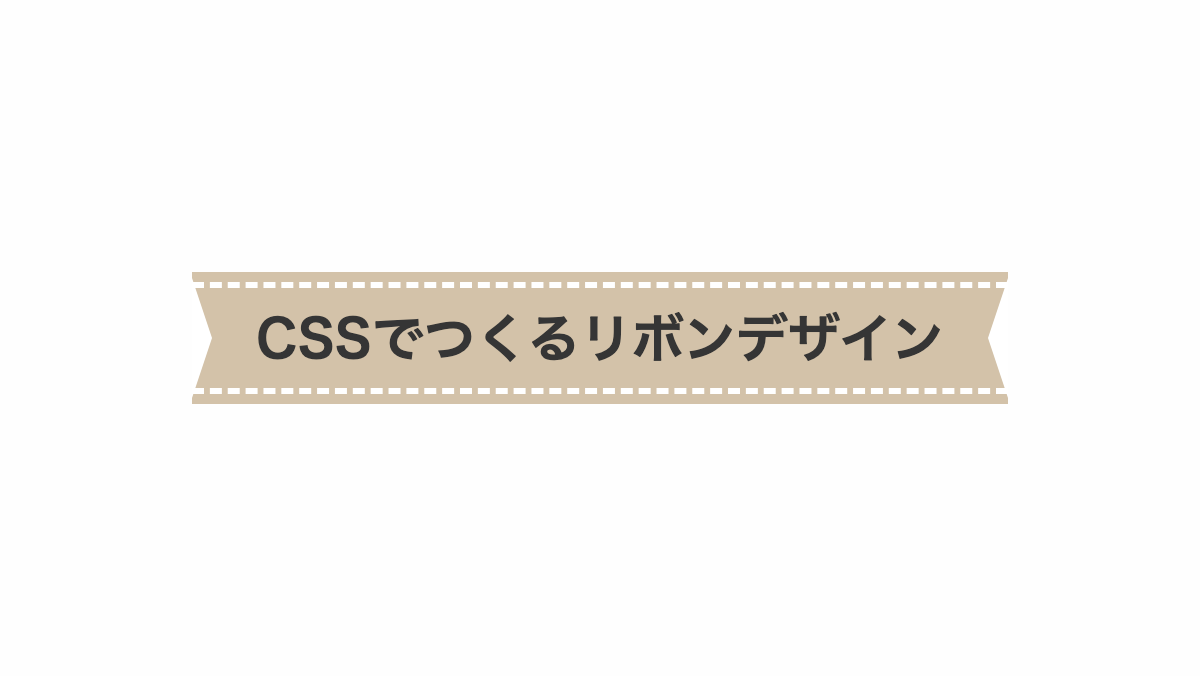
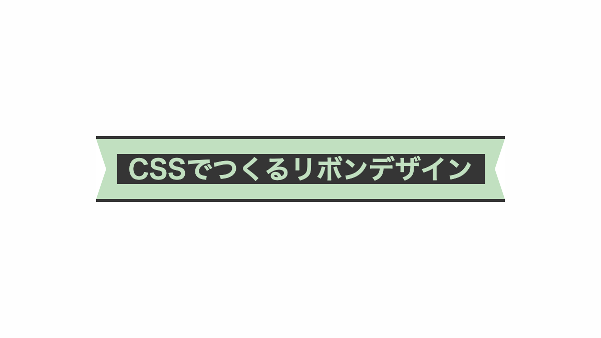
上下に破線を引いたCSSデザイン
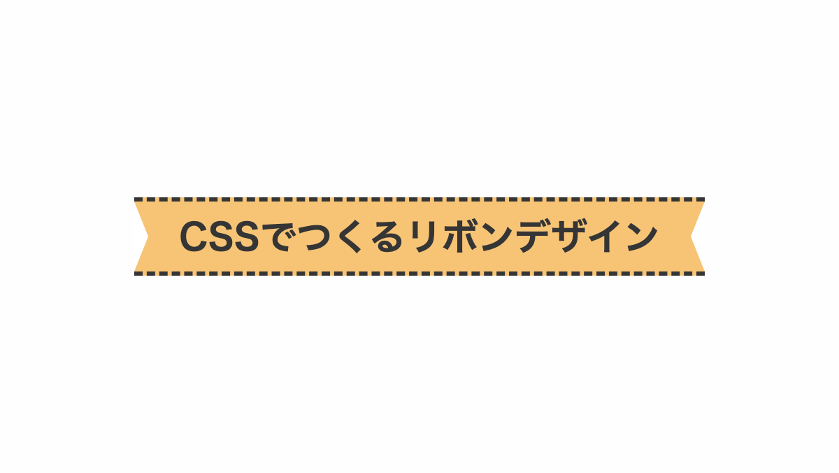
「border」プロパティのスタイルに「dashed」を指定し上下に二重線を引いてます
コードを表示
<h2>CSSでつくるリボンデザイン</h2>
h2 {
    position: relative;
    display: inline-block;
    height: 50px;
    line-height: 50px;
    padding: 0 2rem;
    border-top: 3px dashed;
    border-bottom: 3px dashed;
    background-color: #f7c476;
    color: #353535;
    font-size: 26px;
    font-weight: bold;
    text-align: center;
}

h2::before,
h2::after {
    position: absolute;
    content: '';
    top: 0;
    width: 0px;
    height: 0px;
    border-color: transparent #fff;
    border-style: solid;
}

h2::before {
    left: 0;
    border-width: 25px 0px 25px 10px;
}

h2::after {
    right: 0;
    border-width: 25px 10px 25px 0px;
}HTML・CSSのカスタマイズや動作確認ができます
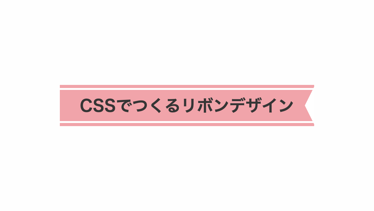
内側に白い線を引いたCSSデザイン
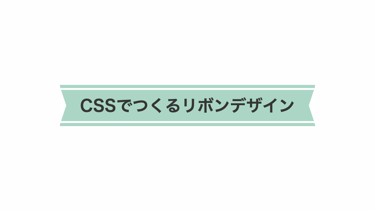
「box-shadow」を上下に入れ、「border」で白線を引いてます
コードを表示
<h2>CSSでつくるリボンデザイン</h2>
h2 {
    position: relative;
    display: inline-block;
    height: 50px;
    line-height: 50px;
    padding: 0 2rem;
    box-shadow: 0px -5px #abd6c5, 0px 5px #abd6c5;
    border-top: 3px solid #fff;
    border-bottom: 3px solid #fff;
    background-color: #abd6c5;
    color: #353535;
    font-size: 26px;
    font-weight: bold;
    text-align: center;
}

h2::before,
h2::after {
    position: absolute;
    top: -5px;
    width: 0px;
    height: 0px;
    border-color: transparent #fff;
    border-style: solid;
    content: '';
}

h2::before {
    left: 0;
    border-width: 30px 0px 30px 10px;
}

h2::after {
    right: 0;
    border-width: 30px 10px 30px 0px;
}HTML・CSSのカスタマイズや動作確認ができます
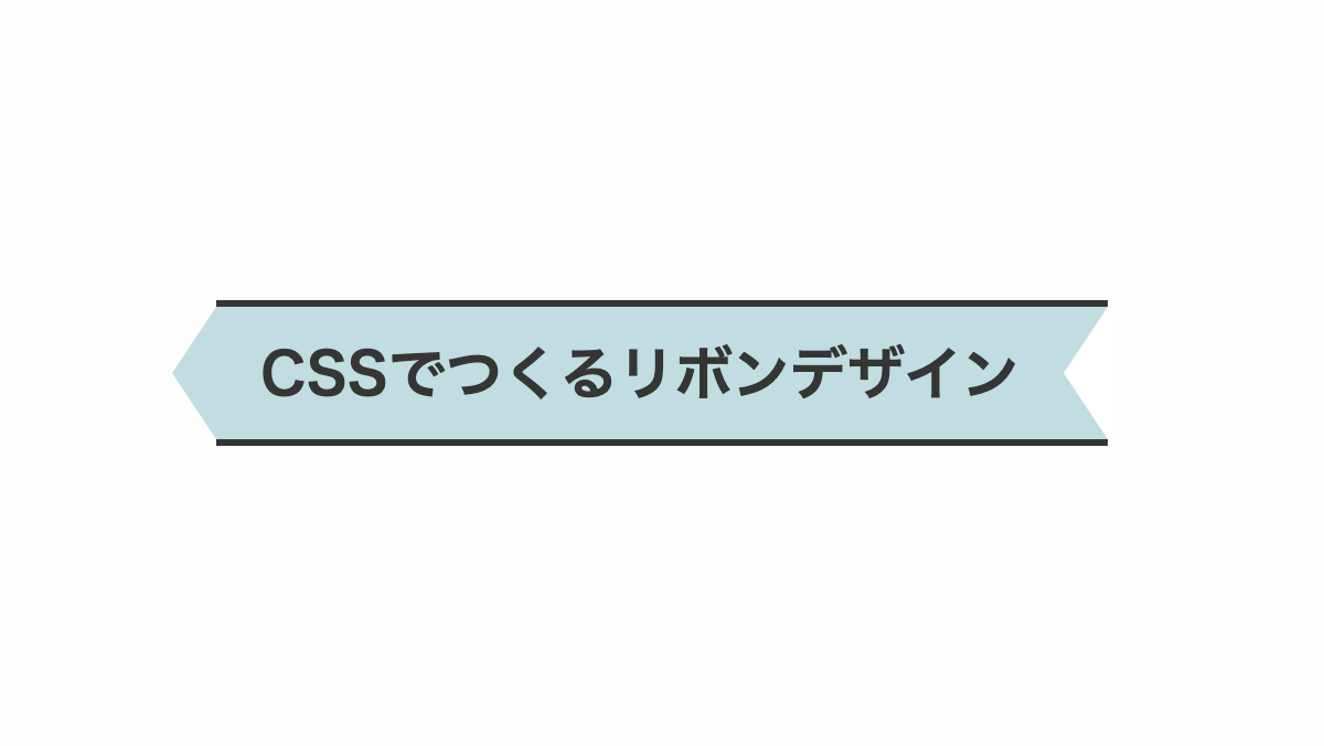
上下に二重線を引いたCSSデザイン
「border」プロパティのスタイルに「double」を指定し上下に二重線を引いてます
コードを表示
<h2>CSSでつくるリボンデザイン</h2>
h2 {
    position: relative;
    display: inline-block;
    height: 50px;
    line-height: 50px;
    padding: 0 2rem;
    border-top: 5px double;
    border-bottom: 5px double;
    background-color: #c5e7f3;
    color: #4f5c60;
    font-size: 26px;
    font-weight: bold;
    text-align: center;
}

h2::before,
h2::after {
    position: absolute;
    top: 0;
    width: 0px;
    height: 0px;
    border-color: transparent #fff;
    border-style: solid;
    content: '';
}

h2::before {
    left: 0;
    border-width: 25px 0px 25px 10px;
}

h2::after {
    right: 0;
    border-width: 25px 10px 25px 0px;
}HTML・CSSのカスタマイズや動作確認ができます
グラデーションにしたCSSデザイン
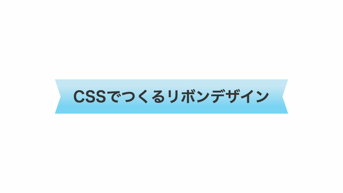
「linear-gradient」で背景をグラデーションにしています
コードを表示
<h2>CSSでつくるリボンデザイン</h2>
h2 {
    position: relative;
    display: inline-block;
    height: 60px;
    line-height: 60px;
    padding: 0 2rem;
    background: linear-gradient(#c5e7f3 0 20%, #79d3f2 80%);
    color: #353535;
    font-size: 26px;
    font-weight: bold;
    text-align: center;
}

h2::before,
h2::after {
    position: absolute;
    top: 0;
    width: 0px;
    height: 0px;
    border-color: transparent #fff;
    border-style: solid;
    content: '';
}

h2::before {
    left: 0;
    border-width: 30px 0px 30px 10px;
}

h2::after {
    right: 0;
    border-width: 30px 10px 30px 0px;
}HTML・CSSのカスタマイズや動作確認ができます
上下に白い線を入れたCSSデザイン
「box-shadow」を上下に入れ、「border」で破線を引いてます
コードを表示
<h2>CSSでつくるリボンデザイン</h2>
h2 {
    position: relative;
    display: inline-block;
    height: 50px;
    line-height: 50px;
    padding: 0 2rem;
    box-shadow: 0px -5px #d3c2a9, 0px 5px #d3c2a9;
    border-top: 3px dashed #fff;
    border-bottom: 3px dashed #fff;
    background-color: #d3c2a9;
    color: #353535;
    font-size: 26px;
    font-weight: bold;
    text-align: center;
}

h2::before,
h2::after {
    position: absolute;
    top: -5px;
    width: 0px;
    height: 0px;
    border-color: transparent #fff;
    border-style: solid;
    content: '';
}

h2::before {
    left: 0;
    border-width: 30px 0px 30px 10px;
}

h2::after {
    right: 0;
    border-width: 30px 10px 30px 0px;
}HTML・CSSのカスタマイズや動作確認ができます
中央部分を色分けしたCSSデザイン
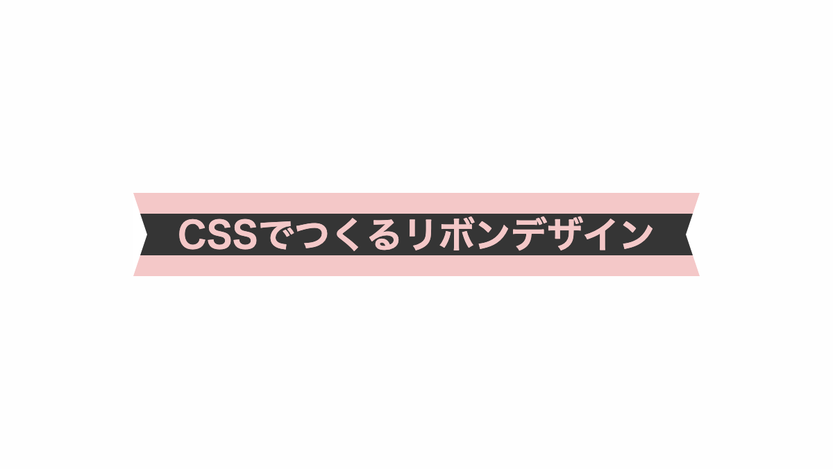
「linear-gradient」で中央部分を色分けしています
コードを表示
<h2>CSSでつくるリボンデザイン</h2>
h2 {
    position: relative;
    display: inline-block;
    height: 60px;
    line-height: 60px;
    padding: 0 2rem;
    background:
        repeating-linear-gradient(#353535 0 100%);
    background-repeat: no-repeat;
    background-size: 100% 30px;
    background-position: center;
    background-color: #f4c8c8;
    color: #f4c8c8;
    font-size: 26px;
    font-weight: bold;
    text-align: center;
}

h2::before,
h2::after {
    position: absolute;
    top: 0;
    width: 0px;
    height: 0px;
    border-color: transparent #fff;
    border-style: solid;
    content: '';
}

h2::before {
    left: 0;
    border-width: 30px 0px 30px 10px;
}

h2::after {
    right: 0;
    border-width: 30px 10px 30px 0px;
}HTML・CSSのカスタマイズや動作確認ができます
両端の色を変えたCSSデザイン
「linear-gradient」で横中央だけ塗り、両端の色を変えてます
コードを表示
<h2>CSSでつくるリボンデザイン</h2>
h2 {
    position: relative;
    display: inline-block;
    height: 60px;
    line-height: 60px;
    padding: 0 2rem;
    background:
        repeating-linear-gradient(#a9b4d3 0 100%);
    background-repeat: no-repeat;
    background-size: 87% 100%;
    background-position: center;
    background-color: #353535;
    color: #353535;
    font-size: 26px;
    font-weight: bold;
    text-align: center;
}

h2::before,
h2::after {
    position: absolute;
    top: 0;
    width: 0px;
    height: 0px;
    border-color: transparent #fff;
    border-style: solid;
    content: '';
}

h2::before {
    left: 0;
    border-width: 30px 0px 30px 10px;
}

h2::after {
    right: 0;
    border-width: 30px 10px 30px 0px;
}HTML・CSSのカスタマイズや動作確認ができます
中央部分を色分けし上下に実践を引いたCSSデザイン
「linear-gradient」で中央部分を色分けしています
コードを表示
<h2>CSSでつくるリボンデザイン</h2>
h2 {
    position: relative;
    display: inline-block;
    height: 60px;
    line-height: 60px;
    padding: 0 2rem;
    border-top: 3px solid #353535;
    border-bottom: 3px solid #353535;
    background:
        repeating-linear-gradient(#353535 0 100%);
    background-repeat: no-repeat;
    background-size: 90% 30px;
    background-position: center;
    background-color: #c1e0c0;
    color: #c1e0c0;
    font-size: 26px;
    font-weight: bold;
    text-align: center;
}

h2::before,
h2::after {
    position: absolute;
    top: 0;
    width: 0px;
    height: 0px;
    border-color: transparent #fff;
    border-style: solid;
    content: '';
}

h2::before {
    left: 0;
    border-width: 30px 0px 30px 10px;
}

h2::after {
    right: 0;
    border-width: 30px 10px 30px 0px;
}HTML・CSSのカスタマイズや動作確認ができます
右側だけ斜めにカットしたCSSデザイン
before疑似要素で「border」を使用し右側だけカットしてます
コードを表示
<h2>CSSでつくるリボンデザイン</h2>
h2 {
    position: relative;
    display: inline-block;
    height: 50px;
    line-height: 50px;
    padding: 0 2rem;
    box-shadow: 0px -5px #f1a4aa, 0px 5px #f1a4aa;
    border-top: 3px solid #fff;
    border-bottom: 3px solid #fff;
    background-color: #f1a4aa;
    color: #353535;
    font-size: 26px;
    font-weight: bold;
    text-align: center;
}

h2::before {
    position: absolute;
    top: -5px;
    right: 0;
    width: 0px;
    height: 0px;
    border-width: 30px 15px 30px 0px;
    border-color: transparent #fff;
    border-style: solid;
    content: '';
}HTML・CSSのカスタマイズや動作確認ができます
左側と右側でカットの形状を変えたCSSデザイン
before,after疑似要素の「border」を使用し「border-color」の色を変化させてカットの形状を変えています
コードを表示
<h2>CSSでつくるリボンデザイン</h2>
h2 {
    position: relative;
    display: inline-block;
    height: 60px;
    line-height: 60px;
    padding: 0 40px 0 20px;
    border-top: 3px solid;
    border-bottom: 3px solid;
    background-color: #C1DDE1;
    color: #353535;
    font-size: 26px;
    font-weight: bold;
    text-align: center;
}

h2::before,
h2::after {
    position: absolute;
    top: 0;
    width: 0px;
    height: 0px;
    border-style: solid;
    border-width: 30px 20px 30px 0px;
    content: '';
}

h2::before {
    left: -20px;
    border-color: transparent #C1DDE1;
}

h2::after {
    right: 0;
    border-color: transparent #fff;
}HTML・CSSのカスタマイズや動作確認ができます
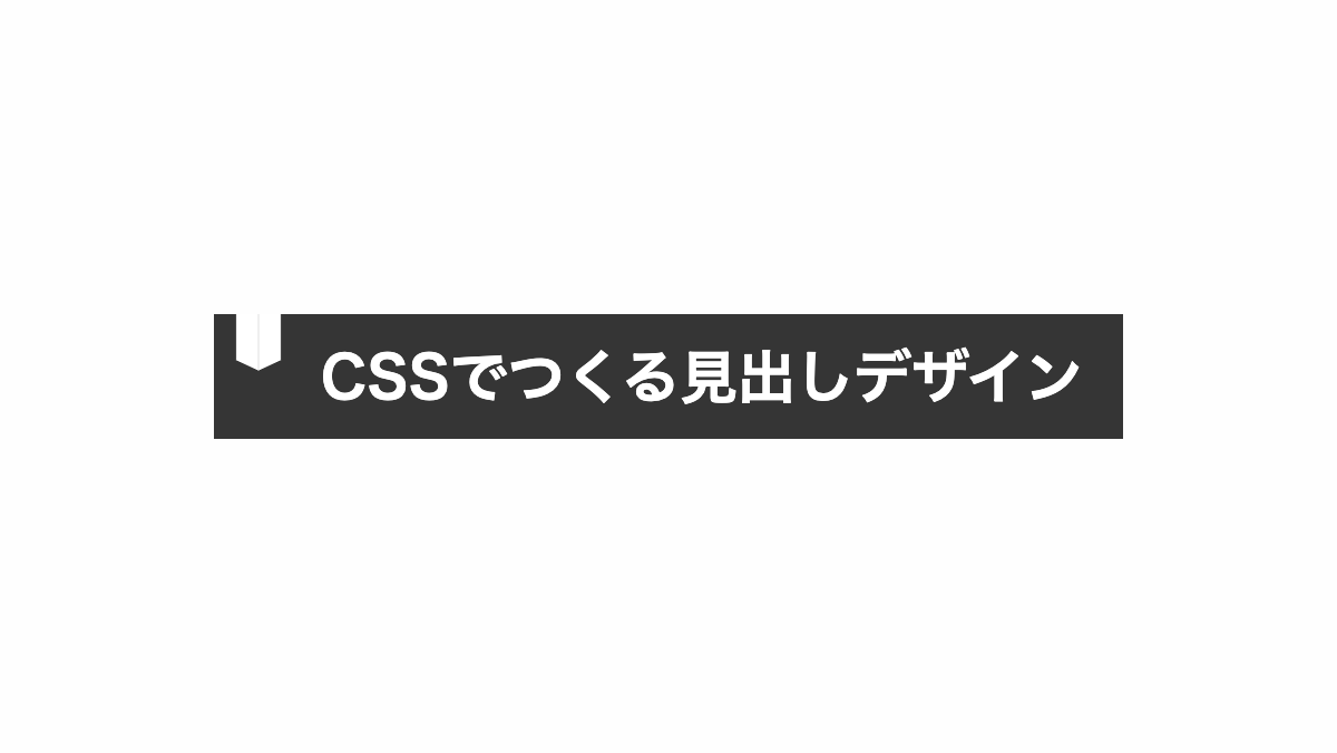
左端を折ったようなCSSデザイン
before疑似要素で「border」を使用し紙を折ったようなエフェクトを入れてます
コードを表示
<h2>CSSでつくるリボンデザイン</h2>
h2 {
    position: relative;
    display: inline-block;
    height: 60px;
    line-height: 60px;
    padding: 0 40px 0 20px;
    background-color: #C1DDE1;
    color: #353535;
    font-size: 26px;
    font-weight: bold;
    text-align: center;
}

h2::before {
    position: absolute;
    bottom: 100%;
    left: 0;
    width: 0px;
    height: 0px;
    border: none;
    border-top: 10px solid transparent;
    border-right: 20px solid #999;
    content: '';
}HTML・CSSのカスタマイズや動作確認ができます
文字の左にリボンを付ける
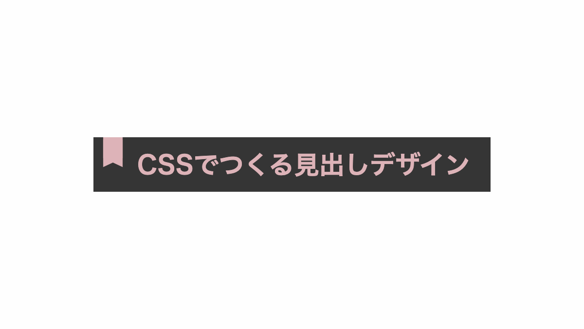
before,after疑似要素の「transform: skew」で変形させリボンを作ってます
コードを表示
<h2>CSSでつくる見出しデザイン</h2>
h2 {
    position: relative;
    padding: 15px 15px 15px 45px;
    overflow: hidden;
    background: #5e292d;
    color: #f2b0b4;
    font-size: 26px;
    font-weight: bold;
}

h2::before,
h2::after {
    position: absolute;
    top: -2px;
    left: 10px;
    width: 20px;
    height: 50%;
    background-color: #f2b0b4;
    content: '';
}

h2::before {
    transform: skewY(25deg);
}

h2::after {
    transform: skewY(-25deg);
}HTML・CSSのカスタマイズや動作確認ができます
文字の上にリボンを付ける
before,after疑似要素で「transform: skew」を指定し要素を変形させています
コードを表示
<h2>CSSでつくるリボンデザイン</h2>
h2 {
    position: relative;
    padding: 45px 15px 15px;
    border-radius: 5px;
    color: black;
    background: #DECECE;
    font-size: 26px;
    font-weight: bold;
    text-align: center;
}

h2::before,
h2::after {
    position: absolute;
    top: 10px;
    left: 35%;
    width: 30%;
    height: 20px;
    padding: 5px 0 0;
    background: #BF4740;
    box-shadow: 0 5px 10px -5px rgba(0, 0, 0, .3);
    font-size: 14px;
}

h2::before {
    content: '';
    transform: skew(25deg);
}

h2::after {
    color: white;
    text-transform: uppercase;
    content: 'heading';
    transform: skew(-25deg);
}HTML・CSSのカスタマイズや動作確認ができます
文字の左にリボンを付ける
before,after疑似要素の「transform: skew」で変形させリボンを作ってます
コードを表示
<h2>CSSでつくる見出しデザイン</h2>
h2 {
    position: relative;
    padding: 15px 15px 15px 45px;
    overflow: hidden;
    background: #b4ba66;
    color: white;
    font-size: 26px;
    font-weight: bold;
}

h2::before,
h2::after {
    position: absolute;
    top: -5px;
    width: 10px;
    height: 50%;
    background-color: white;
    content: '';
}

h2::before {
    left: 10px;
    transform: skewY(25deg);
}

h2::after {
    left: 20px;
    transform: skewY(-25deg);
}HTML・CSSのカスタマイズや動作確認ができます
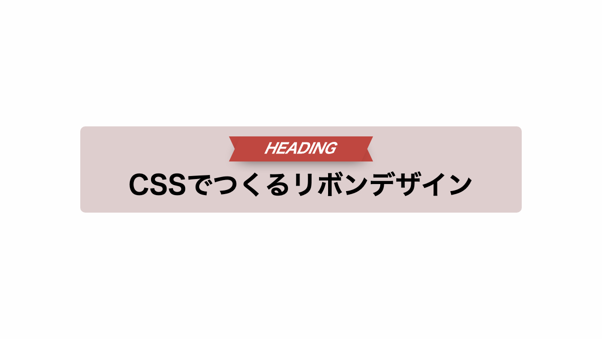
左上にリボンを付けたCSSデザイン
before,after疑似要素で「transform: skew」を指定し要素を変形させています
コードを表示
<h2>CSSでつくるリボンデザイン</h2>
h2 {
    position: relative;
    padding: 45px 15px 15px;
    overflow: hidden;
    background: #DCE2E9;
    color: black;
    font-size: 26px;
    font-weight: bold;
}

h2::before,
h2::after {
    position: absolute;
    top: 10px;
    left: 0px;
    width: 30%;
    height: 20px;
    padding: 5px 0 0 20px;
    background: #5391C5;
    font-size: 14px;
}

h2::before {
    content: '';
    transform: skew(25deg);
}

h2::after {
    color: white;
    text-transform: uppercase;
    content: 'heading';
    transform: skew(-25deg);
}HTML・CSSのカスタマイズや動作確認ができます
左上にリボンを付けたCSSデザイン
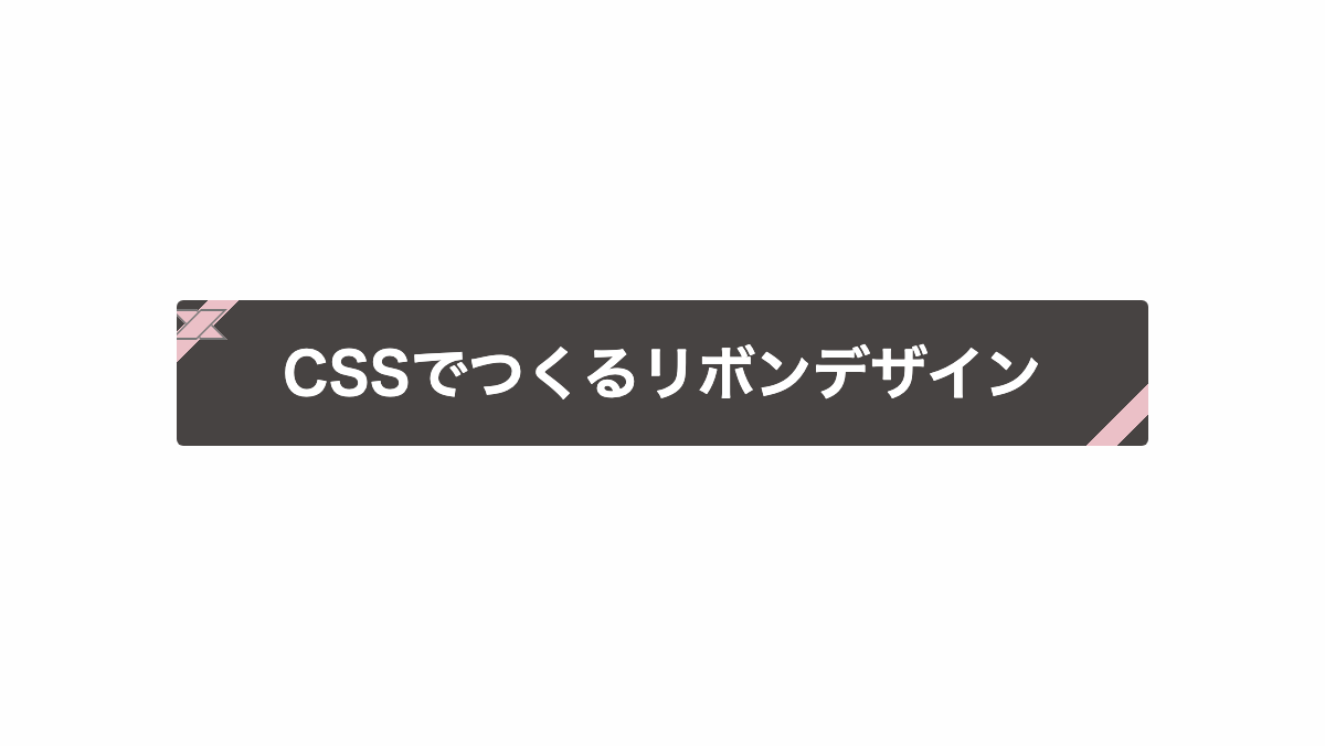
linear-gradientで斜めにピンクの線を入れて、before,after疑似要素で「transform: skew」を指定しリボン風にしています。
コードを表示
<h2>CSSでつくるリボンデザイン</h2>
h2 {
    position: relative;
    padding: 20px;
    overflow: hidden;
    border-radius: 3px;
    background: #474342;
    background-image: linear-gradient(135deg, transparent 0 10px, #EBC0C7 10px 20px, transparent 10px),
        linear-gradient(-45deg, transparent 0 10px, #EBC0C7 10px 20px, transparent 20px);
    color: white;
    font-size: 26px;
    font-weight: bold;
    text-align: center;
}

h2::before,
h2::after {
    position: absolute;
    top: 4px;
    left: 4px;
    width: 10px;
    height: 12px;
    border: 1px solid #777;
    background: #EBC0C7;
    font-size: 14px;
    content: '';
}

h2::before {
    transform: skew(45deg);
}

h2::after {
    transform: skew(-45deg);
}HTML・CSSのカスタマイズや動作確認ができます
折り目を入れたリボンをボックスに付けたCSSデザイン
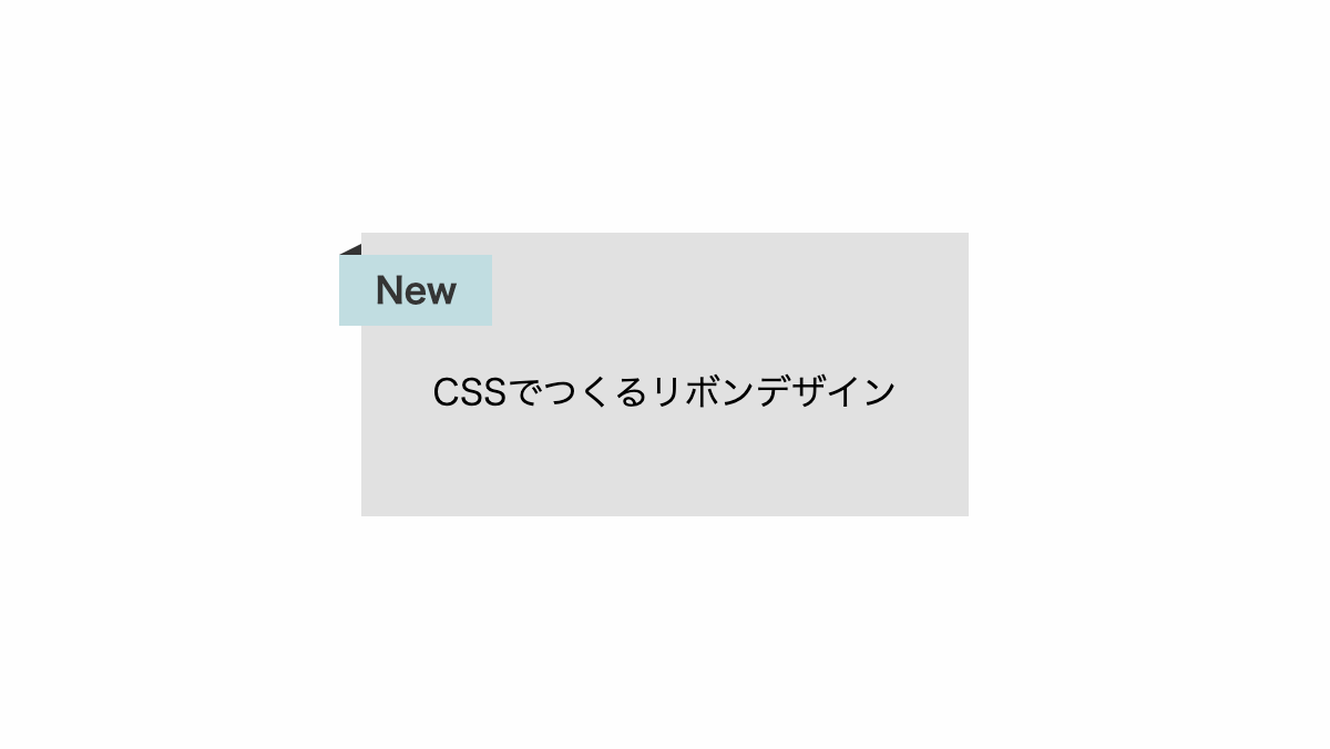
before疑似要素で「border」を使用し紙を折ったようなエフェクトを入れてます
コードを表示
<div class="box">
    <span>New</span>
    <p>CSSでつくるリボンデザイン</p>
</div>
.box {
    position: relative;
    padding: 4rem 2rem 3rem;
    background-color: #e1e1e1;
}

.box span {
    position: absolute;
    top: 10px;
    left: -10px;
    padding: 0.5rem 1rem;
    background-color: #C1DDE1;
    color: #353535;
    font-weight: bold;
}

.box span::before {
    position: absolute;
    bottom: 100%;
    left: 0;
    width: 0px;
    height: 0px;
    border: none;
    border-top: 5px solid transparent;
    border-right: 10px solid #333;
    content: '';
}HTML・CSSのカスタマイズや動作確認ができます
右側をカットしたリボンをボックスに付けたCSSデザイン
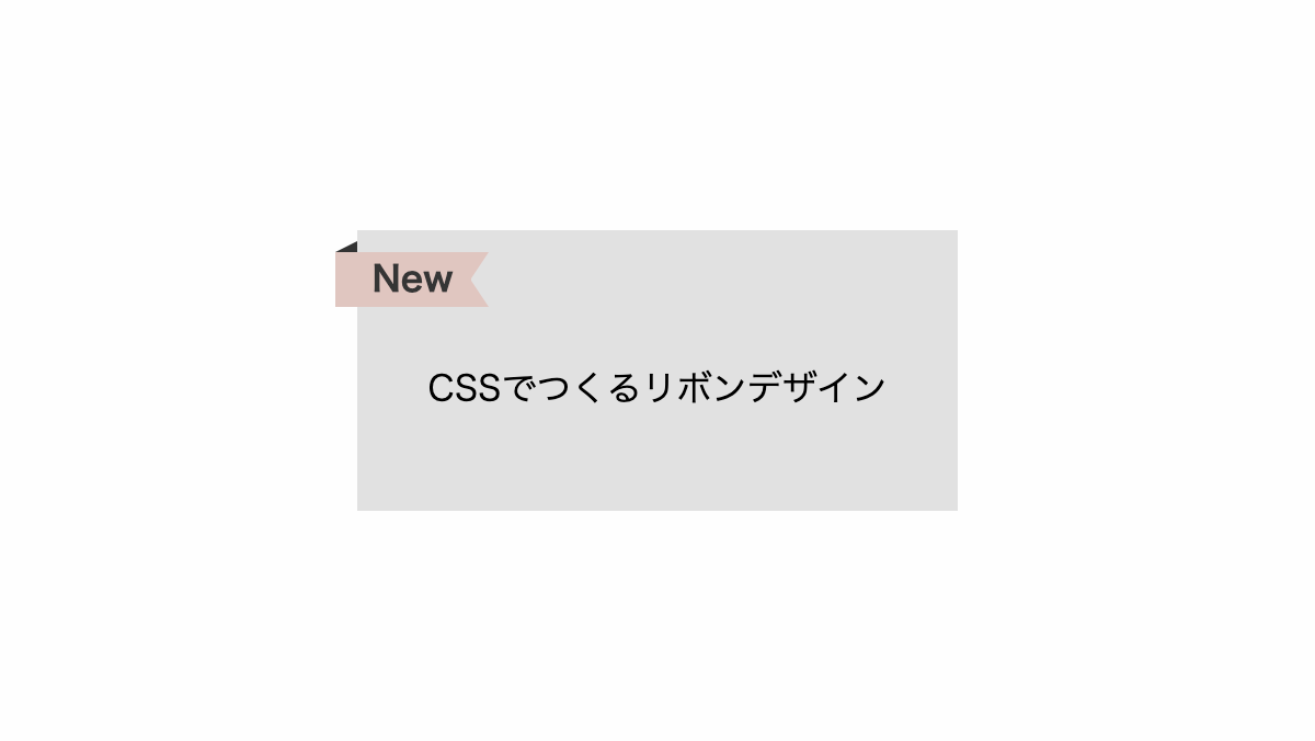
before、after疑似要素で左端に折り目を入れ、右端をカットしてます
コードを表示
<div class="box">
    <span>New</span>
    <p>CSSでつくるリボンデザイン</p>
</div>
.box {
    position: relative;
    padding: 4rem 2rem 3rem;
    background-color: #e1e1e1;
}

.box span {
    position: absolute;
    top: 10px;
    left: -10px;
    height: 25px;
    line-height: 25px;
    width: 70px;
    background-color: #e0c6c0;
    color: #353535;
    font-weight: bold;
    text-align: center;
}

.box span::before {
    position: absolute;
    bottom: 100%;
    left: 0;
    width: 0px;
    height: 0px;
    border: none;
    border-top: 5px solid transparent;
    border-right: 10px solid #333;
    content: '';
}

.box span::after {
    position: absolute;
    top: 0px;
    right: 0;
    width: 0px;
    height: 0px;
    border-width: 12.5px 8px 12.5px 0px;
    border-color: transparent #e1e1e1;
    border-style: solid;
    content: '';
}HTML・CSSのカスタマイズや動作確認ができます
折り目を入れたリボンを右上に付けたCSSデザイン
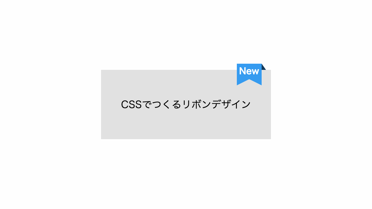
before、after疑似要素で上部に折り目を入れ、下部をカットしてます
コードを表示
<div class="box">
    <span>New</span>
    <p>CSSでつくるリボンデザイン</p>
</div>
.box {
    position: relative;
    padding: 3rem 2rem 3rem;
    background-color: #e1e1e1;
}

.box span {
    position: absolute;
    top: -10px;
    right: 15px;
    width: 40px;
    height: 25px;
    line-height: 25px;
    background-color: #359bf0;
    color: #fff;
    font-weight: bold;
    font-size: 14px;
    text-align: center;
}

.box span::before {
    position: absolute;
    top: 0;
    left: 100%;
    width: 0px;
    height: 0px;
    border: none;
    border-bottom: 10px solid #153b5b;
    border-right: 7px solid transparent;
    content: '';
}

.box span::after {
    position: absolute;
    top: 100%;
    left: 0;
    width: 0px;
    height: 0px;
    border-style: solid;
    border-width: 0 20px 10px 20px;
    border-color: transparent #359bf0;
    content: '';
}HTML・CSSのカスタマイズや動作確認ができます
折り目を入れたリボンを右上に付けたCSSデザイン
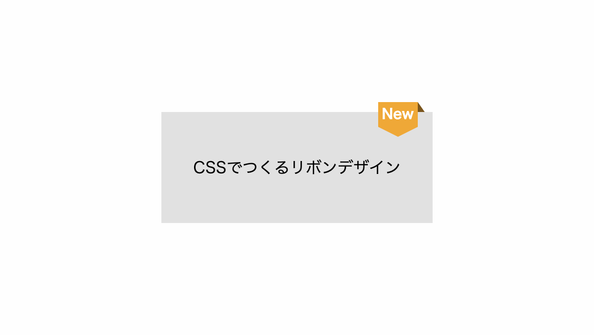
before、after疑似要素で上部に折り目を入れ、下部をカットしてます
コードを表示
<div class="box">
    <span>New</span>
    <p>CSSでつくるリボンデザイン</p>
</div>
.box {
    position: relative;
    padding: 3rem 2rem 3rem;
    background-color: #e1e1e1;
}

.box span {
    position: absolute;
    top: -10px;
    right: 15px;
    width: 40px;
    height: 25px;
    line-height: 25px;
    background-color: #efa837;
    color: #fff;
    font-weight: bold;
    font-size: 14px;
    text-align: center;
}

.box span::before {
    position: absolute;
    top: 0;
    left: 100%;
    width: 0px;
    height: 0px;
    border: none;
    border-bottom: 10px solid #7a551d;
    border-right: 7px solid transparent;
    content: '';
}

.box span::after {
    position: absolute;
    top: 100%;
    left: 0;
    width: 0px;
    height: 0px;
    border-style: solid;
    border-width: 10px 20px 0px 20px;
    border-color: #efa837 transparent;
    content: '';
}HTML・CSSのカスタマイズや動作確認ができます
内側に波線を入れたリボンを右上に付けたCSSデザイン
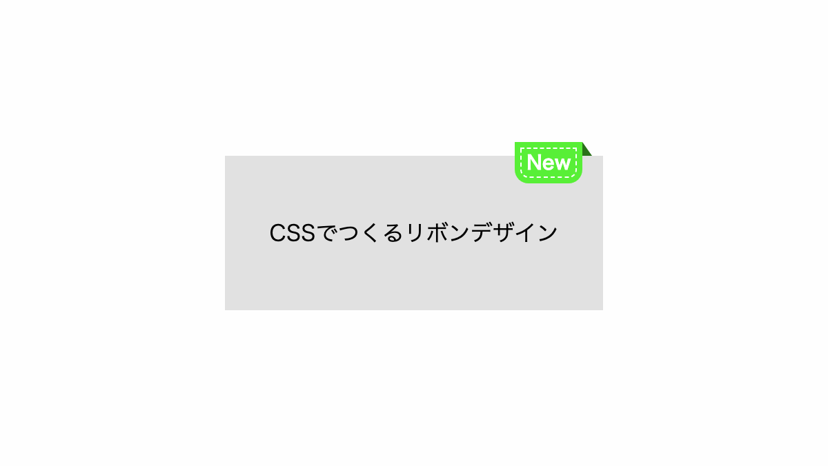
before疑似要素で「outline」プロパティを使用し波線を入れてます
コードを表示
<div class="box">
    <span>New</span>
    <p>CSSでつくるリボンデザイン</p>
</div>
.box {
    position: relative;
    padding: 3rem 2rem 3rem;
    background-color: #e1e1e1;
}

.box span {
    position: absolute;
    top: -10px;
    right: 15px;
    padding: 0.5rem;
    border-radius: 0 0 10px 10px;
    background-color: #58ef37;
    outline: 1px dashed #fff;
    outline-offset: -5px;
    color: #fff;
    font-weight: bold;
    font-size: 14px;
    text-align: center;
}

.box span::before {
    position: absolute;
    top: 0;
    left: 100%;
    width: 0px;
    height: 0px;
    border: none;
    border-bottom: 10px solid #2a701a;
    border-right: 7px solid transparent;
    content: '';
}HTML・CSSのカスタマイズや動作確認ができます
斜めに短い線を入れたCSSデザイン
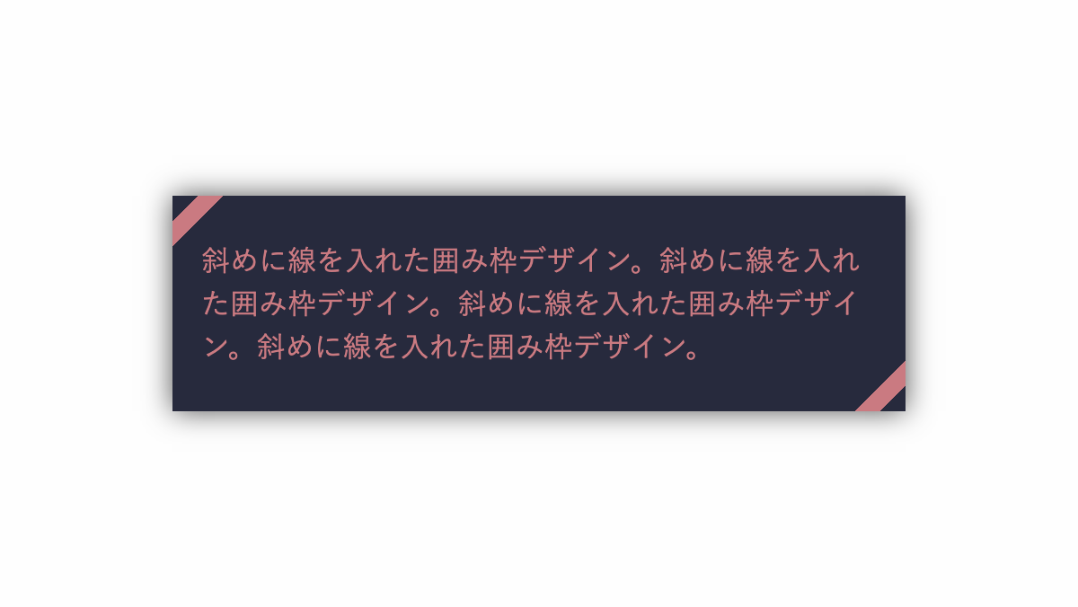
「linear-gradient」でリボン風の線を斜めに入れてます
コードを表示
<div class="box">
    <p>斜めに線を入れた囲み枠デザイン。斜めに線を入れた囲み枠デザイン。斜めに線を入れた囲み枠デザイン。斜めに線を入れた囲み枠デザイン。</p>
</div>
.box {
    --main-color: #CA7A81;
    position: relative;
    padding: 1.5rem 1rem;
    box-shadow: 0 0 15px #555;
    box-sizing: border-box;
    background-color: #272A3D;
    background-image: linear-gradient(-45deg, transparent 0 10px, var(--main-color) 10px 20px, transparent 20px calc(100% - 20px), var(--main-color) calc(100% - 20px) calc(100% - 10px), transparent calc(100% - 10px));
    color: var(--main-color);
}

.box p {
    line-height: 1.5;
}HTML・CSSのカスタマイズや動作確認ができます
CSSで作る吹き出しの見出しデザインを作りました。
before、after疑似要素で「border」プロパティ等を使用し吹出口を作っています。
三角の吹出口だけではなく、線を入れただけのシンプルな吹き出しや背景をストライプにしたものなど様々なパターンで作成しています。


