
画像やSVGは使用しなくてもCSSだけでリボン風のデザインを作ることができます。
今回は「border」プロパティを疑似要素で使用し作成する方法を解説します。
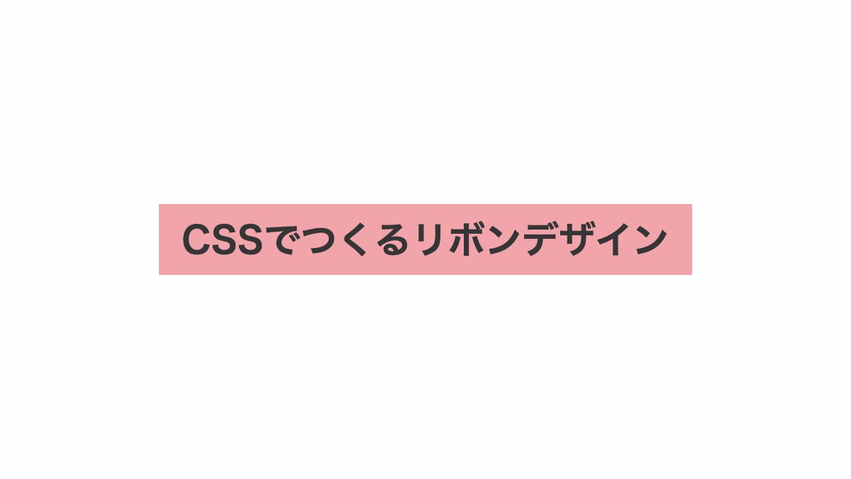
両端をカットしたリボンデザイン
要素を文字幅に合わせる
「display: inline-block;」で要素を文字幅に合わせます。「height」と「line-height」に同じ値を指定し文字を縦中央に配置。
<h2>CSSでつくるリボンデザイン</h2>
h2 {
    position: relative;
    display: inline-block;
    height: 50px;
    line-height: 50px;
    padding: 0 1rem;
    background-color: #f1a4aa;
    color: #353535;
    font-size: 26px;
    font-weight: bold;
    text-align: center;
}
左端を三角にカットする
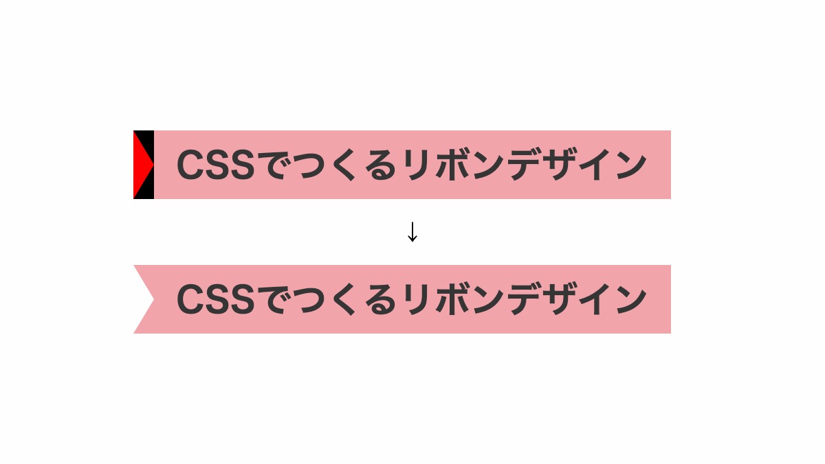
before疑似要素で位置を調整。「border」プロパティを使用し上下を背景と同色に。右ボーダーの幅を0にし、左ボーダーを透過させカットしてます。
h2::before{
    position: absolute;
    top: 0;
    left: -15px;
    width: 0px;
    height: 0px;
    border-color: #f1a4aa transparent;
    border-width: 25px 0px 25px 15px;
    border-style: solid;
    content: '';
}
右端もカットする
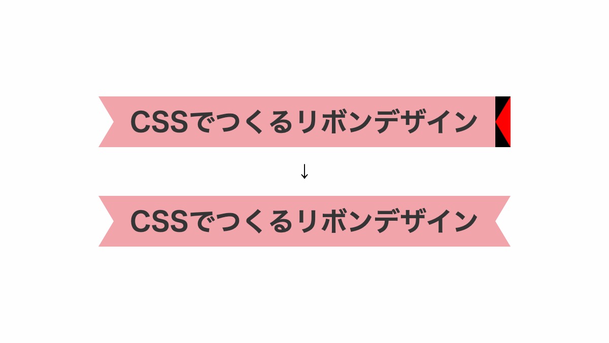
after疑似要素で左端とは逆に、左ボーダーの幅を0にし、右ボーダーを透過させカットしてます。
h2::before,
h2::after {
    position: absolute;
    top: 0;
    width: 0px;
    height: 0px;
    border-color: #f1a4aa transparent;
    border-style: solid;
    content: '';
}
h2::before {
    left: -15px;
    border-width: 25px 0px 25px 15px;
}
h2::after {
    right: -15px;
    border-width: 25px 15px 25px 0px;
}
全てのソース
コードを表示
HTML・CSSのカスタマイズや動作確認ができます
両端をカットし上下に線を引いたリボンデザイン
上下に実線を引く
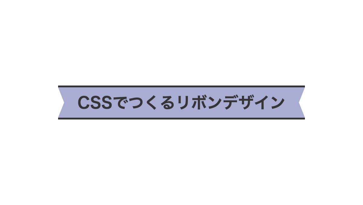
「border-top」「border-bottom」に「solid」を指定し実線を引いてます。before,after疑似要素で両端をリボン風にカット。
h2 {
    border-top: 3px solid #353535;
    border-bottom: 3px solid #353535;
    ...
}

h2::before,h2::after {
    position: absolute;
    content: '';
    top: 0; width: 0px; height: 0px;
    border-color: transparent #fff;
    border-style: solid;
}
h2::before {
  left: 0; border-width: 25px 0px 25px 10px;
}
h2::after {
  right: 0;border-width: 25px 10px 25px 0px;
}
全てのソース
コードを表示
<h2>CSSでつくるリボンデザイン</h2>
h2 {
    position: relative;
    display: inline-block;
    height: 50px;
    line-height: 50px;
    padding: 0 2rem;
    border-top: 3px solid;
    border-bottom: 3px solid;
    background-color: #a9acd3;
    color: #353535;
    font-size: 26px;
    font-weight: bold;
    text-align: center;
}

h2::before,
h2::after {
    position: absolute;
    content: '';
    top: 0;
    width: 0px;
    height: 0px;
    border-color: transparent #fff;
    border-style: solid;
}

h2::before {
    left: 0;
    border-width: 25px 0px 25px 10px;
}

h2::after {
    right: 0;
    border-width: 25px 10px 25px 0px;
}HTML・CSSのカスタマイズや動作確認ができます
上下に破線を引く
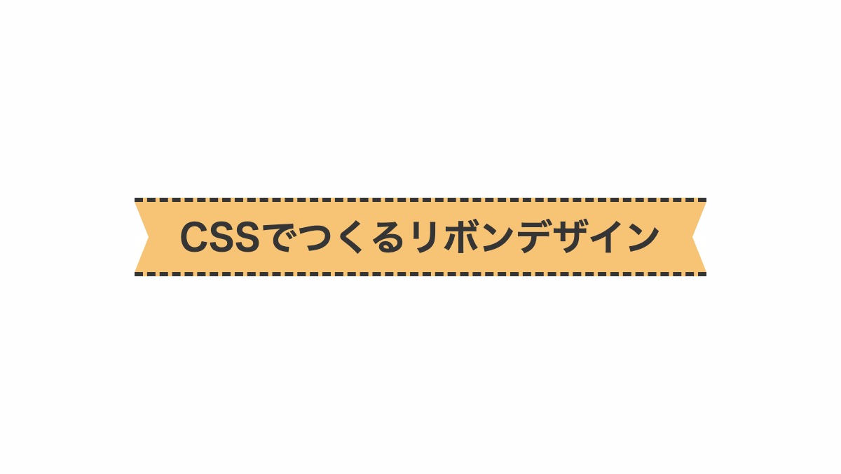
「border-top」「border-bottom」に「dashed」を指定し破線を引いてます。
h2 {
    border-top: 3px dashed #353535;
    border-bottom: 3px dashed #353535;
    background-color: #f7c476;
    ...
}
全てのソース
コードを表示
<h2>CSSでつくるリボンデザイン</h2>
h2 {
    position: relative;
    display: inline-block;
    height: 50px;
    line-height: 50px;
    padding: 0 2rem;
    border-top: 3px dashed;
    border-bottom: 3px dashed;
    background-color: #f7c476;
    color: #353535;
    font-size: 26px;
    font-weight: bold;
    text-align: center;
}

h2::before,
h2::after {
    position: absolute;
    content: '';
    top: 0;
    width: 0px;
    height: 0px;
    border-color: transparent #fff;
    border-style: solid;
}

h2::before {
    left: 0;
    border-width: 25px 0px 25px 10px;
}

h2::after {
    right: 0;
    border-width: 25px 10px 25px 0px;
}HTML・CSSのカスタマイズや動作確認ができます
内側に白い線を引く
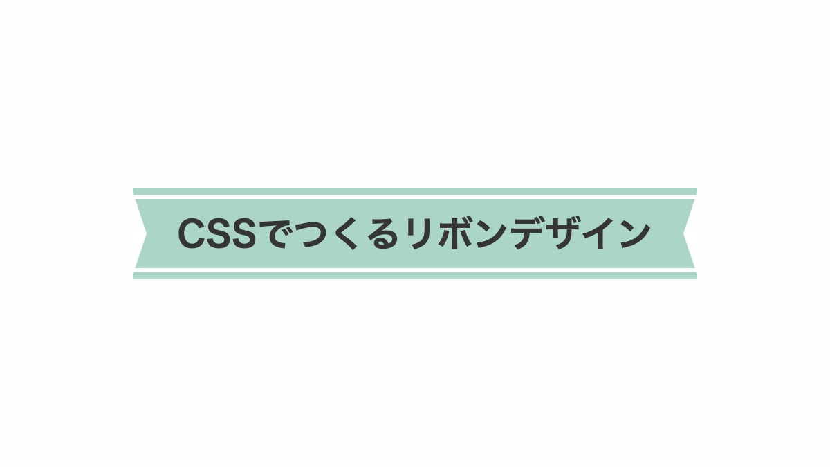
「box-shadow」で上下を5px広げ、「border-top」「border-bottom」で白い実線を引いてます。before,after疑似要素の「top:-5px」で両端縦のカット位置を調整
h2 {
    box-shadow: 0px -5px #abd6c5,
                0px 5px #abd6c5;
    border-top: 3px solid #fff;
    border-bottom: 3px solid #fff;
    background-color: #abd6c5;
    ...
}

h2::before,h2::after {
    position: absolute;
    top: -5px;
    ...
}
全てのソース
コードを表示
<h2>CSSでつくるリボンデザイン</h2>
h2 {
    position: relative;
    display: inline-block;
    height: 50px;
    line-height: 50px;
    padding: 0 2rem;
    box-shadow: 0px -5px #abd6c5, 0px 5px #abd6c5;
    border-top: 3px solid #fff;
    border-bottom: 3px solid #fff;
    background-color: #abd6c5;
    color: #353535;
    font-size: 26px;
    font-weight: bold;
    text-align: center;
}

h2::before,
h2::after {
    position: absolute;
    top: -5px;
    width: 0px;
    height: 0px;
    border-color: transparent #fff;
    border-style: solid;
    content: '';
}

h2::before {
    left: 0;
    border-width: 30px 0px 30px 10px;
}

h2::after {
    right: 0;
    border-width: 30px 10px 30px 0px;
}HTML・CSSのカスタマイズや動作確認ができます


