
蛍光ペン風の下線はWEB広告などでよく見かけますよね。
今回はCSSで蛍光ペン風の下線を引き、下線のスタイルを色々と変えてみました。
ノーマルな蛍光ペン風の下線
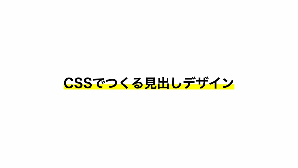
「h2」タグの中に「span」タグを入れ、「linear-gradient」を指定。上から下方向に「透過→黄色」でグラデーションをかけて蛍光ペン風の下線にしています。
<h2><span>CSSでつくる見出しデザイン</span></h2>
h2 {
    margin-bottom: 0.2rem;
    font-weight: bold;
    font-size: 26px;
    text-align: center;
}

h2 span {
    background: linear-gradient(
      transparent 60%, #FFFE03 60%
    );
}
全てのソース
コードを表示
<h2><span>CSSでつくる見出しデザイン</span></h2>h2 {
margin-bottom: 0.2rem;
font-weight: bold;
font-size: 26px;
text-align: center;
}
h2 span {
background: linear-gradient(transparent 60%, #FFFE03 60%);
}
このWEBパーツを確認する
HTML・CSSのカスタマイズや動作確認ができます
蛍光ペン風の下線の角を変形させる
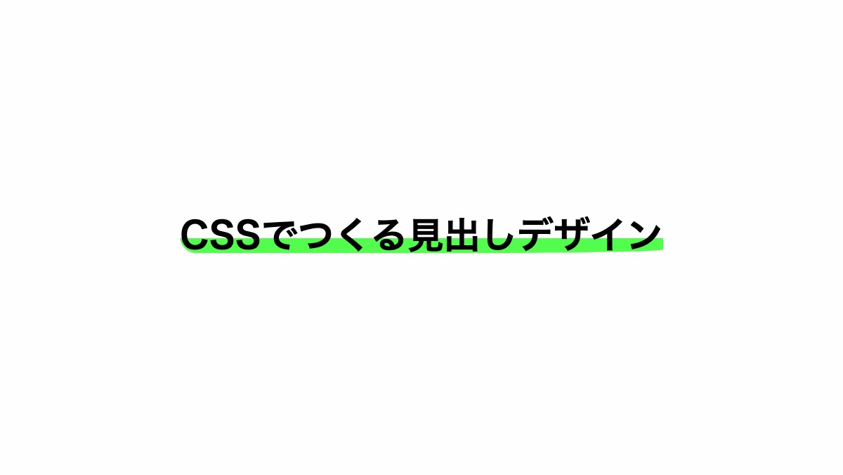
「border-radius」を指定し、4つ角を変形させてます。
<h2><span>CSSでつくる見出しデザイン</span></h2>
h2 {
    margin-bottom: 0.2rem;
    font-weight: bold;
    font-size: 26px;
    text-align: center;
}

h2 span {
    background: linear-gradient(
      transparent 60%, #FFFE03 60%
    );
    border-radius:
      80% 50% 60% 5%/80% 75% 15% 75%;
}
全てのソース
コードを表示
<h2><span>CSSでつくる見出しデザイン</span></h2>h2 {
margin-bottom: 0.2rem;
font-weight: bold;
font-size: 26px;
text-align: center;
}
h2 span {
background: linear-gradient(transparent 60%, #52FD4D 60%);
border-radius: 80% 50% 60% 5%/80% 75% 15% 75%;
}
このWEBパーツを確認する
HTML・CSSのカスタマイズや動作確認ができます
蛍光ペン風の下線を波線にする
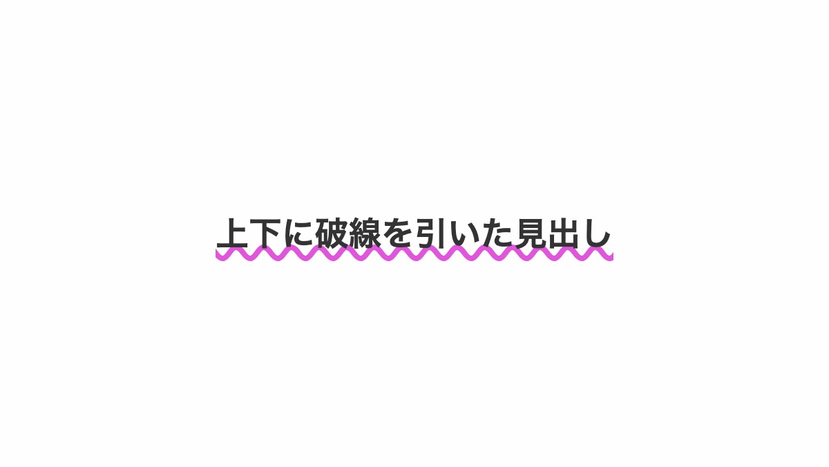
「text-decoration」プロパティに「wavy」を指定し波線にしています。
<h2><span>CSSでつくる見出しデザイン</span></h2>
h2 {
    color: #333;
    text-decoration:
      4px underline wavy #E056DB;
    text-underline-offset: -2px;
    text-align: center;
    font-weight: bold;
    font-size: 24px;
}
全てのソース
コードを表示
<h2>上下に破線を引いた見出し</h2>h2 {
color: #333;
text-decoration: 4px underline wavy #E056DB;
text-underline-offset: -2px;
text-align: center;
font-weight: bold;
font-size: 24px;
}
このWEBパーツを確認する
HTML・CSSのカスタマイズや動作確認ができます


