
before疑似要素は指定せずに、「background-image」プロパティに異なるタイプの「gradient」関数を指定して、一部だけ斜めストライプを表示しています。
ブログなどにご活用ください。
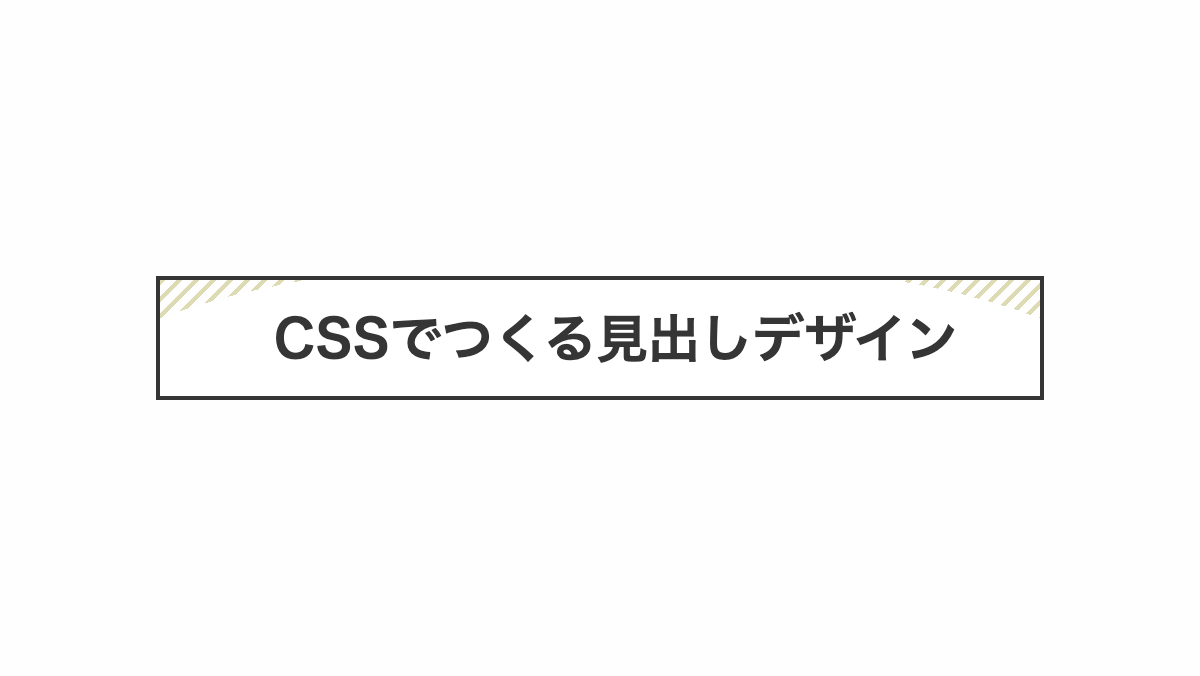
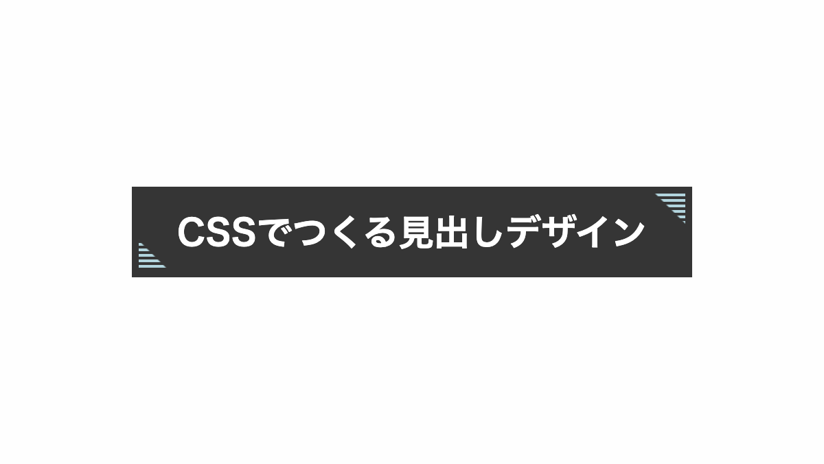
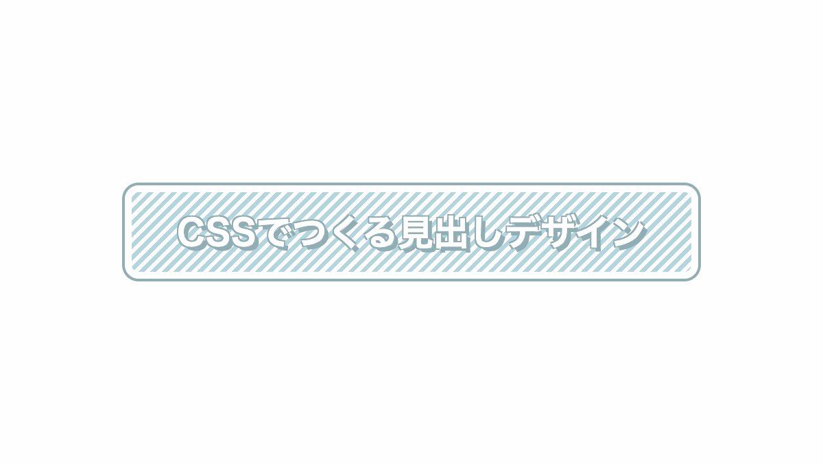
左下だけストライプにした見出し
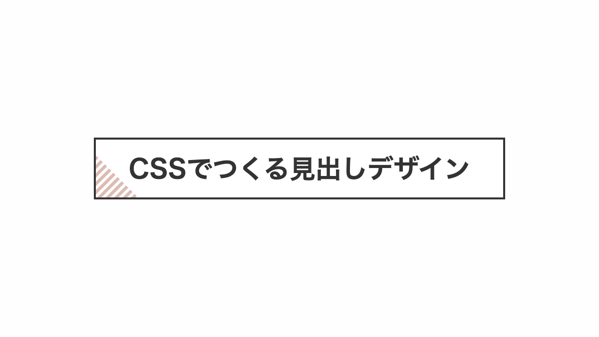
「linear-gradient(45deg, transparent 0 30px, #fff 30px)」で左下だけ45度に透過させ、背景のストライプを表示しています
コードを表示
<h2>CSSでつくる見出しデザイン</h2>
h2 {
    position: relative;
    padding: 1rem;
    outline: 2px solid #333;
    background-image:
        linear-gradient(45deg, transparent 0 30px, #fff 30px),
        repeating-linear-gradient(135deg, #db349b 0 3px, transparent 3px 6px);
    color: #333;
    font-size: 26px;
    font-weight: bold;
    text-align: center;
}HTML・CSSのカスタマイズや動作確認ができます
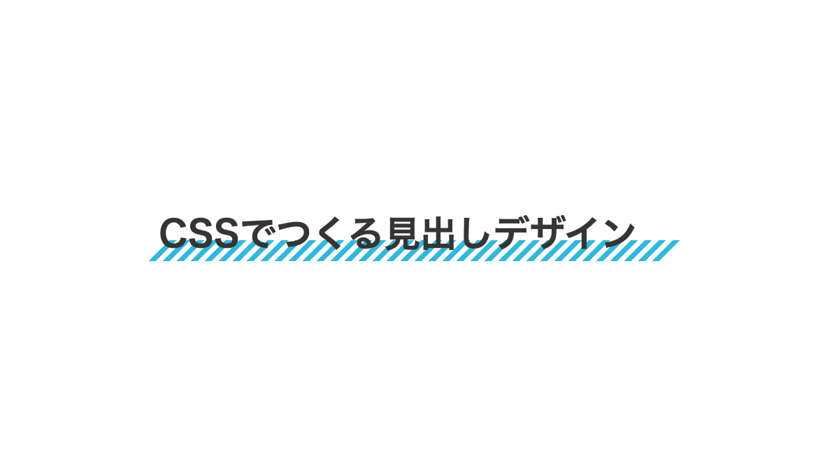
左側をストライプにした見出し
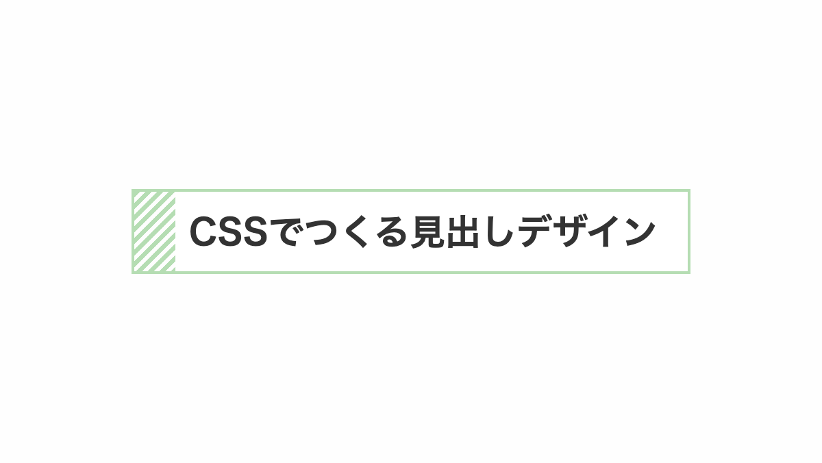
「linear-gradient(90deg, transparent 0 30px, #fff 30px)」で左側の一部を透過させ、「repeating-linear-gradient」を表示しています。
コードを表示
<h2>CSSでつくる見出しデザイン</h2>
h2 {
    position: relative;
    padding: 1rem 1rem 1rem 2.5rem;
    border: 2px solid #5dd834;
    background-image:
        linear-gradient(90deg, transparent 0 30px, #fff 30px),
        repeating-linear-gradient(135deg, #5dd834 0 3px, transparent 3px 6px);
    color: #333;
    font-size: 26px;
    font-weight: bold;
}HTML・CSSのカスタマイズや動作確認ができます
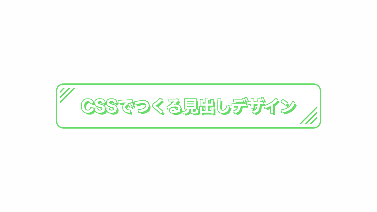
左上、右下をストライプにした見出し
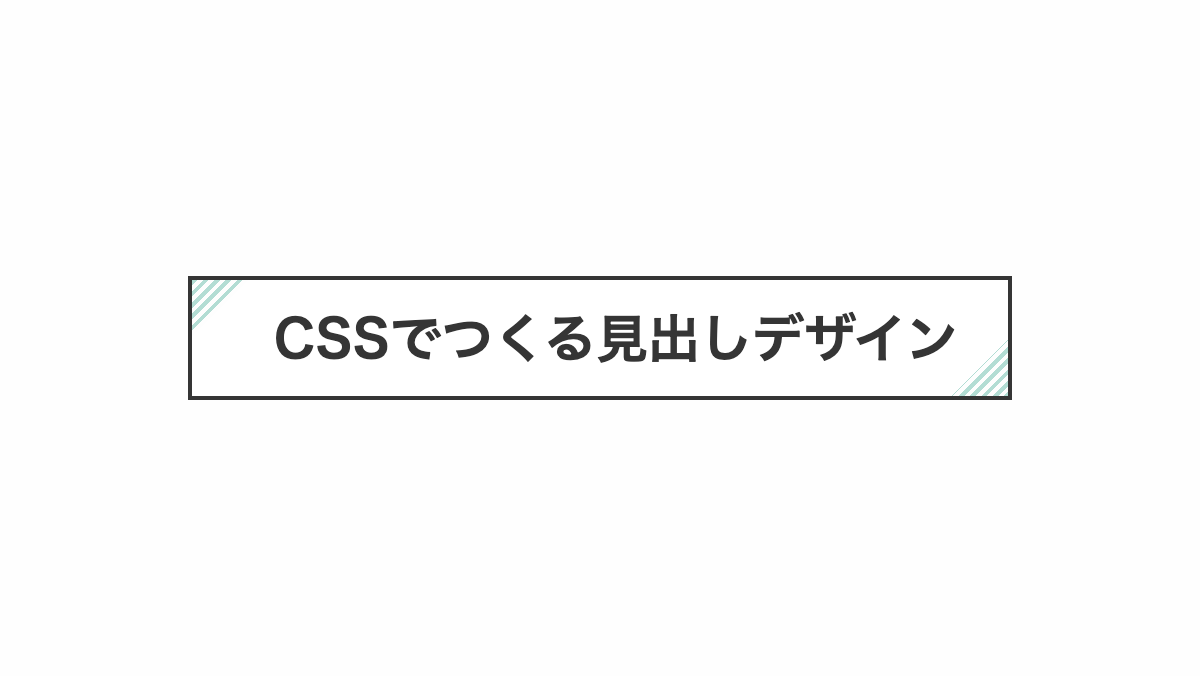
「linear-gradient(-45deg, transparent 0 20px, #fff 20px calc(100% - 20px), transparent calc(100% - 20px))」で右下から透過→白→透過にして、左上と右下にストライプを表示しています。
コードを表示
<h2>CSSでつくる見出しデザイン</h2>
h2 {
    position: relative;
    padding: 1rem 1rem 1rem 2rem;
    outline: 2px solid #333;
    background-image:
        linear-gradient(-45deg, transparent 0 20px, #fff 20px calc(100% - 20px), transparent calc(100% - 20px)),
        repeating-linear-gradient(135deg, #33dddd 0 2px, transparent 2px 4px);
    color: #333;
    font-size: 26px;
    font-weight: bold;
}HTML・CSSのカスタマイズや動作確認ができます
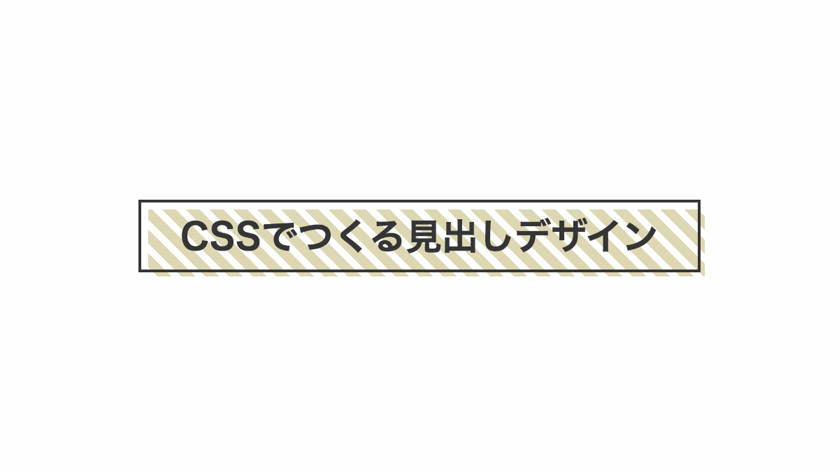
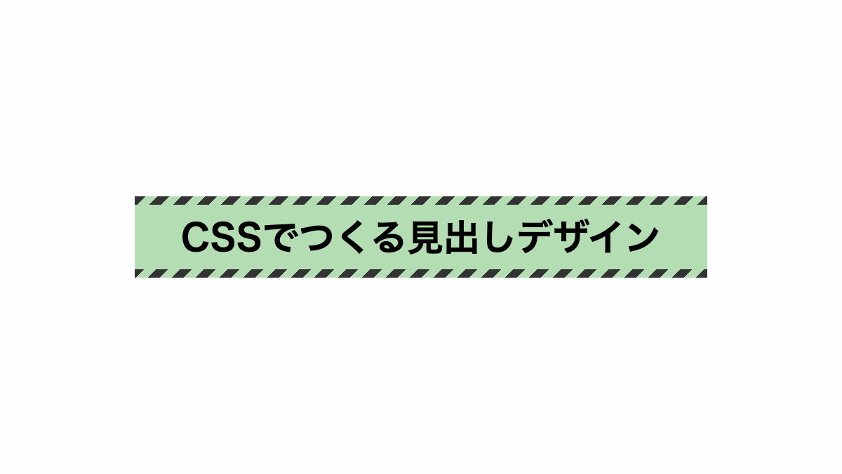
ストライプで囲んだ見出し
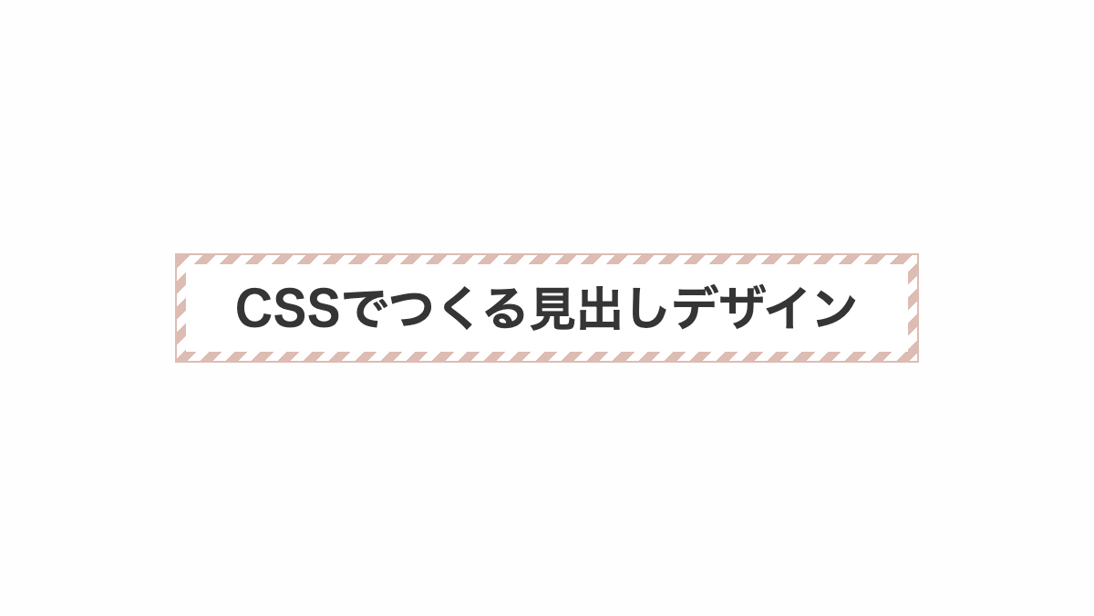
「linear-gradient」で白背景に。「background-size」で10px小さくして、ストライプを表示しています。
コードを表示
<h2>CSSでつくる見出しデザイン</h2>
h2 {
    position: relative;
    padding: 1rem;
    border: 1px solid #e94e33;
    background-image:
        linear-gradient(#fff 0 100%),
        repeating-linear-gradient(135deg, #e94e33 0 5px, transparent 5px 10px);
    background-repeat: no-repeat;
    background-position: center;
    background-size: calc(100% - 10px) calc(100% - 10px), 100%;
    color: #353535;
    font-size: 26px;
    font-weight: bold;
    text-align: center;
}HTML・CSSのカスタマイズや動作確認ができます
内枠をストライプにした見出し

「linear-gradient」で黒背景に。「background-size」で10px小さくして、ストライプを表示し、「border」で背景と同色の境界線を入れてます
コードを表示
<h2>CSSでつくる見出しデザイン</h2>
h2 {
    position: relative;
    padding: 1rem;
    border-radius: 5px;
    border: 10px solid #333;
    background-color: #333;
    background-image:
        linear-gradient(#333 0 100%),
        repeating-linear-gradient(135deg, #fff 0 5px, transparent 5px 10px);
    background-repeat: no-repeat;
    background-position: center;
    background-size: calc(100% - 10px) calc(100% - 10px), 100%;
    color: #fff;
    font-size: 26px;
    font-weight: bold;
    text-align: center;
}HTML・CSSのカスタマイズや動作確認ができます
左上、右上をストライプにした見出し
「radial-gradient(ellipse at bottom」で白背景の半円をストライプの前面に表示しています。
コードを表示
<h2>CSSでつくる見出しデザイン</h2>
h2 {
    position: relative;
    padding: 1rem 1rem 1rem 2rem;
    outline: 2px solid #333;
    background-image:
        radial-gradient(ellipse at bottom, #fff 0 80%, transparent 60%),
        repeating-linear-gradient(135deg, #f0b531 0 2px, transparent 2px 6px);
    color: #333;
    font-size: 26px;
    font-weight: bold;
}HTML・CSSのカスタマイズや動作確認ができます
下線をストライプにした見出し
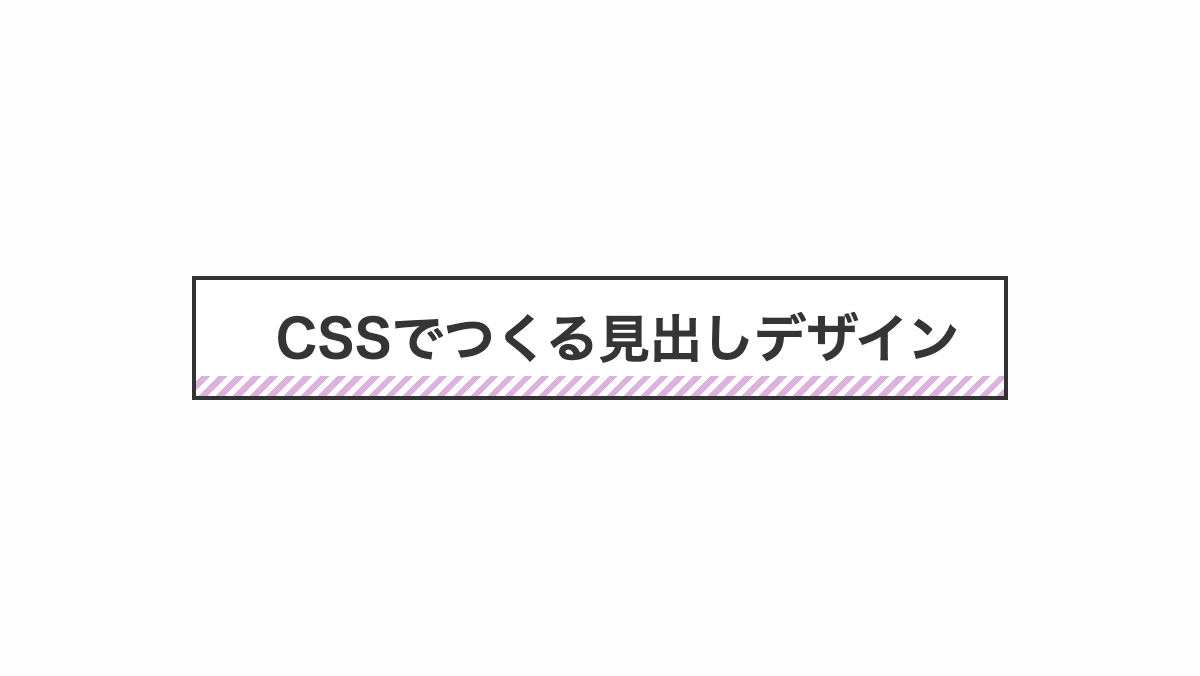
「linear-gradient」で下側10pxを透過させた白背景をストライプの前面に表示し下線を引いたようにしています。
コードを表示
<h2>CSSでつくる見出しデザイン</h2>
h2 {
    position: relative;
    padding: 1rem 1rem 1rem 2.5rem;
    border: 2px solid #333;
    background-image:
        linear-gradient(0deg, transparent 0 10px, #fff 10px),
        repeating-linear-gradient(135deg, #bb35d6 0 3px, transparent 3px 6px);
    color: #333;
    font-size: 26px;
    font-weight: bold;
}HTML・CSSのカスタマイズや動作確認ができます
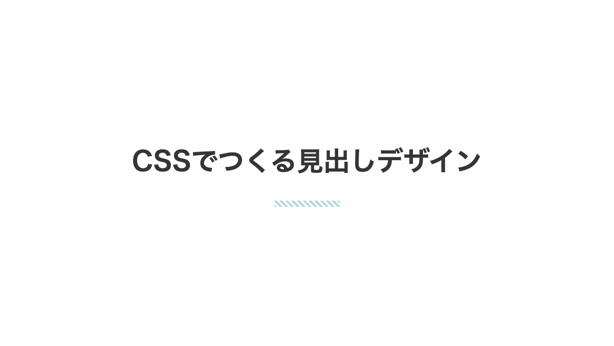
下線を斜めストライプにした見出し
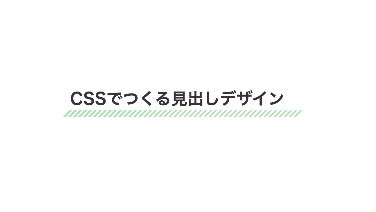
「repeating-linear-gradient」を使用しストライプに。「background-position」で下部に表示しています。
コードを表示
<h2>CSSでつくる見出しデザイン</h2>h2 {
position: relative;
margin-bottom: 0.5rem;
padding-bottom: 1rem;
background-image: repeating-linear-gradient(45deg, transparent 0 3px, #e06850 3px 6px);
background-repeat: no-repeat;
background-size: 100% 0.5rem;
background-position: bottom;
font-weight: bold;
font-size: 26px;
color: #353535;
}HTML・CSSのカスタマイズや動作確認ができます
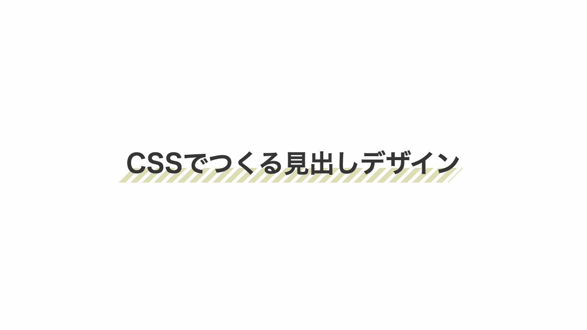
下線を斜めストライプにした見出し
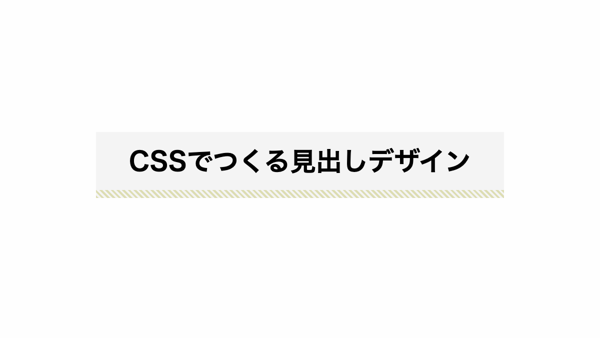
ストライプは「background-image」プロパティで調整可能です。
コードを表示
<h2>CSSでつくる見出しデザイン</h2>h2 {
position: relative;
padding: 1rem 0.5rem 1.5rem;
margin-bottom: 0.5rem;
font-weight: bold;
font-size: 26px;
color: black;
background-color: #F4F4F4;
background-image: repeating-linear-gradient(45deg, #F4AD3B 0, #F4AD3B 2px, transparent 2px, transparent 4px);
background-repeat: no-repeat;
background-size: 100% 0.5rem;
background-position: bottom;
}HTML・CSSのカスタマイズや動作確認ができます
下線に小さい斜めストライプを入れた見出し
「repeating-linear-gradient」でストライプに。横幅を「background-size」で小さくしています。
コードを表示
<h2>CSSでつくる見出しデザイン</h2>h2 {
padding: 1.3rem 0;
margin-bottom: 0.5rem;
background-image: repeating-linear-gradient(45deg, #68dfed 0 2px, transparent 2px 4px);
background-repeat: no-repeat;
background-size: 4rem 0.4rem;
background-position: center bottom;
color: #353535;
font-weight: bold;
font-size: 26px;
text-align: center;
}HTML・CSSのカスタマイズや動作確認ができます
ストライプに少し文字を重ねた見出し
「repeating-linear-gradient」でストライプにし、「background-position」で位置を調整。
コードを表示
<h2>CSSでつくる見出しデザイン</h2>h2 {
position: relative;
padding: 0.7rem 0;
margin-bottom: 0.2rem;
background-image: repeating-linear-gradient(45deg, transparent 0 3px, #bee0e1 3px 6px);
background-repeat: no-repeat;
background-size: 100% 10px;
background-position: left 0 bottom 10px;
color: #353535;
font-weight: bold;
font-size: 26px;
}HTML・CSSのカスタマイズや動作確認ができます
ストライプに少し文字を重ねた見出し
「repeating-linear-gradient」でストライプにし、「background-position」で位置を調整。
コードを表示
<h2>CSSでつくる見出しデザイン</h2>h2 {
display: inline-block;
padding: 0.7rem 0;
margin-bottom: 0.2rem;
background-image: repeating-linear-gradient(45deg, transparent 0 3px, #f7c133 3px 6px);
background-repeat: no-repeat;
background-size: 100% 10px;
background-position: left 0 bottom 10px;
color: #353535;
font-weight: bold;
font-size: 26px;
}HTML・CSSのカスタマイズや動作確認ができます
左に斜めストライプを入れた見出し
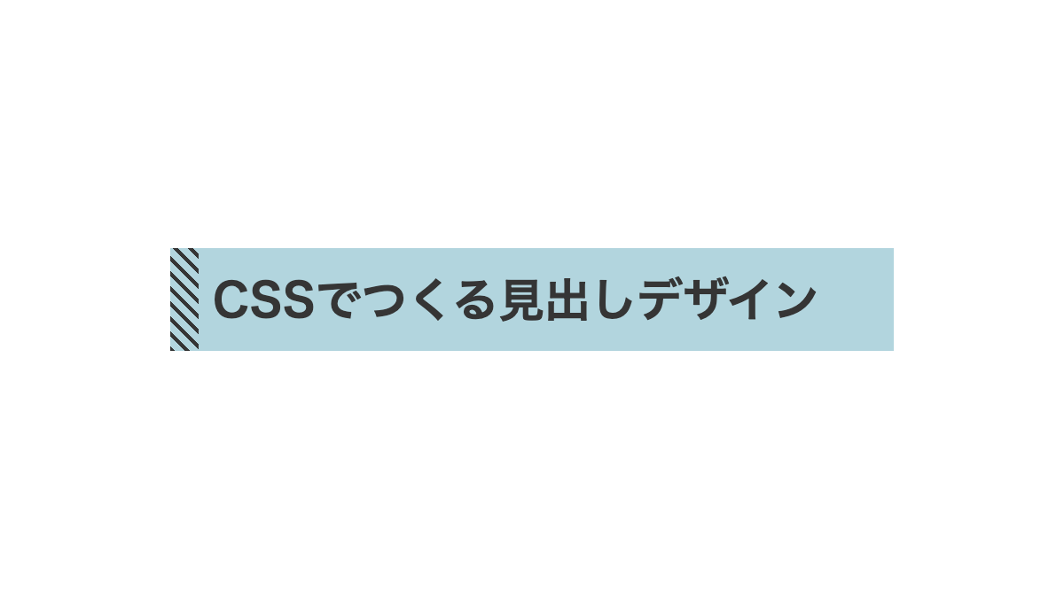
色はカスタムプロパティの「--main-color」ストライプは「before」疑似要素内の「background-image」プロパティで調整可能です
コードを表示
<h2>CSSでつくる見出しデザイン</h2>h2 {
padding: 1rem 1rem 1rem 1.5rem;
background-color: #C6D8DA;
background-image: repeating-linear-gradient(45deg, #353535 0 2px, transparent 2px 6px);
background-repeat: no-repeat;
background-size: 1rem 100%;
background-position: left;
font-weight: bold;
font-size: 26px;
color: 353535;
}HTML・CSSのカスタマイズや動作確認ができます
最初の文字に角丸のストライプを入れた見出し
first-letter疑似要素で最初の文字の背景をストライプに。 形やカラーやを変える場合は「background-image」プロパティを調整してください。
コードを表示
<h2>最初の文字に白いストライプを入れる</h2>h2 {
font-size: 26px;
font-weight: bold;
}
h2::first-letter {
padding: 0.5rem;
background-image: repeating-linear-gradient(135deg, #89d2e9 0 3px, transparent 3px 6px);
font-size: 36px;
}HTML・CSSのカスタマイズや動作確認ができます
斜めストライプの上に黒背景を重ねた見出し

「background-image」で黒背景は「linear-gradient」、ストライプは「repeating-linear-gradient」で設定
コードを表示
<h2>斜めストライプの上に黒背景を重ねる</h2>h2 {
padding: 1rem;
margin-bottom: 0.2rem;
background-image:
linear-gradient(black 0 100%),
repeating-linear-gradient(45deg, black 0 3px, #dbc92b 3px 6px);
background-repeat: no-repeat;
background-size: calc(100% - 2rem) 24px, 100%;
background-position: center;
color: white;
font-size: 24px;
}HTML・CSSのカスタマイズや動作確認ができます
ストライプの上に斜めにしたグラデーション背景を重ねた見出し

「background-image」で斜めの背景は「linear-gradient」、ストライプは「repeating-linear-gradient」で設定
コードを表示
<h2>ストライプの上に斜めにした背景を重ねる</h2>h2 {
padding: 1rem 1.5rem;
margin-bottom: 0.2rem;
background-image:
linear-gradient(45deg, transparent 0 5%, #101e17 15% 80%, transparent 95%),
repeating-linear-gradient(#3c8789 0 1px, transparent 1px 3px);
background-repeat: no-repeat;
background-size: 100% 100%, 100%;
background-position: center;
color: white;
font-size: 24px;
}HTML・CSSのカスタマイズや動作確認ができます
左右にストライプ入りの三角形を入れた見出し
「linear-gradient 」で三角形にして「repeating-linear-gradient」でストライプにしています。
コードを表示
<h2>シンプルなあしらいを入れた見出し</h2>h2 {
padding: 15px;
border: 5px solid #333;
background-image:
linear-gradient(45deg, transparent 15px, #333 16px calc(100% - 16px), transparent calc(100% - 15px)),
repeating-linear-gradient(#97B7C4, 2px, #4f5f66 2px 4px);
color: white;
font-size: 26px;
font-weight: bold;
}HTML・CSSのカスタマイズや動作確認ができます
左右に斜めストライプ入りのあしらいを入れた見出し
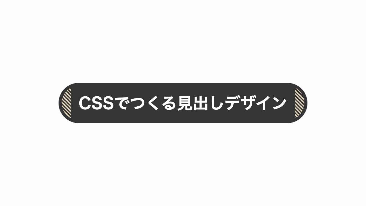
「linear-gradient 」で罫線を入れ、「border-radius」で角丸に。「repeating-linear-gradient」でストライプにしています。
コードを表示
<h2>シンプルなあしらいを入れた見出し</h2>h2 {
padding: 15px 20px;
border: 5px solid #333;
border-radius: 50px;
background-image:
linear-gradient(90deg, transparent 15px, #333 16px calc(100% - 16px), transparent calc(100% - 15px)),
repeating-linear-gradient(45deg, #F3CC57, 2px, #9b8237 2px 4px);
color: white;
font-size: 26px;
font-weight: bold;
text-align: center;
}HTML・CSSのカスタマイズや動作確認ができます
ストライプをずらした見出し
「outline」で実践を引き、「background-position」でストライプをずらしてます
コードを表示
<h2>CSSでつくる見出しデザイン</h2>h2 {
position: relative;
padding: 1rem;
outline: 2px solid #333;
outline-offset: -5px;
background-image:
repeating-linear-gradient(45deg, #E2DED3 0 7px, transparent 7px 12px);
background-repeat: no-repeat;
background-position: 10px 10px;
color: #333;
font-size: 26px;
font-weight: bold;
text-align: center;
}HTML・CSSのカスタマイズや動作確認ができます
背景をストライプにした見出し
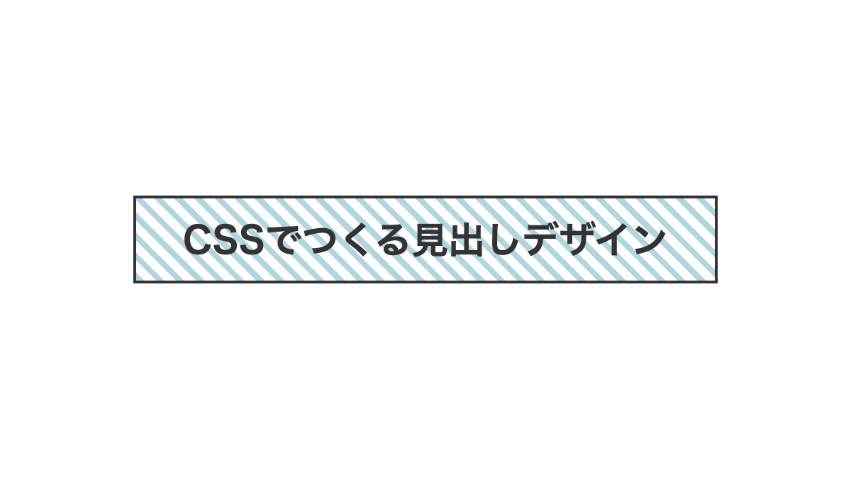
「repeating-linear-gradient」で背景をストライプにしています
コードを表示
<h2>CSSでつくる見出しデザイン</h2>h2 {
position: relative;
padding: 1rem;
outline: 2px solid #333;
background-image:
repeating-linear-gradient(45deg, #badbd8 0 4px, transparent 4px 10px);
color: #333;
font-size: 26px;
font-weight: bold;
text-align: center;
}HTML・CSSのカスタマイズや動作確認ができます
斜めストライプを入れた見出し
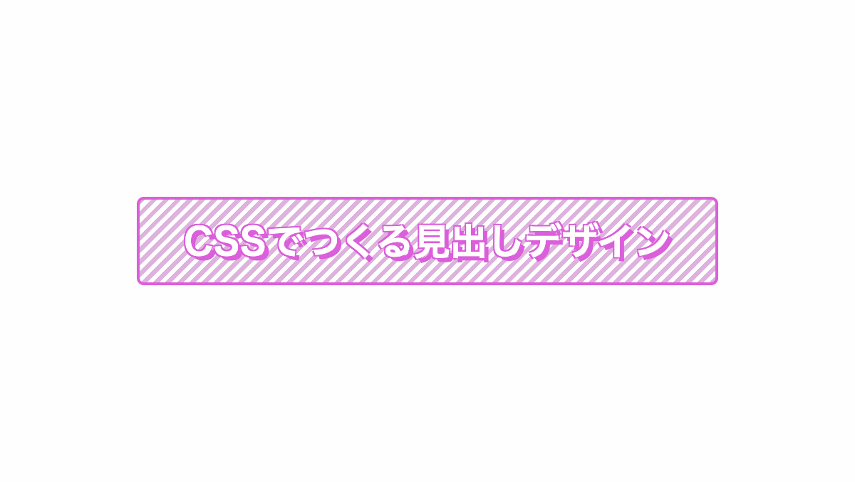
「repeating-linear-gradient」で斜めストライプを入れてます
コードを表示
<h2>CSSでつくる見出しデザイン</h2>h2 {
position: relative;
padding: 1rem;
border-radius: 5px;
border: 2px solid #8728ed;
background: repeating-linear-gradient(-45deg, #ccaaef 0 3px, #fff 3px 6px);
color: #fff;
text-shadow: -1px -1px 0 #8728ed, -1px 1px 0 #8728ed, 1px -1px 0 #8728ed, 3px 3px 0 #8728ed;
font-weight: bold;
font-size: 30px;
text-align: center;
}HTML・CSSのカスタマイズや動作確認ができます
斜めストライプをずらした見出し
「repeating-linear-gradient」で斜めストライプを入れ、after疑似要素で境界線をずらしてます
コードを表示
<h2>CSSでつくる見出しデザイン</h2>h2 {
position: relative;
padding: 1rem;
border-radius: 5px;
background: repeating-linear-gradient(45deg, #E7DA2C 0 3px, #fff 3px 8px);
color: #333;
font-weight: bold;
font-size: 26px;
text-align: center;
}
h2::before {
position: absolute;
bottom: -16px;
left: calc(50% - 6px);
transform: translateX(-50% + 6px);
height: 20px;
width: 2px;
background-color: #333;
content: "";
}
h2::after {
position: absolute;
top: -6px;
left: -6px;
width: 100%;
height: 100%;
border: 2px solid #353535;
content: '';
}HTML・CSSのカスタマイズや動作確認ができます
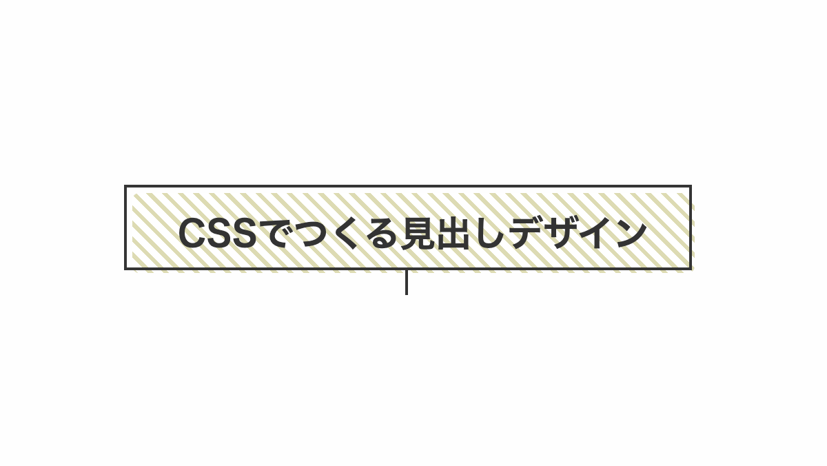
斜めストライプを入れた見出し
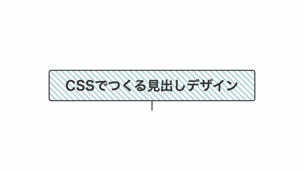
「repeating-linear-gradient」で斜めストライプを入れてます
コードを表示
<h2>CSSでつくる見出しデザイン</h2>h2 {
position: relative;
padding: 1rem;
border-radius: 5px;
border: 2px solid #333;
background: repeating-linear-gradient(45deg, #aAE8F2 0 3px, #fff 3px 8px);
color: #333;
font-weight: bold;
font-size: 26px;
text-align: center;
}
h2::before {
position: absolute;
top: 100%;
left: 50%;
transform: translateX(-50%);
height: 20px;
width: 2px;
background-color: #333;
content: "";
}
h2 p {
line-height: 1.5;
}HTML・CSSのカスタマイズや動作確認ができます
斜めストライプを入れた見出し
「repeating-linear-gradient」で斜めストライプを入れ、「outline」プロパティで隙間を空けて枠線を引いてます
コードを表示
<h2>CSSでつくる見出しデザイン</h2>h2 {
position: relative;
padding: 1rem;
border-radius: 5px;
outline: 2px solid #43a4d8;
outline-offset: 5px;
background: repeating-linear-gradient(-45deg, #94cce8 0 3px, #fff 3px 6px);
color: #fff;
text-shadow: -1px -1px 0 #43a4d8, -1px 1px 0 #43a4d8, 1px -1px 0 #43a4d8, 3px 3px 0 #43a4d8;
font-weight: bold;
font-size: 30px;
text-align: center;
}HTML・CSSのカスタマイズや動作確認ができます
左上、右下に斜めストライプを入れた見出し
「repeating-linear-gradient」で斜めストライプを入れ、「outline」プロパティで隙間を空けて枠線を引いてます
コードを表示
<h2>CSSでつくる見出しデザイン</h2>h2 {
position: relative;
padding: 1rem;
border-radius: 5px;
outline: 2px solid #55d644;
outline-offset: 5px;
background:
linear-gradient(-45deg, transparent 0 20px, #fff 20px calc(100% - 20px), transparent calc(100% - 20px)),
repeating-linear-gradient(-45deg, #55d644 0 2px, #fff 2px 6px);
color: #fff;
text-shadow: -1px -1px 0 #55d644, -1px 1px 0 #55d644, 1px -1px 0 #55d644, 3px 3px 0 #55d644;
font-weight: bold;
font-size: 30px;
text-align: center;
}HTML・CSSのカスタマイズや動作確認ができます
上下に斜めストライプを入れた見出し
「linear-gradient」で上下を透過にして、「repeating-linear-gradient」で斜めストライプを入れてます
コードを表示
<h2>CSSでつくる見出しデザイン</h2>h2 {
position: relative;
padding: 1rem;
background: linear-gradient(0deg, transparent 0 10%, #42b584 0 90%, transparent 90%),
repeating-linear-gradient(-45deg, #333 0 6px, #42b584 6px 12px);
font-weight: bold;
font-size: 30px;
text-align: center;
}HTML・CSSのカスタマイズや動作確認ができます


