
CSSの「border」プロパティや「linear-gradient」関数を使用して、見出しに括弧を付けました。
カギ括弧や2重カギ括弧、丸括弧や隅付き括弧などをCSSで実装しています。
以下のサンプルを参考にブログやWEBサイトに活用してください〜。
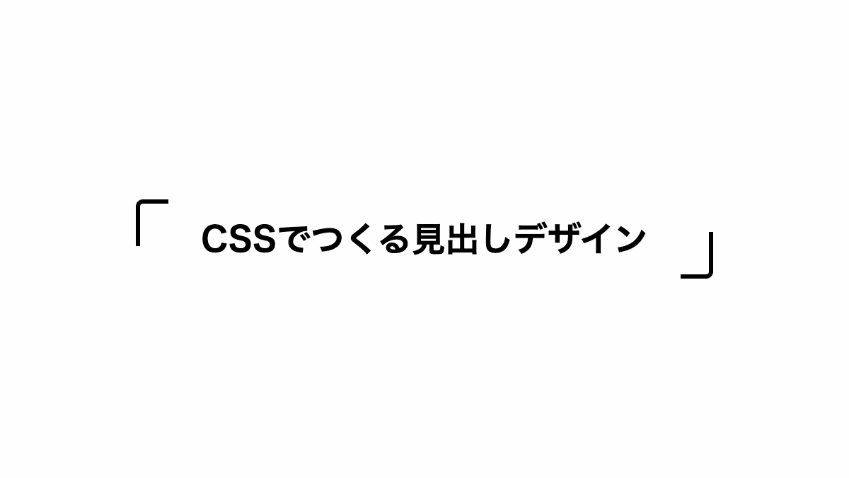
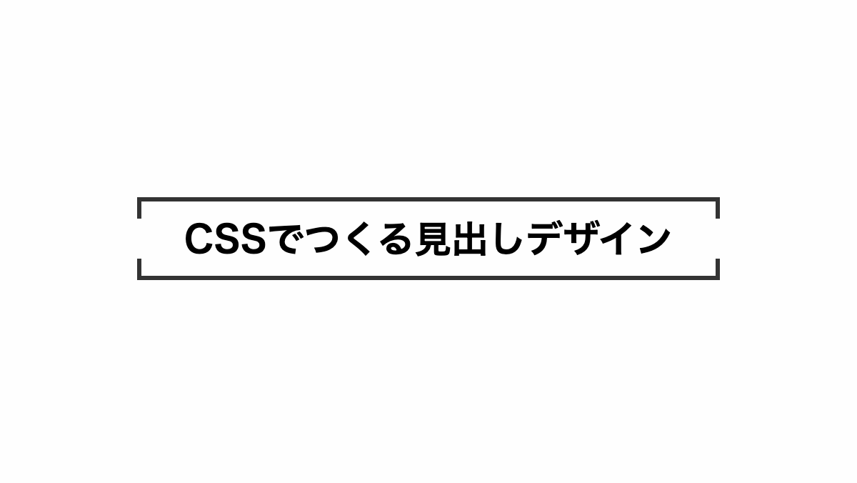
カギ括弧を付けた見出し
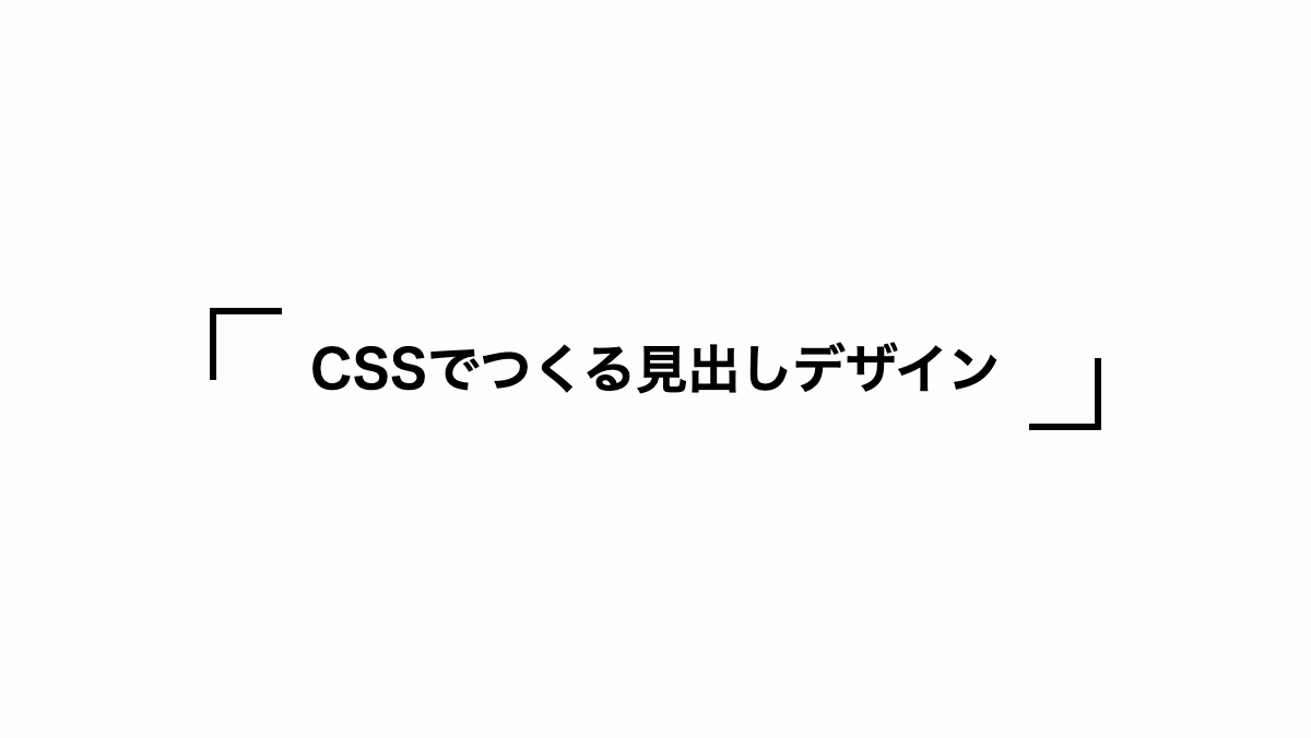
before、after疑似要素で「border」プロパティを指定し括弧を作っています
コードを表示
<h2>CSSでつくる見出しデザイン</h2>
h2 {
    position: relative;
    padding: 1rem;
    font-size: 24px;
    font-weight: bold;
    text-align: center;
}

h2::before,
h2::after {
    position: absolute;
    width: 30px;
    height: 30px;
    content: '';
}

h2::before {
    border-left: solid 3px;
    border-top: solid 3px;
    top: 0;
    left: 0;
}

h2::after {
    border-right: solid 3px;
    border-bottom: solid 3px;
    bottom: 0;
    right: 0;
}HTML・CSSのカスタマイズや動作確認ができます
二重カギ括弧をつけた見出し
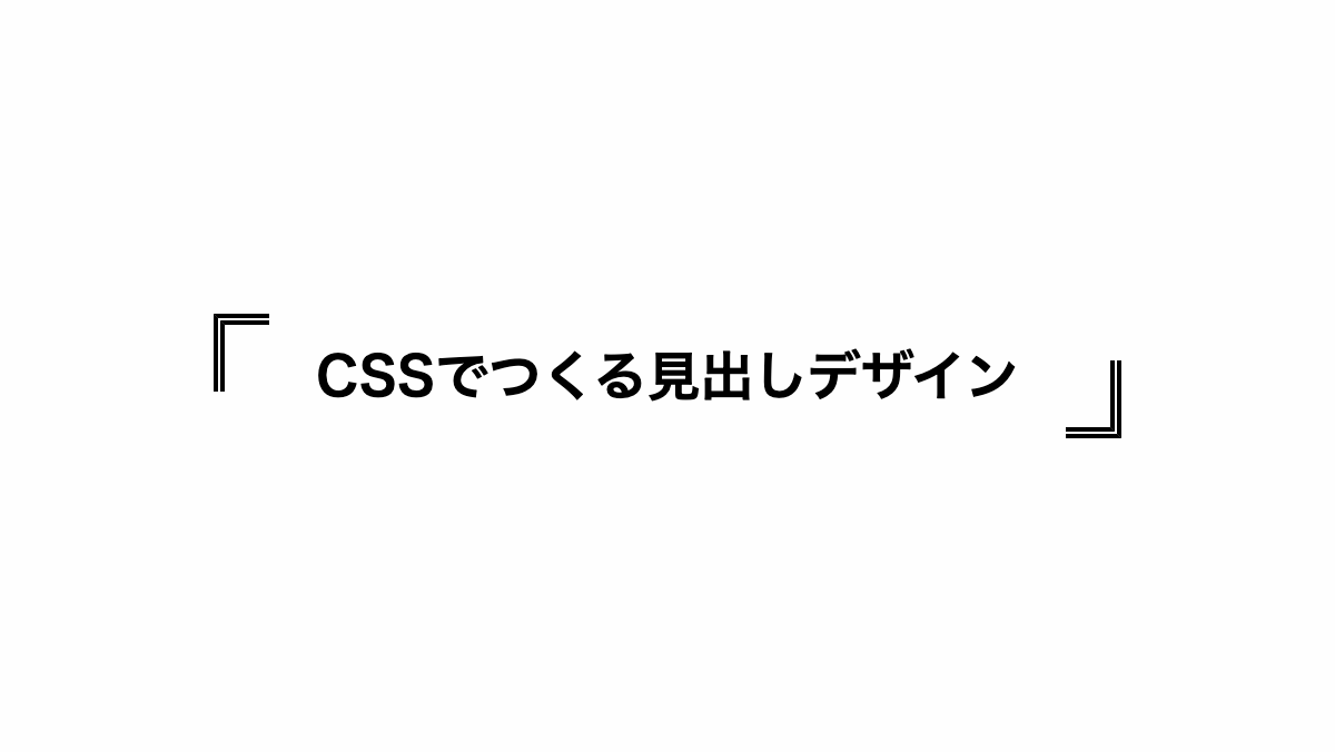
before、after疑似要素で「border」プロパティを指定し「border-style」を「double」にして括弧を作っています
コードを表示
<h2>CSSでつくる見出しデザイン</h2>
h2 {
    position: relative;
    padding: 1rem;
    font-size: 24px;
    font-weight: bold;
    text-align: center;
}

h2::before,
h2::after {
    position: absolute;
    width: 20px;
    height: 30px;
    content: '';
}

h2::before {
    border-left: double 5px;
    border-top: double 5px;
    top: 0;
    left: 0;
}

h2::after {
    border-right: double 5px;
    border-bottom: double 5px;
    bottom: 0;
    right: 0;
}HTML・CSSのカスタマイズや動作確認ができます
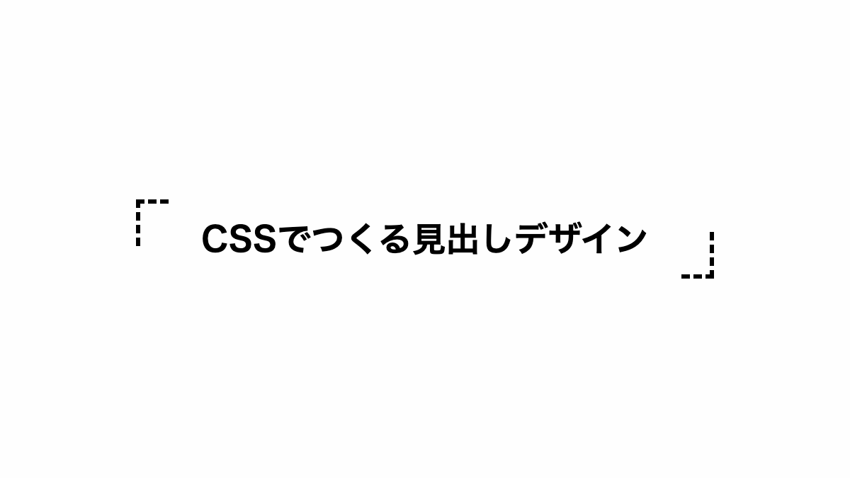
点線のカギ括弧をつけた見出し

before、after疑似要素で「border」プロパティを指定し「border-style」を「dotted」にして括弧を作っています
コードを表示
<h2>CSSでつくる見出しデザイン</h2>
h2 {
    position: relative;
    padding: 1rem;
    font-size: 24px;
    font-weight: bold;
    text-align: center;
}

h2::before,
h2::after {
    position: absolute;
    width: 20px;
    height: 30px;
    content: '';
}

h2::before {
    border-left: dotted 3px;
    border-top: dotted 3px;
    top: 0;
    left: 0;
}

h2::after {
    border-right: dotted 3px;
    border-bottom: dotted 3px;
    bottom: 0;
    right: 0;
}HTML・CSSのカスタマイズや動作確認ができます
破線のカギ括弧をつけた見出し
before、after疑似要素で「border」プロパティを指定し「border-style」を「dashed」にして括弧を作っています
コードを表示
<h2>CSSでつくる見出しデザイン</h2>
h2 {
    position: relative;
    padding: 1rem;
    font-size: 24px;
    font-weight: bold;
    text-align: center;
}

h2::before,
h2::after {
    position: absolute;
    width: 20px;
    height: 30px;
    content: '';
}

h2::before {
    border-left: dashed 3px;
    border-top: dashed 3px;
    top: 0;
    left: 0;
}

h2::after {
    border-right: dashed 3px;
    border-bottom: dashed 3px;
    bottom: 0;
    right: 0;
}HTML・CSSのカスタマイズや動作確認ができます
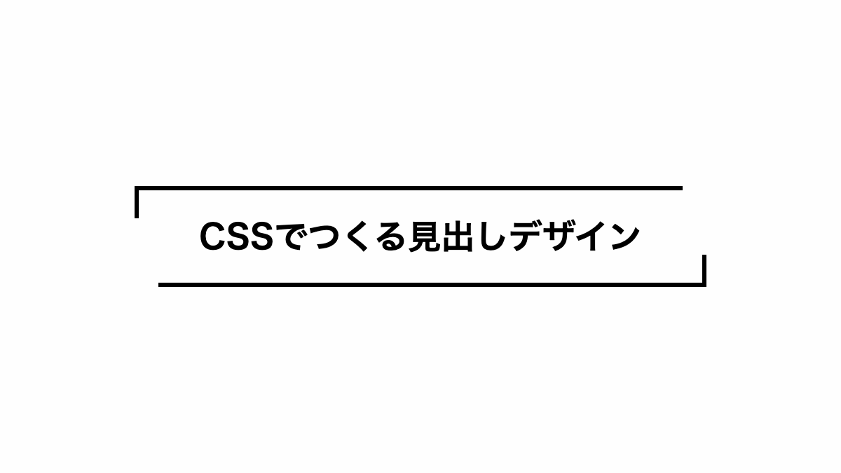
縦横の長さが違うCSSカギ括弧見出し

before、after疑似要素で「border」プロパティを指定し「width」「height」の値を変えて括弧を作っています
コードを表示
<h2>CSSでつくる見出しデザイン</h2>
h2 {
    position: relative;
    padding: 1rem;
    font-size: 24px;
    font-weight: bold;
    text-align: center;
}

h2::before,
h2::after {
    position: absolute;
    width: 15px;
    height: 40px;
    content: '';
}

h2::before {
    border-left: solid 3px;
    border-top: solid 3px;
    top: 0;
    left: 0;
}

h2::after {
    border-right: solid 3px;
    border-bottom: solid 3px;
    bottom: 0;
    right: 0;
}HTML・CSSのカスタマイズや動作確認ができます
縦横の長さが違うCSSカギ括弧見出し
before、after疑似要素で「border」プロパティを指定し「width」「height」の値を変えて括弧を作っています
コードを表示
<h2>CSSでつくる見出しデザイン</h2>
h2 {
    position: relative;
    padding: 1.5rem 1rem;
    font-size: 24px;
    font-weight: bold;
    text-align: center;
}

h2::before,
h2::after {
    position: absolute;
    width: 95%;
    height: 20px;
    content: '';
}

h2::before {
    border-left: solid 3px;
    border-top: solid 3px;
    top: 0;
    left: 0;
}

h2::after {
    border-right: solid 3px;
    border-bottom: solid 3px;
    bottom: 0;
    right: 0;
}HTML・CSSのカスタマイズや動作確認ができます
カギ括弧を角丸にしたシンプルな見出し
before、after疑似要素で「border」プロパティを指定し「border-radius」角丸にして括弧を作っています
コードを表示
<h2>CSSでつくる見出しデザイン</h2>
h2 {
    position: relative;
    padding: 1rem 1.5rem;
    font-size: 24px;
    font-weight: bold;
    text-align: center;
}

h2::before,
h2::after {
    position: absolute;
    width: 20px;
    height: 30px;
    content: '';
}

h2::before {
    border-left: solid 3px;
    border-top: solid 3px;
    border-radius: 5px 0 0 0;
    top: 0;
    left: 0;
}

h2::after {
    border-right: solid 3px;
    border-bottom: solid 3px;
    border-radius: 0 0 5px 0;
    bottom: 0;
    right: 0;
}HTML・CSSのカスタマイズや動作確認ができます
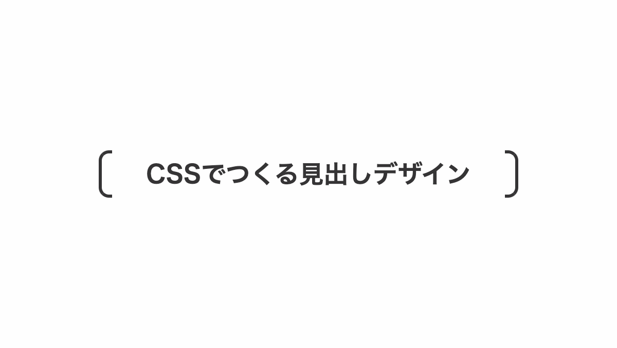
角括弧をつけたシンプルな見出し

before、after疑似要素で「border」プロパティを指定し高さを100%にして角括弧を作っています
コードを表示
<h2>CSSでつくる見出しデザイン</h2>
h2 {
    position: relative;
    padding: 0.5rem 1rem;
    color: black;
    font-size: 24px;
    font-weight: bold;
    text-align: center;
}

h2::before,
h2::after {
    position: absolute;
    top: -3px;
    width: 10px;
    height: 100%;
    content: '';
    border-top: solid 3px;
    border-bottom: solid 3px;
}

h2::before {
    border-left: solid 3px;
    left: 0;
}

h2::after {
    border-right: solid 3px;
    right: 0;
}HTML・CSSのカスタマイズや動作確認ができます
角括弧を角丸にしたシンプルな見出し
before、after疑似要素で「border」プロパティを指定し「border-radius」で角丸にして括弧を作っています
コードを表示
<h2>CSSでつくる見出しデザイン</h2>
h2 {
    position: relative;
    padding: 0.5rem 1rem;
    color: #353435;
    font-size: 24px;
    font-weight: bold;
    text-align: center;
}

h2::before,
h2::after {
    position: absolute;
    top: -3px;
    width: 10px;
    height: 100%;
    content: '';
    border-top: solid 3px #353435;
    border-bottom: solid 3px #353435;
}

h2::before {
    border-left: solid 3px #353435;
    border-radius: 10px 0 0 10px;
    left: 0;
}

h2::after {
    border-right: solid 3px #353435;
    border-radius: 0 10px 10px 0;
    right: 0;
}HTML・CSSのカスタマイズや動作確認ができます
丸括弧を付けたシンプルな見出し
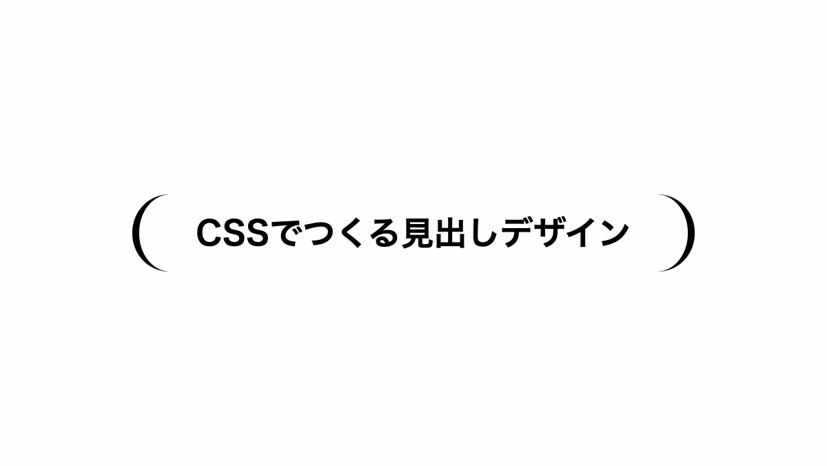
before、after疑似要素で「border」プロパティを指定し「border-radius」角丸にして括弧を作っています
コードを表示
<h2>CSSでつくる見出しデザイン</h2>
h2 {
    position: relative;
    padding: 1rem;
    color: black;
    font-size: 24px;
    font-weight: bold;
    text-align: center;
}

h2::before,
h2::after {
    position: absolute;
    top: 0;
    height: 100%;
    width: 50px;
    border-radius: 30px;
    content: '';
}

h2::before {
    border-left: solid 5px;
    left: 0;
}

h2::after {
    border-right: solid 5px;
    right: 0;
}HTML・CSSのカスタマイズや動作確認ができます
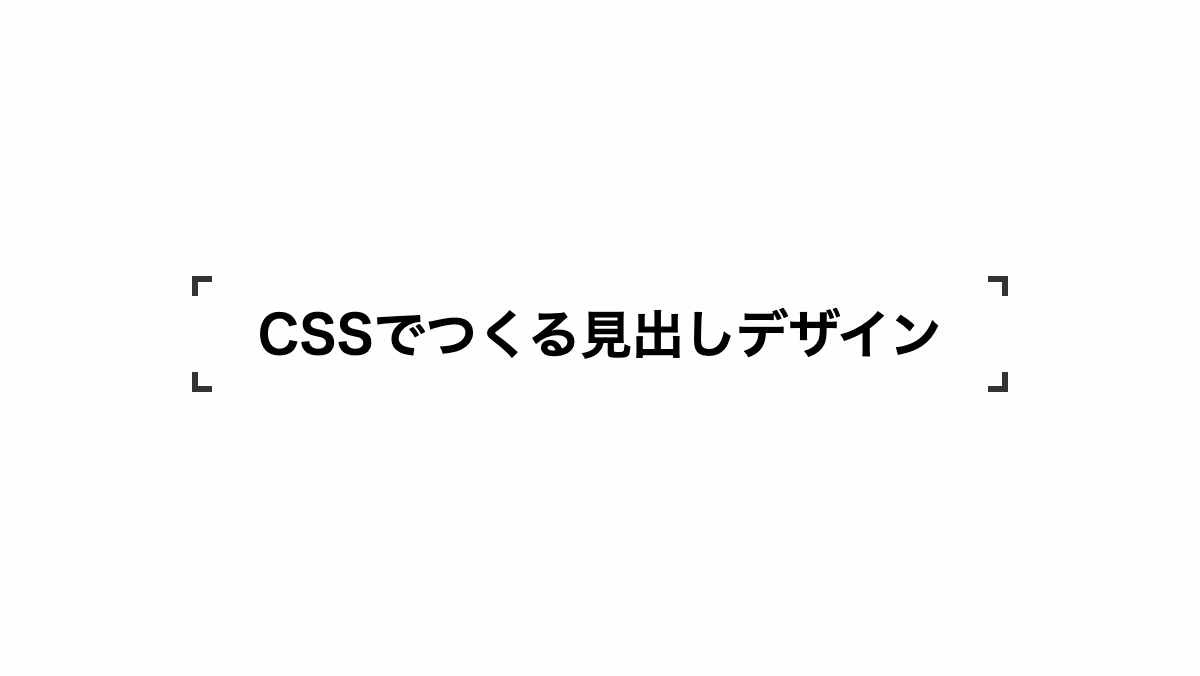
隅付き括弧をつけたシンプルな見出し

角丸の白い背景を黒背景に重ねて隅付き括弧を作っています
コードを表示
<h2>括弧をつけた見出しデザイン</h2>
h2 {
    position: relative;
    padding: 1rem;
    border-radius: 15px;
    background-color: white;
    font-size: 24px;
    font-weight: bold;
    text-align: center;
}

h2::before {
    position: absolute;
    top: 0;
    right: -0.3rem;
    bottom: 0;
    left: -0.3rem;
    background-color: black;
    content: '';
    z-index: -1;
}HTML・CSSのカスタマイズや動作確認ができます
4隅に枠をつけたシンプルな見出し
「background-image」に「linear-gradient」を4箇所入れて括弧を作っています
コードを表示
<h2>CSSでつくる見出しデザイン</h2>
h2 {
    --x-gradient: linear-gradient(90deg, #333 0 10px, transparent 0 calc(100% - 10px), #333 calc(100% - 10px));
    --y-gradient: linear-gradient(#333 0 10px, transparent 0 calc(100% - 10px), #333 calc(100% - 10px));
    position: relative;
    padding: 1rem;
    margin-bottom: 0.2rem;
    background-image:
        var(--x-gradient),
        var(--y-gradient),
        var(--x-gradient),
        var(--y-gradient);
    background-repeat: no-repeat;
    background-size: 100% 3px, 3px 100%, 100% 3px, 3px 100%;
    background-position: top, right, bottom, left;
    font-weight: bold;
    font-size: 26px;
    text-align: center;
}HTML・CSSのカスタマイズや動作確認ができます
上下を括弧で囲んだ見出し
「background-image」に「linear-gradient」を4箇所入れて括弧を作っています
コードを表示
<h2>CSSでつくる見出しデザイン</h2>
h2 {
    --x-gradient: linear-gradient(90deg, #333 0 100%);
    --y-gradient: linear-gradient(#333 0 15px, transparent 0 calc(100% - 15px), #333 calc(100% - 15px));
    position: relative;
    padding: 1rem;
    margin-bottom: 0.2rem;
    background-image:
        var(--x-gradient),
        var(--y-gradient),
        var(--x-gradient),
        var(--y-gradient);
    background-repeat: no-repeat;
    background-size: 100% 3px, 3px 100%, 100% 3px, 3px 100%;
    background-position: top, right, bottom, left;
    font-weight: bold;
    font-size: 26px;
    text-align: center;
}HTML・CSSのカスタマイズや動作確認ができます


