
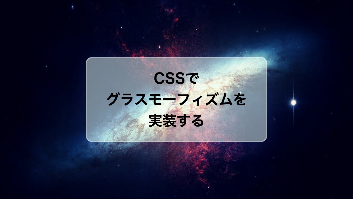
CSSの「backdrop-filter」プロパティを使用しグラスモーフィズム(磨りガラス風エフェクト)を作ってみました。
今回はその作り方を解説します。
背景画像を設定
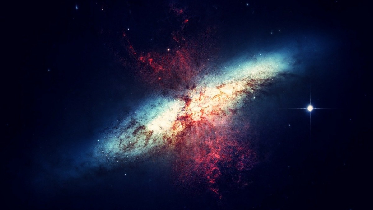
「background-image」で背景画像を設定し、フレックスボックスで子要素を上下中央に配置。「 z-index: 0;」にします
<div class="container"></div>
.container {
    position: relative;
    display: flex;
    justify-content: center;
    align-items: center;
    flex-direction: column;
    width: 100vw;
    height: 100vh;
    background-image: url(...);
    background-size: cover;
    background-position: center;
    z-index: 0;
}
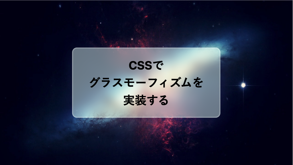
要素を透過にする
「background」プロパティに「rgba」を指定し要素を透過に設定。「box-shadow」を入れ下部にぼかしをいれます
<div class="container">
  <h1>CSSで<br>グラスモーフィズムを<br>実装する</h1>
</div>
h1 {
  position: relative;
  padding: 1rem 2rem;
  border: 2px solid rgba(255, 255, 255, .3);
  background: rgba(232, 255, 255, 0.5);
  box-shadow:
    0 8px 32px 0 rgba(31, 38, 135, 0.37);
  border-radius: 10px;
  font-weight: bold;
  font-size: 24px;
  text-align: center;
  line-height: 1.5;
}
磨りガラス風にする
before疑似要素で「backdrop-filter」を指定し磨りガラス風にしています
<div class="container">
  <h1>CSSで<br>グラスモーフィズムを<br>実装する</h1>
</div>
h1::before {
    position: absolute;
    top: 0;
    left: 0;
    width: 100%;
    height: 100%;
    backdrop-filter: blur(8px);
    -webkit-backdrop-filter: blur(8px);
    content: '';
    z-index: -1;
}
全てのソースコード
コードを表示
<div class="pic-container pic-background">
    <h1>CSSで<br>グラスモーフィズムを<br>実装する</h1>
</div>
.pic-container { position: relative; display: flex; justify-content: center; align-items: center; width: 100vw; height: 100vh; background-image: image(...); background-size: cover; background-position: center; z-index: 0; } h1 { position: relative; padding: 1rem 2rem; border: 2px solid rgba(255, 255, 255, .3); background: rgba(232, 255, 255, 0.5); box-shadow: 0 8px 32px 0 rgba(31, 38, 135, 0.37); border-radius: 10px; font-weight: bold; font-size: 24px; text-align: center; line-height: 1.5; } h1::before { position: absolute; top: 0; left: 0; width: 100%; height: 100%; backdrop-filter: blur(8px); -webkit-backdrop-filter: blur(8px); content: ''; z-index: -1; }
HTML・CSSのカスタマイズや動作確認ができます


