
文字を強調する時に使われるギザギザの吹き出し。
今回はCSSで正方形の要素を回転させてギザギザの吹き出しを作っていきます。
正方形の枠をつくる
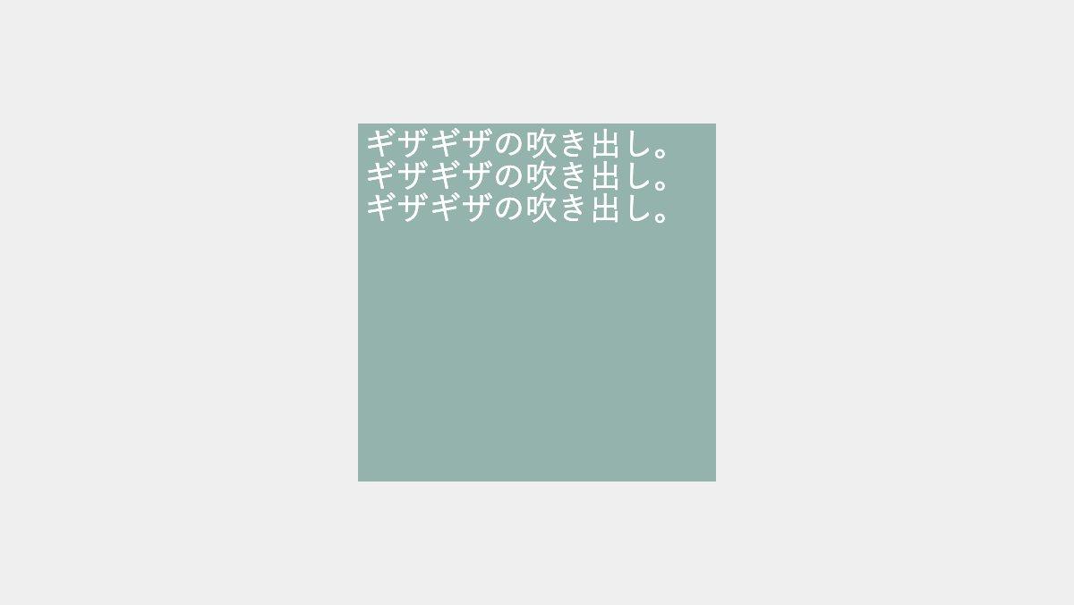
「box」「box-body」クラスと疑似要素の幅・高さを200pxにし、正方形の枠を作ります。
<div class="box">
    <div class="box-body">
        <p>ギザギザの吹き出し...</p>
    </div>
</div>
.box, .box:before, .box:after,
.box-body, .box-body:before{
    position: absolute;
    background-color: #94B3AD;
    width: 200px;
    height: 200px;
}

.box-body p {
    padding: 0.2rem;
    font-size: 18px;
    color: white;
}
要素を回転させる
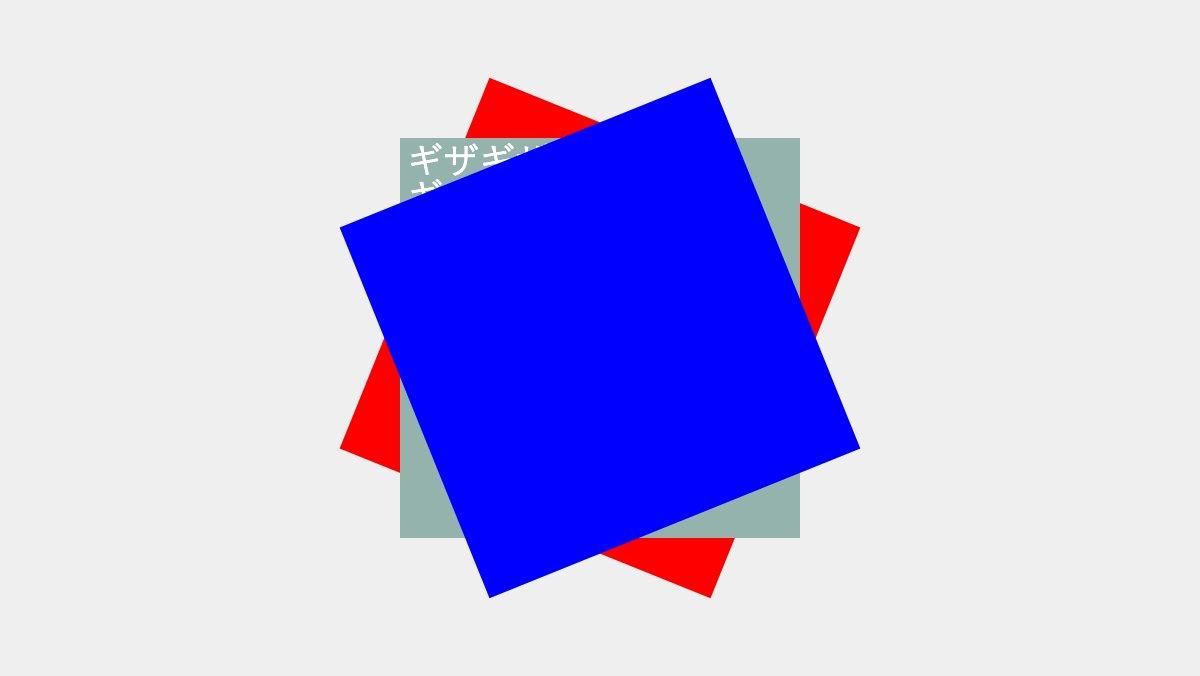
「boxクラス」のbefore、after疑似要素を「transform: rotate」で回転させます。(before疑似要素「赤」、after疑似要素「青」)
.box:before {
    transform: rotate(22deg);
    content: '';
}

.box:after {
    transform: rotate(-22deg);
    content: '';
}
要素を回転させる
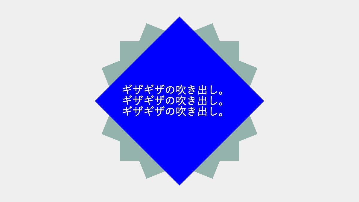
「box-body」クラスにフレックスボックスを指定し文字を上下左右中央に配置し「z-index:1;」で最前面に表示する。before疑似要素で45度回転させ「z-index:-1;」で背面に移動し完成
.box-body {
    display: flex;
    justify-content: center;
    align-items: center;
    flex-direction: column;
    z-index: 1;
}
.box-body:before {
    transform: rotate(45deg);
    content: '';
    z-index: -1;
}
全てのソース
コードを表示
<div class="box">
    <div class="box-body">
        <p>ギザギザの吹き出し。ギザギザの吹き出し。ギザギザの吹き出し。</p>
    </div>
</div>.box,
.box:before,
.box:after,
.box-body,
.box-body:before {
position: absolute;
background-color: #94B3AD;
width: 200px;
height: 200px;
}
.box:before {
transform: rotate(22deg);
content: '';
}
.box:after {
transform: rotate(-22deg);
content: '';
}
.box-body {
display: flex;
justify-content: center;
align-items: center;
flex-direction: column;
z-index: 1;
}
.box-body:before {
transform: rotate(45deg);
content: '';
z-index: -1;
}
.box-body p {
padding: 0.2rem;
font-size: 18px;
color: white;
}
このWEBパーツを確認する
HTML・CSSのカスタマイズや動作確認ができます


