
今回は囲み枠の左上と右下に背景パターンを配置して、吹き出しにする方法を解説します。
「background」プロパティに複数の「gradient」関数を指定して実装しています。
以下のように指定することでチェック柄の吹き出しが作れます。
上下の余白を取る
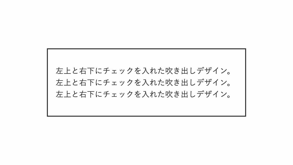
「padding: 2rem 1rem;」で上下の余白を多めにとります。
<div class="box">
    <p>左上と右下にチェックを入れた...</p>
</div>
.box {
    position: relative;
    padding: 2rem 1rem;
    border: 2px solid #333;
}
左上と右下にチェックを表示
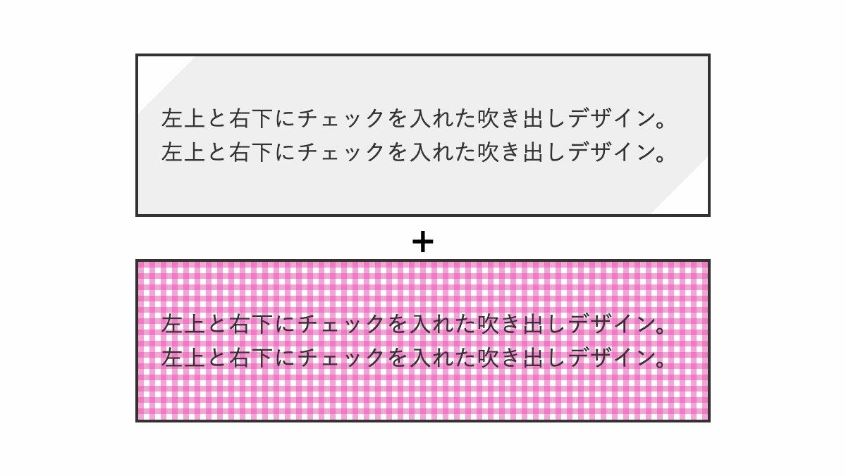
「background」プロパティの最初の「linear-gradient」で左上と右下を斜めに透過。2つの「repeating-linear-gradient」でチェックパターンを作り重ねます。
.box {
  ...
  background:
      linear-gradient(
          135deg,
          transparent 1.8rem,
          #efefef 1.8rem calc(100% - 1.8rem),
          transparent calc(100% - 1.8rem)
      ),
      repeating-linear-gradient(
        rgba(232, 78, 175, .5) 0px 4px,
        transparent 4px 8px
      ),
      repeating-linear-gradient(90deg,
         rgba(232, 78, 175, .5) 0px 4px,
         transparent 4px 8px
      );

}
吹き出しを入れる
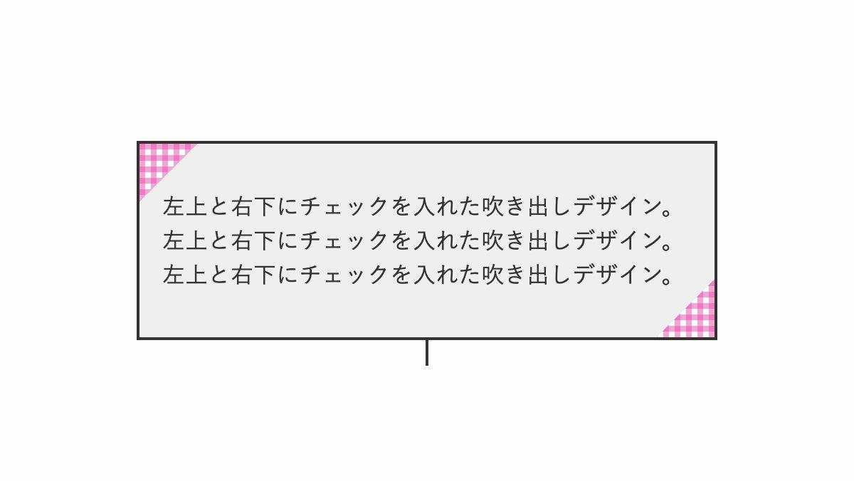
before疑似要素で中央に線を引いた吹き出しを入れ完成
.box{...}
.box::before {
    position: absolute;
    top: 100%;
    left: 50%;
    transform: translateX(-50%);
    height: 20px;
    width: 2px;
    background-color: #333;
    content: "";
}

.box p {
    color: #333;
    line-height: 1.5;
}
全てのコード
コードを表示
<div class="box">
    <p>左上と右下にチェックを入れた囲み枠デザイン。左上と右下にチェックを入れた囲み枠デザイン。左上と右下にチェックを入れた囲み枠デザイン。</p>
</div>
.box {
    position: relative;
    padding: 2rem 1rem;
    border: 2px solid #333;
    background:
        linear-gradient(135deg, transparent 1.8rem, #efefef 1.8rem calc(100% - 1.8rem), transparent calc(100% - 1.8rem)),
        repeating-linear-gradient(rgba(232, 78, 175, .5) 0px 4px, transparent 4px 8px),
        repeating-linear-gradient(90deg, rgba(232, 78, 175, .5) 0px 4px, transparent 4px 8px);
}

.box::before {
    position: absolute;
    top: 100%;
    left: 50%;
    transform: translateX(-50%);
    height: 20px;
    width: 2px;
    background-color: #333;
    content: "";
}

.box p {
    color: #333;
    line-height: 1.5;
}HTML・CSSのカスタマイズや動作確認ができます


