
囲み枠の背景にパターンと吹き出しを入れたデザインの作り方を解説します。
「linear-gradient」「repeating-linear-gradient」を使用することでストライプやグリッド、市松模様など様々なパターンを作ることができます。
以下のサンプル・コードを参考にパターンの作り方を見ていきましょう。
斜めストライプを入れる
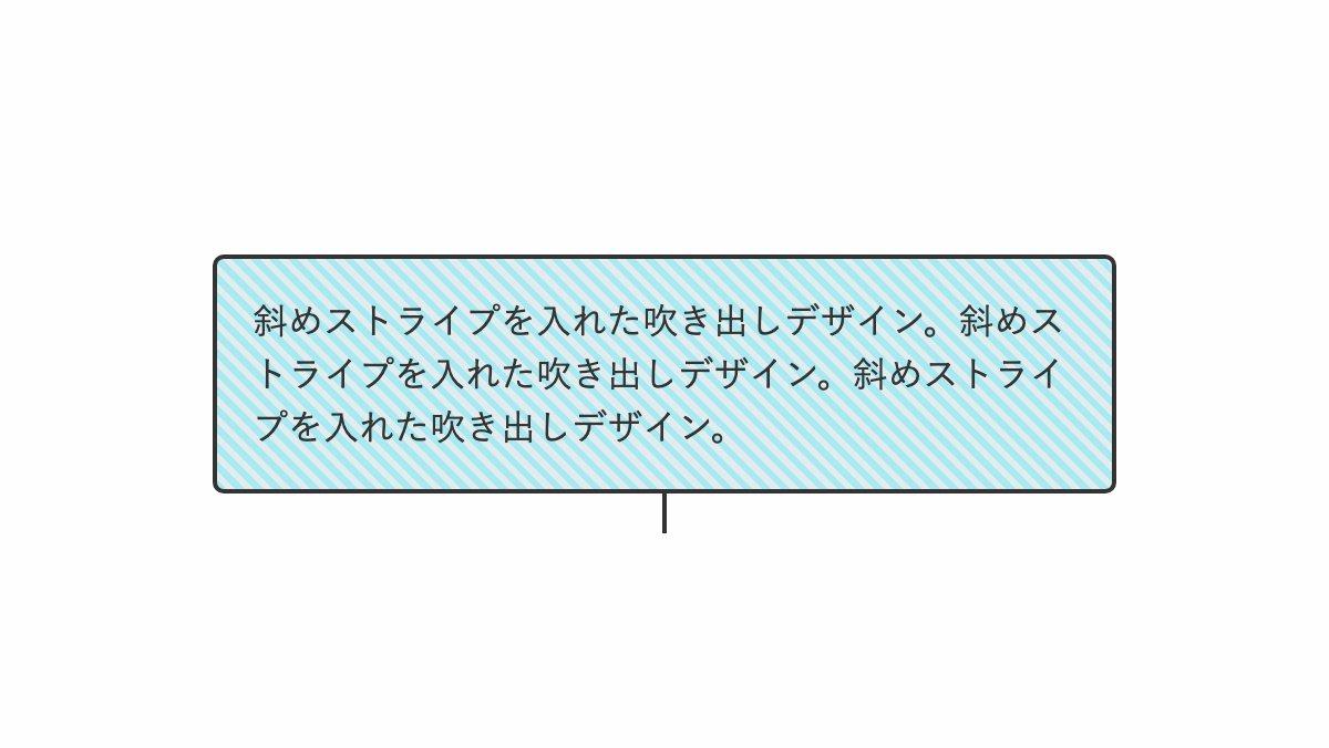
「repeating-linear-gradient」で斜めストライプを入れ、before疑似要素で線だけの吹出口を作っています。
<div class="box"><p>斜めストライプ...</p></div>
 .box {
    position: relative;
    padding: 1rem; border-radius: 5px;
    border: 2px solid #333;
    background:
      repeating-linear-gradient(45deg, #aAE8F2 0 3px, #e1ecef 3px 6px);
    color: #333;
}
.box::before {
    position: absolute;
    top: 100%; left: 50%;
    transform: translateX(-50%);
    height: 20px; width: 2px;
    background-color: #333;
    content: "";
}
.box p {
    line-height: 1.5;
}
全てのソース
コードを表示
<div class="box">
    <p>斜めストライプを入れた吹き出しデザイン。斜めストライプを入れた吹き出しデザイン。斜めストライプを入れた吹き出しデザイン。</p>
</div>
.box {
position: relative;
padding: 1rem;
border-radius: 5px;
border: 2px solid #333;
background: repeating-linear-gradient(45deg, #aAE8F2 0 3px, #e1ecef 3px 6px);
color: #333;
}
.box::before {
position: absolute;
top: 100%;
left: 50%;
transform: translateX(-50%);
height: 20px;
width: 2px;
background-color: #333;
content: "";
}
.box p {
line-height: 1.5;
}
このWEBパーツを確認する
HTML・CSSのカスタマイズや動作確認ができます
グリッドパターンを入れる
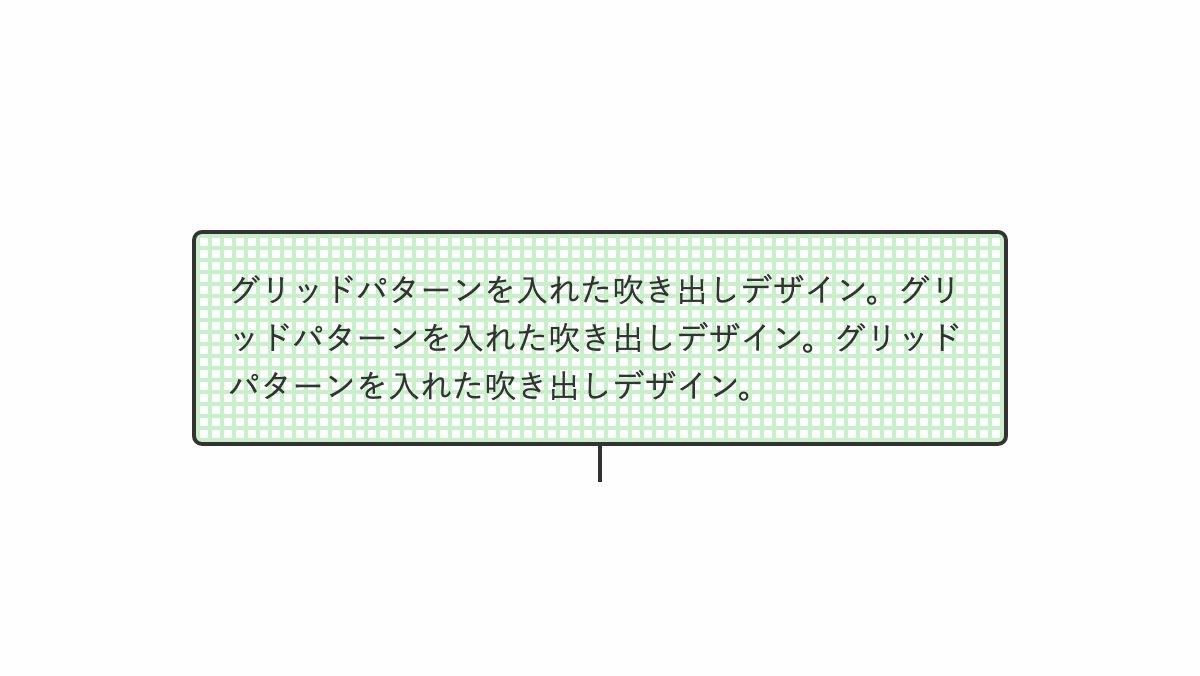
「background」プロパティに「repeating-linear-gradient」を2つ指定。最初の指定で横線、次の指定で縦線を引きグリッドパターンを作ってます。
.box {
  position: relative;
  padding: 1rem;
  border-radius: 5px;
  border: 2px solid #333;
  background:
    repeating-linear-gradient(
        #c9efcb 0 2px, transparent 2px 6px
    ),
    repeating-linear-gradient(
      90deg, #c9efcb 0 2px, transparent 2px 6px
    );
  color: #333;
}

.box::before {...}
.box p {
    line-height: 1.5;
}
全てのソース
コードを表示
<div class="box">
    <p>グリッドパターンを入れた吹き出しデザイン。グリッドパターンを入れた吹き出しデザイン。グリッドパターンを入れた吹き出しデザイン。</p>
</div>
.box {
position: relative;
padding: 1rem;
border-radius: 5px;
border: 2px solid #333;
background: repeating-linear-gradient(#c9efcb 0 2px, transparent 2px 6px),
repeating-linear-gradient(90deg, #c9efcb 0 2px, transparent 2px 6px);
color: #333;
}
.box::before {
position: absolute;
top: 100%;
left: 50%;
transform: translateX(-50%);
height: 20px;
width: 2px;
background-color: #333;
content: "";
}
.box p {
line-height: 1.5;
}
このWEBパーツを確認する
HTML・CSSのカスタマイズや動作確認ができます
市松模様を入れる
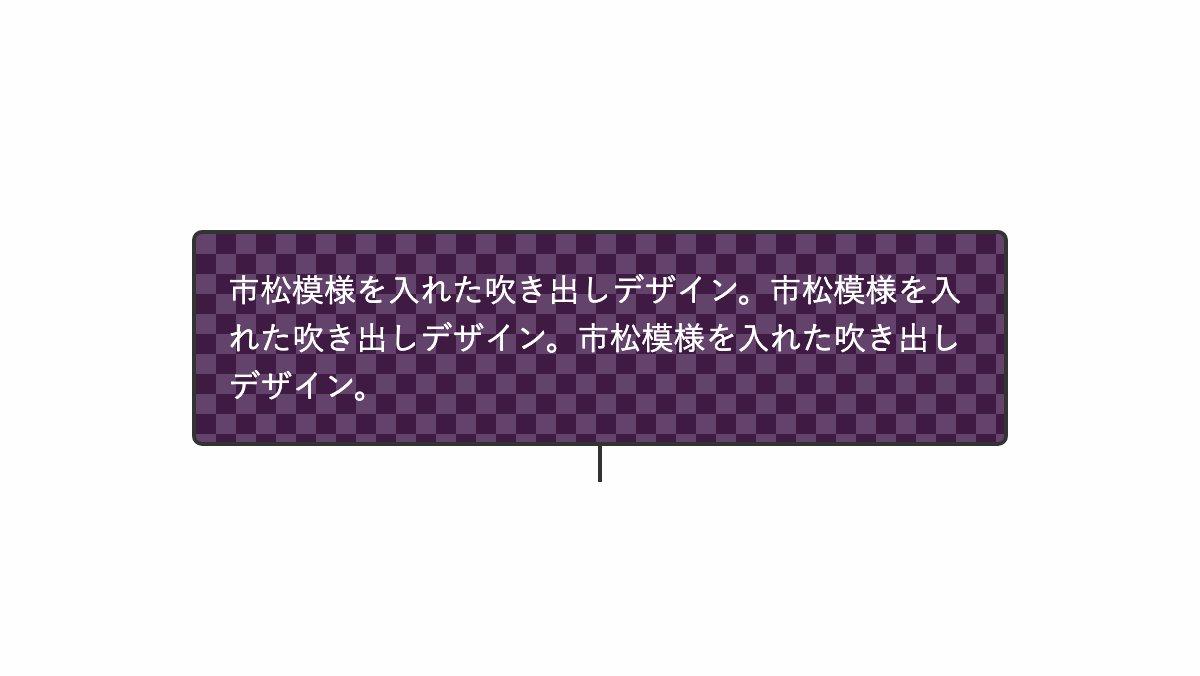
「linear-gradient」を2つ指定し斜めに模様を描きます。サイズを20pxにし、「background-position」で後に指定した「linear-gradient」を10pxずらして市松模様にしています。
.box {
    position: relative;
    padding: 1rem;
    border-radius: 5px;
    border: 2px solid #333;
    background:
      linear-gradient(45deg, #3f1a42 25%, transparent 25%, transparent 75%, #3f1a42 75%),
      linear-gradient(45deg, #3f1a42 25%, #63436b 25%, #63436b 75%, #3f1a42 75%);
    background-position: 0 0, 10px 10px;
    background-size: 20px 20px;
    color: #333;
}

.box::before {...}
.box p {...}
全てのソース
コードを表示
<div class="box">
    <p>市松模様を入れた吹き出しデザイン。市松模様を入れた吹き出しデザイン。市松模様を入れた吹き出しデザイン。</p>
</div>
.box {
position: relative;
padding: 1rem;
border-radius: 5px;
border: 2px solid #333;
background: linear-gradient(45deg, #3f1a42 25%, transparent 25%, transparent 75%, #3f1a42 75%),
linear-gradient(45deg, #3f1a42 25%, #63436b 25%, #63436b 75%, #3f1a42 75%);
background-position: 0 0, 10px 10px;
background-size: 20px 20px;
color: #333;
}
.box::before {
position: absolute;
top: 100%;
left: 50%;
transform: translateX(-50%);
height: 20px;
width: 2px;
background-color: #333;
content: "";
}
.box p {
color: white;
line-height: 1.5;
}
このWEBパーツを確認する
HTML・CSSのカスタマイズや動作確認ができます


