
今回は囲み枠の一部にバッジを配置したCSSを紹介します。
before,after疑似要素を使用し、バッジを配置しています。
以下、ソースを見ていきましょう。
円形バッジを左上に配置
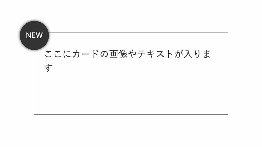
「border-radius: 50%;」で円形にし、「box-shadow: 0 0 5px #333;」で少しぼかしを入れてます。
<div class="card new-badge">
    <p>ここにカードの画像やテキストが入ります</p>
</div>
.card.new-badge::before {
    position: absolute;
    top: -25px; left: -25px;
    width: 50px; height: 50px;
    line-height: 50px;
    box-shadow: 0 0 5px #333;
    border-radius: 50%;
    background: #333;
    color: white; font-size: 0.8rem;
    text-align: center;
    text-transform: uppercase;
    content: 'new';
}
全てのソース
コードを表示
<div class="card new-badge">
    <p>ここにカードの画像やテキストが入ります</p>
</div>
.card {
position: relative;
padding: 1.5rem 1rem 1rem;
width: 300px;
height: 100px;
border: 1px solid #333;
}
.card.new-badge::before {
position: absolute;
top: -25px;
left: -25px;
width: 50px;
height: 50px;
line-height: 50px;
box-shadow: 0 0 5px #333;
border-radius: 50%;
background: #333;
color: white;
font-size: 0.8rem;
text-align: center;
text-transform: uppercase;
content: 'new';
}
.card p {
color: #333;
line-height: 1.5;
}
このWEBパーツを確認する
HTML・CSSのカスタマイズや動作確認ができます
斜めにしたバッジを左上に配置
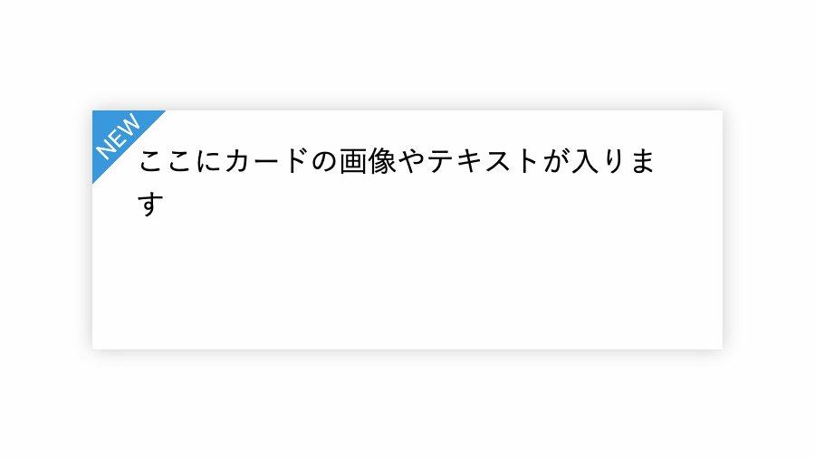
before疑似要素の「linear-gradient」で左上から青➛透過で色を入れ、after疑似要素でテキストを入れてます。
.card.new-badge::before {
    position: absolute;
    top: 0; left: 0; bottom: 0; right: 0;
    background-image: linear-gradient(135deg,
          #3998db 0 1.8rem,
          transparent 1.8rem);
    content: '';
}
.card.new-badge::after {
    position: absolute;
    top: 0.35rem; left: 0;
    color: white; font-size: 0.8rem;
    transform: rotate(-45deg);
    text-transform: uppercase;
    text-align: center;
    content: 'new';
}
全てのソース
コードを表示
<div class="card new-badge">
    ここにカードの画像やテキストが入ります
</div>
.card {
position: relative;
padding: 1rem 1.5rem;
box-shadow: 0 0 10px #ccc;
width: 300px;
height: 100px;
line-height: 1.5;
}
.card.new-badge::before {
position: absolute;
top: 0;
left: 0;
bottom: 0;
right: 0;
background-image: linear-gradient(135deg, #3998db 0 1.8rem, transparent 1.8rem);
content: '';
}
.card.new-badge::after {
position: absolute;
top: 0.35rem;
left: 0;
color: white;
font-size: 0.8rem;
transform: rotate(-45deg);
text-transform: uppercase;
text-align: center;
content: 'new';
}
このWEBパーツを確認する
HTML・CSSのカスタマイズや動作確認ができます
半円にしたバッジを中央上に配置
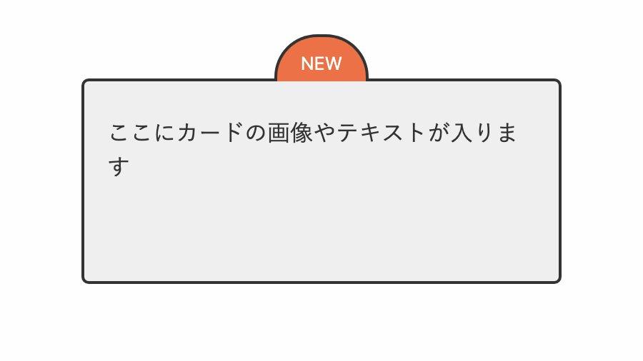
「border-radius: 30px 30px 0 0;」で左上と右上だけ角丸に。「border-bottom: transparent;」で下線を透過にしてます。
.card.new-badge::before {
    position: absolute;
    top: -2.05rem;
    left: 50%;
    width: 30px;
    height: 15px;
    line-height: 5px;
    transform: translateX(-50%);
    border-radius: 30px 30px 0 0;
    border: 2px solid #333;
    border-bottom: transparent;
    padding: 1rem 1rem 0 1rem;
    background: #ED7146;
    color: white;
    font-size: 0.8rem;
    text-align: center;
    text-transform: uppercase;
    content: 'new';
}
全てのソース
コードを表示
<div class="card new-badge">
    <p>ここにカードの画像やテキストが入ります</p>
</div>
.card {
position: relative;
padding: 1.5rem 1rem 1rem;
width: 300px;
height: 100px;
border: 2px solid #333;
border-radius: 5px;
background-color: #efefef;
}
.card.new-badge::before {
position: absolute;
top: -2.05rem;
left: 50%;
width: 30px;
height: 15px;
line-height: 5px;
transform: translateX(-50%);
border-radius: 30px 30px 0 0;
border: 2px solid #333;
border-bottom: transparent;
padding: 1rem 1rem 0 1rem;
background: #ED7146;
color: white;
font-size: 0.8rem;
text-align: center;
text-transform: uppercase;
content: 'new';
}
.card p {
color: #333;
line-height: 1.5;
}
このWEBパーツを確認する
HTML・CSSのカスタマイズや動作確認ができます


