
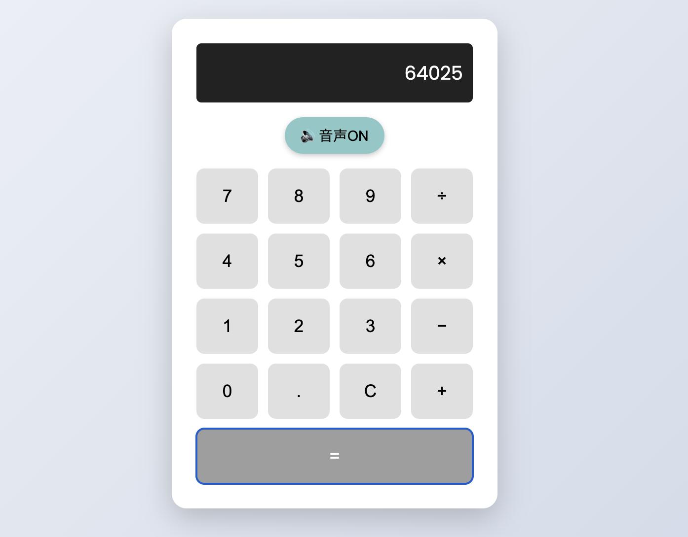
計算結果をアニメーション効果でお祝いする電卓をHTMLで作成しました。基本的な四則演算の計算実行時に、いろいろなアニメーションと効果音を再生するだけのツールです。
ファイル構成
celebration-calculator/
├── index.html          # HTMLマークアップ
├── style.css           # CSSスタイル・アニメーション
├── script.js           # JavaScript制御ロジック
├── sound.mp3           # 効果音ファイル
技術仕様
-
HTML5, CSS3, Vanilla JavaScript
-
Web Audio API(効果音ラボ)
使い方
基本操作
-
数字・演算子設定: 数字・または演算子ボタンをクリックまたはキーボード入力
-
計算実行: = ボタンをクリック(全アニメーションとサウンド効果が発生)
-
クリア: C ボタンで全クリア
キーボード操作
-
数字キー(0-9)→ 数値入力
-
Enter または = → 計算実行
-
Backspace → 文字削除
-
Escape, C, c → 全クリア
-
. → 小数点入力
-
+ → 加算
-
- → 減算(表示は−)
-
* → 乗算(表示は×)
-
/ → 除算(表示は÷)
音声機能
-
効果音: 計算実行時にサウンドが再生
-
切り替え: 画面右上のON/OFFボタンで制御
-
状態表示: 🔊(ON)/ 🔇(OFF)アイコンで現在状態を表示
演出効果の実装内容
1. 計算結果飛び出しエフェクト
計算結果が画面中央に大きく表示される主要なアニメーション効果
CSS実装:
/* ポップアップ結果表示用の固定要素 */
.popup-result {
    position: fixed;
    top: 50%;
    left: 50%;
    transform: translate(-50%, -50%);
    font-size: 8em;
    font-weight: 700;
    color: #f8915a;
    text-shadow: 0 0 10px rgba(255, 107, 53, 0.8);
    opacity: 0;
    z-index: 1000;
    pointer-events: none;
}

/* スパークルエフェクト用疑似要素 */
.popup-result::before {
    content: '';
    position: absolute;
    left: -80px;
    top: 50%;
    transform: translateY(-50%);
    font-size: 0.5em;
    animation: sparkle 0.3s infinite alternate;
}

.popup-result::after {
    content: '';
    position: absolute;
    right: -80px;
    top: 50%;
    transform: translateY(-50%);
    font-size: 0.5em;
    animation: sparkle 0.3s infinite alternate 0.15s;
}

/* スパークルアニメーション */
@keyframes sparkle {
    from { transform: translateY(-50%) scale(1); opacity: 0.7; }
    to { transform: translateY(-50%) scale(1.3); opacity: 1; }
}

/* メインアニメーション */
@keyframes popupFlyOut {
    0% {
        opacity: 0;
        transform: translate(-50%, -50%) scale(0.2);
        text-shadow: 0 0 10px rgba(255, 107, 53, 0.3);
    }
    20% {
        opacity: 1;
        transform: translate(-50%, -50%) scale(1);
        text-shadow: 0 0 30px rgba(255, 107, 53, 0.7);
    }
    60% {
        opacity: 1;
        transform: translate(-50%, -50%) scale(5);
        text-shadow: 0 0 60px rgba(255, 107, 53, 0.8);
    }
    100% {
        opacity: 0;
        transform: translate(-50%, -50%) scale(10);
        text-shadow: 0 0 10px rgba(255, 107, 53, 0.2);
    }
}

/* アニメーション開始時に追加されるクラス */
.popup-result.animate {
    animation: popupFlyOut 2s ease-in-out forwards;
}
JavaScript制御:
/**
 * 3D飛び出しエフェクトの実行
 * @param {number} result - 計算結果の数値
 */
function trigger3DPopupEffect(result) {
    // ポップアップ要素に結果をセット
    popupResult.textContent = result;

    // 既存のアニメーションクラスをリセット(再実行対応)
    popupResult.classList.remove('animate');

    // 50ms後にアニメーション開始(DOM更新待ち)
    setTimeout(() => {
        popupResult.classList.add('animate');
    }, 50);

    // 0.1秒後に結果をディスプレイ表示(スライドイン準備)
    setTimeout(() => {
        // アニメーション競合回避のため一時的にCSS無効化
        displayText.classList.add('no-transition');
        displayText.style.transform = 'translateY(60px)';
        displayText.style.opacity = '0';
        displayText.textContent = result;

        // スライドインアニメーション開始
        setTimeout(() => {
            displayText.classList.remove('no-transition');
            displayText.style.transform = '';
            displayText.style.opacity = '';
            displayText.classList.add('slide-in');
            isResultDisplayed = true;

            // アニメーション完了後にクラス削除
            setTimeout(() => {
                displayText.classList.remove('slide-in');
            }, 1500);
        }, 50);
    }, 100);

    // 2秒後にクリーンアップ実行
    setTimeout(() => {
        popupResult.classList.remove('animate');
        popupResult.textContent = '';
    }, 2000);
}
2. キランと光るエフェクト
ディスプレイ表面を光の帯が横切る演出効果(計算完了1秒後に実行)
CSS実装:
/* 光掃引アニメーション用のコンテナ */
.display-light-sweep {
    overflow: hidden;
    position: relative;
}

/* 光掃引用の疑似要素定義 */
.display-light-sweep::before {
    background: #fff;               /* 白色の光源 */
    content: "";
    display: block;
    position: absolute;
    top: 0px;
    left: -100px;                   /* 初期位置は画面外左側 */
    width: 30px;                    /* 光の帯の幅 */
    height: 100%;                   /* ディスプレイ全高 */
    opacity: 0;                     /* 初期状態は透明 */
    rotate: 45deg;                  /* 45度回転 */
}

/* 光掃引アニメーション中に追加されるクラス */
.display-light-sweep.animate::before {
    animation: kiran 0.6s ease-out;
}

/* キーフレーム定義:scaleによる光の移動と拡大表現 */
@keyframes kiran {
  0% {
    transform: scale(2);
    opacity: 0;
  }
  20% {
    transform: scale(20);
    opacity: 0.4;
  }
  40% {
    transform: scale(30);
    opacity: 0.6;
  }
  80% {
    transform: scale(45);
    opacity: 0.2;
  }
  100% {
    transform: scale(50);
    opacity: 0;
  }
}
JavaScript制御:
/**
 * ディスプレイ光掃引エフェクトの実行
 * 計算完了から1秒後に自動実行される
 */
function triggerDisplayKiran() {
    // 光掃引クラスを追加してアニメーション開始
    display.classList.add('display-light-sweep', 'animate');

    // 0.6秒後にクラス削除(アニメーション終了後のクリーンアップ)
    setTimeout(() => {
        display.classList.remove('display-light-sweep', 'animate');
    }, 600);
}

// メイン計算処理内での呼び出し(1秒遅延)
setTimeout(() => {
    triggerDisplayKiran();
}, 1000);
3. パーティクルエフェクト
Canvas-confettiライブラリによる物理演算ベースのパーティクル生成
花火エフェクト実装:
/**
 * 短縮花火エフェクトの実行
 * 左右2箇所から時間差で花火を発射
 */
function triggerFireworksEffect() {
    // 1回目の花火(左側から右上方向)
    setTimeout(() => {
        confetti({
            particleCount: 25,          // パーティクル数
            angle: 60,                  // 発射角度(度)
            spread: 55,                 // 拡散範囲(度)
            origin: { x: 0.3, y: 0.6 }, // 発射位置(画面比率)
            colors: ['#ff6b35', '#f7931e', '#ffd23f'], // 暖色系
            gravity: 0.3,               // 重力係数
            ticks: 150                  // 持続時間(フレーム数)
        });
    }, 200);

    // 2回目の花火(右側から左上方向)
    setTimeout(() => {
        confetti({
            particleCount: 25,
            angle: 120,                 // 左上方向
            spread: 55,
            origin: { x: 0.7, y: 0.6 },
            colors: ['#ff6b35', '#f7931e', '#ffd23f'],
            gravity: 0.3,
            ticks: 150
        });
    }, 400);
}
星エフェクト実装:
/**
 * ディスプレイ中心からの星エフェクト
 * 動的にディスプレイ位置を取得して発射位置を計算
 */
function triggerStarEffect() {
    // ディスプレイ要素の画面上位置を取得
    const displayRect = display.getBoundingClientRect();
    const displayCenterX = (displayRect.left + displayRect.right) / 2;
    const displayCenterY = (displayRect.top + displayRect.bottom) / 2;

    // 画面全体に対する相対位置を計算(0-1の範囲)
    const originX = displayCenterX / window.innerWidth;
    const originY = displayCenterY / window.innerHeight;

    // 共通設定オブジェクト
    var defaults = {
        spread: 360,                    // 全方向拡散
        ticks: 50,                      // 短い持続時間
        gravity: 0,                     // 重力無効
        decay: 0.94,                    // 減衰率
        startVelocity: 30,              // 初期速度
        colors: ['FFE400', 'FFBD00', 'E89400', 'FFCA6C', 'FDFFB8'],
        origin: { x: originX, y: originY }
    };

    // 星発射関数
    function shoot() {
        // 大きな星パーティクル
        confetti({
            ...defaults,
            particleCount: 40,
            scalar: 1.2,                // サイズ倍率
            shapes: ['star']
        });

        // 小さな円パーティクル
        confetti({
            ...defaults,
            particleCount: 10,
            scalar: 0.75,
            shapes: ['circle']
        });
    }

    // 100ms間隔で3回発射
    setTimeout(shoot, 0);
    setTimeout(shoot, 100);
    setTimeout(shoot, 200);
}
4. スライドインエフェクト
計算結果がディスプレイに下方向からスライドインする演出
CSS実装:
/* スライドイン中に追加されるクラス */
.slide-in {
    animation: slideInFromBelow 1.5s ease-out forwards;
}

/* キーフレーム定義:下から上へのバウンシングモーション */
@keyframes slideInFromBelow {
    0% {
        transform: translateY(60px);    /* 下方60px位置から開始 */
        opacity: 0;
    }
    30% {
        transform: translateY(15px);    /* オーバーシュート */
        opacity: 0.6;
    }
    60% {
        transform: translateY(-3px);    /* 軽い跳ね上がり */
        opacity: 0.9;
    }
    80% {
        transform: translateY(1px);     /* 微細な戻り */
        opacity: 1;
    }
    100% {
        transform: translateY(0);       /* 最終位置に着地 */
        opacity: 1;
    }
}

/* アニメーション競合回避用の一時無効化クラス */
.no-transition {
    transition: none !important;
}

.display-text.no-transition {
    transition: none;
    animation: none !important; /* アニメーションも完全に無効化 */
}
JavaScript制御 (計算結果飛び出しエフェクト内で実行):
// 0.1秒後にスライドイン開始(3D効果との連携)
setTimeout(() => {
    // Step 1: CSS遷移を一時的に無効化してポジション設定
    displayText.classList.add('no-transition');
    displayText.style.transform = 'translateY(60px)';
    displayText.style.opacity = '0';
    displayText.textContent = result;

    // Step 2: 50ms後にスライドインアニメーション開始
    setTimeout(() => {
        displayText.classList.remove('no-transition');
        displayText.style.transform = '';          // CSS keyframeに制御移行
        displayText.style.opacity = '';
        displayText.classList.add('slide-in');     // アニメーション開始
        isResultDisplayed = true;

        // Step 3: 1.5秒後にアニメーションクラス削除
        setTimeout(() => {
            displayText.classList.remove('slide-in');
        }, 1500);
    }, 50);
}, 100);
音声再生
Web Audio APIを使用した効果音再生制御
JavaScript実装:
// 音声切り替えボタンの処理
soundToggle.addEventListener('click', () => {
    isSoundEnabled = !isSoundEnabled;  // 状態切り替え

    if (isSoundEnabled) {
        soundToggle.textContent = '🔊 音声ON';
        soundToggle.classList.remove('muted');
    } else {
        soundToggle.textContent = '🔇 音声OFF';
        soundToggle.classList.add('muted');
    }
});

// 計算実行時の音声再生処理
if (isSoundEnabled) {
    celebrationSound.currentTime = 0;  // 再生位置をリセット
    celebrationSound.play().catch(e => {
        console.log('音楽再生エラー:', e);  // エラーハンドリング
    });
}
まとめ
普通の電卓にアニメーション効果と効果音を加えた、少し変わった電卓です。
いつもと違う気分で計算を楽しみたい時にお試しください。


