
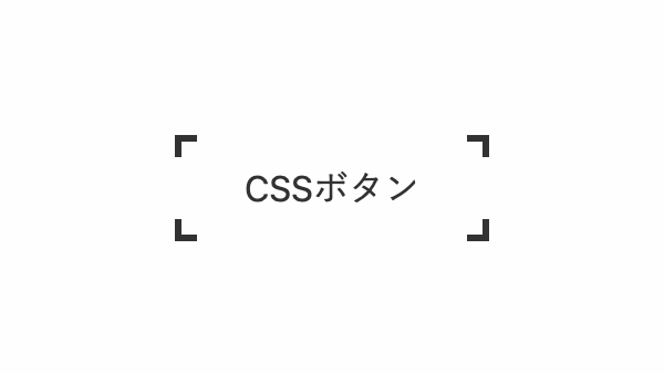
4つ角に括弧を設定し、ホバーエフェクトを付けたCSSボタンを作りました。
「linear-gradient」を使用し上下左右に「黒線→透過→黒線」を引いて4つ角に括弧を付けてます。
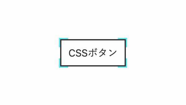
ホバー時に枠線を入れ替えるCSSボタン
ホバー時に「background-position」を変更しています
コードを表示
<a class="btn-4line">
    CSSボタン
</a>
.btn-4line {
    --x-gradient: linear-gradient(90deg, #323232 0 10px, transparent 0 calc(100% - 10px), #323232 calc(100% - 10px));
    --y-gradient: linear-gradient(#323232 0 10px, transparent 0 calc(100% - 10px), #323232 calc(100% - 10px));
    margin: 0.5rem;
    padding: 1rem 2rem;
    background-image:
        var(--x-gradient),
        var(--y-gradient),
        var(--x-gradient),
        var(--y-gradient);
    background-repeat: no-repeat;
    background-size: 100% 3px, 3px 100%, 100% 3px, 3px 100%;
    background-position: top, right, bottom, left;
    color: #323232;
    text-decoration: none;
    transition: 0.5s;
}

.btn-4line:hover {
    background-position: bottom, left, top, right;
}HTML・CSSのカスタマイズや動作確認ができます
ホバー時に内側の枠線が広がるCSSボタン
ホバー時に「outline-offset」を変えてます
コードを表示
<a class="btn-4line">
    CSSボタン
</a>
.btn-4line {
    --x-gradient: linear-gradient(90deg, #6be5ec 0 15px, transparent 0 calc(100% - 15px), #6be5ec calc(100% - 15px));
    --y-gradient: linear-gradient(#6be5ec 0 15px, transparent 0 calc(100% - 15px), #6be5ec calc(100% - 15px));
    margin: 0.5rem;
    padding: 1rem;
    outline: 2px solid;
    outline-offset: -4px;
    background-image:
        var(--x-gradient),
        var(--y-gradient),
        var(--x-gradient),
        var(--y-gradient);
    background-repeat: no-repeat;
    background-size: 100% 2px, 2px 100%, 100% 2px, 2px 100%;
    background-position: top, right, bottom, left;
    color: #323232;
    text-decoration: none;
    transition: 0.5s;
}

.btn-4line:hover {
    outline-offset: -2px;
    color: #6be5ec;
}HTML・CSSのカスタマイズや動作確認ができます
ホバー時に括弧で囲むように変化するCSSボタン
ホバー時に「liner-gradient」と「background-size」で線幅を変更しています
コードを表示
<a class="btn">
    CSSボタン
</a>
.btn {
--x-gradient: linear-gradient(90deg, #323232 0 3px, transparent 0 calc(100% - 3px), #323232 calc(100% - 3px));
--y-gradient: linear-gradient(#323232 0 3px, transparent 0 calc(100% - 3px), #323232 calc(100% - 3px));
margin: 0.5rem;
padding: 1rem 2rem;
background-image:
var(--x-gradient),
var(--y-gradient),
var(--x-gradient),
var(--y-gradient);
background-repeat: no-repeat;
background-size: 100% 50%, 50% 100%, 100% 50%, 50% 100%;
background-position: top, right, bottom, left;
color: #323232;
text-decoration: none;
transition: 0.5s;
}
.btn:hover {
--x-gradient: linear-gradient(90deg, #323232 0 10px, transparent 0 calc(100% - 10px), #323232 calc(100% - 10px));
--y-gradient: linear-gradient(#323232 0 10px, transparent 0 calc(100% - 10px), #323232 calc(100% - 10px));
background-size: 100% 3px, 3px 100%, 100% 3px, 3px 100%;
}
このWEBパーツを確認する
HTML・CSSのカスタマイズや動作確認ができます


