
CSSで背景画像をグレースケールに変換し、背景画像を文字の形に切り取る方法を解説します。
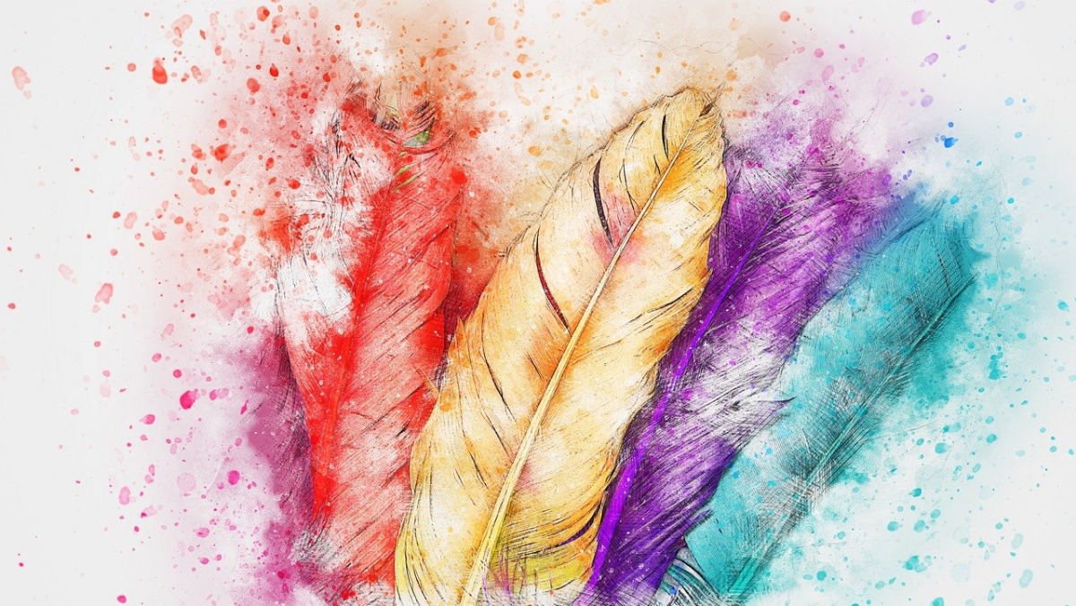
背景画像を設定
文字の上部に白い影、下部にグレーの影をつけます
<div class="container"></div>
 .pic-container {
    position: relative;
    display: flex;
    justify-content: center;
    align-items: center;
    flex-direction: column;
    width: 100vw;
    height: 100vh;
    background-image: url(...);
    background-size: cover;
    background-position: center;
    overflow: hidden;
    z-index: 0;
}
背景をグレースケールに変換
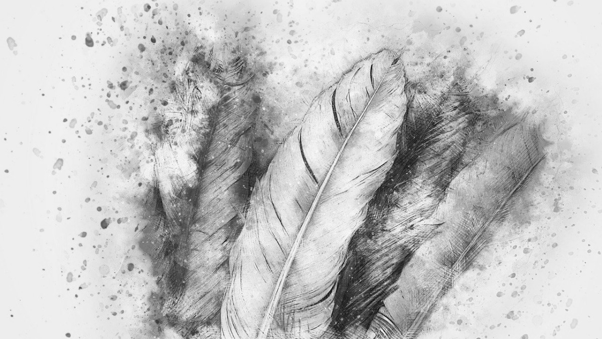
before疑似要素の「filter」プロパティで「grayscale(100%)」を指定しグレースケールに変換
<div class="container"></div>
.container::before {
    position: absolute;
    top: 0;
    left: 0;
    width: 100%;
    height: 100%;
    background: inherit;
    filter: grayscale(100%);
    content: '';
    z-index: -1;
}
背景画像を文字の形に切り抜く
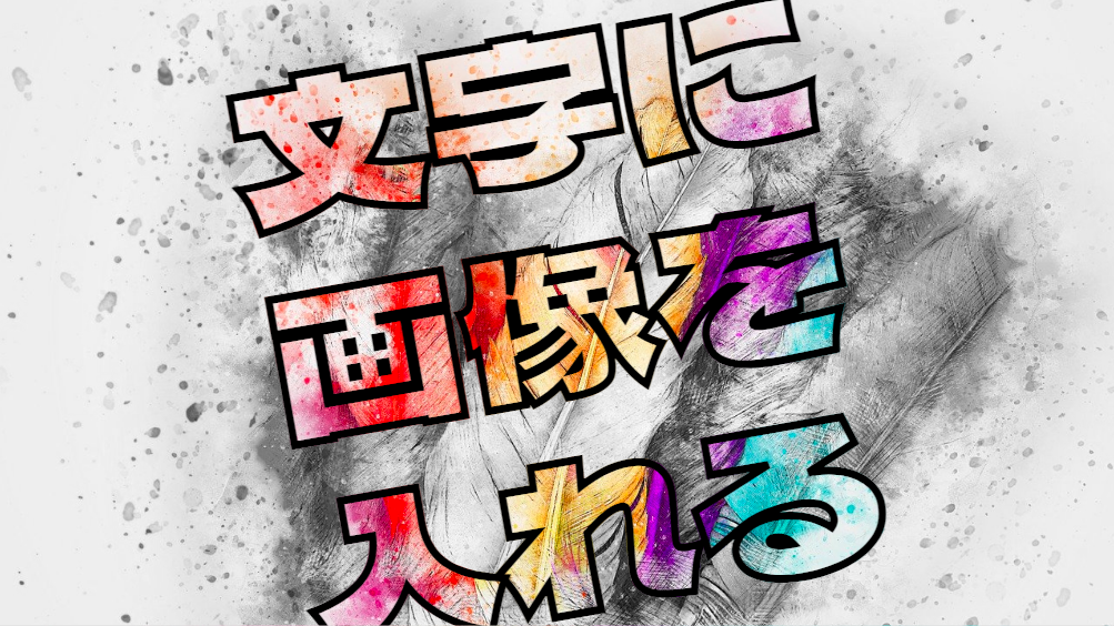
「background: inherit;」で親要素から背景画像を継承。「-webkit-background-clip: text;」を指定し画像で文字をマスク。フォントはGoogleFontの「Dela Gothic One」を指定。
<div class="container">
    <h1>文字に<br>画像を<br>入れる</h1>
</div>
h1 {
    background: inherit;
    background-clip: text;
    -webkit-background-clip: text;
    -webkit-text-stroke: 1px black;
    color: transparent;
    font-family: 'Dela Gothic One';
    font-weight: bold;
    font-size: 105px;
    line-height: 1.1;
    text-align: center;
    transform: rotate(-10deg);
}
全てのソース
コードを表示
<div class="pic-container pic-background">
    <h1>文字に<br>画像を<br>入れる</h1>
</div>
@import url('https://fonts.googleapis.com/css2?family=Dela+Gothic+One&display=swap');
.pic-background {
background-image: var(--pic-image-data, none);
background-size: cover;
background-position: center;
}
.pic-container {
position: relative;
display: flex;
justify-content: center;
align-items: center;
overflow: hidden;
width: 100vw;
height: 100vh;
z-index: 0;
}
.pic-container::before {
position: absolute;
top: 0;
left: 0;
width: 100%;
height: 100%;
background: inherit;
filter: grayscale(100%);
content: '';
z-index: -1;
}
h1 {
background: inherit;
background-clip: text;
-webkit-background-clip: text;
color: transparent;
font-family: 'Dela Gothic One';
font-weight: bold;
font-size: 105px;
-webkit-text-stroke: 1px black;
line-height: 1.1;
text-align: center;
transform: rotate(-10deg);
}
このWEBパーツを確認する
HTML・CSSのカスタマイズや動作確認ができます


